
In a move designed to fortify its status as the world’s most recognizable beverage brand, Coca-Cola has officially unveiled a sweeping visual identity overhaul. This global refresh, which spans the entirety of the company’s touchpoints—from physical packaging and retail vending machines to digital interfaces—aims to synthesize its disparate marketing efforts into a single, cohesive "visual system." While the iconic Spencerian script and the legendary red-and-white color palette remain untouched, the company is doubling down on consistency, aiming to bridge the gap across more than 200 international markets.
The Core Transformation: A Unified Visual Language
On July 20, the Atlanta-based beverage giant announced a strategic shift in how its brand presents itself to the world. For decades, Coca-Cola has relied on a patchwork of regional marketing strategies and varying design nuances. The new initiative seeks to collapse these regional silos.
The strategy relies on a return to "brand fundamentals." By leaning heavily into the classic visual cues that have defined the product for over a century—specifically the Dynamic Ribbon, the Arden Square, and the unmistakable red background—the company is attempting to make the brand feel ubiquitous and singular.
“This refresh is about being clearer and more consistent in how we show up, wherever people experience our brand,” said Arnab Roy, Coca-Cola’s Global Category President. The philosophy driving this change is summarized by the internal mandate shared by Rapha Abreu, the company’s global vice president of design: "Make Coca-Cola more Coca-Cola, everywhere."
Chronology of a Global Brand
To understand the scale of this project, one must look at the recent history of Coca-Cola’s visual evolution. The brand has never been static, but its recent pivots have been remarkably rapid.
- 2021: The "Real Magic" Era: Coca-Cola launched its "Real Magic" global brand platform. This update was significant for its introduction of the "Hug" logo—a curved interpretation of the iconic bottle silhouette that aimed to bring a more human, emotive quality to the brand’s digital presence.
- 2024: The Strategic Evaluation: Internal data indicated that while the brand remained strong, the fragmentation of design assets across global markets had begun to dilute the consumer experience. The need for a standardized global identity became a priority for the leadership team.
- 2025: Collaboration and Development: Coca-Cola engaged the branding agency JKR to lead the global identity development, while the design studio The Superultrarare was tasked with the technical execution of the new packaging system.
- July 2026: The Global Rollout: The company officially commenced the deployment of the new visual system, targeting Latin America, Europe, the Middle East, and Asia as the primary initial markets.
Coke Zero Sugar: A Bolder Pivot
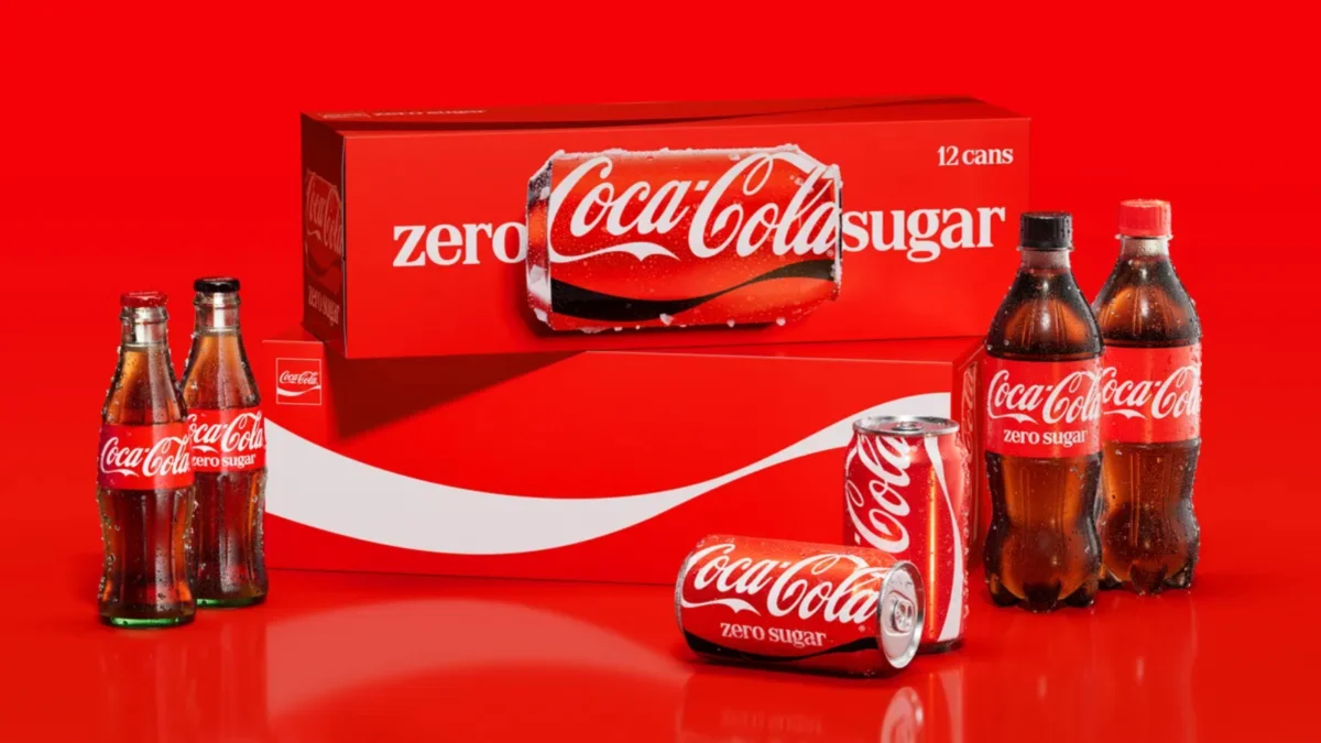
While the flagship Coca-Cola product receives subtle refinements to its layout and iconography, the most radical changes are reserved for the Coca-Cola Zero Sugar line. As the company continues to aggressively pivot toward health-conscious consumers, it has sought to elevate the visibility of its sugar-free offering.
The new Zero Sugar cans feature significantly enlarged, bolder "Zero Sugar" lettering, serving as a primary visual anchor for the product. Furthermore, the introduction of a prominent black version of the Dynamic Ribbon creates a stark, high-contrast look that separates it from the classic red-and-white design. Perhaps most practically, the company is transitioning to black caps on all Zero Sugar plastic bottles. This move serves a dual purpose: it acts as a quick-reference signifier for consumers in retail aisles and provides a definitive visual break from the red caps associated with the original formula.
Supporting Data and Design Philosophy
The decision to standardize was not merely aesthetic; it was rooted in the psychology of consumer behavior. Data suggests that in a high-noise retail environment—where consumers often spend mere milliseconds scanning shelves—consistency in color and shape is the most effective driver of brand recognition.
The new "visual system" utilizes a rigid set of design rules. The Arden Square, for instance, has been repositioned to serve as a frame for the Spencerian script, ensuring that the logo remains the hero of every package. By removing extraneous design elements that had crept into the brand over the last decade, the designers have essentially "cleaned the house," allowing the brand’s core equity to shine through without distraction.
Market testing conducted during the development phase showed that a unified system significantly improves "shelf pop," the metric used to determine how quickly a shopper identifies a product against its competitors. By aligning the design of every SKU, Coca-Cola is essentially turning every vending machine and store shelf into a massive billboard for the brand.
Official Responses and Strategic Rationale
The leadership at Coca-Cola has been vocal about the intent behind these changes. It is not an attempt to reinvent the brand, but rather a "sharpening" of its identity. The company’s media center explicitly frames this as an effort to ensure that the Coca-Cola experience is identical in Tokyo, London, or Buenos Aires.
Designers involved in the project have described the process as a "reductive exercise." The goal was to remove anything that did not contribute to the immediate recognition of the product. By stripping away clutter, the company is betting that the emotional resonance of the red color and the classic script is enough to maintain its dominant market position.
"We are not abandoning our heritage," a company representative noted during the rollout. "We are curating it. We are making sure that the brand we built over 130 years is optimized for the next 130 years of digital and physical interaction."
Global Implications and Market Reach
The rollout is currently in its primary phase across several continents. However, the absence of a timeline for the North American market has sparked industry speculation. Analysts suggest that the delay in the United States and Canada may be due to the sheer scale of the supply chain and the complexity of coordinating a packaging shift across such a massive, highly saturated market.
Impact on Retail Partners
For retailers, the change is expected to be seamless. The new designs are meant to be modular, fitting easily into existing shelving planograms. However, the increase in "Zero Sugar" visibility could lead to a shift in shelf space allocation, as the company pushes to make the sugar-free variant more prominent in its total portfolio mix.
Digital Integration
The new visual system was designed with "mobile-first" principles. In a digital-first economy, the brand’s assets must be legible at small sizes—on an app icon, a digital storefront, or a social media profile picture. The new system’s emphasis on bold typography and high-contrast color blocks ensures that the brand remains legible even on the smallest screens.
Conclusion: The Future of the Red Can
Coca-Cola’s decision to refresh its global identity is a testament to the brand’s endurance. In an era where consumers are bombarded with new choices and shifting trends, Coca-Cola is leaning into the strength of its past to secure its future. By refining its visual language, the company is not just changing labels on a can—it is reinforcing a global identity that transcends language, borders, and culture.
As the new packaging makes its way into the hands of millions, the ultimate success of this endeavor will be measured by its ability to simplify the consumer choice. If the design overhaul succeeds in making the product "more Coca-Cola" as intended, the brand will likely see continued dominance in the global beverage landscape for years to come. For now, the world watches as the most famous red in history gets a high-definition update.