The release of promotional material for Spider-Man: Brand New Day has triggered a fervor among the Marvel faithful, but not entirely for the reasons the studio might have hoped. While the latest posters—featuring a tantalizing glimpse of Tom Holland’s unmasked protagonist—have successfully built anticipation for the upcoming film, they have also inadvertently launched a high-stakes debate within the graphic design and comic book communities. At the center of this firestorm is a subtle, yet contentious, detail in the iconic Spider-Man chest emblem.
What began as a casual observation on social media has spiraled into a comprehensive dissection of visual branding, logo hierarchy, and the delicate balance between functional costume design and aesthetic clarity.
The Anatomy of the Controversy: A Deep Dive into the Emblem
In the world of superhero cinema, the chest emblem is more than just a decorative element; it is a brand identity. From the classic thin-limbed spiders of the Silver Age comics to the blocky, tactical emblems of the MCU’s recent iterations, the logo serves as a visual shorthand for the character’s current status and tone.
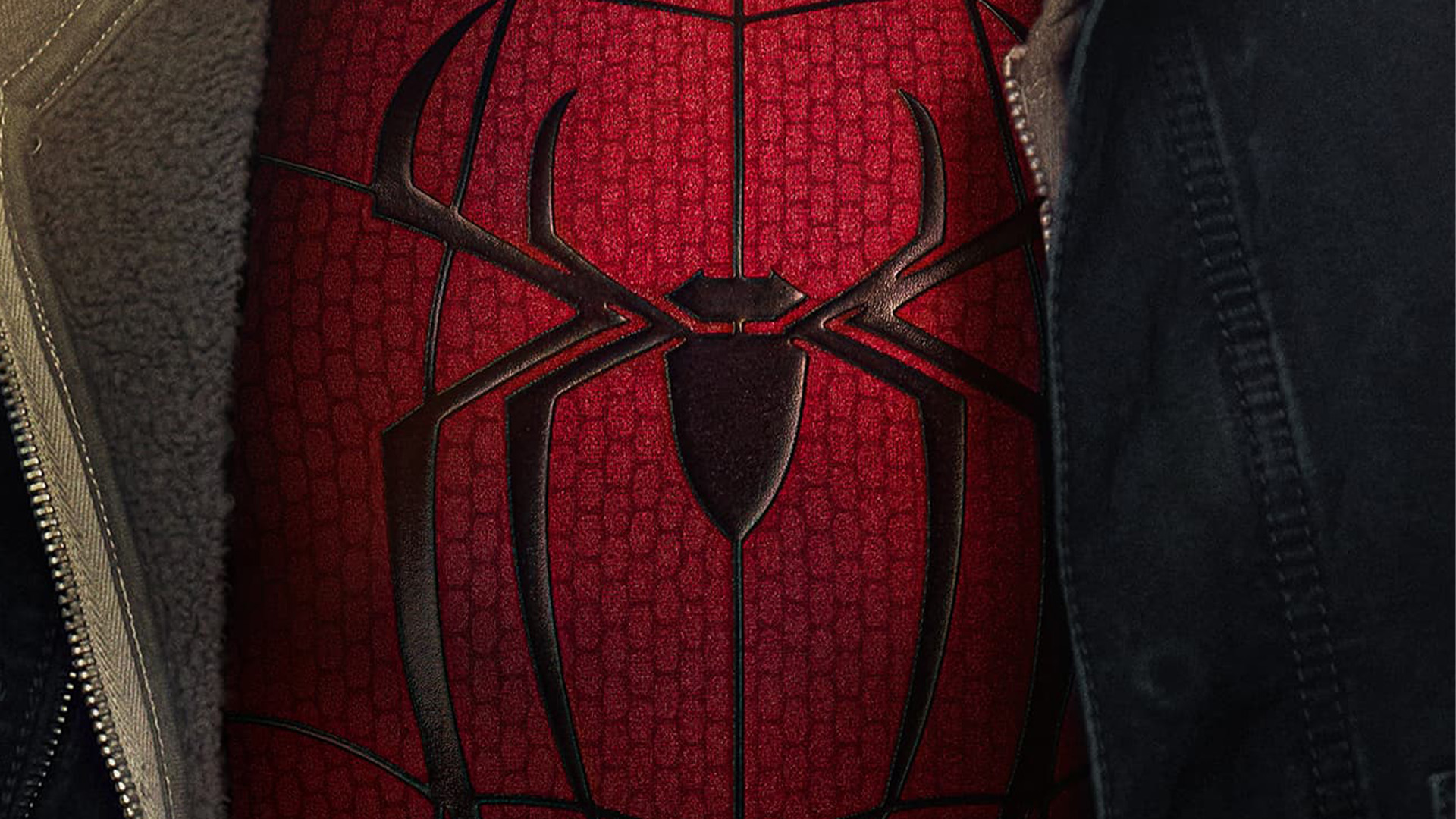
The current point of contention involves the connectivity of the spider’s upper legs in the Brand New Day design. An X (formerly Twitter) user sparked the conversation by posting a close-up of the emblem, noting, "I don’t like how the top legs connect to each other." This critique, seemingly minor in isolation, struck a nerve with a segment of the fanbase that prides itself on scrutinizing the minutiae of superhero costuming.
The Design Divide
Graphic design experts and casual viewers alike have found themselves on opposite sides of the fence. To the untrained eye, the emblem looks like a standard spider. However, for those versed in the principles of iconography, the "over-designed" nature of the new logo suggests a departure from the clean, minimalist silhouettes that defined earlier Spider-Man films.
Critics argue that the visual clutter created by the connected upper limbs detracts from the iconic nature of the spider. Supporters, conversely, suggest that the design is a byproduct of the suit’s internal "web-tech" mechanics. As one fan theorized during the online discourse, the design isn’t a stylistic choice for the sake of the logo itself, but rather a realistic depiction of the webbing material physically overlapping the emblem. Yet, for many, this technical explanation fails to soothe the aesthetic dissatisfaction.
A Chronology of the Spider-Emblem
To understand why fans are so sensitive to this change, one must look at the history of the Spider-Man logo. The emblem has undergone radical transformations since Peter Parker’s debut in 1962.

- The Early Years (1962–1970s): Steve Ditko’s original design was erratic and organic, reflecting the "friendly neighborhood" nature of a teenager with homemade gear.
- The Cinematic Shift (2002–2007): Sam Raimi’s Spider-Man trilogy introduced the elongated, sharp-angled spider that felt both sleek and dangerous, setting a high bar for future films.
- The Modern MCU Era (2016–Present): The emblem became modular and integrated. We saw the return of the "classic" spider in Homecoming, followed by the distinct variations seen in No Way Home and the Spider-Verse films.
Brand New Day represents the latest chapter in this lineage. By attempting to modernize the classic silhouette, the design team has inadvertently challenged the "sacred geometry" that fans have grown accustomed to over the last two decades.
Supporting Data: The Impact of "Brand Identity" in Film
Why do we care so much about a few lines on a chest piece? According to branding specialists, the Spider-Man logo is one of the most recognizable pieces of intellectual property in the world. When a studio alters an iconic emblem, they are navigating a minefield of consumer psychology.
"A logo is not just a drawing; it is a promise of consistency," says an industry analyst. "When the audience sees a deviation in that design—especially one that feels ‘cluttered’ or ‘incorrect’—it creates a subconscious friction. It signals that the character is changing, which can be both exciting and anxiety-inducing for the core audience."
The current debate highlights a growing trend where fans, empowered by high-definition social media imagery, act as de facto focus groups. Studios no longer simply broadcast their designs; they invite a global, real-time critique that can influence the public perception of a project months before a single frame of the film is seen.
The Professional Perspective: Is It "Over-Designed"?
The critique that the logo is "over-designed" is a common refrain in modern graphic design. As technology in film production allows for higher levels of detail, there is a temptation to fill every negative space.
"As a Graphic Designer, I agree, there has to be a reason!" wrote one user on social media. This sentiment reflects a broader frustration among design enthusiasts who feel that modern superhero costumes are increasingly cluttered with unnecessary texture and line work, moving away from the bold, flat vector designs that made characters like Spider-Man so effective in print.
The "web running behind the logo" explanation provided by some fans is a crucial piece of the puzzle. It suggests a philosophy of "Diegetic Design"—where the costume is treated as a real object with physical layers. While this adds realism, it often sacrifices the "readability" of the logo from a distance, a core tenet of good graphic design.
Implications: Does the Backlash Matter?
One might ask: Does a debate over a chest emblem truly impact the success of a blockbuster film? Historically, the answer is nuanced. While a "bad" logo rarely kills a movie’s box office performance, it can contribute to a negative narrative cycle.
The Risks of "Design Noise"
If the audience is distracted by the costume, they are less focused on the story. The Brand New Day marketing team now finds itself in a position where the aesthetic of the suit is competing with the actual content of the movie.
However, there is also the "Streisand Effect." The more fans argue about the logo, the more the film stays in the cultural conversation. The sheer volume of posts debating the connectivity of the spider’s legs ensures that the Brand New Day posters are being analyzed under a microscope, providing the studio with organic (albeit chaotic) engagement that money couldn’t buy.
Looking Ahead: The Future of the Spider-Look
As we count down to the release of Spider-Man: Brand New Day, the conversation serves as a reminder of how deeply ingrained these characters are in our cultural consciousness. Whether the logo is a stylistic failure or a bold, realistic evolution remains to be seen in the final cut.
For now, the controversy underscores a vital lesson for design teams in Hollywood: even the smallest details have the power to ignite a fanbase. The challenge remains in balancing the need for fresh, modern visual storytelling with the responsibility of maintaining the iconic silhouettes that have defined generations of comic book fans.
Ultimately, if the film delivers on its promise of a "Brand New Day," the logo may well become the new standard—or it might simply be remembered as a curious footnote in the long, tangled web of Spider-Man’s cinematic history.