In the fast-paced world of digital and print media, space is the most valuable commodity. Whether you are crafting a high-conversion social media banner, a compelling exhibition poster, or a minimalist brand identity, the ability to convey a powerful message within a restricted horizontal footprint is a hallmark of professional graphic design. This is where the strategic application of condensed fonts—often referred to as "narrow fonts"—becomes indispensable.

As we navigate 2025, the demand for typography that balances vertical elegance with aggressive readability has reached an all-time high. This comprehensive guide explores the evolution of condensed typefaces, their technical applications, and a curated list of 35 premium assets designed to help you command attention in an increasingly crowded visual landscape.

The Strategic Importance of Condensed Typography
Condensed fonts are characterized by a reduced character width relative to their height. Unlike standard typefaces, which are designed for balanced readability across paragraphs, condensed fonts are engineered for efficiency. By tightening the letterforms, designers can pack more information into a single line without sacrificing the boldness required for impactful headlines.

Why Designers Prefer Narrow Fonts
- Space Optimization: In UI design and mobile advertising, where horizontal real estate is severely limited, condensed fonts allow for longer copy without forcing awkward text wrapping.
- Visual Hierarchy: Because they are tall and narrow, these fonts naturally draw the eye. They are the go-to choice for "hero" sections on websites and billboard advertising.
- Dynamic Aesthetics: Many modern, ultra-slim fonts provide a sense of urgency, motion, and architectural stability, making them perfect for sports branding, tech-sector logos, and fashion editorials.
Chronology and Evolution of the Condensed Style
The history of condensed lettering dates back to the industrial revolution, when printers needed to fit large, attention-grabbing headlines onto smaller broadsheets and posters. Over the decades, these "poster fonts" evolved from clunky, wood-block aesthetics to the refined, geometric, and high-legibility sans-serifs we use today.

By the early 2020s, the trend shifted toward "extra-condensed" styles—typefaces that push the boundaries of width to create a nearly monolithic block of text. As we enter 2025, we are seeing a shift toward "Humanist" condensed fonts, which combine the narrow structure of traditional display fonts with the organic, soft-cornered curves of contemporary design.

Technical Considerations: Mastering Spacing and Legibility
While condensed fonts are powerful, they are not a "one-size-fits-all" solution. Their primary weakness is legibility in long-form copy. When characters are packed too closely, the "counters" (the negative space inside letters like ‘o’, ‘e’, or ‘a’) can vanish, causing the text to blur.

Best Practices for Implementation:
- Prioritize Display Usage: Reserve ultra-condensed styles for headlines, titles, and short, high-impact phrases. Avoid using them for body text or dense information blocks.
- Adjust Kerning and Tracking: Because these fonts are tall and tight, standard tracking (letter spacing) is often insufficient. Increasing your tracking by a small percentage can significantly improve legibility without losing the "narrow" aesthetic.
- Maintain Contrast: Use high-contrast color schemes. Because the letter strokes are often thin, they need a clean background to stand out effectively.
Premium Assets: 35 Fonts for Your Design Toolkit
For professional projects, free fonts often lack the character sets, ligatures, and technical refinements required for high-end print or branding work. Below are 35 of the most versatile premium condensed fonts available in 2025, selected for their balance of form and function.

(Note: For download links and detailed previews, please refer to the resource library at Graphic Design Junction.)

1. The Geometric Powerhouses
- Pizalio: A modern, capital-only sans-serif. Its clean lines make it a favorite for architectural logos.
- Johnsun: Designed for high-speed impact. Its stark, vertical geometry is ideal for sports and tech-focused branding.
- Overlord: An extra-condensed typeface that commands authority. Its heavy, geometric shape is perfect for commanding headlines.
- Limited: A bold, capital-only font that maximizes space while maintaining a sharp, professional finish.
2. The Sporty & Kinetic Styles
- Bungqus Slanted: A display typeface with a forward-leaning stance, perfect for designs that need to convey motion and speed.
- Dunker: A heavy-weight, aggressive font with sharp edges. It is specifically engineered for automotive and extreme sports branding.
- Gorian: Built for energy. This font is a staple for team logos and athletic apparel.
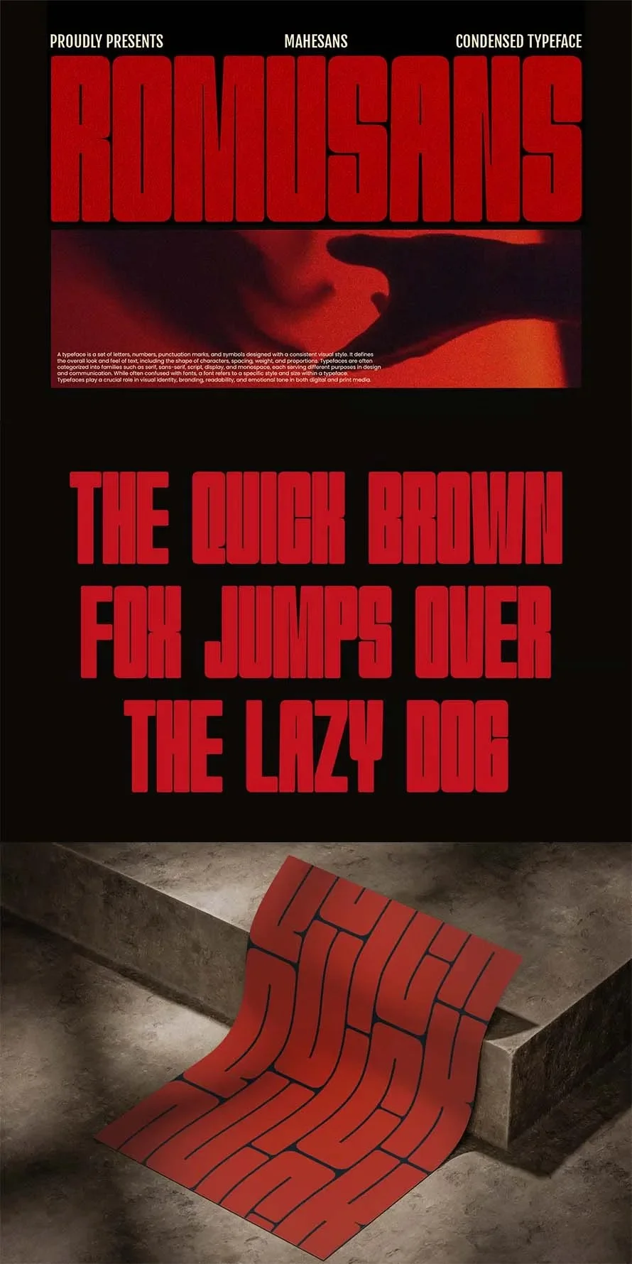
- Romusans: A versatile duo (regular and italic) that brings a sporty, collegiate feel to modern layouts.
3. Elegant & Refined Options
- Calixon: A rare, narrow serif that blends classic elegance with modern minimalism. Ideal for high-end fashion and publishing.
- Million: A branding-focused font featuring beautiful, connected ligatures that create a sophisticated, bespoke look.
- Sleek: A rounded-edge condensed font that feels soft and approachable, making it a perfect fit for tech interfaces and product labeling.
- Hansanu: A balanced, neutral typeface that offers excellent readability in small sizes without sacrificing its tall, condensed profile.
4. Corporate & Professional Solutions
- Hugeon: Designed for clarity. Its uniform stroke width makes it the ideal choice for corporate reports and professional presentations.
- Merca: A clean, no-nonsense sans-serif that excels in dense layouts where every pixel counts.
- NexCondense: A highly technical typeface that includes ink-trap features for perfect printing, even on low-quality paper stocks.
- Romanine Pro: A comprehensive family offering multiple weights and italics, providing the flexibility needed for complex multi-page branding projects.
(The list continues with specialized fonts such as Pushkey, Kranezi, Maxcond, Aisling, Gervind, Oblisk, Unlimited, Roloker, Sports, Humble, Overhead, Esporta, Taller, Skybold, Theadzan, and Midgod, each offering unique technical variations in stroke weight, aperture, and stylistic sets.)

Implications for Modern Design Strategy
The move toward condensed typography is more than just an aesthetic preference; it is a response to the digital environment. As audiences spend more time on mobile devices, the "short-attention-span economy" requires designers to communicate value within milliseconds.

By incorporating these premium condensed fonts, designers can:

- Reduce Visual Noise: Narrower text blocks allow for cleaner negative space around the copy, letting the content "breathe" despite its density.
- Increase Brand Recall: A unique, custom-feeling condensed font helps differentiate a brand from competitors who rely on standard, overused system fonts.
- Future-Proof Assets: As screen resolutions continue to increase and display formats (like wearables and smart-home interfaces) become more varied, these typefaces provide the scalability needed to ensure brand consistency across every touchpoint.
Conclusion: Elevating Your Creative Workflow
Whether you are a freelancer working on your first logo or a design lead managing a large-scale brand identity, the right font is the foundation of your success. The 35 fonts highlighted in this collection represent the current state-of-the-art in typography.

When you choose a premium condensed font, you are investing in more than just a character set; you are investing in better spacing, superior legibility, and the professional-grade support required to keep your projects on track. As you move forward with your next design project, consider how a shift in width—a slight narrowing of your letters—might just be the change that turns a good design into a great one.

Explore the collection today and start crafting headlines that don’t just speak—they stand out.