In the digital age, where attention spans are measured in seconds, the marriage of language and aesthetics has become more critical than ever. Typography—the art and technique of arranging type—is no longer merely a functional requirement for readability; it is a powerful psychological tool that dictates how a message is perceived, processed, and remembered. Whether it is a minimalist quote on a smartphone wallpaper or a bold, aggressive headline on a social media campaign, the choice of font, spacing, and layout acts as the "tone of voice" for the written word.

The Psychology of Type: More Than Just Words
Typography is the silent influencer of visual communication. Research in cognitive psychology suggests that our brains process visual information significantly faster than text. When a reader encounters a quote, the typeface provides the initial emotional cue before the actual words are even read.

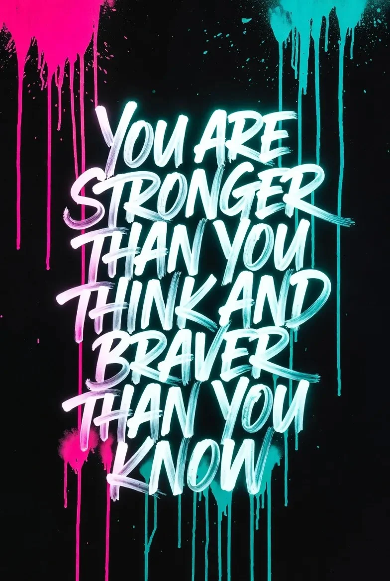
A bold, geometric sans-serif font often conveys authority, modernity, and confidence, making it ideal for corporate branding or high-impact motivational statements. Conversely, delicate, handwritten, or script-style fonts evoke warmth, intimacy, and a personal touch. This emotional resonance is precisely why designers spend countless hours obsessing over kerning (the spacing between letters) and leading (the space between lines). Balanced typography creates a rhythm that guides the eye, ensuring that the reader remains focused on the core message rather than struggling with a cluttered or confusing layout.

The Evolution of Motivational Design: A Chronology
The surge in popularity of "typography quotes" can be traced back to the rise of social media platforms like Pinterest and Instagram. What began as simple, amateur efforts to share inspiration quickly evolved into a sophisticated design sub-genre.

- The Early 2010s: The "minimalist movement" took hold, focusing on clean black-and-white layouts. The emphasis was on high contrast and maximum readability.
- The Mid-2010s: As design tools became more accessible, creators began experimenting with layering. We saw the rise of text overlaid on atmospheric photography and the use of "white space" to draw the eye to a single, impactful word.
- The Late 2010s to Present: The current era is defined by maximalism and experimental typography. Creators are now mixing serif and sans-serif fonts in the same layout to create dynamic tension and visual interest, while also utilizing "digital-first" aesthetics like neon glows and grid-based structures.
Supporting Data: Why Visual Quotes Dominate
The effectiveness of typography-driven content is not merely anecdotal; it is backed by digital engagement metrics. Data from creative platforms consistently shows that quotes featuring high-quality typographic layouts experience significantly higher shareability rates compared to plain text posts.

- Retention: Visualized information is remembered at a rate of 65% compared to 10% for text alone.
- Engagement: Posts featuring inspirational quotes in custom typography receive 3x more engagement on platforms like Pinterest, as they are frequently saved as "aspirational assets" for personal mood boards or digital wallpapers.
- Accessibility: As mobile usage accounts for over 60% of web traffic, designs that prioritize large, clean, and well-spaced typography are naturally favored by algorithms that prioritize user experience and low bounce rates.
Professional Perspectives on Design Strategy
Industry experts, including designers at the forefront of the GDJ (Graphic Design Junction) collective, argue that the most successful designs are those that adhere to the "less is more" philosophy.

"The goal is not to decorate the quote, but to elevate it," says Muhammad Faisal, founder of GDJ. "When we work with motivational quotes, we aren’t just selecting a font; we are selecting a personality for the message. If the quote is about ‘strength,’ we use heavy weights. If it’s about ‘growth,’ we might use a clean, modern serif to reflect sophistication."

Official design standards currently emphasize:

- Hierarchy: The most important word in a quote should be the largest, acting as an anchor for the viewer’s eye.
- Color Theory: Monochromatic palettes are making a comeback because they force the viewer to focus on the structure of the letters rather than being distracted by color noise.
- Negative Space: The "breathing room" around the text is as important as the text itself. It creates a sense of luxury and focus.
The Implications: Typography in Branding and Beyond
The influence of this design trend extends far beyond social media feeds. Small businesses, in particular, are leveraging professional typography to create a sense of scale and authority. A well-designed, typography-heavy poster or office wall mural can change the culture of a workspace, turning a sterile environment into a hub of inspiration.

Furthermore, the rise of "unlimited download" libraries for fonts and mockups has democratized design. Where once high-end typography was the domain of agencies with large budgets, today’s freelancers and students have access to over 1.5 million assets. This shift has led to a more creative, albeit more competitive, landscape where the ability to pair fonts effectively is a core professional skill.

Curating the Future: 50 Pillars of Inspiration
As we look at the current landscape of typographic design, it is clear that certain themes remain evergreen. Whether it is the classic "Progress is better than perfection" or the more modern "Love beyond the grid," these messages provide a sense of stability in a rapidly changing world.

The Essential Techniques for Modern Creators:
- The Power of Contrast: Mixing a bold, thick-stroke display font with a thin, refined body font creates immediate visual depth.
- Dynamic Alignment: Moving away from centered text to left-aligned or even asymmetrical layouts can make a quote feel more active and contemporary.
- Texturizing: Adding subtle noise or paper textures to digital files gives the work a "human" feel, counteracting the coldness of pixels.
Conclusion: The Everlasting Impact of the Written Word
Typography is the bridge between human emotion and digital delivery. As we continue to move toward an increasingly visual-centric future, the importance of these designs will only grow. A single, perfectly rendered quote has the power to shift a perspective, comfort a troubled mind, or spark a new idea. By mastering the balance of spacing, font weight, and layout, designers are doing more than just creating images—they are crafting the visual language of our time.

For those looking to enter this space, the advice is simple: study the masters, embrace the negative space, and never underestimate the power of a well-placed character. As the digital library of fonts continues to expand, the only limit to the impact of your message is your own creative vision. Remember, in the world of design, the medium is not just the message—the medium is the emotion.