

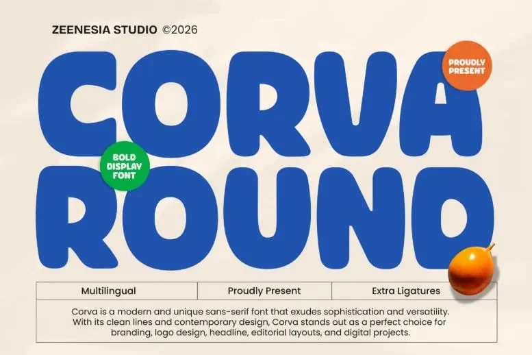
In the fast-paced digital landscape of 2026, the psychology of design has shifted toward comfort, accessibility, and human-centric experiences. As consumers face an overwhelming deluge of information, the visual "noise" of sharp, aggressive typography is increasingly being replaced by the welcoming, organic embrace of rounded fonts. Whether it is a high-growth startup’s logo, a mobile application interface, or a viral social media campaign, rounded typefaces have become the gold standard for brands aiming to bridge the gap between professionalism and approachability.

The Evolution of Soft Geometry: A Chronology
The trajectory of rounded typography is not merely a passing trend; it is a response to the way we interact with technology.

- Early 2020s: Rounded fonts began appearing in "friendly tech" branding—companies like Airbnb and Slack popularized soft, sans-serif aesthetics to humanize digital platforms.
- 2024: The "cozy design" movement gained traction, with designers moving away from cold, industrial minimalism toward warmer, more tactile visual identities.
- 2026 (The Present): Rounded typefaces have reached a state of maturity. They are no longer relegated to "cute" or "child-centric" projects. Instead, we see them in luxury branding, high-end tech, and editorial design, proving that rounded edges can convey authority just as effectively as traditional serifs.
The Psychological Edge: Why Softness Sells
The rise of the rounded font is rooted in cognitive science. Human brains are naturally drawn to curves; sharp angles are evolutionarily associated with danger or "piercing" objects, whereas rounded shapes are processed as safe, soft, and non-threatening.

In 2026, user interface (UI) designers prioritize "frictionless" experiences. On mobile screens, where pixels are precious and eye fatigue is a real concern, rounded fonts offer superior readability. By eliminating harsh, pointed terminals, these fonts reduce the visual tension on the reader, allowing them to engage with the content for longer periods without feeling mentally drained.

The Versatility of Rounded Typefaces
Modern design requires adaptability. A single brand identity must look as good on a massive 8K digital billboard as it does on a compact smartphone widget.

- Branding & Logos: Because of their geometric simplicity, rounded fonts are highly scalable. They retain their legibility even when reduced to tiny favicon sizes.
- Headlines: Designers are increasingly pairing heavy, bold rounded fonts with minimalist layouts. This contrast creates a "balanced" aesthetic where the typeface acts as a focal point without overwhelming the page.
- Digital Products: From YouTube banners to product packaging, these fonts offer a "clean" finish. They suggest a brand that is transparent, modern, and easy to interact with.
Expert Insight: How to Select the Right Font
When curating a typeface for a professional project, the distinction between "friendly" and "unprofessional" lies in the execution. Not all rounded fonts are created equal.

For high-stakes corporate work, designers should opt for fonts with high-contrast, geometric foundations, such as the Quasar Soft or Kindel Rounded series. These fonts maintain a crisp, authoritative structure despite their rounded edges. Conversely, for lifestyle brands, food packaging, or social media engagement, more organic, "bubbly" options like Wubly or Butter Humble provide the necessary personality to stand out in a crowded market.

33 Essential Rounded Fonts for the 2026 Design Toolkit
To help you navigate this trend, we have categorized the top 33 fonts that are currently defining the industry standard.

The Heavy-Hitters: Bold & Impactful
These fonts are designed for maximum visibility. They are best suited for headlines and display work where you need to command attention immediately.

- Milne Rounded: A masterclass in bold, sans-serif weight. Ideal for headers that need to feel solid and substantial.
- Blinko: Perfect for creators who want an energetic, "chunky" look that feels youthful and vibrant.
- Monostrike: Offers a unique, bold display aesthetic that works well for tech-forward, futuristic branding.
The Modern & Professional
These selections focus on balance and geometric perfection. They are the go-to choices for startups and professional agencies.

- Kindel Rounded: A contemporary staple. Its balanced proportions make it suitable for everything from UI design to marketing materials.
- Quasar Soft: Employs smooth geometry to convey a professional yet approachable tone.
- Davigo Pro: A refined evolution of the original, offering a fluid, sophisticated visual character.
The Playful & Creative
When your brand needs a dash of personality, these fonts offer unique ligatures, quirks, and organic shapes.

- Torkue: With over 200 unique ligatures, this is a designer’s dream for custom, eye-catching typography.
- Landeur Peufios: A vibrant choice for projects that need a "joyful" atmosphere.
- Kidpop: Specifically crafted for high-energy projects where imagination and fun are the primary objectives.
(Note: The full list including Roundlane, Branden, Godger, Rounding, Corva, Moder, Bener, Finder Uniround, Agnez, Lotzo, Grounding, Bunko, Portys, MaxBeda, Makio, Untech, Tendream, Porten, Kravent, Hinotha Tomori, Cottra, and Rounded Soft can be explored via professional design asset libraries.)

Implications for Future Design
As we look beyond 2026, the trend toward rounded typography shows no signs of waning. It is part of a larger shift in the design industry toward "Inclusive Design." By creating fonts that are inherently easier to read and less aggressive, designers are making the internet a more accessible place for everyone, including those with visual impairments or neurodivergence.

When you choose a rounded font, you are making a conscious decision to prioritize the user’s comfort. In an era where trust is the most valuable currency for any brand, the "softness" of your typography can subconsciously communicate your brand’s commitment to empathy and clarity.

Final Recommendations for Implementation
- Check Licensing: Always verify if your chosen font is for personal or commercial use. High-quality fonts often require a license for corporate deployment.
- Test for Contrast: Ensure your font weight is sufficient for your background. Because rounded fonts have soft edges, they can sometimes disappear into busy backgrounds; use high-contrast color palettes to compensate.
- Limit Your Mix: Do not pair two different rounded fonts together. Instead, pair a bold, rounded headline font with a clean, standard sans-serif body copy to maintain hierarchy.
In conclusion, the popularity of rounded fonts in 2026 is a reflection of our desire for a more humanized digital experience. By integrating these typefaces into your workflow, you aren’t just following a trend—you are adopting a design philosophy that values clarity, warmth, and modern efficiency. Browse the curated collections, experiment with weights, and let your text do the talking with a softer, more effective touch.




No comments yet. Be the first to join the conversation!