How does an institution dedicated to the preservation and study of the distant past effectively communicate its identity in an era dominated by sleek, minimalist digital branding? For most organizations, the playbook is clear: simplify the typography, embrace high-contrast color palettes, and strip away all visual clutter to ensure maximum scalability across mobile screens.
However, the Association of Applied Paleontological Sciences (AAPS) has taken a defiant path. Its newly unveiled logo is not a product of the "flat design" revolution that has homogenized corporate identities over the last decade. Instead, it is a complex, tactile, and narrative-driven piece of visual communication. By blending contemporary minimalist aesthetics with the rugged, weathered textures of an archival document, the AAPS has challenged the fundamental rules of modern graphic design—and in doing so, has created an identity that excels in storytelling where others might fail in versatility.
Main Facts: A Bold Rebrand for a Scientific Community
The AAPS serves as a unique nexus for professional fossil dealers, academic paleontologists, private collectors, and enthusiasts. It is an organization that balances the commercial realities of the fossil trade with the rigorous standards of scientific inquiry. Its previous branding was, by modern standards, dated and institutional, lacking the gravitas required for a modern professional body.
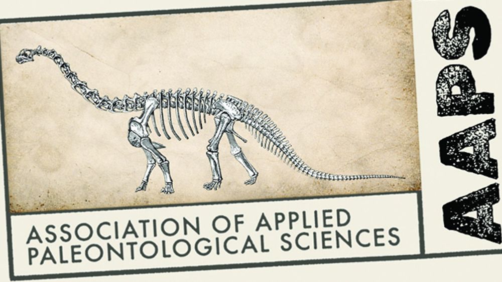
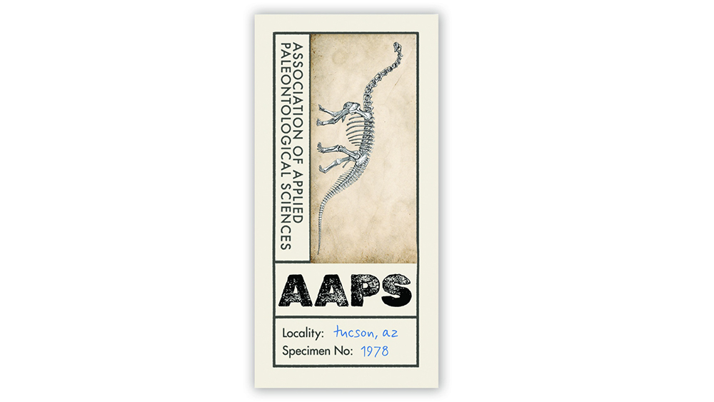
The new logo, crafted by creative director Grant Sanders of the New England-based SAND Agency, represents a dramatic departure. It avoids the cold, sterile feel of traditional institutional design, instead leaning into an aesthetic that feels more at home in a high-end fashion editorial or a curated boutique archive. It utilizes an aged, cream-colored background, a sophisticated stencil typeface, and a detailed, almost forensic illustration of a dinosaur.
While a purist designer might argue that the logo is "too busy" for modern digital consumption, the AAPS has prioritized emotional resonance and thematic immersion over rigid adherence to the rules of scalability.
The Chronology of the Rebrand
The transition from the old identity to the new did not happen in a vacuum. For years, the AAPS functioned under a logo that signaled its existence but lacked a cohesive brand story. The decision to overhaul the identity was driven by a need to unify a diverse membership base that spans from rigorous university researchers to high-end fossil collectors.
- The Briefing Phase: Grant Sanders and the team at SAND Agency were tasked with a difficult duality: the logo had to feel contemporary and "fresh," yet it had to explicitly communicate the ancient, dusty, and tactile nature of paleontological work.
- Concept Development: The designers moved away from standard corporate vectors. They experimented with textures—simulating the look of paper that has survived decades in a field archive. They chose to integrate "Specimen No." labeling, a nod to the curatorial process inherent in the association’s mission.
- The Final Reveal: The rollout of the brand occurred in mid-2024, signaling a shift in how the organization wants to be perceived—not just as a trade association, but as a cultural custodian of Earth’s history.
- Integration: The organization acknowledged that while the primary logo is complex, they developed a separate, simplified avatar for social media platforms and favicon usage, ensuring that they didn’t entirely ignore the functional requirements of the 21st-century web.
Supporting Data: Breaking the Rules of Graphic Design
In the world of professional logo design, there are "unbreakable" laws: ensure legibility at small sizes, avoid excessive font variation, and maintain simplicity for easy reproduction. The AAPS logo ignores almost all of these.
The Conflict of Complexity
The design features multiple typefaces—a stark, industrial stencil for the acronym "AAPS" and a hand-applied, fluid script for supporting text. These elements operate on different hierarchies and are positioned at varying angles. On a standard business card or a mobile app icon, this level of detail risks becoming a illegible blur.
The Texture Factor
The background isn’t a solid flat color; it is a warm, distressed parchment texture. While this evokes the romanticism of discovery, it is a nightmare for traditional print reproduction (such as embroidery on apparel or high-speed silkscreening). Yet, the agency chose to lean into this. By prioritizing the "found in an archive" aesthetic, the AAPS is signaling that its brand is not a commodity, but an experience.
The Symbolic Weight
The use of the "Specimen No." (which denotes the year of the association’s founding in Tucson) transforms the logo from a mere brand mark into a historical record. It invites the viewer to look closer, to engage with the text, and to treat the logo as a piece of data rather than just a corporate symbol.
Official Responses and Creative Direction
Grant Sanders of SAND Agency has remained relatively quiet regarding the criticism, allowing the design to speak for itself. However, industry observers have noted that the project is a masterclass in "brand-as-content."
In an interview-adjacent context, the agency highlighted that the goal was to avoid the "corporate blue" malaise that plagues modern institutional branding. By choosing an earthy, natural palette, the AAPS separates itself from the high-tech firms and tech-adjacent non-profits that currently dominate the landscape.
The feedback from the scientific community has been largely positive. For a group of people who spend their lives looking for detail, texture, and historical context in the dirt, a logo that feels "clean" and "manufactured" would have felt dishonest. The new logo feels like it was excavated, not designed.
Implications: The Future of Institutional Identity
The AAPS rebrand serves as a case study for why institutions—even those rooted in science—should be wary of "design-by-template."
The Return of Personality
We are seeing a trend where organizations are tired of the "blanding" of their identities. When every company uses the same geometric sans-serif font and a single primary color, they become invisible. The AAPS logo proves that if you have a strong, specific story to tell, your logo can—and perhaps should—be complex.
The Shift to "Contextual Branding"
The AAPS case illustrates the rise of the multi-asset identity. You no longer need one logo that does everything. You can have a "hero" logo that is beautiful, intricate, and archival for use on websites, letterheads, and gallery walls, and a "utility" logo for social media avatars. This two-tier approach allows designers to break the rules without sacrificing the functionality required by modern technology.
A New Standard for Niche Organizations
For trade associations, scientific societies, and non-profits, the lesson is clear: your identity is not a digital asset; it is a cultural asset. If your organization deals with history, heritage, or physical labor, your branding should reflect the grit and reality of that work. A sterile, minimalist logo for a fossil association would have been a missed opportunity; instead, they chose to embrace the "grungy" and the "aged," and in doing so, they have become more memorable than their competitors.
Conclusion: Sometimes, Rules Are Meant to be Broken
The Association of Applied Paleontological Sciences has proven that a logo is not merely a geometric arrangement of lines and colors. It is a vessel for an organization’s ethos. By rejecting the pressure to simplify, the AAPS has managed to capture the very essence of its field: the patient, messy, and fascinating process of uncovering the past.
In a digital landscape obsessed with efficiency, the AAPS has chosen to be inefficient. They have chosen to be detailed, tactile, and intentionally complex. They have chosen to tell a story. And perhaps, for an organization that spends its time looking back millions of years, that is the most modern approach of all. The design is a reminder to the creative community that while trends come and go, the most effective branding is that which feels authentic to the soul of the organization it represents. Sometimes, the most professional thing you can do is throw out the rulebook and let the design breathe.