
In the high-stakes world of corporate identity, a logo is more than a simple graphic; it is a visual shorthand for a company’s ethos, history, and future ambitions. For CD Projekt Red (CDPR), the powerhouse Polish developer behind global juggernauts like The Witcher and Cyberpunk 2077, the recent update to their iconic "Raróg" emblem was intended to be a routine modernization. Instead, the design refresh has ignited a bizarre, politically charged firestorm across social media, illustrating the increasingly polarized landscape of modern digital discourse.
The Evolution of the Raróg: A Design Analysis
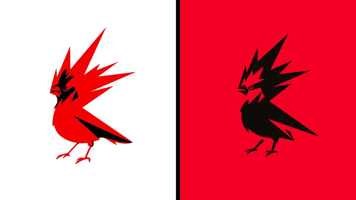
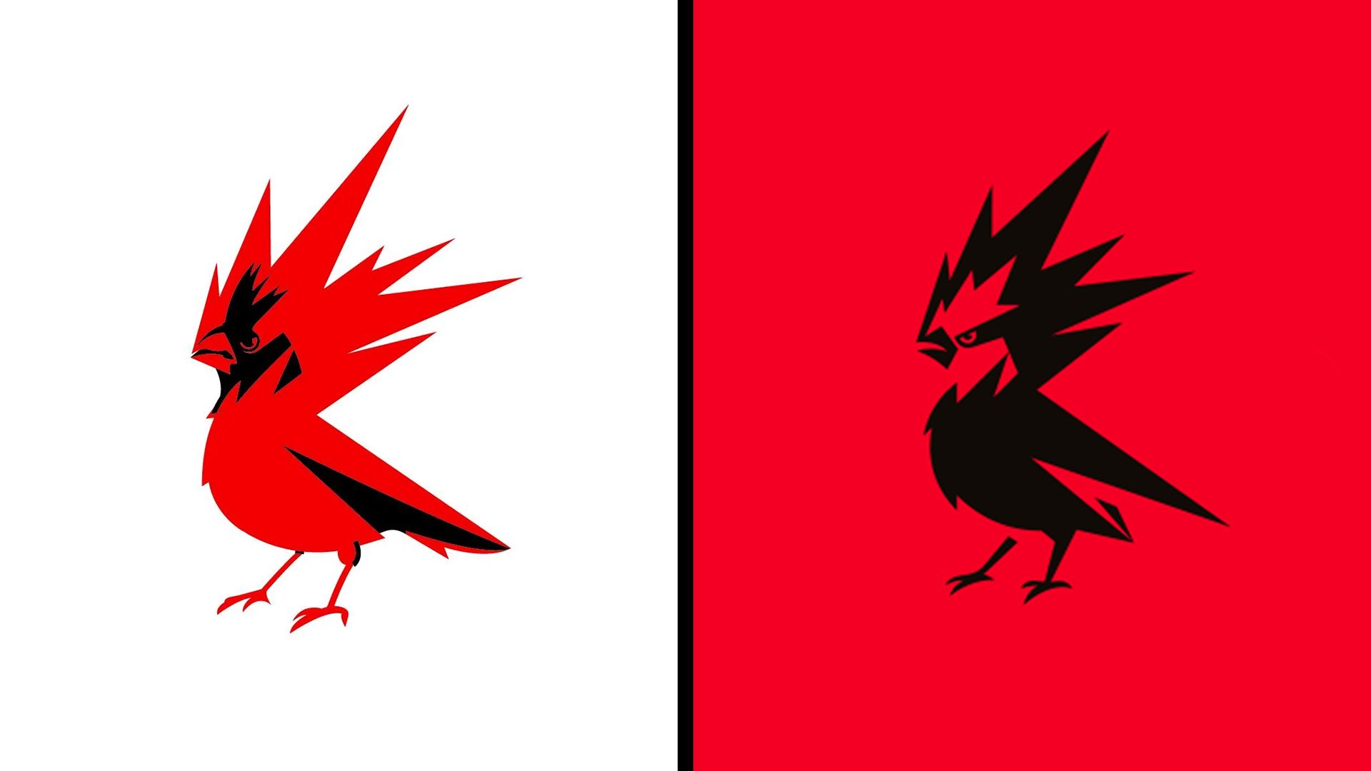
The "Raróg" is a creature deeply rooted in Slavic mythology—a fiery, shape-shifting spirit said to bring luck and fortune. Since 2014, CDPR’s logo had utilized a design clearly inspired by the Northern Cardinal, a bird known for its striking plumage but arguably lacking the mythological ferocity of the legendary firebird.
The 2026 redesign marks a departure from the biological realism of the cardinal toward a more stylized, aggressive, and abstract representation. The lines are sharper, the beak is rendered in a more predatory, open posture, and the talons have been elongated to convey a sense of movement and power.
From a design perspective, the changes are objectively functional. The new iteration is cleaner, more scalable for high-resolution displays, and carries a "weight" that aligns with the studio’s shift toward more mature, AAA-tier project scales. The increased prominence of red—a color that has defined the studio since its inception in the brick-laden offices of Łódź—is a deliberate move to solidify brand recognition. Yet, what the studio described as a move to be "more mature, confident, and energetic" has been interpreted by some corners of the internet as a declaration of political intent.
Chronology of a Controversy: From Design to Discourse
The controversy began almost immediately following the official unveiling of the assets on August 26, 2026. The announcement was meant to build anticipation for the studio’s upcoming slate of releases, including the expansion Songs of the Past (2027) and the highly anticipated The Witcher 4 (2028).
However, the discourse quickly shifted away from the aesthetics of the bird. Within hours of the announcement, the "X" (formerly Twitter) landscape was flooded with accusations that the redesign was "DEIfied" (a reference to Diversity, Equity, and Inclusion initiatives) or a sign of a "woke mind virus." The core of the complaint, bizarrely, focused on the shift in color palette and the perceived "aggression" of the bird’s stance.
By August 27, the situation had escalated from minor grumbling to full-scale meme-ification, with users debating whether the new design signaled a shift in the company’s internal values. The irony of this backlash is palpable: the studio had, only days prior, garnered widespread acclaim at Gamescom for announcing that The Witcher 3 Remastered would be provided as a free upgrade to existing owners—a move that typically earns a developer a reputation for being consumer-friendly, not "woke."
The "Red and Black" Fallacy: A Misreading of Symbolism
The most vocal critics have fixated on the color scheme, specifically the use of black and red, claiming it is a tacit endorsement of political movements such as Antifa. This interpretation ignores both the history of the studio and the broader context of color theory in graphic design.
As Co-CEO Adam Badowski clarified during the 2014 branding update, the red is not a political statement; it is a reference to the firebird and the "inner fire" of creativity. "RED stands for energy," Badowski noted at the time. "It represents something very close to everyone here in the studio—the creativity and passion we harness from within ourselves to make the best RPGs in the world."
The association of black and red as inherently "communist" or "anarchist" is a historical reductionism that fails to account for the ubiquity of these colors in global branding. From Netflix to Coca-Cola Zero, the combination is a staple of high-contrast, high-energy visual communication. To suggest that a Polish company—operating in a market economy and listed on the Warsaw Stock Exchange—is undergoing a radical political transformation based on a logo’s color palette is a testament to the hyper-sensitivity of modern internet culture, where every aesthetic choice is subjected to a "culture war" litmus test.
Official Responses and Corporate Strategy
CD Projekt Red has remained largely stoic in the face of this criticism, focusing their communication on the utility of the rebrand rather than engaging with the fringe political commentary. The company’s focus remains squarely on the pipeline of upcoming titles.
By maintaining a "business as usual" stance, CDPR is utilizing a classic PR strategy: refusing to validate the accusations by treating them as a legitimate debate. For a studio that has faced immense pressure in the past regarding product launches and technical performance, the current focus is on project stability and brand evolution. The "Raróg" update is part of a broader, multi-year strategy to professionalize the studio’s visual identity as it prepares for the next generation of gaming.
Implications: The Death of Nuance in Branding
The backlash against CDPR’s logo is a microcosm of a larger trend in corporate communications. Companies today are navigating an environment where the audience is not just consuming the product, but actively interrogating the "political alignment" of every brand asset.
This creates a "damned if you do, damned if you don’t" scenario for creative directors. If a company does nothing, they are seen as stagnant; if they evolve, they are accused of bowing to external social pressures. In the case of CDPR, a simple, arguably improved design has been hijacked by a narrative that has nothing to do with gaming and everything to do with the projected anxieties of the user base.
The implications for the industry are clear: brand identity is no longer just about color palettes and typography. It is now a battleground where companies must anticipate not only the aesthetic reaction to their work but the sociological projections that will be cast upon it.
Looking Ahead: The Witcher 4 and Beyond
As the dust settles, the reality of the situation is that the "new" CD Projekt Red logo will continue to appear on marketing materials, convention booths, and game splash screens. The controversy will, in all likelihood, be forgotten long before The Witcher 4 hits shelves in 2028.
The studio’s decision to prioritize brand consistency over reactionary design demonstrates a level of confidence that is necessary for a company of its stature. By leaning into their heritage—the firebird, the color red, and the concept of the "rebel"—CDPR is anchoring itself in its past while preparing for a future that requires a more refined, modern visual language.
For the gaming community, the lesson should be equally simple: judge a developer by the quality of the worlds they build, the fairness of their business models, and the passion behind their storytelling. The Raróg, whether it looks more aggressive or refined, remains the symbol of a studio that has defined the modern RPG genre. The fire that drives them—the "inner fire" of creativity—is clearly still burning, regardless of what color the bird is painted.
Ultimately, this episode serves as a reminder that in the age of the internet, even a small, fire-breathing spirit from Slavic folklore isn’t safe from being dragged into the digital abyss of culture wars. But for those interested in the actual craft of game development, the logo is just the beginning of a much larger, much more important story.