 Basiran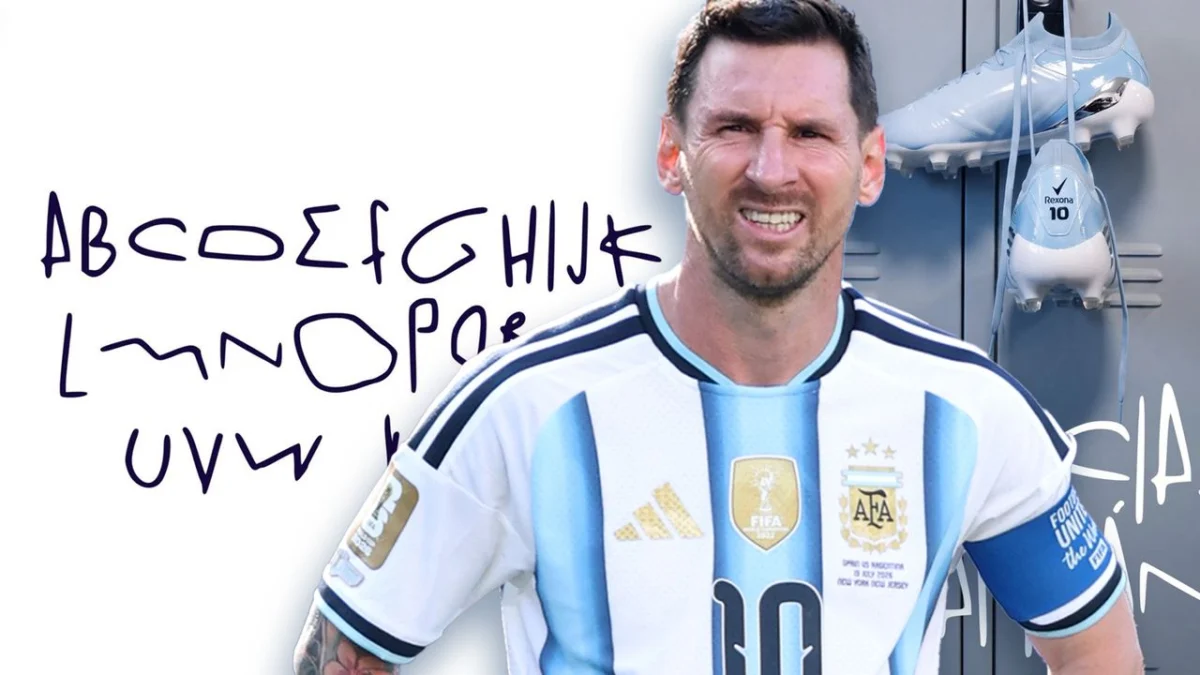
The intersection of sports, branding, and graphic design has produced some of the most innovative marketing campaigns in recent years, but rarely has it achieved the level of cultural resonance seen in Argentina’s latest typographic tribute. Following the national obsession that birthed "Malvinas Sans"—a typeface derived from the celebratory banners of the 2022 World Cup—the design world has turned its attention to a new, more personal project: the "GOAT Font."
Created by the deodorant brand Rexona in the wake of Lionel Messi’s retirement from the Argentine national team, this typeface is not merely a collection of glyphs. It is a bold, abstract interpretation of the greatest football career in history. By distilling Messi’s signature movements on the pitch into digital letterforms, Rexona has sparked a viral scavenger hunt, with fans scouring match footage to decode the origins of every character.
The Genesis of the GOAT Font
When Lionel Messi officially announced his departure from the Albiceleste squad, the vacuum left by his absence was immediate. Brands scrambled to pay tribute to the man who brought the World Cup back to Argentina. Rexona, however, opted for a path less traveled. Rather than releasing a standard commemorative advertisement, they chose to synthesize the "language" of Messi’s playstyle into a functional OTF (OpenType) font.
The project is an exercise in kinetic branding. Each character in the alphabet corresponds to a specific, iconic moment of movement—a sudden turn, a sharp dribble, or a high-velocity sprint—captured during Messi’s illustrious tenure. The resulting aesthetic is frantic, fluid, and unmistakably Messi-esque. It is a visual representation of his "messy" but precise brilliance on the pitch.
A Chronology of Iconic Moves
The public reception of the GOAT Font has been nothing short of forensic. Because Rexona opted to remain tight-lipped regarding the specific mapping of the typeface, a digital community of amateur detectives has emerged on social media, dedicated to reverse-engineering the font’s DNA.
The Breakdown of the Glyphs
The investigative work being done by fans provides a fascinating timeline of Messi’s career highlights:
- The "S" (The Australian Engagement): Fans have largely reached a consensus that the letter ‘S’ is a graphical representation of Messi’s first major dribbling maneuver against Australia during the 2022 Qatar World Cup. The tight, serpentine curves of the letter mirror the way he shed his markers in the midfield.
- The "G" and "T" (The Croatian Masterclass): During the semi-final clash against Croatia, Messi’s movement was particularly pronounced. Observers have pointed to specific moments—where he famously left defenders stumbling—as the direct inspiration for the ‘G’ and ‘T’ characters.
- The Wider Alphabet: Beyond these specific letters, the font incorporates the aggressive angles of his free-kicks and the sudden, staccato movements of his signature "La Pausa."
This crowdsourced validation has transformed the marketing campaign from a static advertisement into a living, interactive archive of football history.
Design Philosophy: From Movement to Typography
The project bears a striking resemblance to other recent high-profile branding experiments, such as the "Legal Amazon" branding initiative, which successfully mapped the topography of the Amazon rainforest into distinct letterforms. Both projects share a core philosophy: that design is at its most powerful when it is rooted in tangible, real-world data.
In the case of the GOAT Font, the "data" is the kinetic energy of a human athlete. By transforming movement vectors into typography, Rexona has created a bridge between the physical exertion of the sport and the static nature of digital design. The font is not just a legible set of letters; it is a rhythmic transcription of a career that defied physics.
The "Black Box" Marketing Strategy
Rexona’s decision to withhold the official design breakdown has proven to be a masterstroke of engagement. By treating the font as a "black box," the brand forced the audience to participate in the storytelling.
In traditional advertising, the brand dictates the narrative. In this instance, the audience is the one doing the work, effectively becoming co-creators of the brand’s message. This creates a high level of "stickiness," where users spend hours interacting with the assets, downloading the font, and debating its origins on platforms like X (formerly Twitter) and Reddit.
The Implications of Kinetic Branding
The emergence of the GOAT Font signals a shift in how major global brands approach digital assets. We are moving away from the era of standardized, corporate fonts and into an era of "expressive utility."
1. Personalization at Scale
The GOAT Font is a prime example of hyper-personalized branding. By tethering a typeface to a cultural icon, the brand creates an emotional moat. Fans are not just downloading a file to use in Photoshop; they are downloading a piece of sporting heritage.
2. The Gamification of Design
Rexona has effectively gamified the act of font usage. By turning the typeface into a puzzle, they have ensured that the brand remains in the public consciousness long after the initial announcement. This represents a significant evolution in how brands can use digital design tools to maintain relevance in a hyper-competitive media landscape.
3. The Ethical and Artistic Gray Area
However, the project also raises questions about intellectual property and the representation of athletes. While Messi did not commission the font, the project serves as an homage. As this trend continues, we may see more "tribute" design projects, which raises the question: at what point does a brand’s use of an athlete’s likeness (even in abstract, typographic form) require formal licensing or collaboration?
Technical Accessibility
Despite the complexity of its origin, the GOAT Font remains remarkably accessible. Rexona has made the OTF file available for public download via their official portal. This accessibility is crucial; it democratizes the tribute, allowing fans to use the "Messi typeface" in their own personal projects, from posters and banners to social media graphics.
This move invites a level of "fan-generated" content that further propagates the brand’s reach. Every time a user types a message in the GOAT Font, they are essentially participating in a brand-sponsored act of devotion to the player.
Conclusion: A New Standard for Sports Branding
The GOAT Font is more than a creative marketing gimmick; it is a study in how modern brands can synthesize cultural phenomena into design assets. By anchoring a digital product in the real-world movements of a legend, Rexona has successfully bridged the gap between a deodorant brand and the emotional core of Argentine football culture.
As the dust settles on the post-Messi era of the national team, the GOAT Font stands as a testament to his influence—not just on the pitch, but in the visual language of the fans who watched him. It is a messy, beautiful, and highly effective piece of design that asks us to look closer at the movements that define greatness.
For designers and marketers alike, the lesson is clear: the most compelling stories are the ones that invite the audience to play along. Whether or not the ‘S’ truly comes from the Australia match or the ‘G’ from Croatia, the fact that we are still talking about it, analyzing it, and downloading it suggests that Rexona has hit upon a design language that resonates far beyond the stadium.
Can you recognize the origin of the letters? The answer might be hidden in the archive footage of a thousand matches, waiting for the next fan to find the connection.

 Nana Muazin
 Nana
Nana