 Pevita Pearce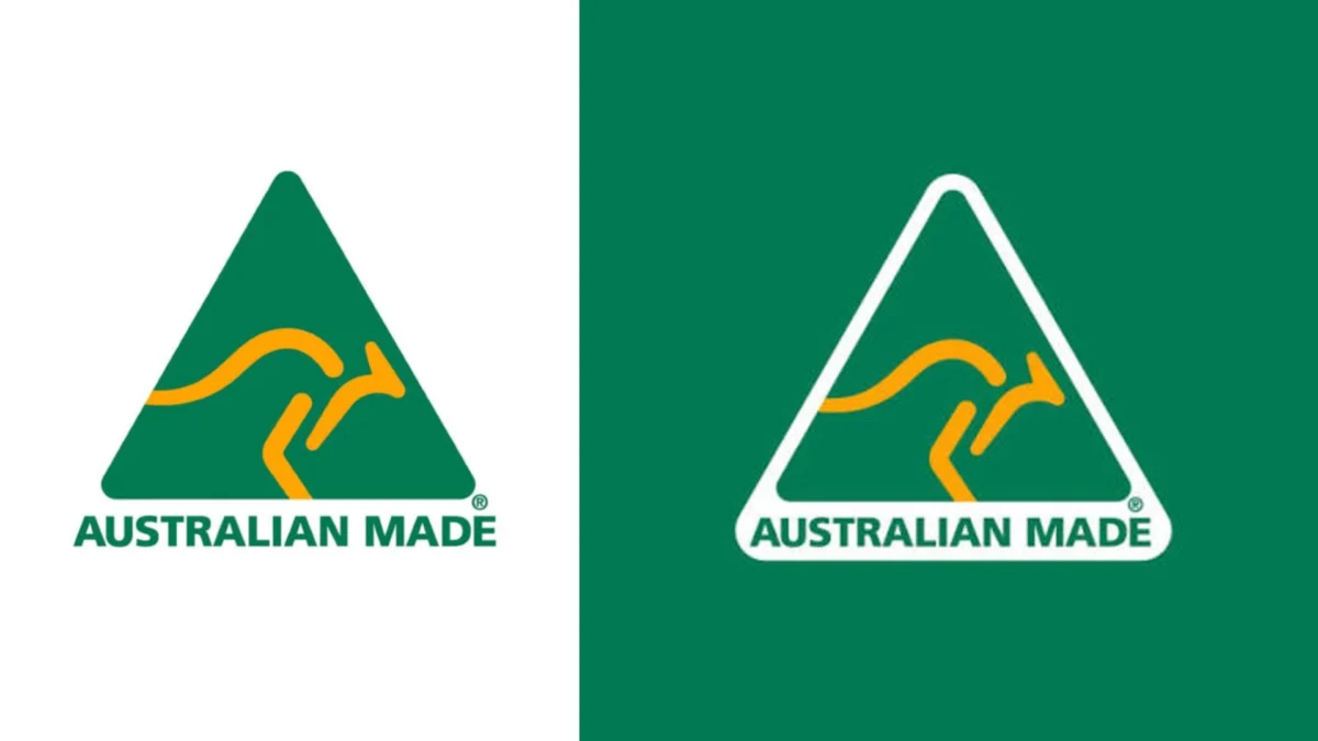
In the volatile world of corporate identity, where the average lifespan of a brand logo is often measured in months or a handful of years, there exists a singular, enduring anomaly. For 40 years, the "Australian Made" logo—a simple, striking green triangle enclosing a stylized gold kangaroo—has remained virtually untouched. While global conglomerates routinely spend millions of dollars on "refreshing" their visual identities to keep pace with shifting trends, this Australian icon has bucked the trend of rebrand fatigue, cementing its place as one of the most successful and resilient pieces of graphic design in history.
The Genesis of an Icon: A Miracle of Speed
To understand the longevity of the Australian Made logo, one must look back to 1986. The project was born not from a lengthy, focus-grouped marketing strategy, but from a pressing political imperative. Then-Prime Minister Bob Hawke sought a visual shorthand to champion local manufacturing and bolster the national economy.
The commission landed on the desk of renowned Australian designer Ken Cato. The brief was effectively non-existent, and the deadline was stifling: less than a week. In the modern era, where design processes are often bogged down by committees, endless iterations, and bureaucratic red tape, the creation of the Australian Made logo stands as a masterclass in creative intuition.
Cato’s approach was deceptively simple. Reflecting on the experience years later, he noted, "It taught me a powerful lesson as a designer—never ignore the obvious, just make the obvious visible." By distilling the concept of "Australia" into its most recognizable components—the gold kangaroo and the geometric frame—Cato achieved a level of clarity that few designers ever reach. The logo does not require a manifesto or a two-page brand book to explain its intent; it communicates its message in a heartbeat.
Chronology of a National Staple
- 1986: The logo is officially launched by the Hawke government to promote locally manufactured goods. It immediately gains traction as a symbol of quality and national pride.
- 1990s: The logo becomes a staple on grocery packaging, automotive parts, and industrial equipment, solidifying its presence in the Australian psyche.
- 2000s: As the global market grows more competitive, the logo evolves from a government campaign tool into a private, not-for-profit entity (Australian Made Campaign Ltd), ensuring its independence and long-term sustainability.
- 2020: The government unveils a new "Nation Brand" (a golden wattle design). The public reaction is swift and critical, with many fearing it would replace the Australian Made logo. The backlash highlights just how deeply the public values the original design.
- 2024: The logo reaches its 40th anniversary, maintaining its original aesthetic while expanding its digital presence to verify authenticity in the e-commerce age.
The Anatomy of Success: Why It Works
Why has this logo survived four decades of design evolution, from the minimalist trends of the 80s to the digital-first aesthetics of the 2020s? The answer lies in its restraint.
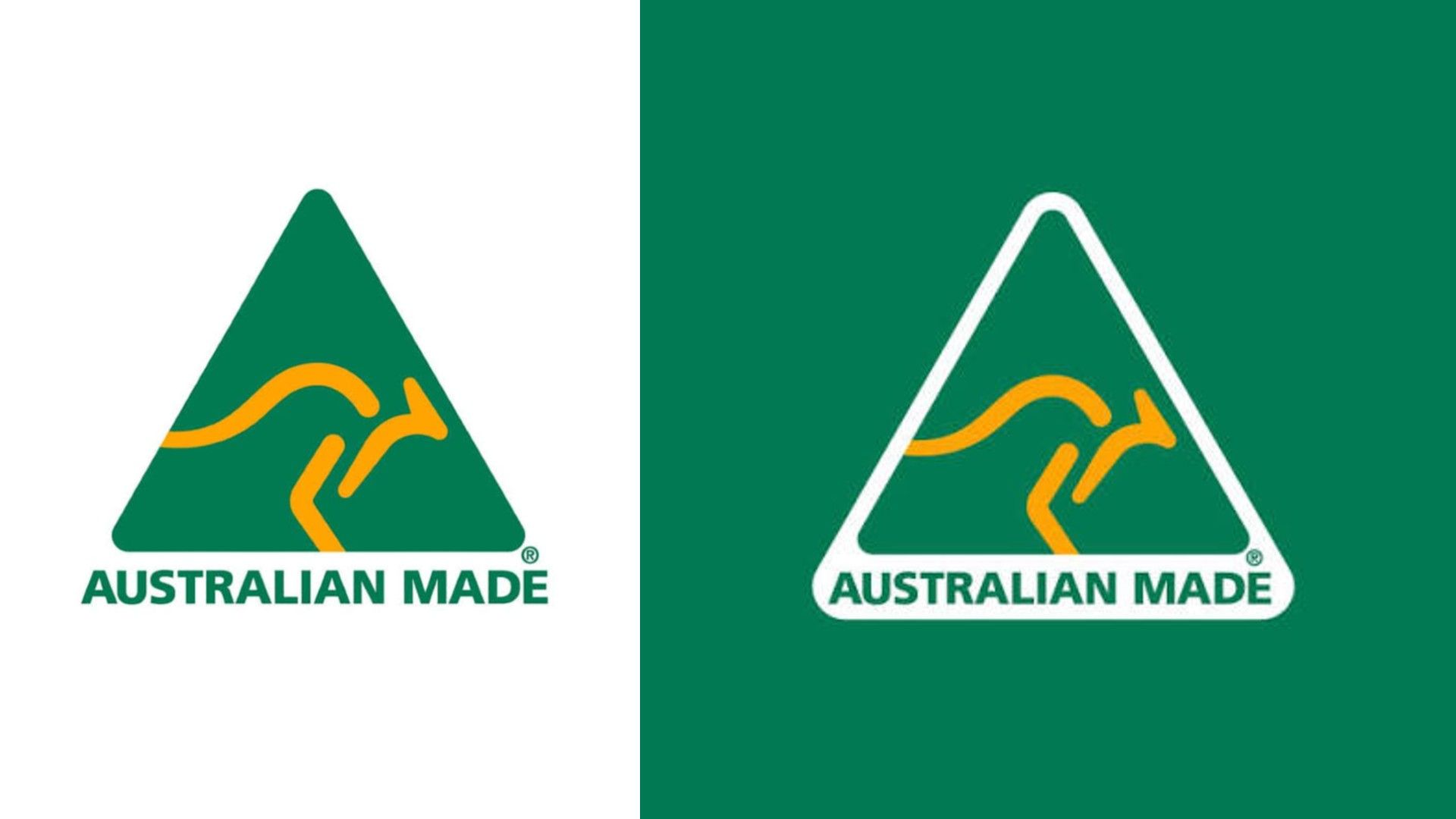
Most logos fall victim to "design creep," where elements are added, adjusted, or modernized until the original integrity is lost. The Australian Made logo, however, was never trying to be "cool" or "clever." It was designed to be functional and communicative. It adheres to the fundamental principles of semiotics: it uses symbols that the target audience already associates with the subject.
The green and gold color palette is quintessentially Australian, tapping into the national sporting colors and the natural landscape. The triangle provides a sense of stability and structure, while the kangaroo in motion conveys vitality and progress. Because it avoided the "trendy" design tropes of the late 80s, it never became "dated." It remains as visually legible on a smartphone screen today as it was on a printed label in a 1986 retail store.
Supporting Data: The Power of Trust
The strength of the Australian Made logo is not merely anecdotal; it is backed by empirical data. In recent consumer surveys, the logo achieved a staggering 99% recognition rate among the Australian population.
More importantly, it boasts a consumer net trust score of +82. In the world of branding, where trust is the most valuable currency, this score places the Australian Made logo in the upper echelon of all national brands. Consumers are not just recognizing the logo; they are actively using it as a heuristic for quality. When a shopper sees that green triangle, they immediately equate it with higher safety standards, support for local jobs, and, often, superior product quality.
This trust has allowed the logo to transcend its original purpose. It is no longer just a government marketing tool; it is a seal of approval that influences purchasing decisions at the point of sale.

The "Nation Brand" Controversy: A Lesson in Emotional Ownership
The 2020 controversy surrounding the government’s proposed "Nation Brand" serves as the perfect case study for the value of brand equity. When the government introduced a new logo—a stylized golden wattle—many Australians expressed vocal opposition, with some even comparing the design to a coronavirus particle.
The visceral reaction of the public was not necessarily a reflection of the quality of the new design, but rather a protective response toward the Australian Made logo. People felt that their "stamp of approval" was under threat. The government eventually clarified that the new brand was intended for international marketing, not to replace the domestic Australian Made logo, but the event proved that the original kangaroo logo had moved beyond being a mere trademark—it had become a piece of national heritage.
Implications for Modern Designers
For the contemporary designer, the 40-year reign of the Australian Made logo offers a sobering and inspiring lesson. We live in an era of hyper-disruption, where brands are encouraged to pivot, rebrand, and iterate constantly. However, the success of this logo suggests that true longevity is found in "the obvious."
- Avoid the Metaphor Trap: Resist the urge to create overly complex metaphors that require an explanation. If the user has to ask "what does that mean?", the design has already failed.
- Design for Purpose, Not Trends: Trends are ephemeral. By focusing on the core identity of the brand rather than the current design aesthetic, you create work that remains relevant across decades.
- The Power of Restraint: Sometimes, the most powerful design choice is knowing what to leave out. The Australian Made logo proves that stripping a design back to its most basic, recognizable elements is the surest way to ensure its survival.
- Trust the Audience: The public is smarter than most branding agencies give them credit for. They value authenticity and consistency. If you build a symbol that represents something meaningful, they will protect it.
Conclusion: An Unstoppable Legacy
As we look toward the future, it is unlikely that the Australian Made logo will disappear. It has become part of the visual language of the country, embedded in the shopping habits of millions. Ken Cato’s creation is a testament to the idea that some concepts are so perfectly formed that they don’t need to be "fixed."
In a world that is obsessed with the new, the Australian Made logo stands as a monument to the power of the timeless. It remains a rare example of design that hasn’t just survived the passage of time—it has thrived within it, proving that when you get the fundamentals right, the result can last a lifetime.


 Muslim
 Basiran