 Laily UPN
In the high-stakes world of automotive luxury, a brand’s visual identity is more than just a logo—it is a promise of performance, a symbol of heritage, and a statement of future intent. Recently, McLaren, the storied British manufacturer synonymous with Formula 1 dominance and high-performance supercars, unveiled a comprehensive overhaul of its brand identity.
This transformation arrives at a pivotal moment in the automotive industry, where electrification, digital-first consumer engagement, and the need to differentiate in a crowded luxury market are driving manufacturers to reconsider their visual DNA. By stripping back the complex, chunky aesthetics of its past and embracing a cleaner, more minimalist typeface, McLaren has signaled a sophisticated pivot. The new identity is not merely an aesthetic choice; it is a strategic repositioning designed to bridge the gap between its humble 1920s roots in a New Zealand service station and the hyper-technological landscape of the 2030s.
The Core Transformation: A New Visual Language
The centerpiece of this rebrand is an entirely reimagined wordmark. Gone is the heavy, aggressive typography that defined the brand’s previous era. In its place sits a sleek, refined sans-serif wordmark that prioritizes legibility and elegance.
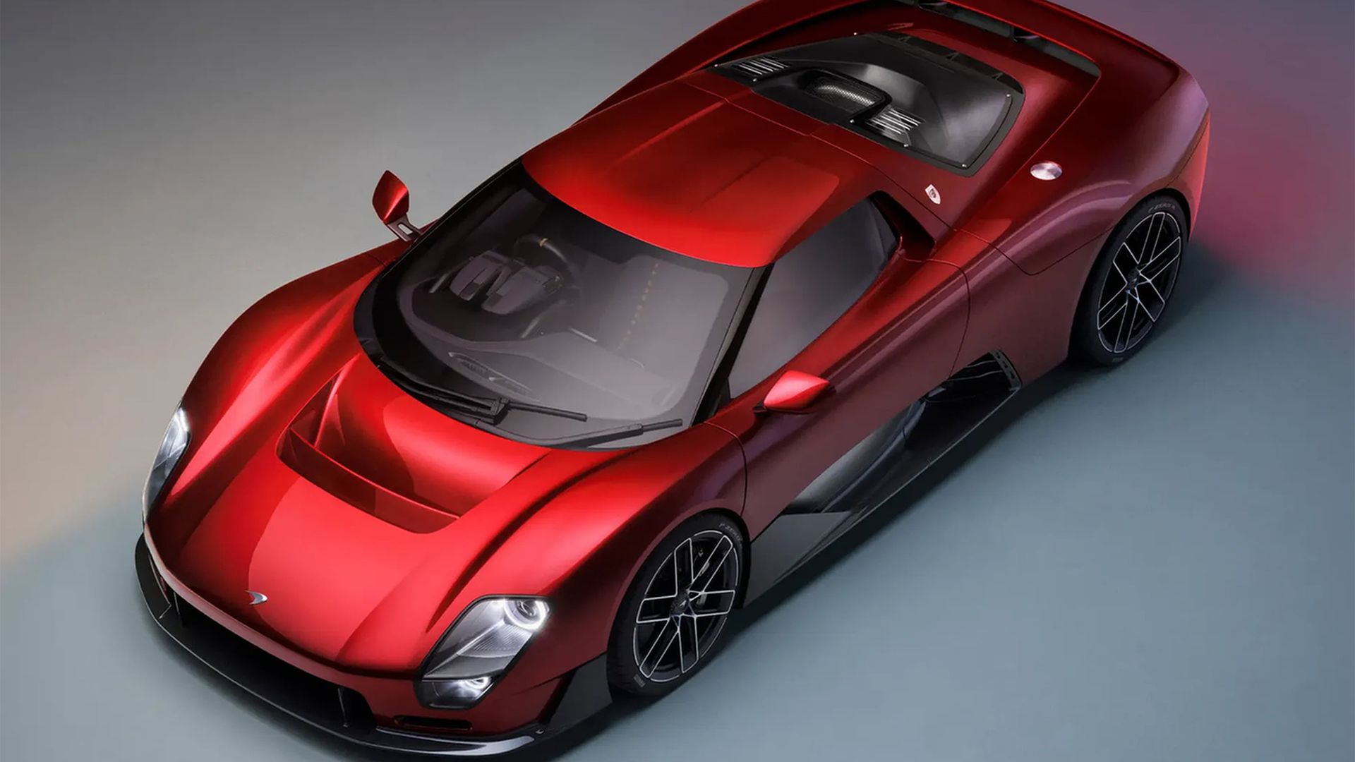
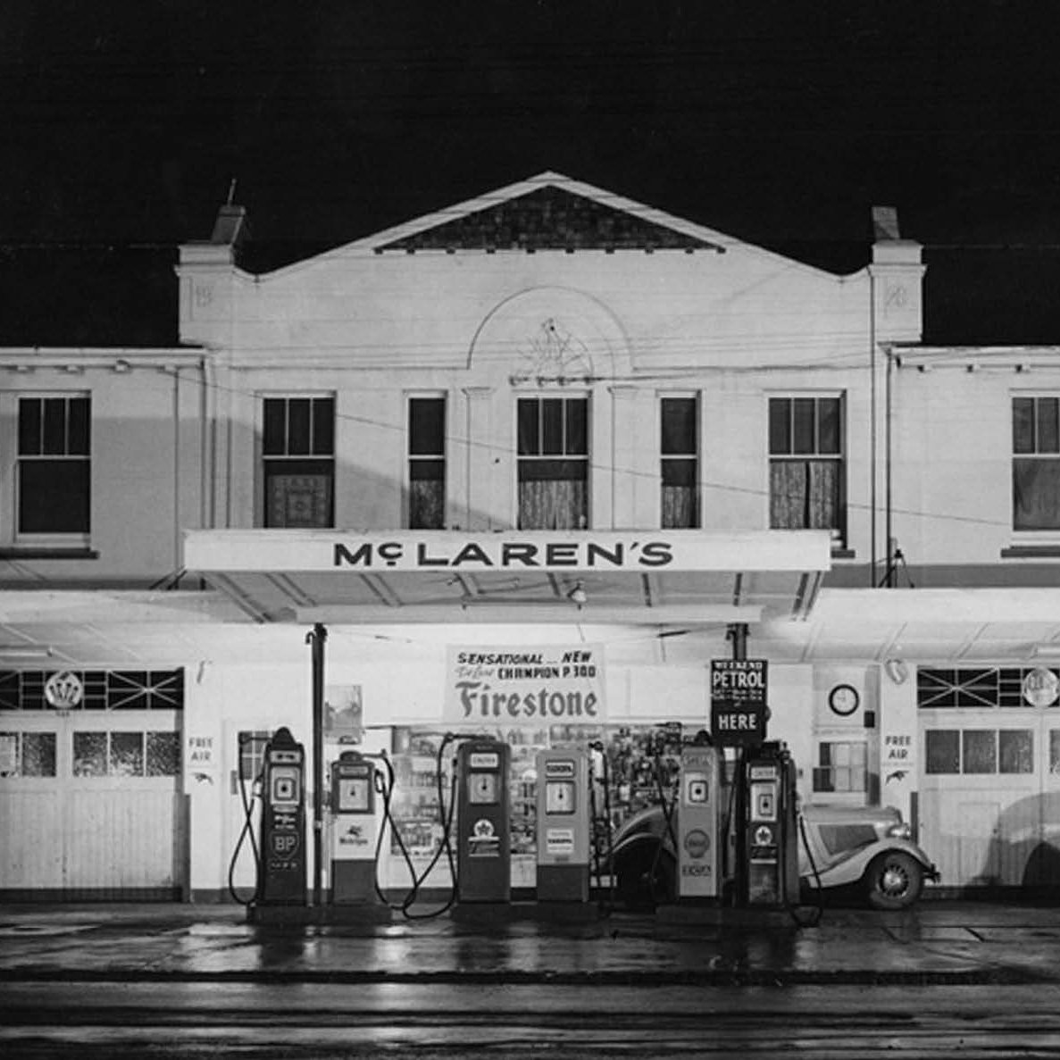
Perhaps the most compelling detail of the new design is the subtle underscore beneath the lowercase "c." This design flourish is intentionally evocative, drawing inspiration from high-end fashion houses and minimalist luxury brands. It provides a sense of "grounding" for the logo, suggesting stability and premium craftsmanship. While the design is undeniably modern, it is deeply rooted in the company’s history. Designers at McLaren looked back to the original sign of the McLaren family service station in Remuera, Auckland—the site where the brand’s namesake, Bruce McLaren, first honed his mechanical intuition. By marrying the simplicity of that 1920s signage with modern, high-precision typography, the brand has created a visual bridge between its small-town origins and its current status as a global titan of engineering.
A Chronology of Change: From Service Station to Supercar
To understand the weight of this change, one must appreciate the trajectory of the McLaren brand.
- The 1920s (The Foundation): The aesthetic DNA of the new logo finds its ancestor in the humble sign of the family service station in Auckland. This was a period defined by utility, honesty, and mechanical necessity.
- The Mid-20th Century (The Racing Era): As Bruce McLaren moved into the competitive sphere, the brand’s identity became tied to the iconic "speedmark"—a symbol that would eventually become one of the most recognizable emblems in motorsport.
- The 2000s–2010s (The Supercar Expansion): McLaren Automotive pivoted from a racing-only entity to a commercial powerhouse. The branding during this time was bold, aggressive, and highly technical, mirroring the complex aerodynamic profiles of cars like the MP4-12C.
- The Present Day (The Refined Identity): With the latest rebrand, McLaren has reached a state of "mature confidence." The new identity suggests that the brand no longer needs to shout through heavy fonts; it can command attention through restraint.
The Strategic Logic: Why Rebrand Now?
In the current climate, automotive brands are under immense pressure to adapt. The cautionary tale of Jaguar’s recent rebrand—which faced significant public and critical backlash—serves as a stark reminder of the risks involved. A rebrand can either galvanize a loyal fanbase or alienate it entirely.
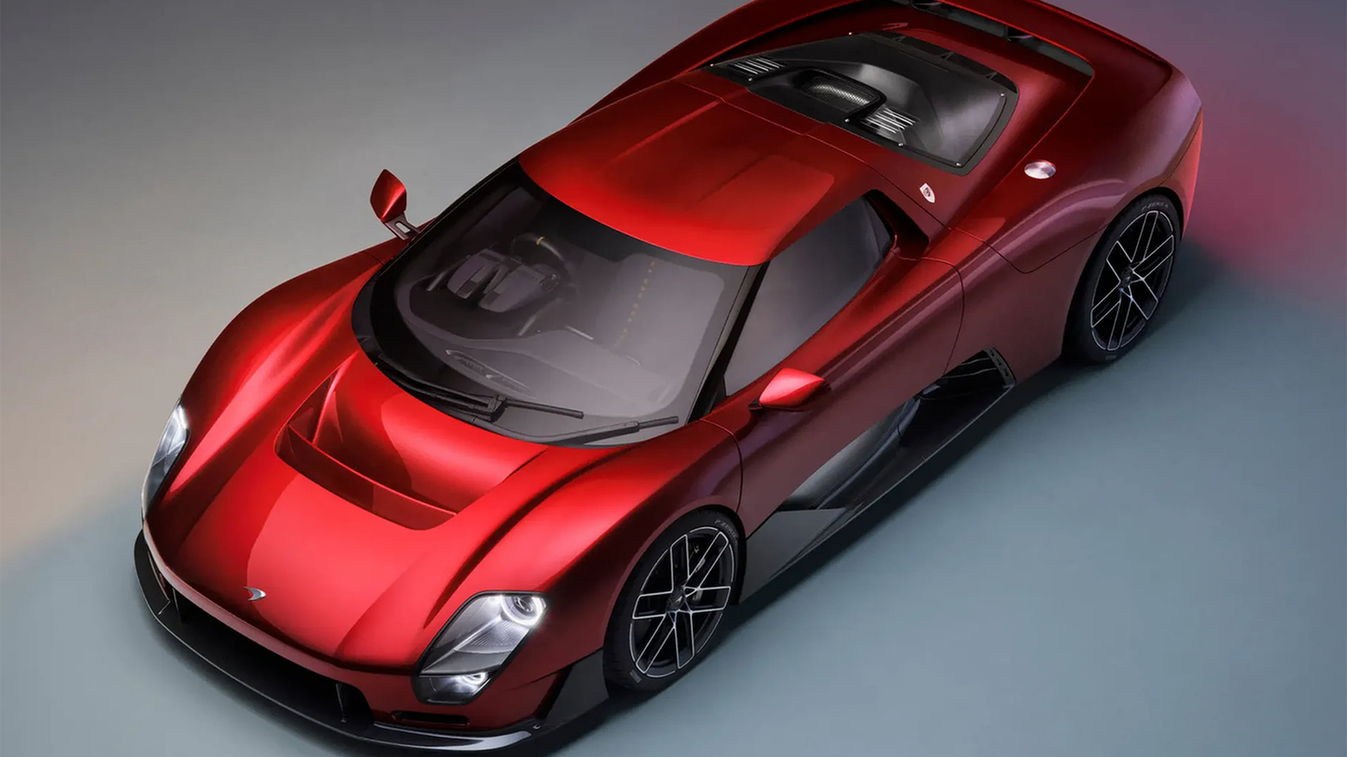
McLaren’s strategy appears to be one of "continuity through evolution." By reintroducing the iconic speedmark for its golf and racing sub-brands, the company has avoided the trap of completely erasing its history. The speedmark remains, serving as a nostalgic anchor, while the new wordmark acts as the face of the road-going automotive business. This dual-track approach allows McLaren to maintain its hard-earned racing heritage while simultaneously signaling a fresh, luxury-oriented aesthetic for its future consumer vehicles.
Industry Perspectives and Official Commentary
The leadership at McLaren has been vocal about the intent behind these changes. David Woodhouse, Chief Creative Officer at McLaren Automotive, described the shift as a necessary evolution of the company’s internal journey. "It marks the beginning of a new chapter for McLaren," Woodhouse noted. "It gives a physical expression to the ambition, creativity, and forward momentum that is shaping our future."
From a marketing perspective, the focus is on emotional connection. Lou McEwen, Chief Marketing Officer at McLaren Racing, emphasized the importance of the brand’s narrative. "It celebrates the symbols and stories our fans, partners, and team mates already know and love," McEwen stated. "It feels unmistakably McLaren, even as we pivot toward new horizons."
Industry analysts have observed that this move is indicative of a broader trend in luxury branding. Just as fashion houses have shifted toward uniform, minimalist sans-serif logos to appeal to a global, digital-native audience, high-performance car brands are moving toward "clean" visual identities that translate well across mobile apps, in-car digital interfaces, and high-resolution marketing materials.
The Implications: What This Means for the Future
The implications of this rebrand extend far beyond the logo on a bonnet.
- Digital Integration: The new, lighter weight of the typeface is optimized for digital displays. In an era where cars are increasingly "software-defined," the brand identity must function as effectively on a smartphone app or an infotainment screen as it does on a piece of metal.
- Luxury Market Positioning: By adopting a more refined, fashion-adjacent aesthetic, McLaren is signaling its intent to compete more directly with the ultra-luxury segment. The brand is moving away from purely "performance-centric" marketing toward a "lifestyle and luxury" narrative.
- Heritage Retention: By explicitly citing the 1920s service station in their communication strategy, McLaren is curating a sense of "authentic longevity." This is a powerful tool for brand loyalty; it reminds the customer that beneath the carbon fiber and the hybrid engines, there is a century of passion and history.
Critical Analysis: A Risk Worth Taking?
Is the new logo a success? From a design standpoint, it is a masterclass in subtlety. The removal of visual "clutter" reflects a brand that is comfortable in its own skin. The "chunky, retro-futuristic" look of the previous iteration served its purpose during the brand’s rapid expansion phase, but it had arguably become a relic of a different design philosophy.
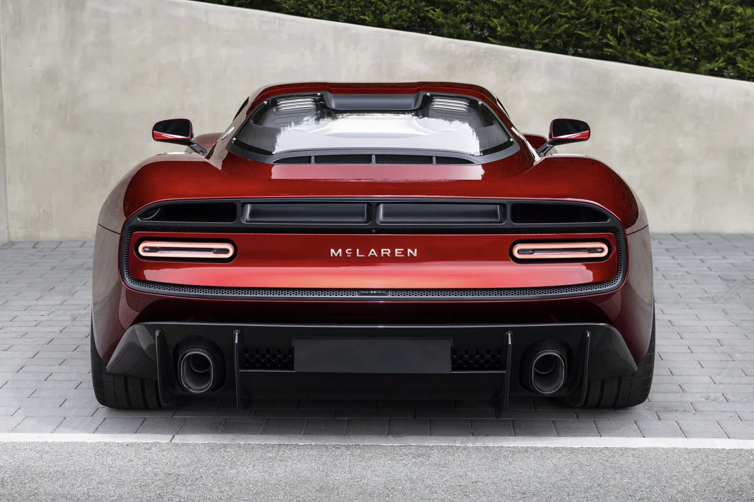
The new identity is, above all, flexible. It allows for a broader application across merchandise, digital platforms, and vehicle liveries without looking forced. While there will inevitably be traditionalists who miss the aggressive thickness of the old letters, the long-term benefit for the brand’s visual coherence is clear.
Conclusion: The Path Ahead
McLaren’s new identity is a reflection of a brand that has matured. It is no longer just a racing team that happens to build cars; it is a comprehensive luxury powerhouse with a legacy that spans nearly a century. By embracing a design language that is both minimalist and historically aware, McLaren has successfully navigated the precarious landscape of corporate rebranding.
As the automotive world moves toward a future defined by electrification and autonomous technology, the brands that succeed will be those that can honor their heritage while appearing entirely at home in the future. With this bold yet refined step, McLaren has firmly positioned itself at the forefront of that transition. The road ahead is long, but for the first time in a decade, the brand’s face is as sharp and clear as the engineering that powers its machines.


 Ali Ikhwan
 Asep Darmawan