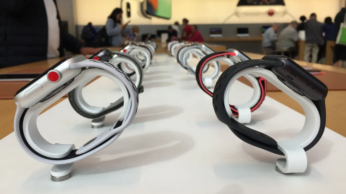
For nearly a decade, the Apple Watch has been a fixture on the wrists of millions, blending high-end fashion with utilitarian health and connectivity features. Among the subtle design language cues that defined the wearable’s evolution, none was more distinct—or more functional—than the "red ring" on the Digital Crown.
For years, a glance at someone’s wrist was all it took to determine whether their device was a basic GPS model or a high-end "GPS + Cellular" variant. However, with the launch of the Apple Watch Series 10 and the refinement of the Ultra lineup, the red ring has quietly vanished. This shift marks a broader change in Apple’s industrial design philosophy, moving away from explicit hardware branding toward a more uniform, integrated aesthetic.
The Genesis of the Red Ring: Defining Connectivity
To understand the significance of the red ring, one must look back to 2017. The Apple Watch Series 3 represented a pivotal moment for the product line. Before this release, the Apple Watch was largely an extension of the iPhone; it required a persistent Bluetooth connection to an nearby smartphone to perform most of its "smart" functions, such as streaming music, sending texts, or placing calls.
With the Series 3, Apple introduced built-in cellular connectivity. This was a technical marvel at the time, requiring the miniaturization of antenna technology to fit inside the watch’s chassis. To distinguish these cutting-edge units from their GPS-only counterparts, Apple’s design team introduced the red ring on the Digital Crown.
It was a functional design choice—a "visual shorthand" for the consumer. At a retail store or in a casual social setting, the red ring immediately communicated that the wearer had the premium, untethered version of the watch. It was a status symbol of connectivity, signaling that the user could leave their iPhone at home during a workout or a commute without losing access to their digital life.
Chronology of a Design Icon
The red ring remained a consistent staple of the Apple Watch design language for seven generations. From the Series 3 through the Series 9, the red ring served as the definitive indicator of cellular capability.

The Key Milestones:
- 2017 (Series 3): The red ring debuts alongside the first cellular-capable Apple Watch.
- 2018–2021 (Series 4–7): The design becomes synonymous with the product. As Apple refined the bezels and display sizes, the red ring remained the one constant, anchoring the user interface to the hardware.
- 2022 (The Ultra Disruption): Apple introduced the Apple Watch Ultra, a rugged, specialized device for extreme sports. With it, the company introduced an "Action Button" and an orange ring on the Digital Crown.
- 2024 (Series 10 and Beyond): Apple officially discontinued the red ring on the mainstream Series 10, opting instead for a minimalist, monochromatic look where the Digital Crown matches the material and color of the watch case itself.
Why the Red Ring Was Abandoned
The disappearance of the red ring was not a sudden accident, but a calculated evolution. As the technology matured, the need to explicitly label a watch as "cellular" became less relevant from a marketing perspective.
1. Aesthetic Minimalism
Apple has increasingly trended toward "invisible technology." In recent years, the company has prioritized seamlessness. A bright red accent on a watch meant for formal wear or professional settings can sometimes clash with the user’s aesthetic. By matching the Digital Crown to the watch casing, Apple creates a cohesive, high-end jewelry appearance rather than a "tech-forward" one.
2. The "Ultra" Influence
The introduction of the Apple Watch Ultra fundamentally changed the visual hierarchy of the product lineup. By introducing the orange ring, Apple created a new visual language for its premium tier. If the company had kept the red ring on the Series 10 and maintained the orange ring on the Ultra, the product line would have become cluttered with different colored accents that lacked a unified purpose.
3. Market Saturation
When the Series 3 launched, cellular connectivity was a luxury feature that required specific marketing. Today, cellular connectivity is widely available and integrated into the vast majority of Apple Watch models sold through carriers. The "premium" nature of cellular is no longer as rare as it once was, making the need for a distinct visual identifier obsolete.
Implications for the Second-Hand Market
The sudden departure of the red ring has an interesting side effect: it makes older models easier to identify at a glance. For those buying or selling refurbished units, the red ring is now a definitive marker of a device that is at least a generation old.
While the red ring was once a symbol of the "newest" tech, it now serves as a historical marker. If you see a red ring on a Digital Crown today, you are almost certainly looking at an Apple Watch Series 9 or earlier. This shift has essentially "retired" the red ring from the modern catalog, relegating it to the history books of wearable technology.
The Role of the Digital Crown in Modern Interaction
It is important to remember that the Digital Crown itself is more than just a place for a colored ring. It remains one of the most sophisticated input methods in consumer electronics. The haptic feedback, the precision of the scrolling mechanism, and its ability to act as a button are central to the watchOS experience.
Apple’s decision to move toward color-matched crowns acknowledges that the hardware is now mature. The user no longer needs a visual cue to know what the watch can do; the software interface of watchOS is now so intuitive that the hardware doesn’t need to shout its capabilities to the world.
Official Stance and Future Outlook
While Apple has not issued a formal "press release" explaining the death of the red ring—a typical move for a company that prefers to let its design language speak for itself—the intent is clear. The company is leaning into a "monolithic" design philosophy. Whether it is the iPhone, the iPad, or the Apple Watch, the goal is to make the device look like a single, unified object rather than a collection of distinct, highlighted features.
Looking forward, we can expect the orange ring on the Ultra to remain for the foreseeable future. Because the Ultra is marketed as a specialized tool for exploration and extreme sports, the high-visibility orange serves a functional, safety-oriented purpose that the red ring no longer provided for the mainstream Series lineup.
Conclusion: A Sign of Maturity
The red ring was a necessary bridge between the early, iPhone-dependent days of the Apple Watch and the modern era of the truly independent wearable. Its removal is not a loss of functionality, but a sign of the platform’s maturity. The Apple Watch no longer needs to prove it is a "smart" device; it is a fundamental part of the Apple ecosystem.
As we move into the era of the Series 10 and beyond, the absence of the red ring serves as a reminder of how far the technology has come. It is a quiet transition, one that reflects Apple’s commitment to evolving its design language alongside its technology. For the discerning user, the lack of a red ring isn’t just a design choice—it’s an indicator that we have entered a new, more refined chapter of the Apple Watch story.