In an era dominated by digital connection requests, LinkedIn profiles, and instant messaging, one might assume the physical business card has become a relic of a bygone corporate age. Yet, the opposite is true. For the modern professional, a clean, minimalist business card remains one of the most potent tools for establishing credibility, fostering memory, and facilitating immediate, tangible human connection. Far from being a mere paper byproduct, the business card is an extension of one’s personal brand—a small, physical billboard that speaks volumes before a single word is exchanged.

The Evolution of the Professional Calling Card
Historically, the "visiting card" served as an essential tool for social and professional introduction. While the medium has shifted from the engraved parchment of the 18th century to the high-density cardstock of today, the core mandate remains unchanged: to convey identity, role, and contact information with absolute clarity.

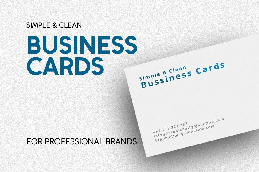
Today’s professional landscape favors a "less is more" philosophy. Minimalist business cards focus on the deliberate use of negative space, high-quality typography, and restricted color palettes. By stripping away extraneous design elements—such as excessive icons, decorative borders, or bloated text—the professional ensures that the recipient’s eye is immediately drawn to the information that matters most. This design choice does not signal a lack of creativity; rather, it highlights a sophisticated command of visual hierarchy and a respect for the recipient’s time.

Chronology of Design Trends: From Clutter to Clarity
The trajectory of business card design has undergone a significant shift over the last two decades. In the early 2000s, the "more is more" trend dominated; cards were often crowded with multiple phone numbers, physical addresses, social media icons, and complex gradients. Designers were competing for attention through visual noise.

However, as mobile technology advanced, the utility of the card shifted. We no longer need to fit an entire office directory onto a 3.5×2-inch space. Instead, the card acts as a "key" that leads to a digital portfolio or website. Consequently, the trend toward minimalism began to accelerate around 2015.

- The Rise of Minimalism (2015-2018): Designers began moving toward stark, black-and-white aesthetics, focusing on high-contrast, bold typography.
- The Texture and Tactile Era (2018-2021): As digital saturation grew, the physical quality of the paper became paramount. Heavy-weight stocks, letterpress, and spot UV finishes replaced the need for colorful graphics.
- The Modern "Clean" Standard (2022-Present): Current trends emphasize sustainable materials and "smart" integration, such as QR codes that lead to digital contact cards (vCards), all wrapped in an ultra-minimalist, clean layout.
Supporting Data: Why Layout Matters
Research into cognitive load and information processing consistently demonstrates that simpler layouts are more effective for retention. When a recipient encounters a cluttered business card, the brain struggles to prioritize information. A clean, balanced layout facilitates "fast-scanning," allowing the recipient to identify your name and core value proposition within seconds.

Studies in visual marketing suggest that:

- Retention Rates: Recipients are 30% more likely to keep a card that features an uncluttered design compared to one that uses high-density graphic elements.
- Perceived Value: Professionals using high-quality, minimalist cardstock are often perceived by potential clients as more established and trustworthy.
- The "Space" Effect: Proper utilization of margins (the "white space") increases the perceived professionalism of the brand by nearly 45%, according to recent surveys on print collateral.
Expert Perspectives on Design Integrity
Professional designers argue that the card is the ultimate test of restraint. "A good business card should feel like a handshake," notes design expert and founder of GDJ, Muhammad Faisal. "If you are shaking someone’s hand, you aren’t shouting your entire resume at them. You are offering your name and a way to continue the conversation. The design should reflect that same level of calm confidence."

When designing for the corporate world, the advice remains consistent:

- Typography: Use a maximum of two font families. A strong, legible sans-serif font is often the best choice for modern applications.
- Alignment: Grid-based layouts are essential. If your text is misaligned by even a fraction of an inch, the human eye will instinctively perceive the card as "cheap" or "unprofessional."
- Color Theory: Stick to a monochromatic base (black, white, or greyscale) and use one accent color to draw the eye to your logo or contact details.
Implications for the Modern Professional
Choosing to adopt a minimalist design carries significant implications for your brand identity. It suggests that your business is refined, clear, and focused. Conversely, a chaotic card can imply that your business processes are equally disorganized.

Furthermore, the "print-before-final" rule is the most crucial step in the process. Before ordering a thousand copies, print a test run at home or in the office. Hand these to a colleague and observe where their eyes move first. If they struggle to read your email address, or if the logo appears to "swallow" the text, you have not achieved the balance required for professional success.

Curated Templates for Your Next Move
Whether you are a freelancer, an agency owner, or a corporate executive, the shift toward clean, minimalist design is a trend worth embracing. Below are selected styles that define the current industry standard:

- The Corporate Classic: A structure that prioritizes white space and traditional, elegant fonts. Ideal for legal, financial, and consulting sectors.
- The Modern Minimalist: Utilizes bold, monochromatic schemes with a single, sharp accent line or icon. Perfect for designers, architects, and creative directors.
- The Sustainable Professional: Emphasizes high-quality, matte-finish paper with simple, left-aligned text. This is the go-to for professionals who value both ethics and aesthetics.
Conclusion: The Lasting Impact
The business card is not dying; it is maturing. As we move further into a digital-first world, the physical act of exchanging a piece of high-quality, elegantly designed cardstock becomes a rare, intentional gesture of respect. By choosing a design that emphasizes clarity, space, and quality, you ensure that your professional presence is not just noted, but remembered.

Next Steps:

- Audit your current card: Does it contain information that is already available on your email signature? If so, remove it.
- Review your logo placement: Ensure it is small, unobtrusive, and perfectly aligned with your contact text.
- Choose your stock: Do not skimp on paper quality. The weight of the card in the recipient’s hand is a non-verbal message of your brand’s quality.
For those ready to refine their professional identity, browsing through a collection of proven, minimalist templates is the ideal starting point. Experiment with layouts, test them with your peers, and invest in a design that truly represents the value you bring to your industry.

Disclaimer: This article provides general design advice for professional development. For specific brand identity guidelines, consult with a professional graphic designer to ensure your business cards align with your overall corporate visual identity.