Nintendo’s penchant for regional variations in game packaging has long been a point of fascination for collectors and fans alike. From subtle color shifts to entirely redesigned artwork, these differences offer a glimpse into marketing strategies and cultural preferences across the globe. This week, in our ongoing "Box Art Brawl" series, we delve into the chaotic world of WarioWare with a focus on the GameCube’s WarioWare, Inc.: Mega Party Game$. This particular installment, a home console evolution of the beloved microgame series, presents three distinct box art designs, each vying for your vote as the definitive visual representation of Wario’s signature brand of zany entertainment.
The Genesis of the Brawl: A Look Back and a New Contender
Last week’s Box Art Brawl saw us revisit the origins of another iconic Nintendo franchise: Yoshi. To celebrate the recent release of Yoshi and the Mysterious Book on Nintendo Switch, we pitted three regional covers for the original NES title, Yoshi, against each other. The European iteration, featuring a distinctive "Mario & Yoshi" design, emerged victorious, capturing a significant 48% of the vote. The North American and Japanese versions garnered 41% and 11% respectively, illustrating a clear preference for the collaborative artwork in the European market.
Now, with the recent buzz surrounding Nintendo’s latest mobile endeavor, Pictonico!, our minds have been firmly set on the frenetic pace and peculiar charm of microgames. This nostalgic inclination naturally leads us to the GameCube era and the delightfully peculiar WarioWare, Inc.: Mega Party Game$. While this title marked the series’ first foray onto a home console, potentially sacrificing some of the portable intimacy of its predecessors, it undeniably retained the hallmark absurdity and boisterous humor that defined WarioWare. As we prepare to cast our votes, let’s examine the three contenders in this week’s Box Art Brawl.
The Contenders: A Regional Breakdown
The core of WarioWare, Inc.: Mega Party Game$‘s appeal lies in its rapid-fire gameplay and eccentric cast of characters. The box art, therefore, needs to encapsulate this chaotic energy. Let’s dissect each regional design:
North America: A Symphony of Characters
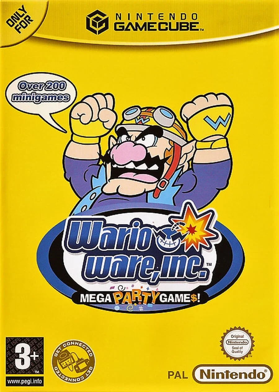
The North American box art for WarioWare, Inc.: Mega Party Game$ presents a visually dense and dynamic composition. At the forefront, Wario himself is positioned prominently, exuding his characteristic swagger and avarice. Surrounding him, and meticulously arranged below, are a vibrant ensemble of his "Ware" companions – the eclectic cast of characters who populate the game’s microgames. This deliberate inclusion of multiple characters serves to highlight the game’s expansive roster and the diverse, often bizarre, scenarios players will encounter.

The color palette is anchored by a striking blue backdrop, a choice that imbues the artwork with a sense of energy and depth. This vibrant hue provides an excellent contrast to the colorful characters, making them pop and drawing the viewer’s eye. A key element of the design’s success is the central logo, which acts as a visual anchor, elegantly holding the entire composition together. The dividing lines that emanate from the logo further reinforce this sense of unity, extending outwards and subtly guiding the viewer’s gaze across the artwork. The overall impression is one of meticulous planning and execution, a well-rounded design that effectively communicates the game’s chaotic fun. The "Good work, all round" sentiment from the original article accurately reflects the thoughtful integration of elements in this design.
Europe: A Bold Yellow Statement
In contrast to the North American approach, the European box art opts for a more streamlined and focused aesthetic. It retains the powerful central Wario imagery found on its North American counterpart, but makes a significant departure in its surrounding elements and color scheme. The bustling array of supporting characters is largely absent, replaced by a much simpler, yet equally impactful, visual strategy.
The dominant feature of the European design is its extensive use of yellow. This bold color choice is not merely a background fill; it actively extends upwards, enveloping the GameCube banner itself. This creates a cohesive and visually striking presentation that immediately signals the game’s energetic and often over-the-top nature. While the absence of the secondary characters might make it appear less detailed than the North American version, this simplicity allows Wario to command even greater attention. The inherent brightness of yellow is intrinsically linked to concepts of energy, excitement, and even a touch of playful mischief, all of which are core tenets of the WarioWare experience. The original article’s observation that this design is "much simpler" is accurate, but this simplicity is a strength, allowing for a more immediate and impactful visual statement.
Japan: Abstract Artistry with a Playful Twist
The Japanese box art for WarioWare, Inc.: Mega Party Game$ stands apart as the most unconventional and abstract of the three. Eschewing the direct depiction of Wario as a full character, this design opts for a more conceptual and artistic representation. Instead of the familiar PNG of Wario, we are presented with his key facial features – his distinctive nose, menacing grin, and perhaps a hint of his iconic cap – rendered against a vibrant, pink polka-dot background.
This approach is undeniably a departure from the more literal portrayals seen in the other regions. It leans into a more avant-garde aesthetic, relying on suggestion and association rather than explicit illustration. The pink polka-dot background is particularly noteworthy; it injects a sense of playful whimsy and unexpectedness, perfectly aligning with the WarioWare ethos of embracing the absurd. While some might find this abstract style less immediately informative about the game’s content, it possesses a unique charm and a distinct visual identity. As the original article notes, it is "certainly eye-catching," and its distinctiveness makes it memorable. This design speaks to a willingness to experiment with visual language, offering a more artistic interpretation of Wario’s brand.

The Chronology of WarioWare’s Visual Identity
To fully appreciate the nuances of these regional box art choices, it’s beneficial to consider the chronological development of the WarioWare series and its visual branding. The original WarioWare, Inc.: Minigame Mania (or Mega Microgames! in Europe and Japan) on the Game Boy Advance set a strong precedent. Its box art typically featured a chaotic collage of Wario and microgame elements, emphasizing the frenetic gameplay.
When the series transitioned to the GameCube with WarioWare, Inc.: Mega Party Game$, the developers faced the challenge of adapting this portable chaos to a larger, home console format. The need to potentially appeal to a broader audience, or to simply align with regional marketing strategies, likely influenced the divergence in box art.
- Game Boy Advance Precedents: The GBA titles often featured a more unified, almost poster-like artwork, with Wario prominently displayed alongside snippets of various microgames. This established a visual language of "Wario + Microgames = Fun."
- GameCube Evolution: Mega Party Game$ was a significant step. The North American version appears to embrace the GBA’s approach of showcasing the ensemble, perhaps to highlight the expanded multiplayer capabilities promised by the "Mega Party Game$" moniker. The European version, by simplifying and intensifying the color, might have aimed for a more direct, impactful branding, emphasizing Wario as the central draw. The Japanese version’s abstract approach could reflect a cultural appreciation for more stylized and less literal artwork, or perhaps a deliberate attempt to stand out in a market with a rich history of unique game packaging.
The evolution from GBA to GameCube demonstrates a conscious effort to adapt the WarioWare brand to different platforms and potentially different market expectations. The choices made for Mega Party Game$ are not random; they are informed by the series’ history and the specific marketing landscape of each region.
Supporting Data and Market Considerations
While direct sales data broken down by box art preference is not publicly available, we can infer potential market considerations that might have influenced these designs.
- Target Audience: In North America, a more detailed and character-rich design might have been seen as appealing to a younger demographic or those new to the series, offering a clearer visual representation of the game’s content. The inclusion of multiple characters could also emphasize the "Party Game" aspect, suggesting multiplayer fun.
- Brand Recognition: In Europe, the bold yellow design might have relied more heavily on existing brand recognition of Wario. The simplicity could be a strategic choice to create a strong, instantly recognizable image that stands out on store shelves, with Wario as the primary brand ambassador.
- Artistic Sensibility: Japan often exhibits a unique appreciation for distinct artistic styles in its media. The abstract approach of the Japanese cover could have been a deliberate choice to appeal to this sensibility, offering a more sophisticated or artistic interpretation that resonates with a segment of the gaming public. It also allows the game to feel more like a unique piece of art rather than just a product.
The differences in these box arts are not merely aesthetic; they are likely the result of calculated marketing decisions aimed at maximizing appeal within each specific regional market.

Official Responses and Nintendo’s Design Philosophy
Nintendo’s official stance on regional box art variations is generally one of acknowledging them as part of the global release strategy. While they rarely offer explicit justifications for each design choice, their history suggests a consistent underlying philosophy:
- Brand Consistency: Despite regional differences, core Nintendo franchises maintain a recognizable visual identity. Wario, in all his iterations, is unmistakably Wario. The core elements of the WarioWare brand – speed, humor, and eccentricity – are also consistently conveyed.
- Market Adaptation: Nintendo is known for its astute understanding of different markets. They recognize that what appeals to consumers in one region may not necessarily resonate in another. This adaptability is crucial for global success.
- Artistic Merit: Nintendo games are often lauded for their artistic direction, and box art is no exception. While commercial considerations are paramount, there’s also a clear emphasis on creating visually appealing and memorable artwork that enhances the overall product.
The WarioWare, Inc.: Mega Party Game$ box arts exemplify this approach. They all feature Wario and hint at the game’s unique gameplay, but they do so in ways that are tailored to their respective markets, demonstrating a blend of global branding and local adaptation.
Implications for Collectors and the Future of Box Art
The existence of these distinct regional box arts has significant implications, particularly for collectors. The desire to own the "complete" set of a beloved game often extends to acquiring all regional variations of its packaging. This creates a niche market for collectors and adds another layer of depth to the appreciation of video game history.
Furthermore, these regional differences serve as a historical marker of a bygone era in game marketing. In an increasingly digital world, where game downloads often come without physical packaging, the tangible art of the box cover is becoming a rarer commodity. The WarioWare, Inc.: Mega Party Game$ box arts, like many others from its generation, represent a significant piece of that legacy.
As we look to the future, it will be interesting to see if Nintendo and other publishers continue to offer distinct regional box art for physical releases. The trend towards digital distribution might diminish this practice, but the enduring appeal of physical media and the collector’s market suggests that regional variations will likely remain a cherished aspect of video game history for years to come.

Now, it’s time for you to decide. Which of these three distinct visual interpretations of WarioWare, Inc.: Mega Party Game$ reigns supreme? Cast your vote and let your preference be known! We’ll be back next week with another exciting edition of Box Art Brawl.