In an era where our smartphones have evolved from simple communication tools into essential digital copilots, the way we traverse the physical world is undergoing a quiet, technological revolution. While most users rely on Google Maps as a habitual utility for avoiding traffic or locating the nearest coffee shop, the platform has increasingly integrated sophisticated environmental intelligence into its interface. Among these features, one small, subtle icon has caught the attention of observant commuters: the green leaf symbol.
Though it may seem like a minor aesthetic choice, the leaf icon represents a significant shift in how tech giants approach carbon neutrality and consumer behavior. This symbol is not merely a design flourish; it is the visual marker of Google’s "eco-friendly routing" feature, a sophisticated algorithm designed to minimize carbon footprints one turn at a time.
The Core Concept: What the Leaf Symbol Signifies
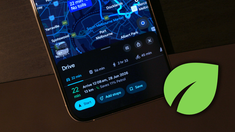
When a user inputs a destination into Google Maps, the app typically presents several route options. Occasionally, one of these routes will be marked with a small, green leaf icon. This icon denotes that the specific path is the most fuel-efficient or energy-efficient route available for that journey.
By analyzing historical traffic patterns, road gradients (the steepness of the terrain), and current congestion levels, Google’s machine learning models identify the path that requires the least amount of fuel or battery power. For the average driver, this means a route that avoids excessive idling in heavy traffic, unnecessary acceleration on steep inclines, or long stretches of stop-and-go driving. When the leaf appears, it acts as a nudge—a gentle prompt to choose a path that is kinder to both your wallet and the planet.
A Chronology of Eco-Conscious Navigation
The rollout of eco-friendly routing was not an overnight endeavor. It is part of a broader, multi-year strategy by Google to integrate sustainability into its core product offerings.
The Development Phase (2020–2021)
The groundwork for this technology was laid during the height of the global pandemic. As traffic patterns became erratic and environmental awareness grew, Google engineers began refining their routing algorithms. The goal was to move beyond the traditional "fastest route" metric and introduce a multi-objective optimization problem: balancing time and fuel efficiency.
Initial Launch (2021–2022)
In late 2021, Google officially announced the deployment of fuel-efficient routing in the United States, followed by a gradual expansion into Europe and Canada. At launch, the feature focused primarily on internal combustion engine (ICE) vehicles. By leveraging data from the U.S. National Renewable Energy Laboratory (NREL), Google created a system that could predict the fuel consumption of various vehicle types across different road geometries.
The Refinement Era (2023–Present)
Following the initial success, Google expanded the feature to accommodate the growing fleet of electric and hybrid vehicles. Recognizing that an EV’s efficiency profile differs drastically from a diesel truck or a gas sedan, the company introduced granular settings allowing users to specify their engine type, thereby tailoring the algorithm to the specific energy-consumption characteristics of their vehicle.

Supporting Data and Technical Underpinnings
The efficacy of the leaf icon is backed by complex data modeling. Google’s routing engine evaluates thousands of potential paths in real-time, considering variables that go far beyond basic distance or speed limits.
How the Algorithm Works
- Topography Integration: A road that is flat is generally more fuel-efficient than a road with steep climbs and descents. Google uses high-resolution topographical maps to adjust its efficiency scores based on elevation changes.
- Traffic Flow Analysis: Constant braking and acceleration are the enemies of fuel efficiency. By analyzing real-time congestion data, Google prioritizes roads with consistent flow, even if they are slightly longer in terms of raw mileage.
- Speed Limit Optimization: Every vehicle has a "sweet spot" for fuel economy, typically between 45 and 65 mph. The algorithm attempts to steer drivers toward roads where they can maintain these optimal speeds, avoiding unnecessary idling or high-speed inefficiency.
The Quantitative Impact
According to internal data provided by Google, the implementation of eco-friendly routing has the potential to prevent millions of metric tons of carbon emissions annually. While an individual trip might only save a fraction of a gallon of fuel, the collective impact across Google Maps’ billions of monthly active users is staggering. If even a small percentage of drivers consistently choose the leaf-marked route, the aggregate reduction in CO2 is equivalent to removing hundreds of thousands of cars from the road.
Customizing Your Experience: Beyond the Default
Google Maps is not a "one-size-fits-all" navigation tool. To truly leverage the power of the leaf icon, users must ensure the app is calibrated to their specific vehicle.
Enabling "Prefer Fuel-Efficient Routes"
By default, the app may prioritize the absolute fastest route. Users can change this by navigating to:
- Settings > Navigation > Route Options.
- From there, toggling on "Prefer fuel-efficient routes" forces the app to give weight to sustainability.
The Importance of Engine Settings
A crucial, yet often overlooked, step is configuring your vehicle type. By going to Settings > Your Vehicles, users can specify if they drive a petrol, diesel, hybrid, or electric car. This is vital because the algorithm calculates "efficiency" differently based on the power source. An EV, for instance, might be more efficient in stop-and-go city traffic due to regenerative braking, whereas a gas-powered car would be significantly more efficient on an open highway. Failing to update this setting results in generic, less-accurate recommendations.
Official Responses and Corporate Strategy
Google’s pivot toward "green" features is part of a broader corporate sustainability pledge. In 2020, the company announced its goal to operate on 24/7 carbon-free energy by 2030. Integrating these goals into the user interface serves a dual purpose: it helps the company meet its environmental KPIs while simultaneously enhancing user utility.
In various public statements, Google spokespeople have emphasized that the company views navigation as a "responsibility-first" product. By providing users with transparent information regarding fuel consumption and emissions, they are empowering the public to make informed choices. Critics, however, have occasionally questioned the accuracy of these "savings" estimates, noting that real-world driving conditions—such as tire pressure, vehicle load, and driver behavior—can fluctuate, making it difficult for an algorithm to provide a 100% accurate prediction of fuel saved. Google acknowledges these variables, positioning the leaf icon as an "estimate" rather than an absolute guarantee.
Broader Implications: The Future of Navigation
The presence of the leaf icon on our screens signals a paradigm shift in the digital map industry. For years, the primary metric of success for navigation apps was "time saved." Today, that has been joined by "carbon saved."
Implications for Urban Planning
As this data becomes more widely available, it offers potential benefits for urban planners. City councils and transportation departments can utilize aggregated, anonymized data from navigation platforms to identify which roads are frequently prioritized for fuel efficiency. This can inform future infrastructure projects, such as the placement of traffic lights, the design of roundabouts to reduce idling, and the prioritization of road repairs.
Changing Driver Psychology
Perhaps the most profound implication is the psychological impact on the driver. Gamification is a powerful tool. By placing a green leaf icon next to a route, Google is essentially rewarding the user for sustainable behavior. This subtle positive reinforcement encourages drivers to view their commute not just as a task to be finished as quickly as possible, but as an opportunity to be a more responsible consumer.
The Integration of EVs
As the automotive industry pivots toward electrification, the "leaf icon" concept is evolving into a more comprehensive "range anxiety" solution. Future iterations of Google Maps are expected to not only suggest the most efficient route but also integrate charging stops based on a vehicle’s current battery level and charging speed, effectively merging environmental consciousness with practical necessity.
Conclusion: A Small Icon, A Large Step
The green leaf symbol on Google Maps serves as a microcosm of the modern intersection between technology and the environment. It proves that sustainability does not always require massive, sweeping policy changes; sometimes, it requires only a change in the way we view our daily routines.
By choosing to follow the leaf, users are participating in a global movement to reduce dependency on fossil fuels. While the icon itself is small, the trend it represents—the democratization of environmental data—is anything but. As we move further into an age defined by the urgency of climate action, tools like these will become essential components of our digital lives, proving that even in the virtual world of pixels and satellite imagery, every turn matters.
Next time you open your navigation app, take a moment to look for that green leaf. It is more than just an icon; it is a signal that our digital tools are finally beginning to map a path toward a greener, more sustainable future.