
In the fast-paced world of 2026 branding, where digital-first identities and hyper-modern aesthetics dominate, the landscape of character marketing is undergoing a fascinating resurgence. From the minimalist charm of Apple’s "Little Finder guy" to the quirky, contemporary appeal of Crocs’ "Niles the croc," brand mascots are reclaiming their territory as the most effective tools for building emotional resonance with consumers. Even tech giants like Sony are pivoting toward character-driven identities, recently unveiling a kawaii-inspired mascot designed to rival the global recognition of Hello Kitty.
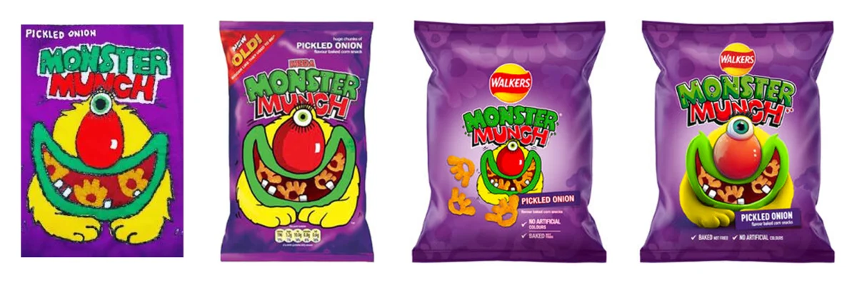
However, as brands scramble to modernize, many are finding that the "less is more" mantra holds true. While some corporations are taking radical risks—such as Kellogg’s reimagining their iconic rooster as a giant, 3D-rendered kaiju or Kraft Heinz subjecting its Jet-Puffed marshmallows to increasingly surreal marketing narratives—others are choosing a more tempered path. A quintessential British icon, the corn crisp brand Monster Munch, has just provided a masterclass in how to honor heritage while subtly refining a design that has successfully spanned four decades.
The Evolution of an Icon: A Chronological Retrospective
To understand the weight of the latest redesign, one must look at the brand’s origins. Launched in 1977 by the snack titan Smiths, Monster Munch was built on the foundation of "The Prime Monster," a set of grotesque yet endearing characters that captured the imagination of a generation. Unlike many of its competitors, which relied on generic geometric patterns or text-heavy packaging, Monster Munch leaned into the bizarre.
The 1980s and 90s saw the brand cement its place in British culinary culture. The characters were not mere logos; they were stars. They appeared in television advertisements, on merchandise, and were etched into the collective memory of school playgrounds across the UK.
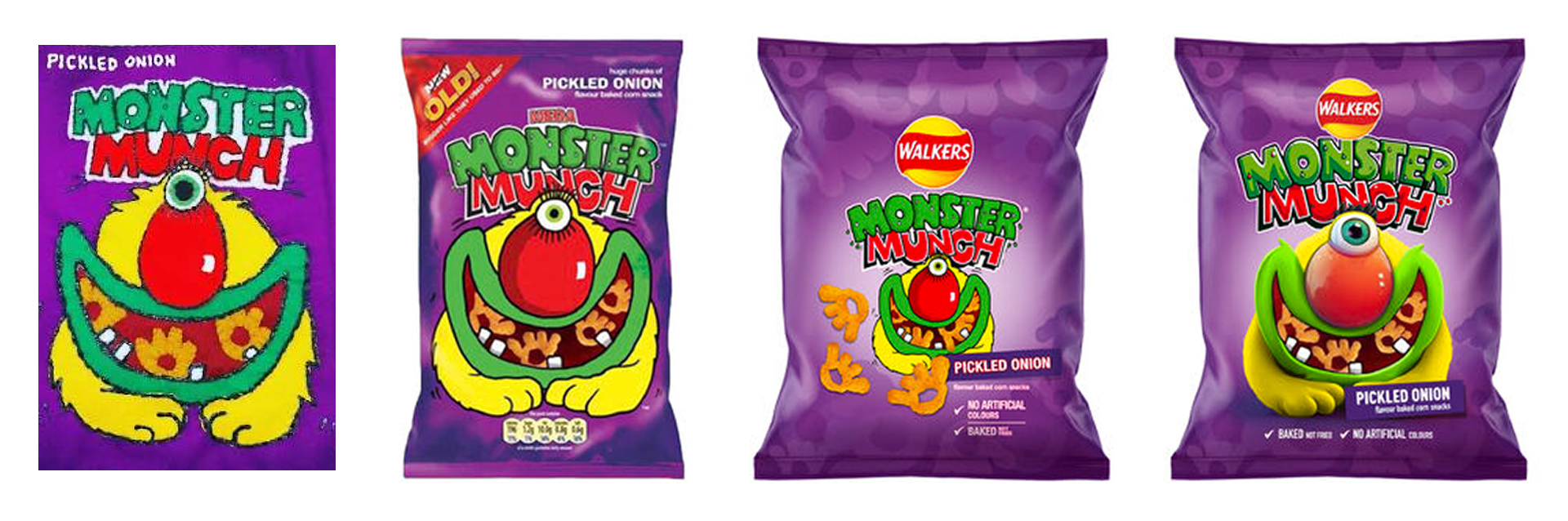
By the time PepsiCo acquired the brand in 1989, the monsters were already firmly established. However, the 21st century brought a trend of corporate homogenization. The 2019 redesign, in particular, serves as a point of contention for design purists. During that refresh, the brand was pulled under the wider Walkers umbrella. The packaging was overhauled to include distracting gradients and a prominent Walkers logo, which effectively pushed the titular monsters into the background. While this strategy aimed to leverage the "Walkers" brand equity, it arguably diluted the unique, rebellious personality that made Monster Munch a cult classic.
The 2026 Rebrand: Returning to the Source
The latest design iteration, spearheaded by PepsiCo’s European design team, signals a definitive return to form. The 2026 update is an exercise in stripping away the "noise" that had accumulated over the previous decade.
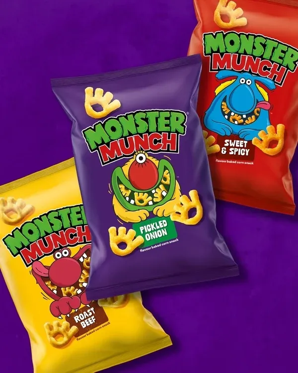
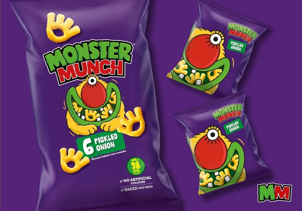
The most significant change is the removal of the heavy-handed Walkers branding from the front of the pack. By reclaiming the primary visual real estate, the monsters are once again the protagonists of their own story. The design team has ditched the overly polished, computer-generated 3D aesthetics that dominated the 2010s in favor of a flatter, bolder, and more illustrative style. This change not only feels modern in its simplicity but also serves as a direct nod to the brand’s late-70s origins, tapping into the powerful psychological trigger of nostalgia.
Data and Design: Why Character Branding Persists
Why are brands still so obsessed with mascots in 2026? The answer lies in cognitive psychology. Humans are hard-wired to respond to faces and anthropomorphic figures. A mascot provides a "human" point of contact for a product, effectively bridging the gap between a faceless multinational corporation and the consumer.
Market data consistently suggests that brands with strong, consistent character identities enjoy higher levels of "brand salience"—the likelihood that a brand will be thought of in buying situations. When a consumer walks down a supermarket aisle, the specific color palette and distinct silhouette of a Monster Munch bag act as a mental shortcut.
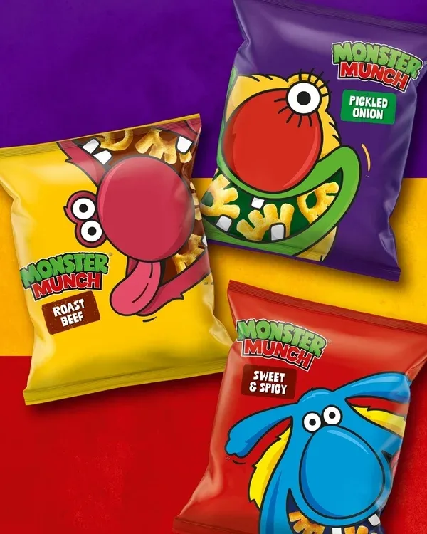
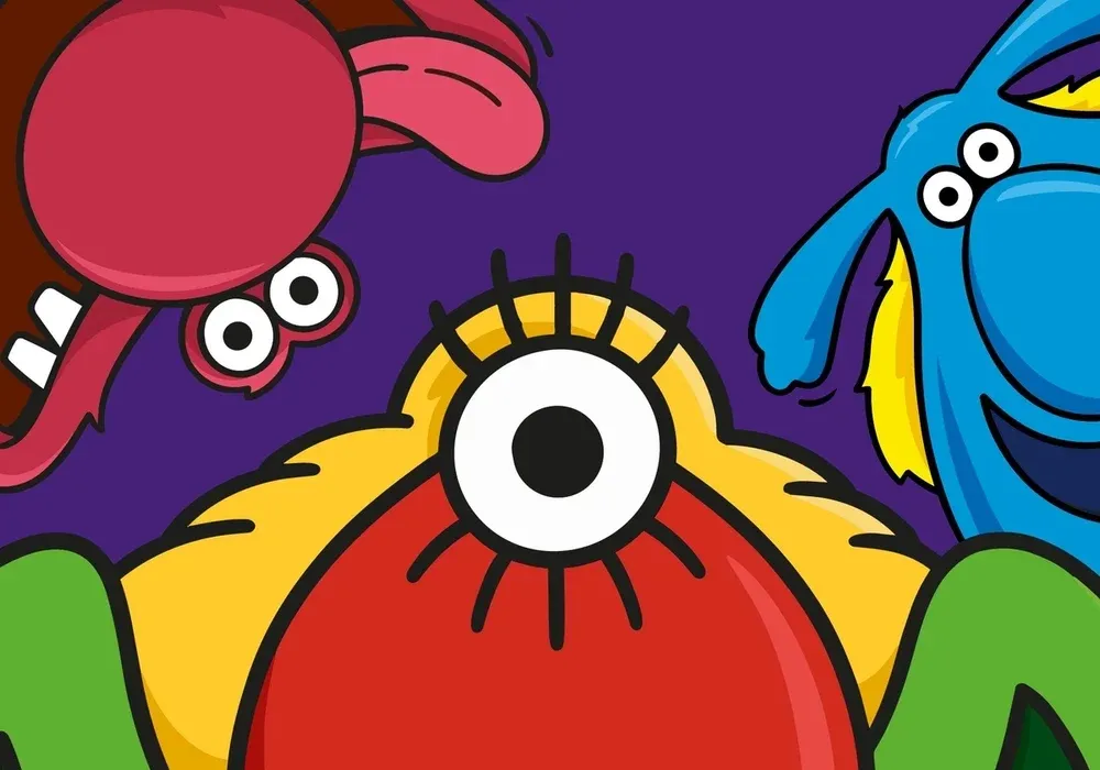
The "Monster" characters are particularly successful because they are distinct. The yellow pickled onion monster, with its single eye and lashes, is a masterclass in shape language. Even without reading the text on the packet, the visual cues allow for immediate recognition. By simplifying the illustrations in this new refresh, the designers have ensured that these silhouettes are readable from several feet away, even under the harsh, often cluttered lighting of modern retail environments.
The Official Perspective: A Cautious Approach
The strategy behind this shift was not arrived at lightly. Jon Bailey, Senior Design Manager at PepsiCo, has spoken openly about the "cautious approach" required when handling a brand with such significant legacy weight. In a recent statement shared via LinkedIn, Bailey emphasized that the goal was to respect the brand’s history while ensuring it remains functional for a modern, digital-savvy audience.
"Our objective was to strip back the layers that had obscured the heart of the brand," noted a design lead close to the project. The internal brief focused on "heritage value," ensuring that the refined illustrations maintained the slightly anarchic, Muppet-esque quality that fans loved in the 1970s. The team implemented a new monogram and a cleaner typography set, which allows the illustrations to "breathe." By eliminating the gradients and the corporate branding, the designers have effectively allowed the product to stand on its own merits.
Implications for the Industry
The success of the Monster Munch rebrand provides a critical lesson for the design industry: Brand equity is a fragile asset. When companies like Kellogg’s or Kraft Heinz opt for radical, high-concept, or even "torturous" marketing campaigns, they are chasing viral engagement. This is a high-risk, high-reward strategy that often prioritizes short-term social media buzz over long-term brand identity.
Conversely, the Monster Munch approach prioritizes longevity. By reverting to a cleaner, more classic aesthetic, PepsiCo is betting on the idea that the "original" was closer to the brand’s soul than the modern, corporate-lite versions that preceded it. This move likely signals a broader shift in the FMCG (Fast-Moving Consumer Goods) sector. As consumers grow weary of "brand saturation" and corporate-speak, a return to simple, honest, and nostalgic character design may become the defining trend of the late 2020s.
Furthermore, the decision to remove the Walkers logo from the front of the bag is a bold admission: some brands are bigger than their parent companies. Acknowledging that Monster Munch is a legacy brand that does not require the "halo effect" of a larger snack portfolio is a sign of confidence. It tells the consumer, "We know who we are, and you know why you’re buying us."
Unanswered Questions and the Future
Despite the success of this refresh, one lingering mystery remains for the fans: the origin of the crisp shape itself. Is the iconic, claw-like, or eye-like shape of the snack actually a representation of the monsters, or is it merely a result of the extrusion process from forty years ago? Regardless of the answer, the fact that fans are still debating the lore of a corn crisp in 2026 is a testament to the brand’s enduring power.
As we look toward the future of branding, the "Monster Munch Model" offers a blueprint for how to handle legacy assets. In an era where digital noise is at an all-time high, the most disruptive thing a brand can do is to be quiet, be consistent, and honor the characters that built its empire. Whether the trend of "kaiju" mascots or "tortured" snack food narratives will continue is yet to be seen, but one thing is certain: for the monsters of Monster Munch, the future looks exactly like their past—and that is exactly how their loyal fans like it.
The industry will undoubtedly be watching to see if other legacy brands follow suit, peeling back the layers of corporate design to reveal the familiar, smiling (or one-eyed) faces that define our childhoods. In the battle for supermarket shelf space, the winner is rarely the loudest; it’s the one that feels most like home.