
In the high-stakes world of global branding, typography is rarely just a matter of aesthetic preference. It is the silent voice of a corporation, a subconscious signal meant to convey authority, heritage, and identity. For a titan like Coca-Cola, every font choice is scrutinized by millions. However, the company’s recent brand overhaul—a comprehensive design refresh led by the agency JKR—has triggered an unexpected and somewhat uncomfortable conversation. By centering their new identity on the bespoke "Better With" typeface, designed by Brody Associates, Coca-Cola has inadvertently drawn comparisons to one of the most polarizing aesthetic legacies in commercial history: the branding of Marlboro cigarettes.
The Core of the Conflict: A Typography Clash
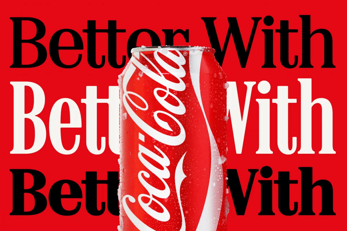
The controversy stems from the prominence of the "Better With" font, which made its debut during a holiday campaign in 2023 but has since been elevated to the cornerstone of the brand’s global marketing and packaging architecture. While Brody Associates maintains that the font was crafted to express "personality, movement, and playfulness" by mining the depths of Coca-Cola’s own historical archives, the public has a different take.
On social media platforms like X (formerly Twitter), users were quick to point out that the serif font, with its sharp, retro-leaning edges and specific weight, bears an uncanny resemblance to the iconic typography found on cigarette packs—specifically the Marlboro brand. While the two fonts are not identical, the visual synergy between the two is striking enough to spark a viral discourse. For many, the juxtaposition of a beverage company and a tobacco giant is not merely a design coincidence, but an ironic commentary on the nature of mass-market addiction.
A Chronology of the Rebrand
To understand how a multi-billion-dollar brand landed in this position, one must look at the timeline of the rollout:
- Late 2023: Coca-Cola introduces the "Better With" typeface, initially as a limited-run asset for seasonal marketing campaigns. At this stage, the font is seen as a clever nod to the brand’s vintage roots.
- Early 2024: Following positive internal reception, JKR is commissioned to integrate the typeface into a broader, more cohesive brand identity, aimed at unifying the company’s disparate visual touchpoints.
- July 2026: The official, full-scale deployment of the new brand identity begins. Almost immediately, the aesthetic shift is met with public scrutiny.
- July 20–21, 2026: Within 48 hours of the launch, side-by-side comparisons of Diet Coke cans and Marlboro packaging go viral. Influencers and design critics alike weigh in, cementing the "fridge cigarette" narrative in the cultural consciousness.
The Design Philosophy: From Archives to Modernity
Brody Associates has defended the design, emphasizing the research-heavy process behind the "Better With" font. According to the agency, the goal was to synthesize Coca-Cola’s deep-seated serif heritage with the modern-day requirement for high-impact, readable storytelling.
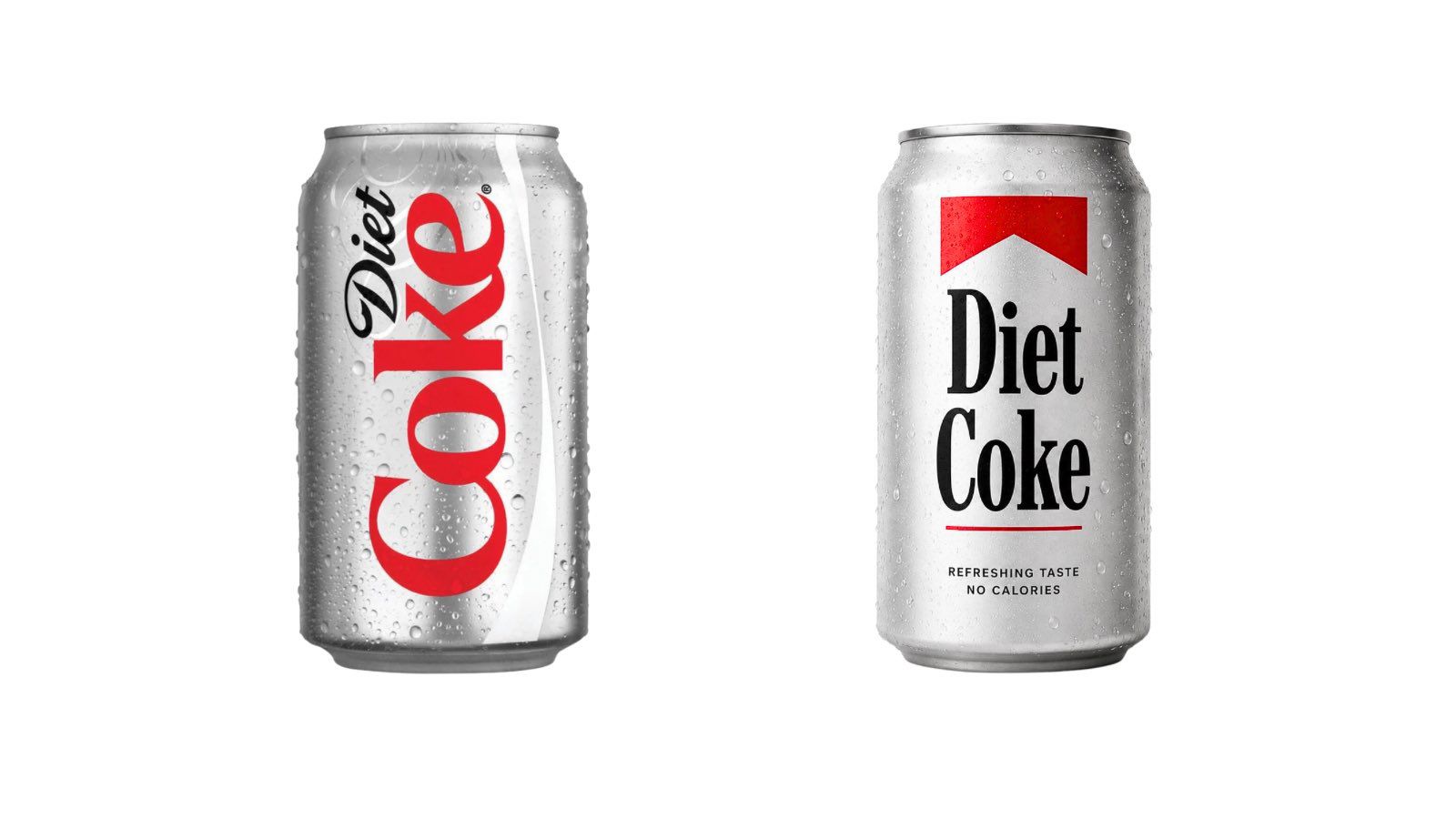
"We were asked to craft a new serif font family to express the brand’s unique personality," a representative for the firm stated. By blending historical letterforms from the Coca-Cola archive with contemporary digital requirements, the firm aimed to create a bridge between the past and the future. However, in the realm of semiotics, the intent of the designer is often superseded by the interpretation of the consumer. In this instance, the combination of the bold, red-and-white color palette—which Coca-Cola and Marlboro share—with this specific serif style has created a "visual shorthand" that consumers are finding impossible to unsee.
Supporting Data: The Power of Color and Serif
The discomfort surrounding this design choice is rooted in color psychology and historical branding dominance. Both Coca-Cola and Marlboro utilize "Signal Red" as their primary brand color. In the 20th century, both brands mastered the art of high-contrast, minimalist packaging that could be recognized from across a room.
Design analysts point out that when a brand uses a heavy serif typeface in a high-contrast red-and-white layout, they are evoking a specific mid-century "masculine" or "authoritative" aesthetic. Because the tobacco industry spent decades utilizing this exact combination to imply boldness and endurance, the human brain has been conditioned to associate that specific visual tension with the act of smoking. When applied to a sugary soft drink, that same visual tension creates a dissonance that some critics have labeled "self-aware" and others have labeled "tone-deaf."
Official Responses and Corporate Strategy
As of this writing, Coca-Cola has remained largely quiet regarding the specific comparisons to tobacco branding. In the corporate world, engaging directly with a negative viral meme is often seen as a losing battle. By acknowledging the comparison, the brand would only serve to amplify the association.
However, industry insiders suggest that the company’s internal teams are likely evaluating the sentiment. If the "fridge cigarette" meme continues to gain traction, it could potentially undermine the wholesome, communal image the brand has cultivated for over a century. Conversely, some marketing experts argue that the controversy is "free press." In an era where "Diet Coke" has become a cultural shorthand for a specific kind of lifestyle habit, the association with the "fridge cigarette" meme might actually solidify the product’s status as an addictive, essential luxury rather than just a drink.
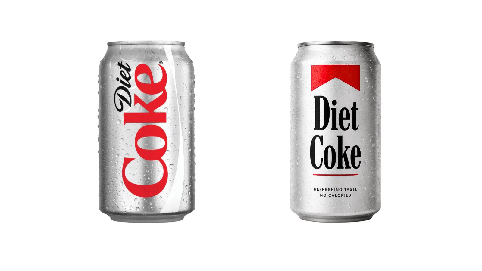
The "Fridge Cigarette" Phenomenon
The rise of the "fridge cigarette" meme—a trend that gained traction on TikTok—is perhaps the most fascinating aspect of this story. For a generation of consumers, Diet Coke has become a ritualistic vice, characterized by the sharp, crisp experience of the first sip.
When users started comparing their daily soda habit to a smoke break, they were essentially reclaiming the brand as a personal comfort. By adopting a font that feels somewhat industrial, retro, and slightly "forbidden," Coca-Cola may have, perhaps accidentally, tapped into the very energy that made the "fridge cigarette" meme go viral. Whether this was a calculated move to capture a cynical, younger demographic or a catastrophic lapse in market research remains the subject of intense debate.
Implications for Future Branding
The "Marlboro-fication" of Coca-Cola raises significant questions about the future of global brand identity.
- The Saturation of Visuals: As brands run out of unique ways to be "bold" or "retro," the likelihood of accidental overlaps increases.
- The Death of the Original: In a digital-first world, every new design is subject to immediate crowdsourced analysis. Nothing is created in a vacuum anymore.
- The Risks of Heritage: By digging into their archives for "authenticity," brands often end up hitting the same design tropes that defined other powerful industries from the same era.
The Coca-Cola situation serves as a cautionary tale for design agencies and corporations alike. It demonstrates that in the modern market, a brand is not just what the company says it is; it is the sum of every cultural connection, historical association, and ironic meme that the public chooses to attach to it.
As Coca-Cola moves forward with this new identity, the "Better With" font will remain a focal point. Whether it eventually sheds its tobacco-adjacent baggage or becomes the permanent symbol of the "soda-as-vice" culture, the brand has successfully sparked a conversation that, for better or worse, keeps them at the very center of the cultural zeitgeist. For a company that has spent over a century fighting for attention, that alone might be considered a win—even if it is written in a font that has the world looking over its shoulder.