Typography is the silent heartbeat of graphic design. For decades, the choice of a typeface has acted as the primary bridge between a brand’s intent and the audience’s perception. Among the various categories of type, "Pop fonts"—characterized by their bold, punchy, and often nostalgic aesthetics—have emerged as the most powerful tools in a designer’s arsenal. From the high-contrast concert posters of the 1960s to the algorithmic-friendly, attention-grabbing typography dominating modern social media feeds, pop fonts maintain a unique visual weight that commands immediate engagement.

The Evolution of Pop Fonts: A Chronological Overview
The history of pop typography is inextricably linked to the history of consumer culture.

The Mid-Century Era (1950s–1960s): The origins of the modern pop aesthetic can be traced back to the post-war advertising boom. During this period, designers moved away from the austere, functional typefaces of the early 20th century, favoring instead the playful, curvaceous, and "bubble-like" lettering found on drive-in movie signs and cereal packaging. These fonts were designed to stop motorists and shoppers in their tracks.

The Psychedelic and Punk Revolutions (1970s–1980s): As the counterculture took root, typography became more rebellious. The 70s introduced fluid, script-based retro fonts that mirrored the era’s neon-drenched aesthetic. By the 80s, the "Pop" label began to solidify, with designers experimenting with thick, heavy-stroke fonts that emphasized legibility and impact in an increasingly loud commercial landscape.

The Digital Age and Y2K Revival (2000s–Present): With the advent of digital design, the barriers to creating custom typography crumbled. The last five years, in particular, have seen a massive resurgence of Y2K-inspired "bubble" fonts and graffiti-influenced lettering. Today, designers use these styles to evoke a sense of digital-native nostalgia, blending classic retro influences with the clean, sharp lines required for modern mobile interfaces.

The Psychology of Bold Typography
Why do designers consistently return to big, bold fonts? The answer lies in the cognitive processing of visual information. Human beings are biologically wired to prioritize high-contrast imagery. In an era of digital saturation, where the average user scrolls past hundreds of pieces of content daily, bold typography functions as a "visual anchor."

Supporting data suggests that headlines using high-impact, display-style fonts experience a 30% to 40% higher click-through rate in social media advertising compared to those utilizing standard, neutral sans-serif fonts. The "pop" aesthetic—often involving rounded edges, exaggerated proportions, and vibrant visual personality—signals to the brain that the information is relevant, urgent, or entertaining.

The Strategic Application of Retro and Modern Pop Fonts
Choosing the right font is a foundational decision that dictates the mood of a project. A typeface is not merely a vehicle for text; it is an emotional signifier.

- Retro Fonts for Storytelling: Using a vintage-inspired script or a 1970s-style display font can instantly transport a viewer to a specific cultural moment. This is highly effective for lifestyle branding, music festival posters, and apparel design, where the goal is to create an emotional connection based on nostalgia.
- Modern Pop for Brand Vitality: Conversely, "modern pop" fonts take those same historical principles—thickness, presence, and playfulness—and strip away the weathered textures. The result is a fresh, crisp, and high-energy look that communicates confidence and innovation.
Essential Categories for Your Design Toolkit
- Bubble/Graffiti Styles: Best for street-wear, youth-oriented branding, and projects requiring a "fun" or "rebellious" tone.
- Retro Display: Ideal for packaging, editorial design, and logos that need a classic, timeless, or "human" touch.
- Modern Sans-Pop: Perfect for digital marketing, where readability must be balanced with the need to stand out against white space.
Expert Perspectives: Why Designers Choose Pop
Industry leaders consistently emphasize that typography should be treated as the "voice" of the design. When asked about the resurgence of bold pop fonts, veteran designers note that the current trend is a direct response to the "minimalist fatigue" of the 2010s. For years, brands adopted thin, geometric, and overly safe fonts. The shift toward chunky, expressive, and even slightly "imperfect" typography represents a desire for authenticity and human warmth in an increasingly automated world.

Implications for Future Design Trends
The implications for designers are clear: we are entering an era of maximalist typography. As artificial intelligence and automation handle more of the mundane aspects of layout and composition, the creative choices—specifically the selection of expressive, bold, and unique fonts—become the primary differentiator for human designers.

To stay ahead, designers should look to integrate these styles strategically. The goal is not just to use a "loud" font, but to pair it with a layout that respects the hierarchy of information. Whether you are working on a streetwear drop, a local cafe’s menu, or a viral social media campaign, the font you choose will either reinforce your message or undermine it.

Curated Selection: 28 Fonts for Your Next Project
To assist in your creative journey, we have curated a selection of the most versatile and high-impact fonts available today. These assets, ranging from bubble-pop styles to refined retro scripts, are designed to give your work the competitive edge it needs.

- Afrodotz: A masterclass in Y2K retro-bold aesthetics.
- Tokyo City Pop: A sleek, urban-inspired typeface that balances retro charm with modern geometry.
- Bavose: Perfect for those seeking that iconic, high-energy bubble aesthetic.
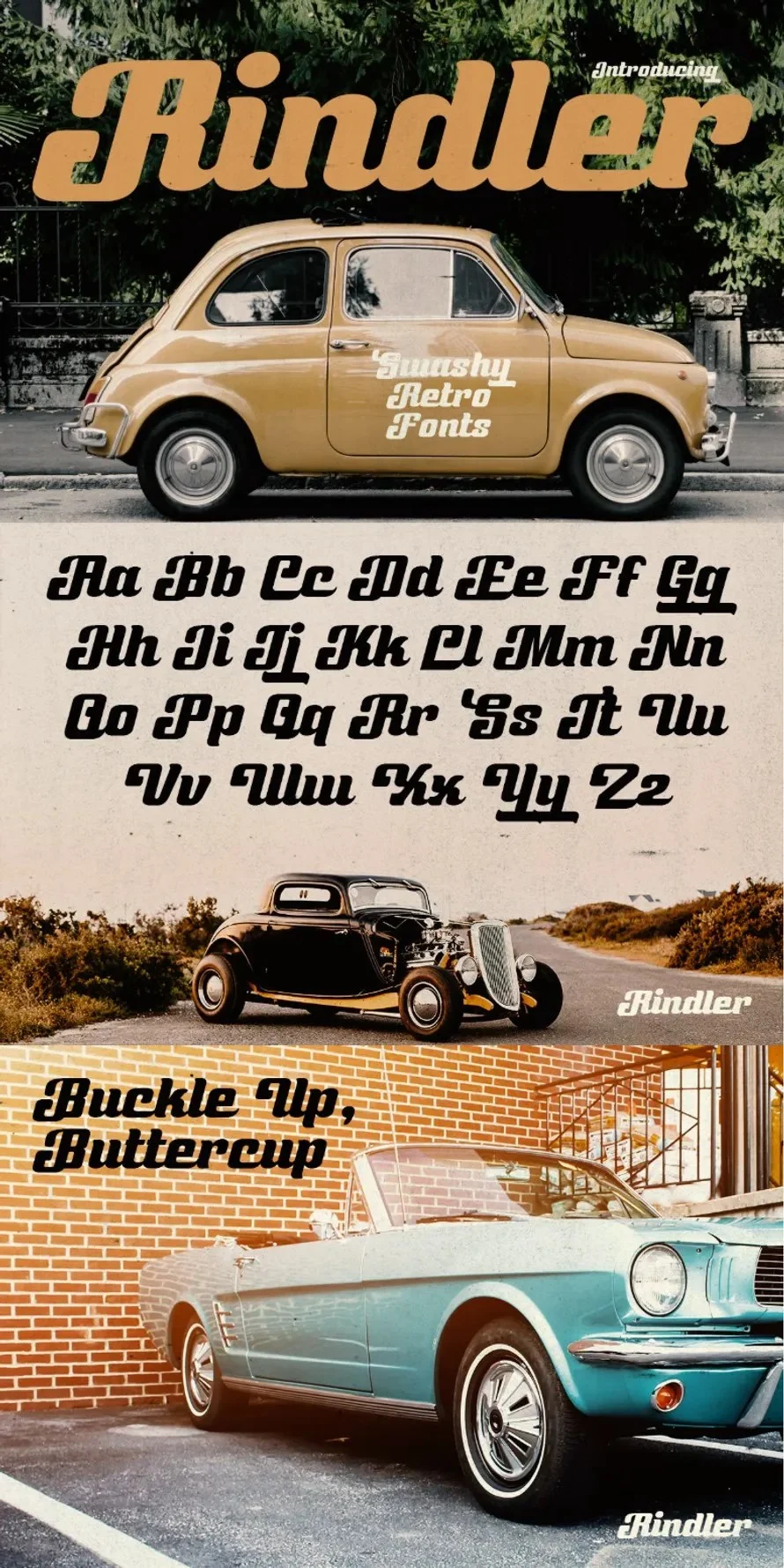
- Rindler: A sophisticated retro script that channels the elegance of 70s automotive branding.
- Chups Gelato: A rare, fun serif that manages to look both professional and playful.
- Popsmile: Designed for the packaging industry, capturing the essence of 80s advertising.
- Guido: A rounded, friendly display font that excels in social media graphics.
- Drynida: Specifically crafted for 90s-inspired headline work.
- Blitzkrieg Pop: For projects requiring a rebellious, punk-rock edge.
- Street Pops: A graffiti-inspired typeface that brings authentic urban energy to posters and flyers.
- Jelly Pop: A thick, high-presence font ideal for logotypes and food branding.
- Unicorn Pop: A whimsical, cute display font for projects that need a softer, magical touch.
- Chubby Popz: Excellent for digital applications where a soft, approachable feel is needed.
- Bubble Dope: A groovy, handwritten display font that adds personality to wedding and stationary work.
- Cream Whip Script: A bold, brush-style font that feels both nostalgic and premium.
(For the full list of 28+ professional assets, including direct download links and licensing options, visit our comprehensive design library.)

Conclusion: Mastering the Balance
Typography does not have to be a complicated, technical exercise. At its core, it is about selecting the right tool for the job. By experimenting with weights, mixing retro and modern styles, and understanding the psychology behind bold lettering, you can transform a standard project into a memorable visual experience.

Remember, the best designs are those that balance visual impact with clear, effective communication. As you browse these 28+ fonts, consider how each one can serve your brand’s unique narrative. Download, test, and adapt—the power of pop is in your hands.