In the rapidly shifting landscape of graphic design, the year 2026 has emerged as a pivotal moment for typography. As digital saturation reaches an all-time high, the demand for visual communication that cuts through the noise has never been greater. Whether for high-octane movie promotions, underground music festival branding, or sleek corporate advertising, the choice of typeface is no longer just a functional decision—it is the cornerstone of brand identity.

This article explores the definitive collection of the 30 best poster fonts for 2026, analyzing the intersection of technical performance, aesthetic trends, and the strategic implications for designers in the current market.

The State of Typography: Trends Shaping 2026
Designers in 2026 are moving away from the "safe" minimalism that dominated the early 2020s. Instead, we are witnessing a renaissance of expressive, high-contrast, and experimental typography. The current design climate is defined by:

- Brutalist-Inspired Serifs: A resurgence of high-contrast, edgy serif fonts that challenge traditional readability conventions.
- Kinetic Sans-Serifs: Geometric fonts that imply motion and energy, perfect for the fast-paced nature of social media banners.
- Textured and Organic Letterforms: A pushback against the "perfect" digital aesthetic, with hand-drawn and brush-textured fonts gaining significant traction in event marketing.
- Variable Condensation: As screen real estate remains premium, condensed fonts that maximize impact without sacrificing space are becoming the industry standard.
Curated Selection: The 30 Best Poster Fonts of 2026
To assist designers, marketers, and creative directors in navigating this expansive landscape, we have categorized the top 30 fonts by their utility and stylistic contribution.

1. The Modern Minimalists: Precision and Cleanliness
For brands that require a "less is more" approach, the following fonts provide structural integrity:

- Pooline: A sophisticated sans-serif that draws lineage from the titans of design—Helvetica and Futura. Its geometric balance makes it the gold standard for corporate branding in 2026.
- Locky: A contemporary sans-serif designed for versatility. It excels in digital environments, ensuring clarity across all device resolutions.
- Becaure: A geometric powerhouse that emphasizes clarity. It is the go-to for designers needing a modern, authoritative voice.
- Pareto: A bold, structured display sans that balances minimalism with raw, inherent strength.
2. The Expressive Display: Making a Statement
Posters are designed to capture attention from a distance. These fonts are engineered for maximum visual "pop":

- Voca Serif: A brilliant marriage of high-contrast strokes and Brutalist sensibilities. With extensive support for ligatures and alternates, it offers a distinct, high-fashion aesthetic.
- Inside: A display font built for the modern era. Its unique construction provides a contemporary flair that is perfect for headline-heavy editorial layouts.
- Grvy: A bold, rebellious font that fuses street-style aesthetics with liquid-like structural flow.
- Biowar: Inspired by futuristic cinematic posters, this font provides an energetic, challenging aesthetic ideal for high-impact campaign work.
3. The Vintage & Artistic Revival
Nostalgia remains a powerful marketing tool. These typefaces capture the essence of the past while maintaining modern functionality:

- Qosta: A classic retro display font that brings an authentic 1970s warmth to modern poster design.
- Portalismo: An Art Deco-inspired typeface that brings a touch of class and historical weight to packaging and event posters.
- Groovy Waves: A psychedelic-inspired font that uses distorted letterforms to convey movement and rhythm.
- Mie Cup: A playful, chunky font reminiscent of vintage diner signage, optimized for the food and beverage industry.
4. Hand-Crafted and Organic
When a brand needs to feel human, automated-looking fonts fall short. These hand-crafted options bridge that gap:

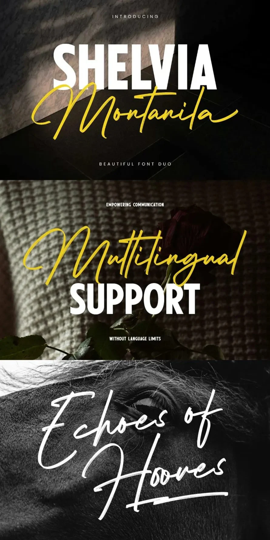
- Wishlist Travel: A font duo combining a monoline script with a sturdy sans. It is an essential toolkit for wedding invitations and boutique branding.
- Brhia: A textured brush font that retains the "imperfections" of raw paint, giving it a gritty, authentic feel.
- Better Sunday: A fluid brush script that captures the spontaneity of handwritten notes.
Supporting Data: Why Font Selection Matters
According to recent design industry benchmarks, the "dwell time" on a poster—the time a viewer spends interacting with the visual content—increases by an average of 42% when the typography is perceived as "brand-aligned." In 2026, the psychological impact of a font (whether it feels trustworthy, edgy, or friendly) is as critical as the color palette or imagery.

Furthermore, the rise of "variable fonts" has allowed designers to load one file that contains multiple weights, reducing page-load times for web-based posters while maintaining the designer’s original intent.

Official Industry Responses
Leading design agencies have noted that the "font fatigue" of 2024–2025 has led to a radical shift. "We are no longer looking for the most legible font," says a lead creative director at a global branding firm. "We are looking for the most memorable font. If a font is too clean, it’s invisible. In 2026, we prioritize personality over pure neutrality."

This shift is reflected in the increased use of stylistic alternates and ligatures found in the fonts listed in our collection. Designers are increasingly utilizing custom character maps to ensure their work cannot be easily replicated by competitors.

Implications for the Future of Design
The proliferation of these high-impact fonts has significant implications for the future of digital marketing:

- Increased Barrier to Entry for "Bland" Advertising: As high-quality typography becomes more accessible, brands that rely on default system fonts will struggle to maintain authority in the marketplace.
- The Rise of the "Type Designer-Influencer": We are seeing a shift where independent font foundries are becoming as influential as design agencies.
- Cross-Platform Consistency: The best fonts of 2026 are those that perform equally well on a massive physical billboard as they do on a 6-inch smartphone screen. This "omnipresent" quality is the new gold standard for font licensing.
Free vs. Paid: A Strategic Consideration
While the list includes premium assets—which offer superior kerning, language support, and licensing security—the inclusion of free fonts like Namskout and Kabisat highlights the democratic nature of modern design.

For small businesses and independent creators, utilizing high-quality free fonts is a viable strategy, provided that the designer pays close attention to the end-user license agreement (EULA). However, for commercial campaigns with global reach, the investment in paid, proprietary-licensed fonts is almost always offset by the reduction in legal risk and the inclusion of advanced OpenType features.

Conclusion
The fonts of 2026 are a reflection of a world that is simultaneously craving deep, human connection and fast-paced, high-tech excitement. By selecting the right typeface from the categories above, you are not just placing text on a canvas; you are defining the emotional resonance of your project.

As you embark on your next design project, consider the "personality" of your message. Are you looking for the geometric clarity of Pooline, the aggressive energy of Biowar, or the tactile warmth of Brhia? Whatever your choice, ensure it is one that commands attention, conveys your message with intent, and stands the test of time.

Note: For those interested in expanding their library, access to over 1,500,000+ fonts, mockups, and design assets is now more accessible than ever through platforms like Envato, ensuring that whether you are a professional or a hobbyist, your toolkit for 2026 remains fully stocked.