The history of the Fantastic Four in cinema is a landscape littered with "what-ifs." For decades, Marvel’s First Family has been the crown jewel of comic book lore, yet they have struggled to find a definitive, critically acclaimed home on the silver screen. Among the various challenges—balancing high-concept science fiction with grounded family dynamics—no hurdle has been quite as steep as the realization of Ben Grimm, the Thing.
Recently, renowned concept artist Jerad S. Marantz pulled back the curtain on a forgotten chapter of this struggle, sharing early development designs from a scrapped Fantastic Four project dating back to the late 2000s. These illustrations provide a rare, jarring glimpse into how close the franchise came to abandoning the classic, iconic look of the character in favor of experimental, grittier aesthetics.
A Legacy of Iteration: The Chronology of Adaptation
The quest to bring the Fantastic Four to life has been a long, arduous journey marked by shifting studio control and evolving visual effects technology. While the 2005 Fantastic Four and its sequel managed a degree of pop-culture success, they relied heavily on physical prosthetics, which often limited the character’s range of motion and emotive potential. Later, the 2015 reboot attempted a radical tonal shift, resulting in a version of the Thing that felt disconnected from the warmth of the source material.

The timeline of these iterations reveals a constant push-pull between the studio’s desire for "cinematic realism" and the comic book’s inherent, stylized aesthetic.
- The Early Prosthetic Era (2005–2007): Focused on practical effects to maintain a tangible presence on set, though the actor (Michael Chiklis) was effectively buried under heavy makeup.
- The Experimental Development Phase (Late 2000s): A period of flux where various drafts and visual concepts were pitched for a potential reboot. It is here that Jerad S. Marantz’s newly revealed designs originated.
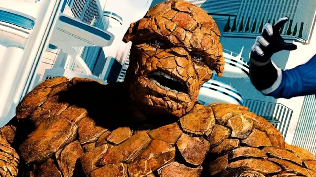
- The Gritty Reboot Attempt (2015): Josh Trank’s vision prioritized a "found-footage" style of horror, leading to a Thing that appeared as a collection of jagged, irregular stone shards, devoid of the classic, human-like structure.
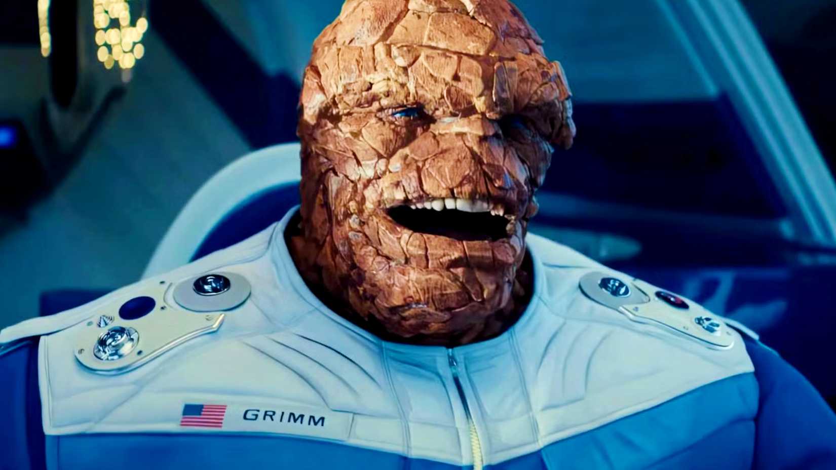
- The Modern Era (2025–2026): With The Fantastic Four: First Steps, Marvel Studios finally embraced the "Jack Kirby" aesthetic, utilizing high-fidelity digital rendering to capture the expressiveness that only comic art had previously achieved.
The Marantz Archive: A Window Into What Might Have Been
Jerad S. Marantz, an artist whose portfolio includes some of the most iconic designs in modern superhero cinema, recently took to social media to showcase his work on the ill-fated late 2000s project. These designs are startling in their variety, highlighting the creative uncertainty that permeated Marvel productions before the full consolidation of the Marvel Cinematic Universe (MCU).
The Anatomy of the Lost Thing
The concepts shared by Marantz range from the bizarre to the monstrous. Some iterations featured a more hunched, "pot-bellied" silhouette, while others leaned into a terrifying, biomechanical aesthetic with sharp, protruding bone-like structures reminiscent of the Abomination. One design, in particular, utilized a uniform set of circular grey stones, creating a look that felt more like a geological specimen than a living, breathing person.

These designs were not merely artistic flourishes; they were attempts to solve the "uncanny valley" problem. Studios were terrified that a bright orange, blocky, four-fingered man would look silly in a live-action setting. Consequently, the art team experimented with textures that looked more like real-world granite or slate. While visually interesting as standalone pieces of concept art, they lacked the soul of Ben Grimm. They were monsters, not the "Ever-Lovin’ Blue-Eyed Thing."
The Essential Conflict: Realism vs. Iconography
The central thesis of the Fantastic Four—that they are a family first and superheroes second—relies heavily on Ben Grimm being the group’s emotional anchor. When he is depicted as a horrifying, asymmetrical beast, the audience loses the ability to empathize with his tragic plight.
The Failure of "Biological Plausibility"
In the 2015 Fantastic Four reboot, the production leaned heavily into the idea that a man turned into stone would look "biologically plausible." The resulting design, characterized by sharp, irregular edges and an absence of clothing, served to alienate the audience. It treated Ben Grimm’s transformation as a deformity to be hidden, rather than a defining feature of a hero.
As history has shown, the "realistic" approach is fundamentally flawed. When you attempt to apply the laws of biology to a character whose very existence is rooted in cosmic, Kirby-esque abstraction, the result is a creature that feels like a special effect rather than a person. By stripping away the artistic exaggerations—the thick brow, the expressive, deep-set eyes, and the blocky, almost tectonic plate-like skin—the "realism" actually makes the character less believable.
Lessons Learned: Why First Steps Got It Right
The arrival of The Fantastic Four: First Steps marks a significant departure from the trend of "grittifying" the character. By opting for a design that pays direct homage to Jack Kirby’s original illustrations, Marvel Studios has effectively validated the belief that comic accuracy is the most effective form of realism.
The current version of the Thing, portrayed through the performance of Ebon Moss-Bachrach, utilizes the freedom of digital animation to mirror the character’s classic facial expressions. The "blocky" design isn’t a limitation; it is a language. It allows the audience to read Ben’s emotions—his sadness, his humor, and his unwavering loyalty—through a design that has worked for over sixty years on the printed page.

Implications for Future Adaptations
The revelation of Marantz’s lost designs serves as a cautionary tale for the industry. It underscores a critical realization: that some characters possess an "iconic threshold" that cannot be crossed without sacrificing the core of the story.
- Trust the Source Material: Marvel’s success with its current iteration proves that fans are more accepting of "comic-accurate" visuals than executives previously assumed.
- Performance Over Aesthetic: The best version of the Thing is the one that allows the actor’s performance to shine through the digital mask. When the design is too "realistic" or complex, it obscures the humanity of the performance.
- Visual Language as Narrative: The Thing’s appearance is not just a costume; it is his story. His struggle with his appearance is a human story, and it requires a design that audiences can find both sympathetic and heroic.
Conclusion: A New Standard
As we look back at the discarded concepts of the late 2000s, we see the echoes of an industry still learning how to translate the language of comics into the language of film. The transition from the disjointed, gritty experiments of the past to the cohesive, faithful design of The Fantastic Four: First Steps represents a coming-of-age for superhero cinema.
The Thing, as it turns out, never needed to be "reimagined" or "made realistic." He only needed to be understood as he was intended: a man with a heart of gold, trapped in a shell that is as enduring and iconic as the history of Marvel itself. The discarded designs of the past will remain as curiosities—a reminder of a time when Hollywood was afraid of the comic book, rather than inspired by it. Today, the Thing stands as a testament to the fact that sometimes, the original vision is the only one that truly works.