As Sporting Clube de Portugal (SCP) approaches its historic 120th anniversary, the legendary Lisbon-based football institution has unveiled a comprehensive brand transformation. This is not merely a cosmetic update; it is a profound strategic realignment intended to bridge the gap between a storied century-old heritage and the digital-first demands of modern global sports culture. Developed in collaboration with the renowned global branding agency JKR, the new visual identity serves as a manifesto for the future, distilling the "Code" of the club into a cohesive, versatile, and emotionally resonant design system.
The Foundation: Honoring the Five Pillars of SCP
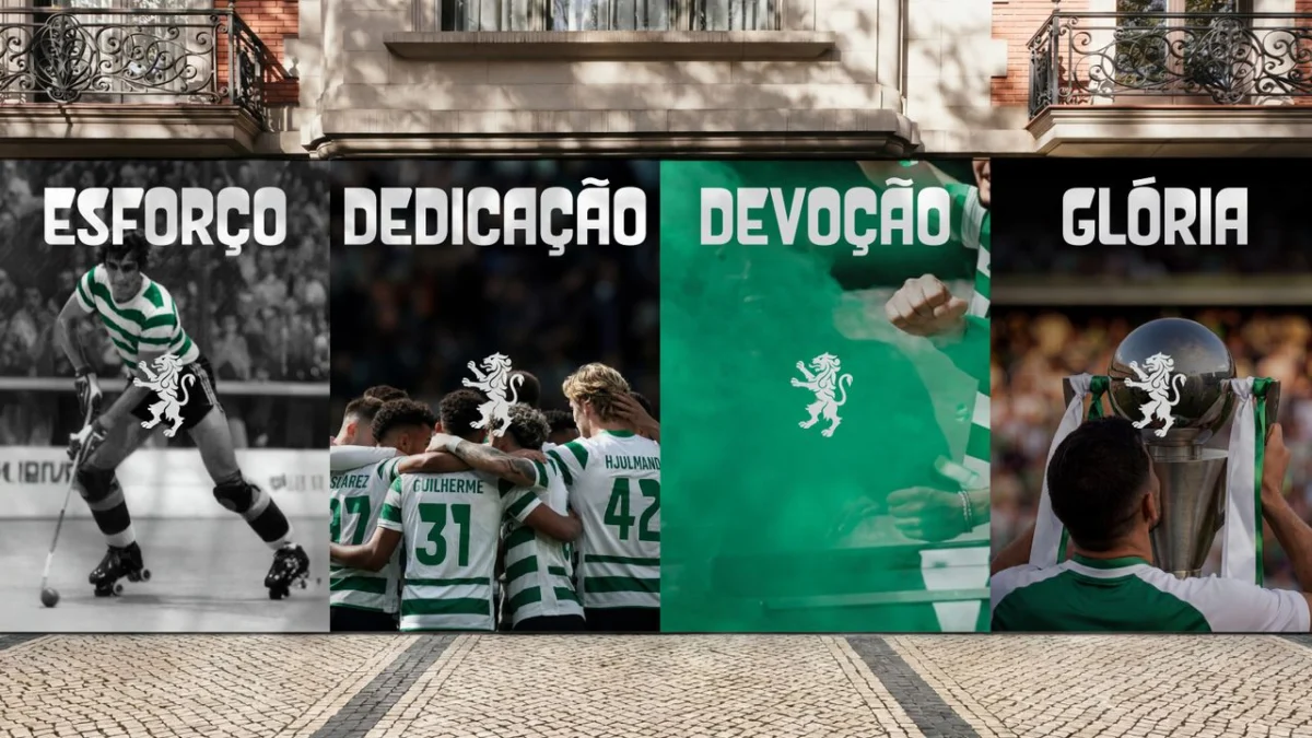
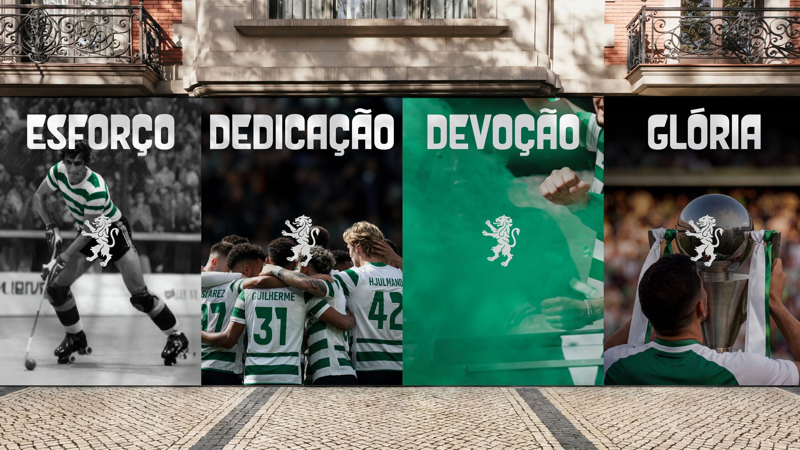
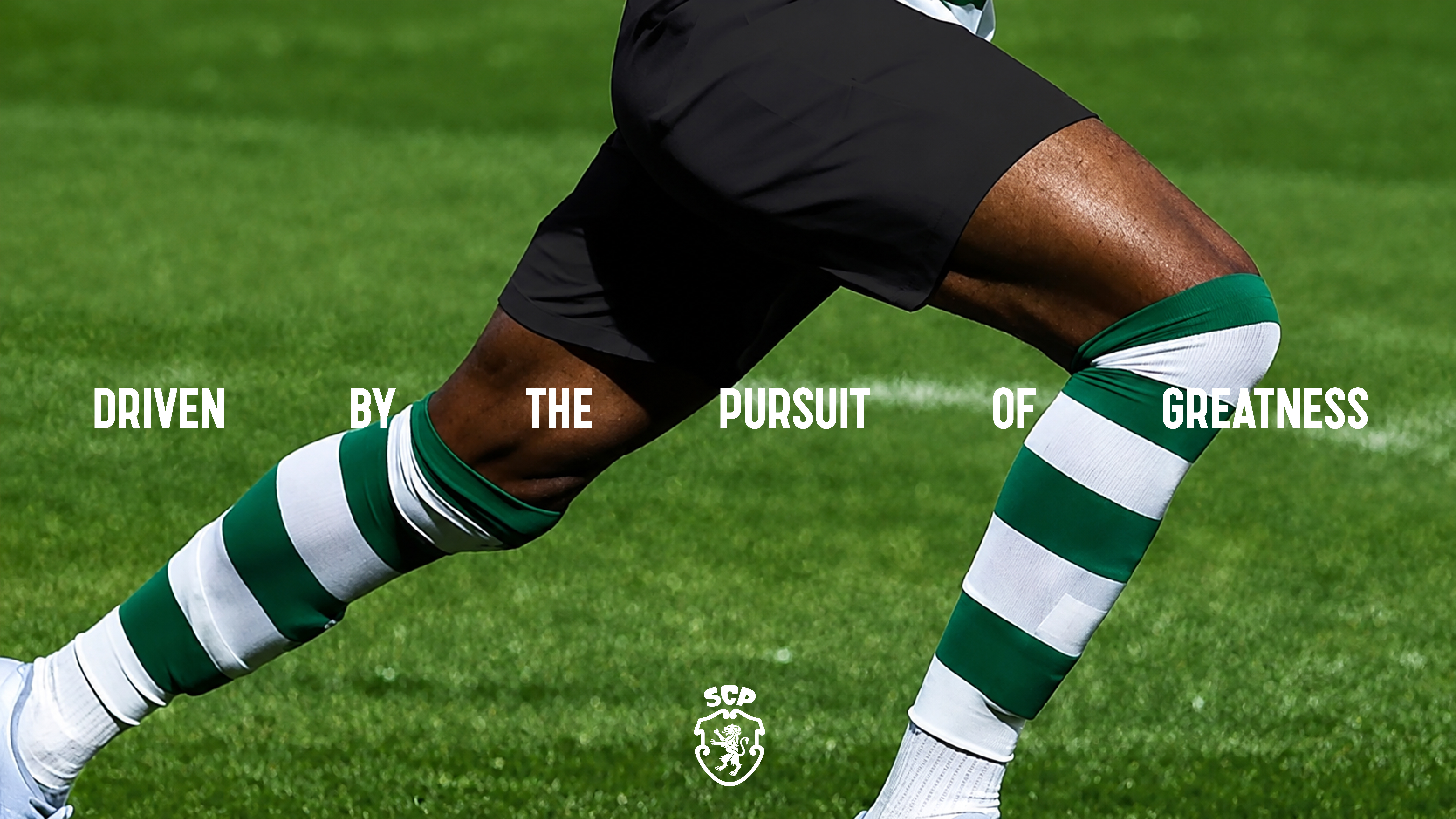
The core of this rebranding effort lies in the synthesis of five fundamental symbols that have defined the club’s identity since its inception: the Porta 10-A, the Stripes, the Shield, the Crown, and the Lion. Rather than discarding these elements, JKR’s approach was one of meticulous curation, refining these motifs to function effectively across diverse media—from high-resolution stadium screens and digital social assets to traditional embroidered match kits.
The Porta 10-A—the legendary gate at the Estádio José Alvalade through which players enter the pitch—has been abstracted into an elegant, recurring geometric pattern. This serves as a sophisticated thread connecting the physical environment of the club to its visual collateral. The Shield, a bedrock of Portuguese heraldic tradition, remains the anchor of the crest, modernized to provide a cleaner silhouette without losing its historical weight. The Crown, representing the club’s historical prestige, now sits atop a bespoke typeface, "Sporting Sans," which provides the brand with a contemporary, authoritative voice. The Lion, perhaps the most vital symbol of the fanbase’s spirit, has been refined to embody power and resilience, drawing subtle inspiration from the evolution of the club’s five previous official emblems. Finally, the Green and White Stripes serve as the engine of the brand’s dynamic motion design, providing a signature visual rhythm that is instantly recognizable to any football enthusiast.
A Chronology of Identity: From 1906 to the Present
Sporting Clube de Portugal’s visual evolution is a reflection of the changing tides of 20th and 21st-century design. Founded in 1906, the club’s visual identity has always sought to balance the aristocratic roots of its founding members with the grassroots passion of its massive, global fan base.
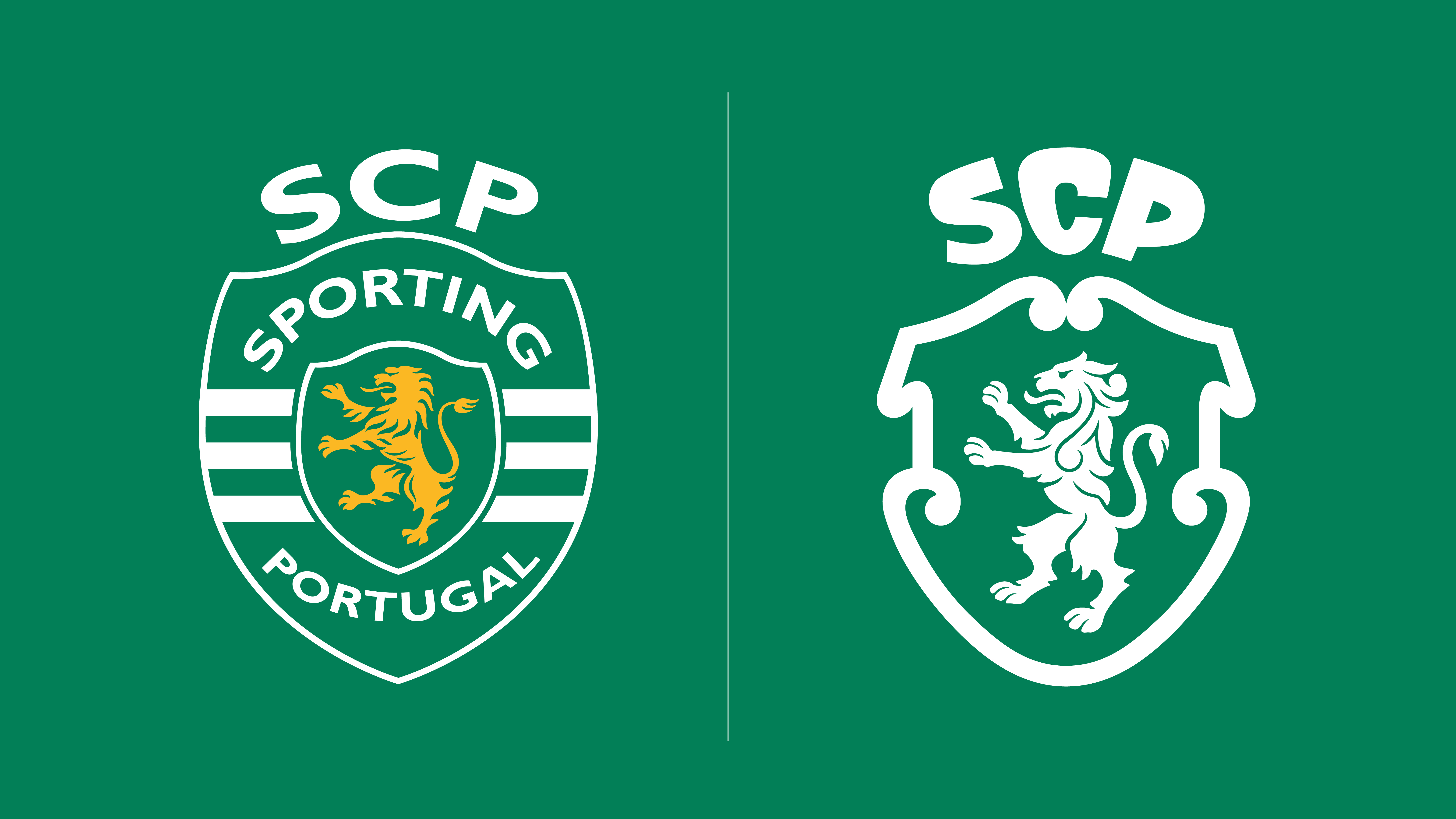
Throughout the decades, the crest has undergone several iterations, each attempting to simplify the complex heraldry of the early 20th century. The 1945 emblem, in particular, has been cited as a major influence for the current 2024 redesign. By returning to these mid-century roots, JKR has managed to strip away the "noise" that accumulated during the late 90s and 2000s, when digital reproduction often necessitated cluttered designs to compensate for low-resolution screens.
In 2024, the priority has shifted. The design is now "digital-first," meaning it is built for clarity on a smartphone screen as much as it is for the facade of a stadium. The transition from the previous crest to the current iteration marks a deliberate move toward minimalism, ensuring that the club’s symbols are scalable and adaptable across the increasingly fragmented landscape of sports broadcasting and digital media.

The Strategy Behind the Aesthetics: Data and Design
Why do clubs, particularly those with such deep-seated traditional values, opt for these sweeping changes? In the modern era of European football, a brand identity is no longer just a crest on a shirt; it is the primary interface through which a global audience interacts with the club.
Research into sports branding consistently shows that younger demographics (Gen Z and Alpha) prioritize "legibility" and "aesthetic versatility." A complex, multi-layered logo is often difficult to replicate on merchandise, social media avatars, or AR (augmented reality) applications. By streamlining the SCP crest, the club is effectively lowering the barrier to entry for international fans who may be less familiar with the complex historical nuances of Portuguese heraldry.
Furthermore, the implementation of "Sporting Sans" is a calculated move to own the club’s verbal communication. In the high-stakes world of sports marketing, custom typography allows for brand consistency that standard commercial fonts cannot achieve. By controlling the typeface, Sporting CP ensures that every piece of communication—from press releases to stadium signage—feels like a deliberate extension of the club’s core identity.
Official Perspectives: The Philosophy of Evolution
The creative direction behind this project was spearheaded by Sean Thomas, Global Executive Creative Director at JKR. In his official statement, Thomas emphasized that the goal was not "re-invention," but "re-affirmation."
"This was not a case of starting from scratch," Thomas noted. "It was about staying faithful to the club’s legacy and true to its loyal fans, while attracting and remaining relevant to the next generation and wider culture. Our job was to build a brand system that carries the spirit of Sporting CP forward without limits, a visual language as distinctive and ambitious as the club itself."
The collaboration between the club’s internal stakeholders and the agency was reportedly exhaustive. It involved deep dives into the club’s archives to understand the emotional weight of each of the five pillars. The management at Sporting CP understood that the most dangerous aspect of a rebrand is the alienation of the "hardcore" supporters. By incorporating elements of the 1945 design, they provided a bridge for long-time fans, anchoring the new in the familiar.
The Implications: What This Means for the Future
The rebranding of Sporting Clube de Portugal carries significant implications for the wider sports industry, particularly within the Primeira Liga and beyond.
- Standardization of Heritage: We are seeing a trend where major European clubs are looking backward to move forward. The "retro-modern" aesthetic is currently the gold standard in sports design, as it balances the nostalgia of the past with the technical requirements of the future.
- The Digital-First Mandate: The success of this rebrand will likely be measured by its performance on digital platforms. If the new visual system increases engagement rates on social media or enhances the "premium" feel of official merchandise, it will be viewed as a success.
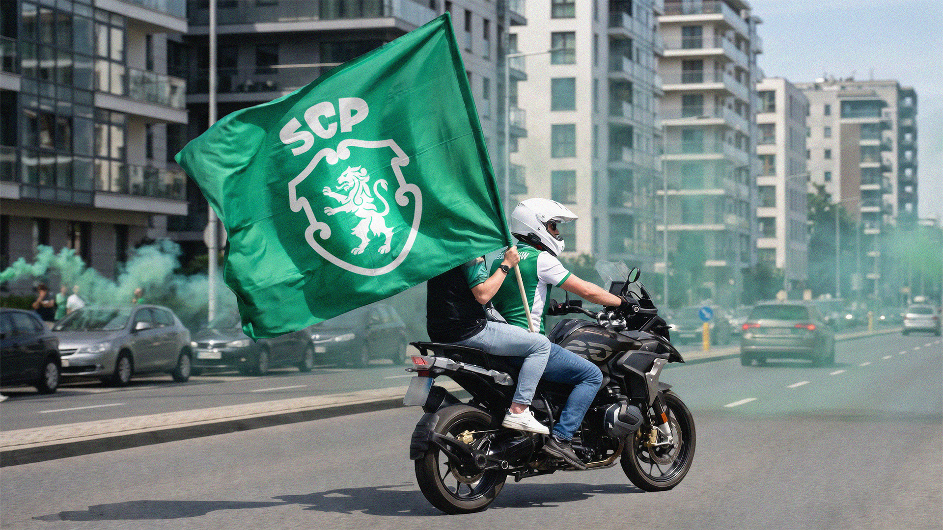
- Cultural Positioning: By positioning the brand as a "culture-first" entity rather than just a football club, SCP is signaling its intent to compete with global lifestyle brands. This move is essential for clubs looking to diversify revenue streams through fashion, content creation, and global partnerships.
Conclusion: A Club for the Next Century
Sporting Clube de Portugal has successfully walked the tightrope between tradition and innovation. The 120th-anniversary rebrand is a masterclass in how to honor institutional history while ensuring that the brand remains a living, breathing entity.
By grounding their new identity in the five pillars of the "Code"—the gate, the stripes, the shield, the crown, and the lion—the club has provided its supporters with a visual shorthand for their identity. As the club moves into its next 120 years, it does so with a brand identity that is as resilient, ambitious, and iconic as the history it represents. In an industry often characterized by fleeting trends and radical, sometimes alienating, design changes, SCP has chosen a path of thoughtful evolution—one that respects the past, acknowledges the present, and prepares for the future.
Whether seen on a match-day kit in Lisbon or a digital screen in a distant market, the new Sporting CP brand stands as a testament to the idea that design is the most powerful tool a club has to communicate its heart and purpose to the world.