
In an era defined by "dating app fatigue" and a growing cultural disillusionment with digital romance, Tinder is attempting a significant strategic pivot. The world’s most recognizable dating platform has unveiled a comprehensive brand identity overhaul, moving away from its utilitarian, tech-centric roots toward a more intimate, human-focused narrative. Spearheaded by the creative agency Porto Rocha, this transformation is more than a mere logo tweak; it is a calculated effort to reposition Tinder as a portal to authentic, real-world connection.
The Evolution of a Digital Titan: Key Facts of the Rebrand
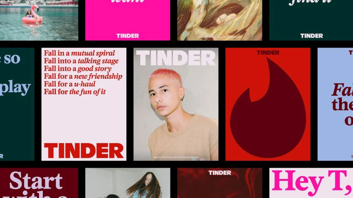
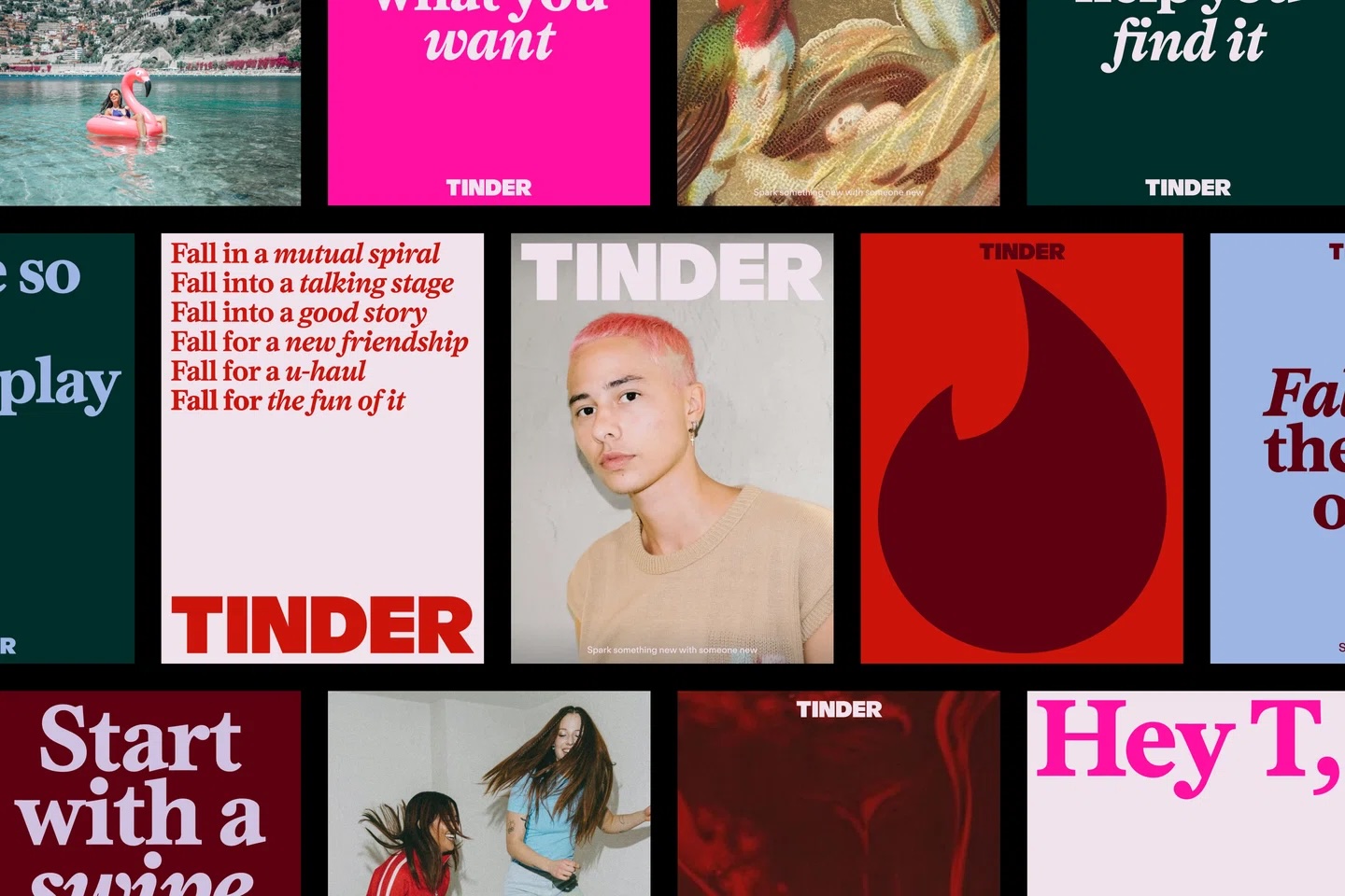
The new identity is built upon a foundation of nostalgia and tactile storytelling. By blending point-and-shoot photography, painterly textures, and a "zine-like" aesthetic, Tinder is actively distancing itself from the sterile, algorithmic feel that has characterized the industry for over a decade.
Central to this new strategy is the introduction of "T," a brand persona modeled after the iconic dating columnist archetype—think Carrie Bradshaw for the modern, digital-native generation. This narrative voice is designed to act as a relatable guide, grounding the brand in the messy, nuanced reality of modern dating.
Core visual and structural changes include:

- Typography: The introduction of a new, bold serif typeface that brings a sense of editorial confidence and authority.
- The Fire Symbol: A sharpened, refined version of the classic flame, signaling a more modern and precise brand identity.
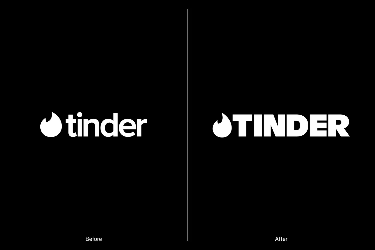
- Wordmark: The transition to an all-caps wordmark, designed to balance the softer, more human-centric imagery with a sense of structural permanence.
- Color Palette: An expanded spectrum that moves beyond the traditional singular red to include blues and greens, representing the full emotional arc of the dating experience.
A Chronology of the Swipe: From Disruptor to Cultural Staple
To understand the necessity of this rebrand, one must look at the trajectory of the platform. Launched in 2012, Tinder fundamentally changed the sociopolitical landscape of courtship. By gamifying the process of meeting new people, it democratized dating, yet it simultaneously introduced a culture of endless choice and disposability.
- 2012–2015: The Disruptive Phase. Tinder enters the market, normalizing location-based mobile dating and becoming a pop-culture phenomenon.
- 2016–2019: The Scaling Phase. The platform focuses on user acquisition, introducing premium tiers (Tinder Gold, Plus) and global expansion.
- 2020–2022: The Pandemic Shift. As global lockdowns forced users into virtual interactions, Tinder’s brand became synonymous with digital-only connectivity, arguably deepening the "disillusionment" mentioned by current critics.
- 2023–2024: The Authenticity Era. Recognizing that users are increasingly seeking "offline" outcomes, the company shifts its brand strategy from being a "game" to being a "bridge" to real-world relationships.
Supporting Data: The Case for a Human-Centric Shift
Market research consistently highlights a growing trend among Gen Z and younger Millennials: a desire for intentionality. According to various industry reports, the "swipe fatigue" phenomenon is statistically linked to high churn rates on major dating platforms.
The decision to adopt a "zine-y," tactile visual identity is not merely an aesthetic choice; it is a data-backed response to the desire for "slow living" and authentic expression. By utilizing multimedia imagery—ranging from oil paintings to raw, amateur-style photography—Tinder is effectively "humanizing the interface." This mirrors the broader design shift seen in high-end editorial and lifestyle branding, where users are increasingly skeptical of hyper-polished, AI-generated imagery and instead gravitate toward content that feels "lived-in" and "real."
Official Perspectives: The Design Philosophy
Yedo Han, Senior Designer at Porto Rocha, has been instrumental in articulating the logic behind these aesthetic choices. In discussions regarding the project, Han emphasized that the all-caps wordmark serves as a necessary anchor.
"The all-caps typography balances out the softer side of the brand," Han noted. "With the updated color palette and the new serif, we are creating a sense of boldness. It feels like a more declarative statement—a new force reclaiming the dating scene."
The incorporation of blue and green hues into the traditional red-dominant palette is intended to mirror the emotional complexity of the user journey. Dating is rarely just "red" (passion/excitement); it is often "blue" (vulnerability/uncertainty) or "green" (growth/new beginnings). By acknowledging this spectrum, Tinder is attempting to position itself as a companion through the emotional highs and lows of the search for a partner.
Implications: Can a Brand Rebrand Human Connection?
The ultimate question remains: can a digital platform effectively market itself as an antidote to the very technology it popularized?
The "Carrie Bradshaw" Effect
By injecting the persona of a "dating columnist" into the brand, Tinder is attempting to reclaim the narrative. In the past, the "Tinder experience" was defined by the user’s individual, often lonely, experience. By adopting a brand voice, Tinder hopes to frame the process as a collective, relatable journey. This move is a direct attempt to pivot from being a "tool" to being a "lifestyle brand."
Reclaiming the "Offline" Narrative
The most significant implication of this rebrand is the shift in messaging. Taglines like "It starts with a swipe" are being evolved to emphasize the outcome rather than the process. By focusing on what happens after the match, Tinder is implicitly admitting that the "swipe" is merely a means to an end. This is a massive shift in marketing psychology—acknowledging that the most successful outcome for a user is, paradoxically, leaving the app.
The Competitive Landscape
The dating app market is currently saturated with competitors attempting to solve the "fatigue" problem, from Hinge’s "designed to be deleted" philosophy to niche, interest-based platforms. Tinder’s rebrand is a defensive move to ensure it does not lose its dominance to apps that promise a more "serious" or "authentic" user experience.
Conclusion
Tinder’s latest rebrand is a masterclass in adapting to a shifting cultural zeitgeist. Whether this transition will successfully mitigate the pervasive feelings of loneliness and burnout associated with digital dating is yet to be seen. However, by embracing a more tactile, emotional, and voice-driven identity, the company is signaling that it understands the core issue: modern users no longer want to play a game; they want to build a life.
If the rebrand succeeds, it will be because it managed to convince its audience that beneath the pixels and the swipes, there is a genuine, human-centric intent. If it fails, it will serve as a stark reminder that no amount of excellent design can replace the raw, unpredictable reality of human attraction. As we watch this new chapter unfold, the industry will undoubtedly be looking to see if Tinder can truly bridge the gap between the screen and the real world.