

In the high-stakes world of municipal branding, the transition from a legacy identity to a modern, streamlined visual system is a perilous tightrope walk. A city’s logo is more than just a graphic; it is a synthesis of local history, community values, and geographic identity. When a municipality attempts to pivot toward a minimalist, corporate-friendly aesthetic, it often finds itself caught between the necessity of digital scalability and the deep-seated attachment residents have to their long-standing visual markers.
The City of Bloomington, Indiana, has become the latest casualty in this ongoing battle of aesthetics. As the city prepares to unveil a new brand identity, the reception has been less than celebratory. In fact, it has been marked by a wave of digital mockery, with critics pointing to a glaring, anatomical resemblance in the proposed design that has effectively stalled the conversation surrounding the city’s future identity.
A Legacy of Tradition: The 1986 Identity
To understand the current fervor, one must look at the legacy being replaced. Adopted in 1986, the existing City of Bloomington logo is a complex, geometric emblem that draws its inspiration from the local landscape and culture. It is a fusion of the state flower—the peony—and the delicate trout lily. These natural elements are structured within a frame that reflects the geometry of 19th-century regional quilt patterns and the physical layout of the city’s historic Downtown Square.

For nearly four decades, this symbol has served as the visual shorthand for Bloomington. It represents a specific time and place, anchoring the city’s identity in the craftsmanship of the past. It is an ornate, distinct, and highly recognizable mark that has woven itself into the fabric of the community.
The Shift: A Modernist Departure
In an era dominated by mobile applications, social media avatars, and responsive web design, the 1986 logo presents significant technical challenges. Its intricate details become lost when the graphic is shrunk to the size of a browser favicon or a mobile app icon. As the city sought to update its visual presence, the directive appears to have been clear: simplify, modernize, and unify.
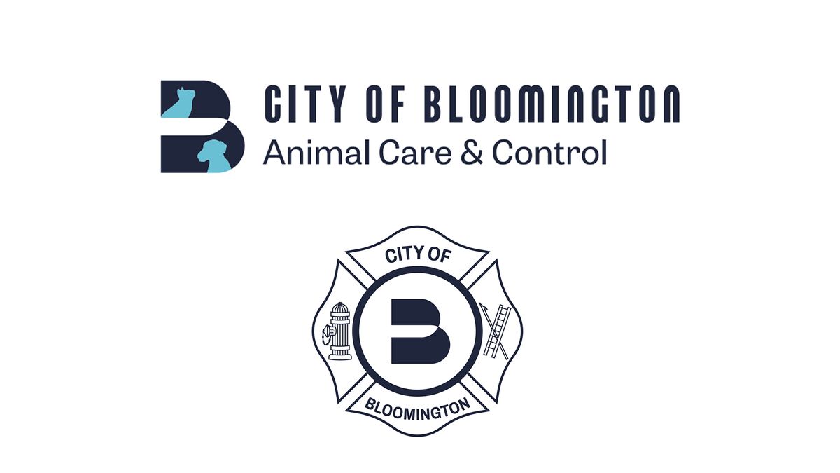
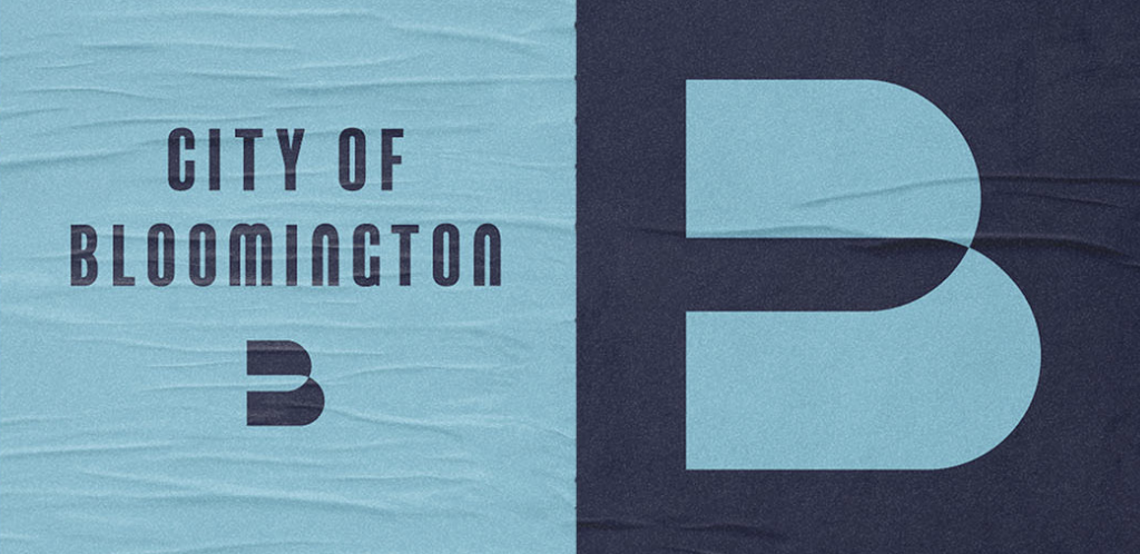
The proposed rebrand replaces the floral, quilt-inspired complexity with a bold, sans-serif letter ‘B’. The brand system, which includes variations for various city departments and services, is designed for maximum legibility and ease of use across digital platforms. On paper, it is a textbook example of "modern corporate identity"—clean, scalable, and versatile. In practice, however, the design has encountered a significant hurdle: the human brain’s innate ability to identify patterns, especially those that are slightly suggestive.

The Anatomy of an Oversight: "The Butt" Controversy
The primary point of contention—and the source of the most vocal criticism—is the shape of the letter ‘B’ itself. Critics have been quick to point out that the two rounded lobes of the letter, pinched together at the center, bear an unmistakable resemblance to a human posterior.
Dave Askins, editor of the local news outlet B Square Bulletin, captured the public sentiment in a blistering editorial titled: "Proposed new Bloomington logo looks like a butt." The critique, while humorous in its delivery, touches on a serious design failure: the lack of rigorous "stress-testing" of a logo against unintended associations.
Askins noted that while the color palette is modern and the typography is clean, the physical form of the letter is inherently problematic. "The two enormous rounded lobes, pinched together at the center, do not just allow that interpretation. They practically invite it," he wrote. The critique went further, suggesting that the logo’s silhouette, when viewed from certain angles or with slight creative interpretation, evokes imagery that is entirely at odds with the dignity of a municipal office.

The "B" Problem: A Crisis of Uniqueness
Beyond the anatomical jokes lies a more fundamental design concern: the lack of distinctiveness. In the global design landscape, the letter ‘B’ is a common motif. By stripping away the unique historical markers of the 1986 logo in favor of a generic, albeit modern, ‘B’, Bloomington risks losing its visual soul.
As critics have pointed out, the proposed logo bears a striking resemblance to a myriad of other entities—from small law firms and digital startups to e-commerce platforms like Boatseekr.com or various app-based services. When a city’s primary identifier looks like a template pulled from a low-cost design marketplace, it diminishes the sense of place. A city is not a startup; it is a community with a long, textured history. When that history is erased in favor of a generic letter, residents are left feeling that the brand represents a "corporate" version of their home, rather than the city itself.
The Chronology of the Rebrand
The process of this rebrand has been a slow-burn evolution. Over the past several months, city officials have worked to develop a brand system that would consolidate the visual identities of various city departments, which had previously operated with disparate logos.
- Initial Research: The city identified the need for a cohesive brand system to improve municipal communication and digital accessibility.
- Design Phase: Agencies were tasked with creating a system that was "simple, clean, and representative of a modern Bloomington."
- Internal Review: The designs underwent internal vetting, likely focusing on technical specifications, scalability, and color theory.
- Public Unveiling: The reveal of the new logo was met with immediate, visceral backlash from the local community, predominantly through social media platforms like Reddit and local news comment sections.
- The Impending Council Meeting: The logo is currently scheduled for formal presentation at the City of Bloomington Council’s upcoming meeting, where the debate is expected to move from online forums to the floor of local government.
Implications for Municipal Governance
The situation in Bloomington serves as a cautionary tale for city authorities everywhere. Branding is not merely a task for graphic designers; it is a political act. When a city changes its logo, it is changing the way it communicates its identity to the world.
The "butt" controversy highlights the necessity of diverse focus groups. Had the logo been presented to a wider, more varied demographic—specifically teenagers or demographics prone to spotting such "design fails"—the error might have been caught before the final design was finalized. It is a reminder that in the age of the internet, any visual element that can be misinterpreted will be, and it will be amplified globally within minutes.
The Way Forward: Authenticity vs. Minimalism
As the city council prepares to deliberate on the future of the new logo, they face a difficult choice. They can stick to the proposed design, likely enduring years of "butt-related" jokes from citizens, or they can scrap the design and start over—a move that carries its own costs, both financial and administrative.
The core question remains: how does a city balance the need for modern functionality with the preservation of its unique character? Perhaps the answer lies in a synthesis—a design that retains the simplicity required for a smartphone age while incorporating the subtle, meaningful nods to local geography or history that made the 1986 logo a classic.
A good city logo, as Askins argued in his editorial, does not necessarily need to be a literal depiction of a landmark, but it must possess enough "personality to become unmistakably ours."
As Bloomington stands at this crossroads, the conversation has become about more than just a logo. It is a conversation about who the city is, who it wants to be, and whether it is possible to modernize without losing the quirky, historical, and deeply human spirit that residents call home. Whether the "B" stays or goes, the lesson for designers and city officials alike is clear: before you put a new face on a city, make sure you look at it from every possible angle.