 Layla Zulfa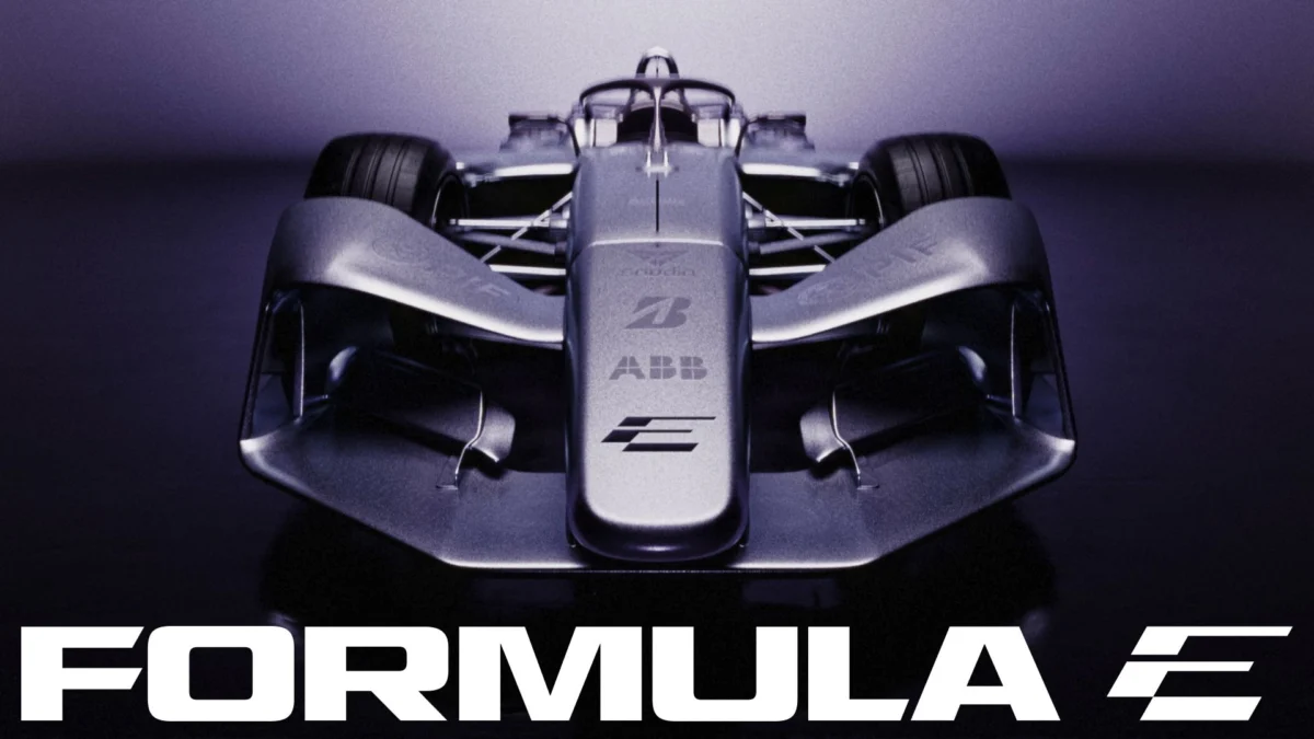
As the ABB FIA Formula E World Championship prepares to bridge the gap between cutting-edge electric vehicle technology and elite motorsport, the organization has taken a decisive step to align its visual identity with its burgeoning ambition. The unveiling of a sophisticated, high-velocity rebrand marks more than just a surface-level aesthetic shift; it represents a fundamental recalibration of the brand as it moves toward the highly anticipated GEN4 era.
Developed in partnership with the global creative agency MOX, the new identity is designed to strip away the "comfort" of the past, replacing it with a sharper, more provocative visual language that reflects the inherent speed and innovation of electric racing.
The Core Transformation: Anatomy of the New Identity
At the heart of the rebrand lies a fundamental reimagining of the Formula E logomark. The previous iteration served the championship well during its formative years, but as the sport has matured, the need for a more versatile and aggressive icon became apparent.
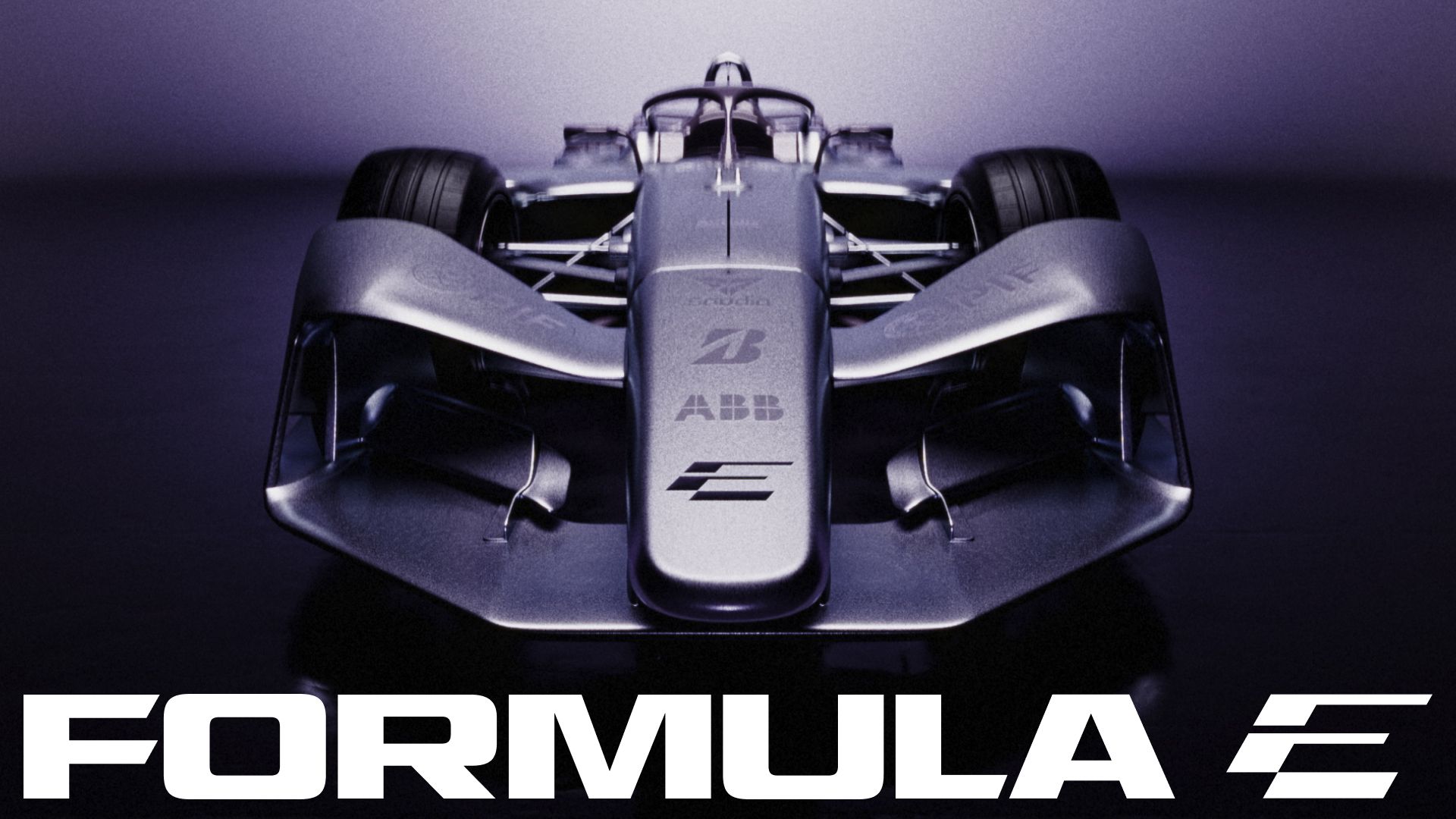
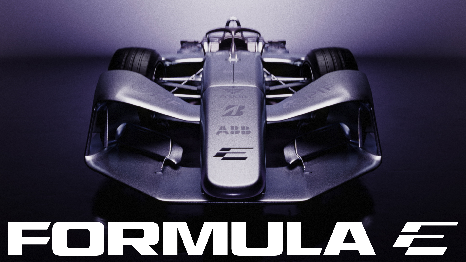
The new mark is a study in visual duality. By blending the letters ‘F’ and ‘E’ into a single, cohesive unit, the design achieves a level of abstraction that is both modern and instantly recognizable. Resting at a deliberate 30-degree angle, the logo is imbued with a sense of kinetic energy, mimicking the lean of a car cornering at high speeds.
The "Marmite" Philosophy
Matt Bolton, creative director and co-founder at MOX, describes the design process as a move away from the "safe" design choices that often plague sports branding. "Anything that feels comfortable straight away dates quickly," Bolton notes. "We went for a ‘Marmite’ icon. It throws you at first, then it grows on you, and that’s what keeps it standing up in five seasons. You read the ‘E’ immediately. The ‘F’ is what you find afterwards."
This approach—prioritizing longevity over immediate, easy gratification—underscores a shift in how the championship views itself. It is no longer an experimental project; it is a global, premium sporting product that demands a sophisticated visual identity.
A Chronological Evolution of Formula E Branding
To understand the significance of this shift, one must look at the trajectory of the championship since its inception.
- 2014: The Birth of the Electric Era: The inaugural logo focused on the letters ‘FE’ with a stylized lightning bolt, emphasizing the novelty of electric power. It was clean, functional, and served to educate a public unfamiliar with the concept of electric grand prix racing.
- 2018: The GEN2 Evolution: As the cars became more aerodynamic and futuristic, the branding leaned into a more aggressive, angular aesthetic. This era solidified Formula E as a distinct, "tech-first" motorsport, moving away from traditional combustion-era tropes.
- 2022: The GEN3 Milestone: With the introduction of the fastest, lightest, and most efficient electric racing car ever built, the branding became more streamlined. However, it still relied on existing design frameworks that the championship has now deemed too restrictive.
- 2024/2025: The GEN4 Precursor: The current rebrand represents a total departure. By moving to a bespoke, motion-first identity, Formula E is acknowledging that its primary audience consumes content through dynamic digital channels, social media, and broadcast graphics, rather than static billboards.
Typographic Precision and Colour Theory
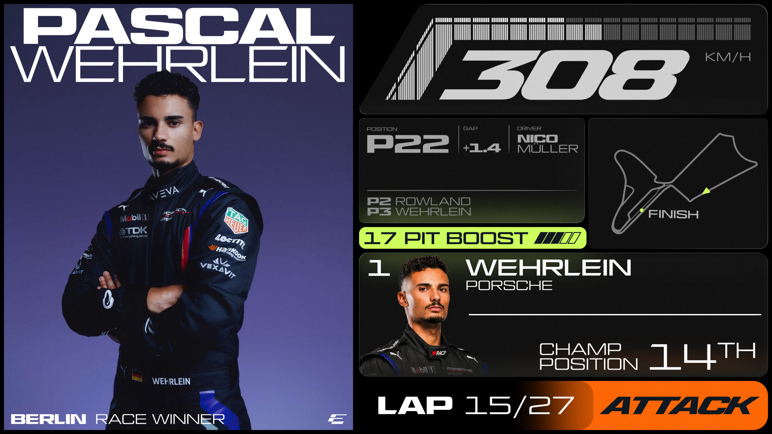
The visual overhaul extends deep into the infrastructure of the brand’s communication tools. Collaborating with the renowned type foundry All Purpose Studio, Formula E has introduced a bespoke typeface family rooted in a customized cut of the typeface AP Gavel.
The Hierarchy of Type
The system is built for extreme flexibility, acknowledging that the brand must look as good on a smartphone screen as it does on a massive trackside banner:
- Turbo Mode: A condensed, italicized variant designed to generate a sense of speed. It is the brand’s "voice" for headlines and high-impact messaging.
- Micro Mono: A utilitarian, technical font used for timestamps, live telemetry, and reference codes. This provides the "sporting data" aesthetic that fans crave.
- Inter: A clean, accessible font utilized for long-form copy, ensuring that the brand remains readable and approachable in journalistic and editorial contexts.
The New Palette: A Future-Forward Spectrum
The color strategy has been completely overhauled to favor vibrancy and high contrast. The introduction of Surge Purple, Signal Orange, and Electric Lime creates a neon-inflected, digital-native palette. These colors are balanced by "Pulse" and "Ignite" gradients, while the entire system is anchored by a sophisticated, neutral Track Grey. This choice of grey is intentional—it provides a concrete, industrial foundation that allows the more "electric" colors to pop during high-octane broadcast moments.
Official Perspectives: Aligning Vision with Execution
Ellie Norman, Chief Marketing Officer of Formula E, has been vocal about the necessity of this change. According to Norman, the previous identity, while effective for the championship’s infancy, was no longer capable of carrying the weight of the brand’s current global influence.
"Our previous identity was created for an earlier stage of our journey," Norman explains. "This modern, expressive brand system matches the scale of our current ambition and gives us a powerful platform to lead the next generation of motorsport."
The collaboration with MOX was not merely a design commission; it was a strategic partnership aimed at ensuring that Formula E remains the premier destination for sustainable racing innovation. By bringing in external experts who specialize in brand disruption, Formula E is signaling that it is willing to challenge its own conventions to remain culturally relevant in a crowded sports landscape.
Implications: What This Means for the Future of Motorsport
The decision to rebrand ahead of the GEN4 era is not just about a logo; it is a signal of intent. The GEN4 cars are expected to push the boundaries of what is possible in electric mobility, and the brand identity must be robust enough to house these technological advancements.
1. Digital Integration
The emphasis on motion graphics and dynamic type indicates that Formula E is prioritizing the digital-first viewer. As the championship grows, the ability to scale the brand across VR, AR, and immersive broadcast experiences will be crucial. This new identity is designed to be animated, fluid, and responsive.
2. Cultural Relevance
Motorsport is currently experiencing a "boom" in popularity, largely driven by younger, digitally savvy audiences. By adopting a aesthetic that feels closer to modern streetwear, tech startups, and luxury lifestyle brands than to traditional, combustion-engine racing, Formula E is positioning itself to capture a demographic that is increasingly concerned with sustainability and technological progress.
3. The "Sporting Edge"
Critics often argue that electric racing lacks the "soul" of traditional motorsport. Formula E’s new identity directly addresses this by leaning into the raw, technical nature of the sport. The use of data-driven design elements like Micro Mono suggests that the championship is proud of its technical complexity and is leaning into it as a core part of its brand narrative.
Conclusion
Formula E’s rebrand is a masterclass in controlled evolution. It manages to retain the core DNA of the championship—innovation, speed, and sustainability—while shedding the visual baggage of its earlier years. In an era where brands often struggle to balance accessibility with professional prestige, Formula E has found a middle ground that is both daring and disciplined.
As the grid prepares for the GEN4 era, the trackside scenery, the digital assets, and the broadcast interface will all be unified under this new, high-velocity design language. The sport is no longer just "the electric alternative"—it is a distinct, forward-looking entity that is confident in its place at the top of the automotive hierarchy.
For designers and motorsport fans alike, the new Formula E identity is a reminder that in a world of constant change, the only way to stay relevant is to move faster than the competition. Whether it’s the 30-degree tilt of the new logo or the neon intensity of the new color palette, Formula E is signaling that it isn’t just watching the future of racing—it is actively defining it.


 Neng Nana
 Nana Wu