 Asep Darmawan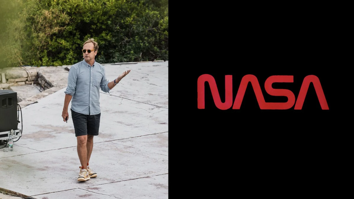
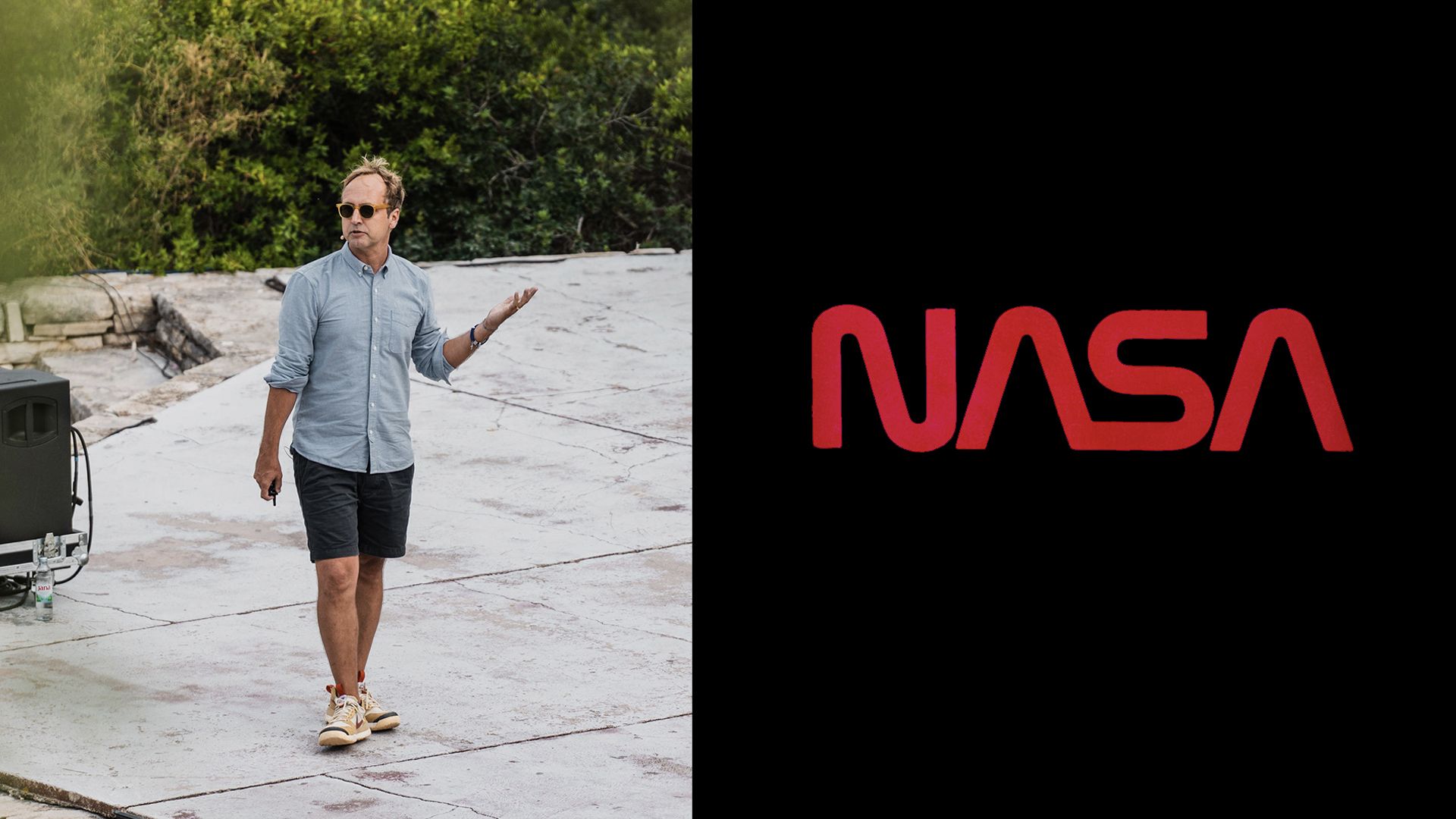
Last week, on the serene, sun-drenched shores of Obanjan Island, Croatia, the creative world converged for Frontify’s Paradigms 2026 conference. Amidst a sea of design industry titans, agency founders, and digital product innovators, one keynote stood out for its unique intersection of bureaucratic rigor and avant-garde aesthetic: David Rager, the Creative Director of NASA.
While the conference played host to a plethora of commercial design leaders, Rager’s presence served as a stark reminder that some of the world’s most influential branding doesn’t live on a store shelf, but in the stratosphere. As the man tasked with overseeing the visual identity of the United States’ premier federal space agency, Rager holds the keys to one of the most recognizable design portfolios in history—including the stewardship of the iconic "Worm" logotype.
In an exclusive follow-up discussion, we explored Rager’s unconventional path to the halls of government, the philosophical weight of managing a heritage brand, and why he has taken the controversial—yet vital—stance of banning AI-generated imagery within the agency’s communications.
The Unconventional Trajectory: From Club Flyers to Cape Canaveral
To understand how a designer becomes the guardian of NASA’s visual legacy, one must first abandon the notion of a "straight line." Rager’s career is a study in creative fluidity. His roots are not in corporate boardrooms, but in the gritty, DIY aesthetic of the underground music scene.
"My beginning in graphic design came through music," Rager explains. "I’ve always been in bands, and when I was in college, I started making flyers, posters, and album covers—first for my own band, then for friends." This grassroots experience provided a foundational understanding of how to communicate complex ideas with limited resources.
His journey eventually took him from the touring circuit to the cultural institutions of Los Angeles and New York, where he navigated the worlds of museum curation and hospitality architecture. It wasn’t until he settled into a neighborhood bordering NASA’s Jet Propulsion Laboratory (JPL) that the possibility of a federal career materialized.
"They were going through a reorganization and needed a design leader," Rager recalls. After a period of consulting that proved his value, NASA realized that their visual communications required more than just sporadic attention—they required a permanent, full-time vision. Rager officially joined the team in 2019, transitioning to the agency’s headquarters in 2023, just as he was finalizing a landmark project: the full-scale revival of the NASA "Worm."
A Chronology of the "Worm" and the "Meatball"
The story of NASA’s branding is a tug-of-war between two distinct eras of American history. To understand Rager’s work, one must understand the "Peace Treaty" he negotiated between the agency’s two most famous visual assets.
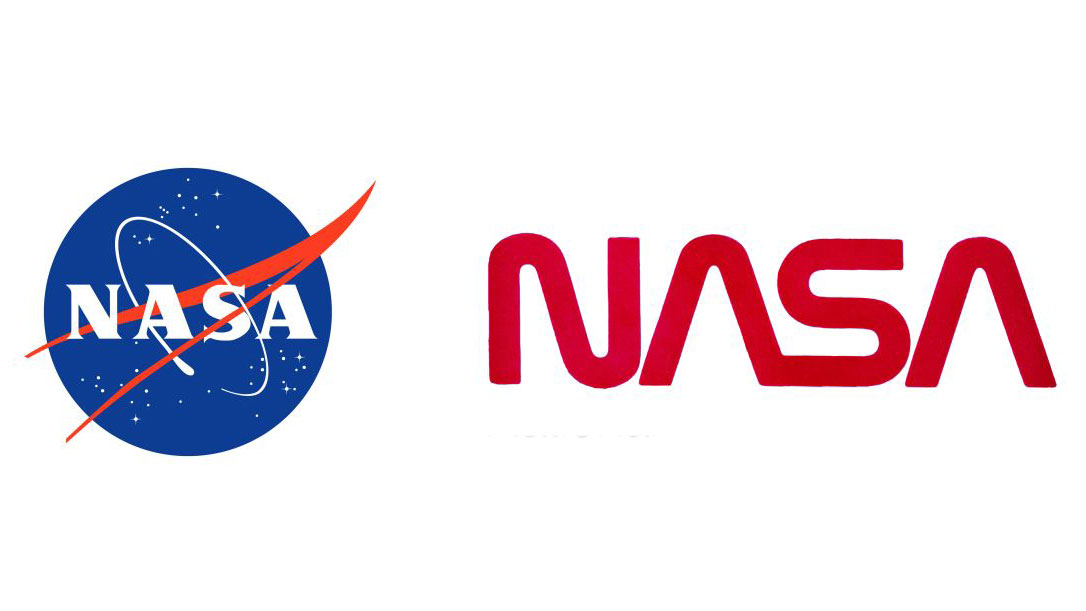
1959: The Birth of the Meatball
The circular insignia, affectionately known as the "meatball," was introduced in 1959. It is a symbol rich with symbolism—the sphere representing a planet, the stars representing space, and the red vector wing representing aeronautics. It is the emblem of the Apollo era, synonymous with the moon landings and the pioneering spirit of early space flight.
1975: The Arrival of the Worm
In the mid-70s, as part of the Federal Graphics Improvement Program, NASA adopted the minimalist, sleek "Worm" logotype. It was a masterpiece of modernism, reflecting the high-tech, forward-looking ethos of the late 20th century.
1992: The Great Erasure
The Worm was abruptly retired in 1992 when an administrator, seeking to recapture the "Apollo energy" of the agency’s earlier years, mandated a return to the meatball. For nearly three decades, the Worm was relegated to history books and vintage shops.
2020–Present: The Resurrection
In 2020, to the delight of space enthusiasts and design purists alike, NASA officially brought the Worm back for limited use, signaling a new chapter in the agency’s history. Under Rager’s guidance, the two logos now coexist, serving different but complementary functions within the agency’s brand architecture.
"The designer of the worm is in his 90s now, and he never thought he would see it used anywhere again," Rager notes. The cultural impact of this revival is such that the Museum of Modern Art (MoMA) in New York recently acquired the logo for its permanent collection, cementing its status as an icon of American graphic design.
Branding the Infinite: The Value of Consistency
Leading a brand that is arguably "too big to fail" presents a unique set of challenges. Unlike a commercial product that needs to capture market share, NASA’s "product" is arguably more abstract: the advancement of human knowledge.
"We’re not selling a product," Rager explains. "What we are selling is optimism and humanity."
However, maintaining this brand within a massive federal bureaucracy is difficult. Rager notes that approximately 30% of NASA’s staff have spent their entire careers at the agency, and another 30% have been there for over three decades. For many, the NASA brand has become "wallpaper"—a background element that is no longer consciously perceived.
Rager’s role is as much an educator as it is a designer. Through workshops and internal presentations, he emphasizes that the agency’s visual consistency isn’t just about aesthetics; it is about building trust. When the public sees that iconic logo, they need to feel an immediate sense of reliability and truth. In an era where information is fragmented, a unified brand voice acts as an anchor for the public’s confidence in scientific data.
The AI Mandate: Why NASA Says "No"
Perhaps the most significant aspect of Rager’s tenure is his firm stance against the integration of generative AI in NASA’s visual output. In a world where every marketing department is racing to automate their creative workflow, Rager has explicitly prohibited the use of AI-generated imagery for the agency’s branding.
The logic is rooted in the fundamental nature of NASA’s mission.
"Our brand is built on trust," Rager asserts. "When people look at an image from NASA, they need to understand that it’s real, that they can believe what they see."
He acknowledges the pushback he has received from technically capable teams who are eager to leverage new tools. "I get people saying, ‘I don’t need to ask it for help designing something, I can generate it.’ But there are already enough people out there looking for excuses not to believe something is true. We don’t need to fuel that fire."
Rager’s policy is clear: any visual communication must be based on existing, verifiable reality. He points to NASA’s vast archive of breathtaking photography and human-made art as a superior resource. "We have the kind of stuff that AI wishes it could make," he says.
Implications for the Future of Institutional Design
The implications of Rager’s philosophy extend far beyond the walls of NASA. As AI tools become more prevalent, the concept of "brand authenticity" is undergoing a stress test.
Organizations that deal in objective truth—whether they are space agencies, news organizations, or educational institutions—are at a crossroads. By choosing to prioritize human-made, authentic imagery, NASA is positioning itself as a beacon of reliability in a "post-truth" landscape.
For the design community at large, Rager’s approach at Paradigms 2026 serves as a sobering reminder: the most important element of any brand is not its font, its color palette, or even its logo. It is the credibility of the entity behind the image.
As David Rager continues to navigate the intersection of government policy and creative vision, one thing is certain: NASA’s brand will remain a testament to the idea that some things—specifically the truth—are not meant to be generated by a prompt. They are meant to be discovered, documented, and delivered with the integrity that only human perspective can provide.

 Nana
Nana
 Siti Muinah