While the general public is well-versed in the history of Nintendo—a company that famously began as a manufacturer of Hanafuda playing cards in the late 19th century—the origins of its primary 1990s rival, Sega, remain shrouded in common misconceptions. Perhaps the most persistent myth involves the company’s name, which internet lore often erroneously suggests is an acronym derived from an explicit Italian slang term. In reality, the name is a mundane, albeit fascinating, portmanteau born of industrial necessity.
As one of the most recognizable names in the gaming industry, Sega’s evolution from a niche provider of coin-operated amusements to a global titan of home console entertainment offers a masterclass in corporate branding and the power of visual identity.
The Origins: A Service-Oriented Beginning
To understand Sega, one must look past the "Blue Blur" of Sonic the Hedgehog and into the post-World War II landscape of Japan. The company’s roots do not lie in pixels or sprites, but in physical, mechanical entertainment.
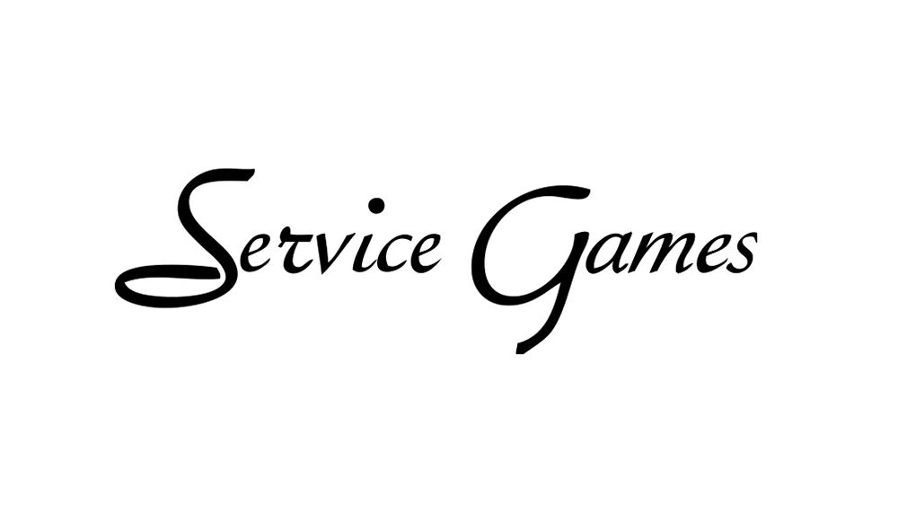
The genesis of the organization can be traced back to the 1950s with the formation of Service Games of Japan. Founded by American businessmen Martin Bromley and Richard Stewart, the company’s initial objective was highly specific: providing slot machines to United States military bases throughout Japan. At the time, the demand for entertainment among stationed personnel was high, and the duo recognized an untapped market for Western-style gambling apparatus.
By 1960, the partners expanded their portfolio by founding Nihon Goraku Bussan, incorporating jukeboxes into their offerings. However, the true turning point came in 1965 when the company merged with Rosen Enterprises, a firm led by David Rosen, who had already found success importing photo booths and other arcade-style amusements to Japan.
It was during this merger that the name "Sega" was officially adopted. It was a simple abbreviation of "Service Games," a branding decision that favored brevity and, at the time, lacked the cultural baggage that modern internet subcultures have retroactively assigned to it.
Chronology of a Corporate Identity
The timeline of Sega’s growth reflects the broader history of the gaming industry, shifting from mechanical curiosities to the digital revolution.
- 1952: Formation of Service Games in Hawaii/Japan to support US military base entertainment.
- 1960: Establishment of Nihon Goraku Bussan; expansion into the jukebox and arcade game market.
- 1965: The landmark merger with Rosen Enterprises. The company officially rebrands as "Sega Enterprises."
- 1966: The release of Periscope, a sophisticated electro-mechanical arcade game that became a global hit, proving Sega’s potential in the interactive market.
- 1969: Acquisition by Gulf and Western Industries. This brought Sega under the same corporate umbrella as Paramount Pictures, signaling a shift toward mass-media entertainment.
- 1975: A major visual identity shift. The company moves away from its original "Service Games" aesthetic to a cleaner, more modern wordmark.
- 1982: Adoption of the iconic blue color palette, designed specifically to cut through the visual noise of neon-drenched arcade halls.
- 1991: The debut of Sonic the Hedgehog, cementing Sega’s status as a household name and necessitating the refined, high-energy branding that defines the company today.
Visual Evolution: From Fantasy Italics to the Iconic Blue
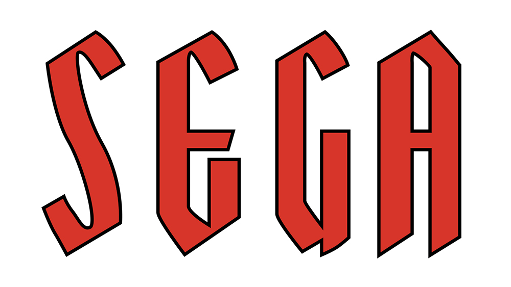
The visual history of Sega is a study in functional design. The company’s first logo, used during the late 1960s and early 1970s, featured tall, bold, sans-serif typography with distinct diagonally cut tops. To modern eyes, the font feels almost like a title card for a 1970s fantasy novel—an aesthetic that, while elegant, lacked the punchy, high-tech energy required for the burgeoning video game market.
The Yagi Double Era
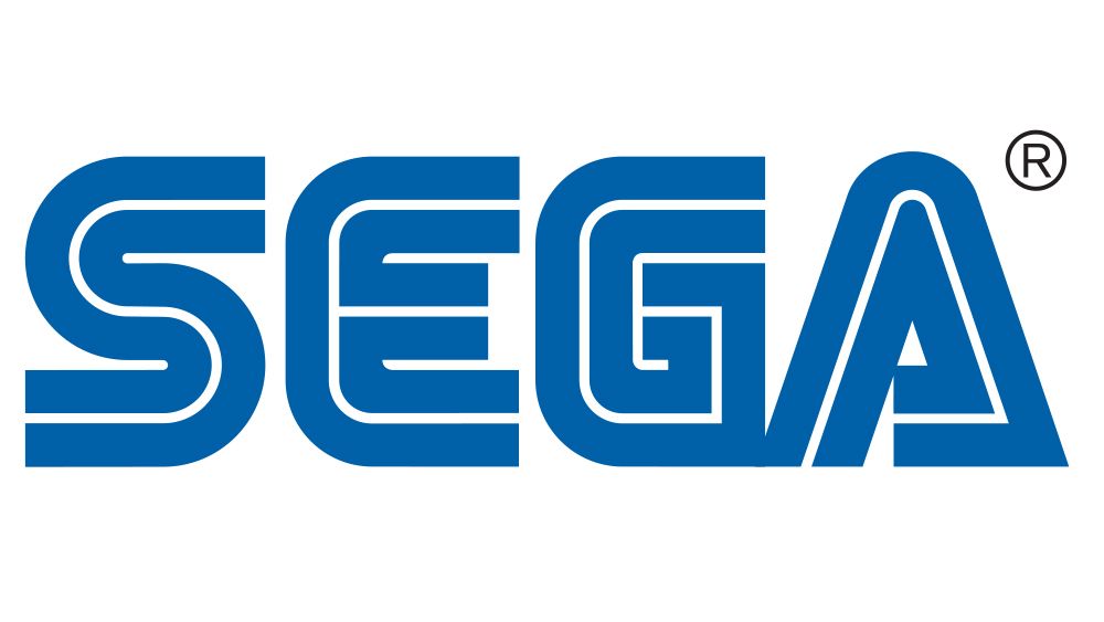
In 1975, the company debuted the logo that would eventually become legendary. The typeface chosen was a variant of "Yagi Double," a bold, heavy-weight font characterized by its distinct, thick strokes and inherent stability. This font was not unique to Sega; eagle-eyed observers may recognize similar typographic DNA in the branding of CNN.
The Shift to "Sega Blue"
The 1982 redesign was perhaps the most crucial strategic move in the company’s branding history. While the wordmark itself remained rooted in the Yagi Double style, the introduction of the iconic "Sega Blue" was a deliberate attempt to differentiate the brand in a physical space.
Arcade environments of the 1980s were dark, chaotic, and saturated with neon lights. By utilizing a vibrant, electric blue with a sharp white outline, Sega ensured that its cabinets were instantly identifiable from across a crowded room. This branding was not just for aesthetics; it was a beacon for consumers, acting as a visual lighthouse in a sea of competition.
Anomalies and Branding Mishaps
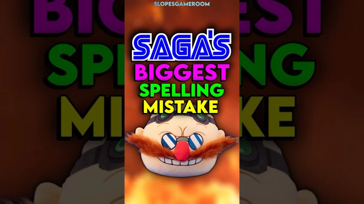
While Sega is celebrated for its strong visual identity, the company has occasionally allowed pragmatism to override standard branding guidelines. A notable example, often discussed on social media, involves the Game Gear port of Dr. Robotnik’s Mean Bean Machine.
In a desperate bid to fit the game’s logo onto the limited screen real estate of the portable handheld device, developers opted to intentionally misspell the game title in the branding. It stands as a humorous reminder that in the early days of gaming, hardware limitations frequently forced developers to compromise on artistic and branding integrity to ensure the final product was functional.
Implications of Brand Legacy
Today, Sega occupies a unique space in the industry. No longer a manufacturer of hardware, it has successfully transitioned into a third-party software giant. Yet, the strength of the Sega brand remains undiminished.
The persistence of the original logo—the blue, italicized wordmark—acts as a nostalgic touchstone. It represents the "console wars" of the 1990s, the rise of Sonic, and a specific era of aggressive, consumer-facing marketing.
From a design perspective, Sega’s history illustrates three fundamental principles:
- Adaptability: The company evolved from slot machines to electro-mechanical games to digital software without losing its brand core.
- Environmental Awareness: The shift to the electric blue color scheme proves that successful branding must consider the context in which the logo will be viewed.
- Consistency: While the font has undergone minor tweaks, the essential silhouette of the wordmark has remained consistent for nearly 50 years, creating a powerful brand legacy that transcends individual games.
Conclusion
Sega’s journey is a testament to the fact that a brand is more than just a name or a logo. It is an accumulation of historical shifts, strategic pivots, and the occasional, charming mistake. While the internet may enjoy speculating on the etymology of its name, the true history of Sega is far more interesting: a legacy built on the foundation of mechanical ingenuity and refined by decades of industry-leading visual communication.
Whether it is the bold, sans-serif lettering of the 60s or the neon-defying blue of the 80s, Sega’s design choices have consistently mirrored its ambition. As the company continues to evolve in the modern gaming landscape, its history serves as a blueprint for how a brand can remain relevant by honoring its past while aggressively looking toward the future.