In the fast-paced world of digital marketing and graphic design, space is often the most expensive commodity. Whether you are crafting a high-impact social media thumbnail, a sprawling outdoor billboard, or a sophisticated editorial headline, the ability to convey a powerful message within a restricted width is a critical skill. Enter the "condensed font"—the designer’s secret weapon for maximizing legibility and aesthetic authority when horizontal space is at a premium.

As we move through 2025, the demand for narrow, ultra-slim, and space-saving typography has reached an all-time high. These typefaces, often referred to as "narrow" or "tall" fonts, allow designers to pack more information into a single line without compromising the layout’s visual integrity. By manipulating the horizontal proportions while maintaining a commanding vertical presence, these fonts ensure that your headings don’t just occupy space—they dominate it.

The Evolution of Narrow Typography: A Chronological Perspective
The history of condensed typography is deeply rooted in the necessity of print journalism and industrial design. In the early 20th century, newspapers utilized condensed typefaces to fit multiple columns of breaking news onto a single page, a practice that forced designers to prioritize legibility over width.

- 1920s–1950s: The rise of the Art Deco movement popularized tall, elegant, and narrow letterforms, which became synonymous with luxury and cinema posters.
- 1960s–1980s: With the advent of corporate branding, condensed sans-serifs became the standard for "Swiss Style" design, emphasizing objectivity and clean, geometric order.
- 1990s–2010s: The digital revolution allowed for the creation of "Extra Condensed" and "Ultra-Narrow" styles, which became essential for early web interfaces and mobile screen constraints.
- 2020–2025: Today, we are seeing a "maximalist" approach to condensed fonts. Designers are blending traditional narrow shapes with experimental ink traps, extreme slants, and display-oriented flourishes, turning utility-focused fonts into artistic focal points.
Why Condensed Fonts Rule Modern Design
When working on complex visual hierarchies, the choice of typeface can determine whether a viewer engages with your content or skips it entirely. Condensed fonts offer several distinct advantages that make them indispensable for modern creative workflows.

1. Spatial Efficiency
Ultra-slim fonts allow for more characters per line, which is vital for long product names, technical data, or lengthy headlines that must remain on a single line for impact.

2. Visual Authority
There is an inherent "boldness" to a tall, condensed typeface. By increasing the vertical height, these fonts demand attention, acting as a visual anchor that guides the reader’s eye directly to the most important message.

3. Versatility Across Mediums
From mobile app splash screens to large-scale urban signage, condensed fonts maintain their clarity better than their wider counterparts. Their structural rigidity ensures that even at small sizes, the letterforms remain distinct.

Expert Strategies for Using Narrow Typefaces
While the aesthetic appeal of a narrow font is undeniable, technical execution is key. To get the most out of your chosen typeface, consider these professional guidelines:

- Mind the Kerning: Because condensed fonts have less internal negative space, the spacing between letters (kerning) is critical. Tight kerning can create a cohesive "block" effect, while slightly increased tracking can add a touch of modern, airy sophistication.
- Avoid Over-Usage in Body Copy: These fonts are display-first. Using them for long-form paragraphs can lead to reader fatigue. Keep them for headlines, call-to-action buttons, and short, punchy sub-headers.
- Balance the Weight: Pair a super-bold, extra-condensed font with a wide, airy sans-serif or a generous amount of whitespace to ensure your design doesn’t feel "claustrophobic."
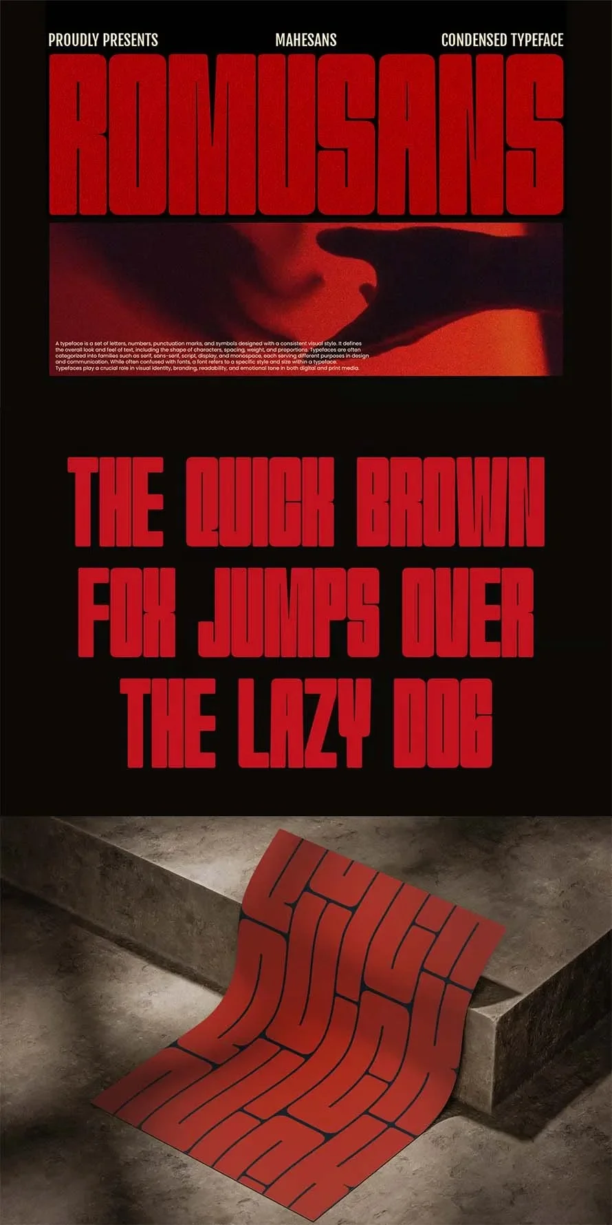
Curated Selection: 35 Best Condensed Fonts for 2025
Choosing the right font can be a daunting task. Below is a curated list of high-performance, premium-grade condensed fonts, each designed to solve specific layout challenges while maintaining a high level of aesthetic polish.

The Heavy Hitters: Bold and Aggressive
- Pizalio: A modern, all-caps sans-serif that defines the "tall and clean" aesthetic. It is perfect for logos and ads where you have only seconds to grab attention.
- Dunker: For designs that require a touch of "aggression." Its thick, sharp edges are ideal for sports branding and automotive-themed graphics.
- Theadzan: A super-bold powerhouse. When you need your headline to feel like a physical weight on the page, this is your go-to.
The Sleek and Sophisticated
- Calixon: Bridging the gap between a serif and a condensed display font, Calixon offers a dark, mysterious, and highly intellectual aesthetic suitable for editorial covers.
- Million: A branding-focused font that utilizes elegant ligatures, making it ideal for luxury packaging or high-end retail typography.
- Sleek: As the name suggests, this font incorporates rounded edges to soften the harshness of a condensed form, making it a perfect candidate for tech and modern UI designs.
The Functional Performers
- Pushkey: An incredibly versatile sans-serif that comes with a full suite of glyphs, making it a reliable choice for international projects.
- Bixsu: If your project requires a mix of uppercase and lowercase, Bixsu offers a balanced, legible, and highly readable solution.
- Unlimited: A massive font family that allows for consistent branding across multiple weight classes—from thin, elegant lines to deep, heavy blacks.
Implications for Future Design Trends
As we look toward the latter half of the decade, the trend of "Adaptive Typography" is gaining momentum. We are seeing a move away from static fonts toward variable fonts that allow designers to adjust the "condensed-ness" of a typeface on the fly. This level of granular control will soon become the industry standard, allowing one typeface to adapt its width based on the device or container size.

The shift towards these narrow, bold, and highly technical typefaces also mirrors a broader cultural shift: the move toward direct, concise, and impact-oriented communication. In an era of infinite content, the "loudest" and most efficient voice—represented by the perfect, well-placed condensed headline—is the one that wins.

Conclusion: Elevating Your Creative Workflow
Whether you are a freelancer working on a local branding project or an agency designer managing global campaigns, the right condensed font can save your layout from visual clutter. By choosing from the high-quality assets listed in this collection, you gain access to professional-grade tools that offer better character support, superior kerning, and the structural integrity required for modern design.

Final Advice for Designers: Don’t just choose a font because it fits; choose one that adds character. Whether you select the athletic energy of Gorian, the tech-forward vibes of NexCondense, or the corporate reliability of Hugeon, ensure that the font’s "personality" matches the core message of your project.

For those looking to expand their design library, exploring premium font marketplaces is the most effective way to ensure your typography is licensed, updated, and ready for commercial use.