
In the world of high-stakes branding, few things are as volatile as the reimagining of a beloved cultural icon. Whether it is a municipal logo for a city like Bloomington, Indiana—which recently faced ridicule for a design many felt resembled a posterior—or a gargantuan global franchise, the stakes are undeniably high.
Now, the wizarding world finds itself in the eye of this aesthetic storm. As anticipation builds for HBO’s upcoming Harry Potter television series, slated for a December debut, the network has unveiled its new emblems for the four iconic Hogwarts houses: Gryffindor, Slytherin, Ravenclaw, and Hufflepuff. While a departure from the visual language established by the Warner Bros. films was inevitable, the reaction from the fandom has been swift and unforgiving. Many critics are arguing that the new designs represent a troubling trend in modern graphic design: the hollow, soulless pursuit of minimalism at the expense of heritage and soul.
The Chronology of the Rebrand
The unveiling occurred via HBO Max’s preview documentary, Finding Harry: The Craft Behind the Magic. The documentary provided a glimpse into the production design of the series, showcasing a visual identity that prioritizes screen readability and digital scalability over the dense, classical heraldry that defined the 2001–2011 film series.
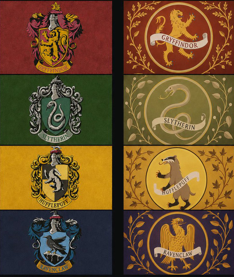
The original film crests—the ones etched into the collective memory of an entire generation—were elaborate. They featured traditional heraldic elements: ornate mantles, rigid shields, and complex scrollwork. They felt like artifacts pulled from a dusty, centuries-old library. In contrast, the new HBO crests are circular, simplified, and prioritize the house mascots, stripping away the "fussy" ornamentation that once gave the Hogwarts brand its gothic, academic gravitas.
This shift has not been received as a "modernization" by the fanbase; it has been decried as a degradation. As the trailer and promotional materials circulated, social media platforms like X (formerly Twitter) and Reddit became hotbeds for design discourse, with users dissecting the geometry, typography, and "aura" of the new assets.
The Case for Minimalism vs. The Soul of Art
The primary point of contention lies in the perceived "tech-ification" of a fantasy universe. Critics argue that the new designs look less like the seals of an ancient magical institution and more like app icons for a Silicon Valley startup.
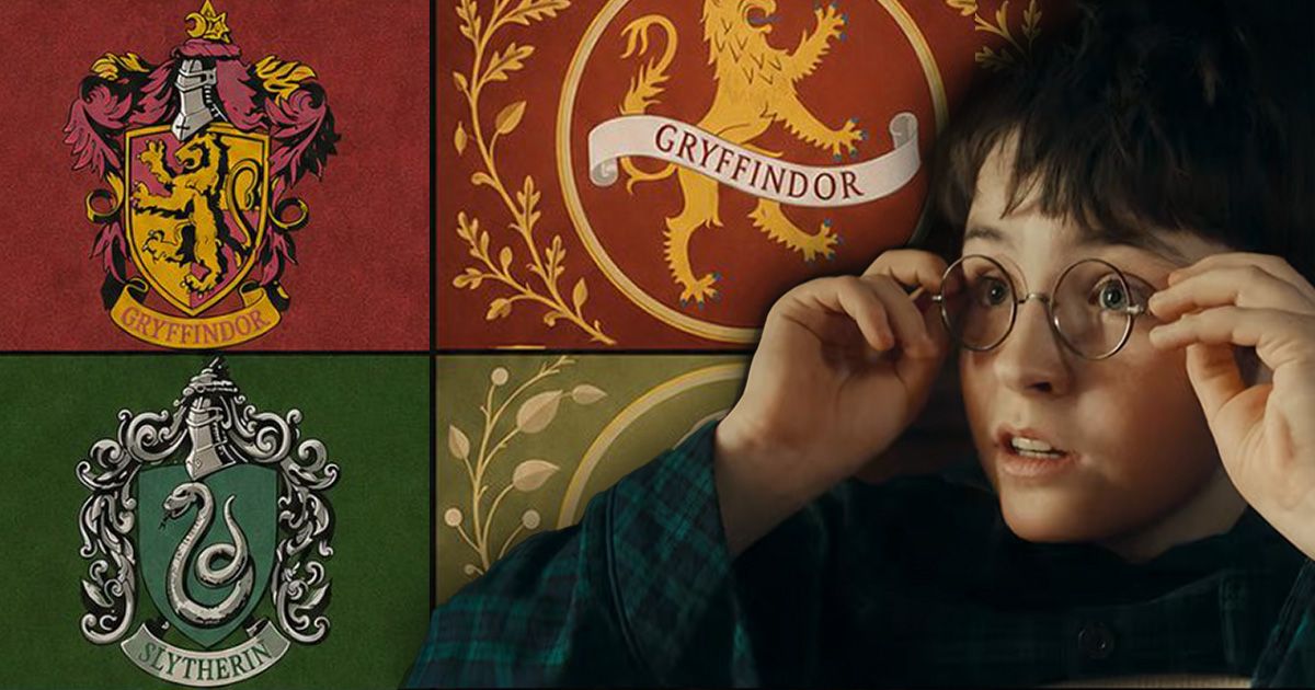
"We are witnessing the decay of art," one disgruntled fan noted on social media. "The new crests look like AI-generated images. There are many passionate designers who would have done better. HBO is not interested in putting effort into the details."
The "App Icon" Critique
The movement toward minimalist logo design—often referred to as "debranding"—has swept through the corporate world, with companies like Burger King, Warner Bros., and countless tech firms flattening their logos into simplified, monochromatic symbols. While this works for mobile interfaces, fans feel it is an intrusion into the immersive world of Harry Potter.
The critique is two-fold:
- Loss of Aura: The original designs felt tactile, as if they were embossed on wax seals or carved into stone. The new designs, according to detractors, look "bleak" and "generic," resembling "grandma’s old plates that were forgotten in a park after a picnic."
- Inconsistent Execution: Sharp-eyed designers have pointed out technical flaws in the new crests, citing inconsistent line weights, off-center mascots, and questionable typography. The use of a font resembling "Arial Rounded" for the Ravenclaw motto has been mocked as "very muggle," sparking debates about whether the production team truly understands the aesthetic language of the source material.
Supporting Data: Faithfulness vs. Visual Identity
Interestingly, the HBO rebrand does attempt to address one specific historical grievance: the house mascots. In the books, the Ravenclaw mascot is an eagle, not the raven used in the films. HBO has corrected this, returning to the literary roots.
However, this nod to accuracy has been overshadowed by the visceral reaction to the design’s execution. The debate highlights a fundamental tension in adaptation: Is it better to be accurate to the text or to the established visual language of the franchise? For many Potterheads, the answer is "both." By changing the design style so drastically while correcting the mascot, the production team has inadvertently made the shift feel even more jarring.
Furthermore, the existence of "variant" crests—which appear to be secondary logos for merchandise or different applications—has added another layer of confusion. Fans have likened the proliferation of different crests to the complex branding of professional sports leagues, further distancing the school from its "magical castle" roots.
Official Responses and Industry Context
While HBO has not issued a formal statement addressing the backlash, the design industry is watching the situation closely. Designers often cite the "scalability" problem as the reason for such redesigns. When a logo must appear on a smartphone screen, a smartwatch, a social media profile, and a 4K television, the intricate, "fussy" designs of the early 2000s often become muddy or illegible.
However, industry experts suggest that the backlash is less about the necessity of change and more about the "personality" of the design. When a brand moves toward minimalism, it often trades "character" for "utility." In the case of Harry Potter, the audience has a deep emotional connection to the "fussy" aesthetic. When that is replaced by a clean, corporate-looking circle, the audience feels a sense of loss, as if the magic is being stripped away to make room for marketing efficiency.
The Implications: Where Do We Go From Here?
The controversy surrounding the Hogwarts crests is a microcosm of a larger cultural shift. As television production moves into the streaming era, the pressure to create "brand-safe," easily readable, and highly versatile visual assets is immense.
However, the failure to account for the audience’s emotional attachment to the "old ways" can be costly. If the new Harry Potter series hopes to capture the same sense of wonder that defined the films, it must reckon with the fact that its visual identity is not just a collection of assets—it is a core component of the world-building.
Key Takeaways for Future Adaptations:
- The Power of Texture: Even in a digital world, audiences respond to designs that feel like they belong in their respective universes (e.g., weathered, hand-drawn, or historically inspired).
- The Danger of "Tech-Minimalism": When fantasy franchises adopt the visual language of modern software, they risk breaking the "fourth wall" of immersion.
- Listening to the Fandom: While creators should not be beholden to every fan whim, the consensus on "inconsistent line weights" and "lack of elegance" suggests that the production team may have overlooked the scrutiny that high-end, detail-oriented fans apply to their favorite stories.
As we approach the December release, the debate over these logos serves as a reminder: the details matter. Whether these crests will be accepted once the series begins and the world-building takes center stage remains to be seen. But for now, the conversation serves as a cautionary tale for any studio looking to strip the "magic" out of a classic design in the name of modern, minimalist efficiency.
The fans have spoken, and they are not looking for an app icon—they are looking for a badge of honor that feels like it belongs in the Great Hall of Hogwarts, not on a tech company’s pitch deck. Only time will tell if the series itself can overcome this initial aesthetic hurdle or if the "decay of art" will continue to be the primary narrative of this much-anticipated reboot.