Every brand is born with a logo, yet history is littered with visual marks that failed to capture the public imagination. You encounter thousands of logos daily—stamped on your morning coffee cup, blinking on your smartphone apps, plastered across city billboards, and scrolling through your social media feeds. Yet, most of these marks leave no footprint in your memory.
This phenomenon is rarely the result of a designer’s negligence. Rather, it underscores a fundamental reality: creating a visual identity that is both iconic and memorable is an exercise in cognitive science as much as it is in aesthetics. It requires navigating the complex interplay between human perception, emotional psychology, and strategic clarity.
1. The Science of Cognitive Fluency: Why We Forget
The human brain is an efficiency machine, designed to filter out "noise" to prevent cognitive overload. When you view a logo, your brain is performing a split-second evaluation. If the design is cluttered, inconsistent, or lacks a clear focal point, the brain struggles to "process" the information. This leads to the logo being discarded by your memory bank almost instantly.
Psychologists refer to this as cognitive fluency—the ease with which the brain processes information. We gravitate toward, and remember, things that are easy to understand. The iconic Nike "Swoosh" is the gold standard here; it is a single, fluid gesture that requires zero cognitive effort to decode. It registers as a shape, then a brand, in milliseconds. By contrast, "bad" logos force the viewer to work too hard to decipher the message, resulting in a subconscious rejection of the mark.

2. Chronology of a Design: From Sketch to Icon
The journey of a lasting logo typically follows a rigorous, non-linear timeline that separates high-impact branding from disposable design.
- Discovery and Strategy (Weeks 1-2): Before a single line is drawn, the designer must identify the brand’s "core value." This is the foundational stage where the brand personality is defined—is it authoritative, playful, disruptive, or traditional?
- Ideation and Sketching (Weeks 2-4): Professionals start with pencil and paper. This stage is about quantity, not quality. By removing the digital crutch, designers can focus on the raw silhouette.
- Refinement and Reduction (Weeks 4-6): This is the most critical phase. Based on the principle of simplicity, designers systematically remove elements until the logo is stripped to its absolute essence.
- Application Testing (Weeks 6-8): The logo is stress-tested. Does it work on a favicon? Does it remain legible on a business card? Can it be embossed on leather or printed on a shipping container?
- Systematization (Final Phase): The creation of the brand guidelines ensures that the logo’s integrity is maintained across all future touchpoints.
3. Supporting Data: The Power of Color and Geometry
The impact of design choices is backed by significant empirical research. A landmark study published in Management Decision revealed that consistent use of color can increase brand recognition by as much as 80 percent.
The Geometry of Trust
Shapes possess inherent psychological archetypes:
- Circles: Represent community, unity, and safety (e.g., Pepsi, Chrome).
- Squares and Rectangles: Suggest stability, professionalism, and logic (e.g., Microsoft, American Express).
- Triangles and Sharp Angles: Evoke energy, innovation, and ambition (e.g., FedEx, Mitsubishi).
The "Grayscale" Rule
One of the most important professional practices is the "Black and White Test." If a logo relies on a gradient, shadow, or specific color to be understood, it is structurally flawed. A strong logo must function as a silhouette. If it can be identified in monochrome, it has the structural integrity to survive any medium.
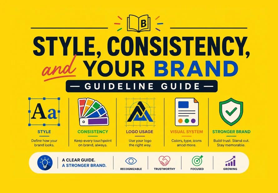
4. Official Industry Perspectives: The Role of Brand Guidelines
Industry experts and branding agencies emphasize that a logo is not a static asset; it is a living part of a brand’s infrastructure. A "Brand Guideline Guide" is not merely an upsell—it is the instruction manual for the brand’s visual survival.
According to global design standards, a comprehensive guideline should include:

- Clearance Zones: The "breathing room" required around the logo to maintain visual dominance.
- Color Palettes: Defined in CMYK (print), RGB (digital), and Pantone (exact color matching).
- Typography Rules: The specific fonts that accompany the logo to ensure visual consistency.
- Prohibited Uses: Explicit instructions on what not to do, such as stretching, skewing, or placing the logo over overly busy backgrounds.
5. Implications: Budgeting and Longevity
One of the most persistent misconceptions is that a high-end logo is a luxury expense. In reality, a well-designed logo is a long-term investment.
The Cost of "Cheap"
When a brand opts for a bottom-dollar, crowdsourced logo, they are often buying a quick fix that lacks scalability. If the logo isn’t delivered in vector format (AI or EPS), the brand will eventually face a "redesign tax." They will have to pay for the logo to be recreated from scratch the moment they need a high-resolution print for a banner or a vehicle wrap.
The Pricing Spectrum
- Budget Tier ($20 – $300): Often relies on stock icons or generic templates. High risk of visual cliches and lack of legal ownership.
- Mid-Tier ($500 – $2,500): Usually involves a professional freelancer who conducts research and provides a set of scalable files.
- Premium Tier ($5,000+): Engages a branding agency that includes deep market research, competitive analysis, and a comprehensive brand strategy, resulting in a mark built to last decades.
6. Summary Comparison: Bad Design vs. Good Design
| Factor | Bad Logo Design | Good Logo Design |
|---|---|---|
| Composition | Cluttered, "busy" | Simple, focused |
| Typography | Trendy, unreadable fonts | Timeless, scalable type |
| Scalability | Becomes a blur at small sizes | Maintains clarity at any size |
| Color | Over-reliance on gradients | Strong, solid color palette |
| Symbolism | Generic stock imagery | Distinctive, unique shape |
| Versatility | Fails the "Grayscale Test" | Works perfectly in black/white |
Final Thoughts: Designing for the Future
A logo is the fastest way to transmit your brand story. It is a visual shorthand that replaces a thousand words with a single, evocative mark. The difference between a brand that fades into the background and one that defines an industry is often found in the restraint of the designer.
When you approach your next design project, remember the mantra of simplicity: if you can remove an element without losing the meaning, remove it. By prioritizing cognitive fluency, investing in proper file formats, and establishing strict brand guidelines, you aren’t just buying a graphic—you are building a piece of visual real estate that can serve your business for decades to come.
Your logo is the first impression that lasts. Make sure it’s one that the brain finds easy to keep.