 Nana
Nana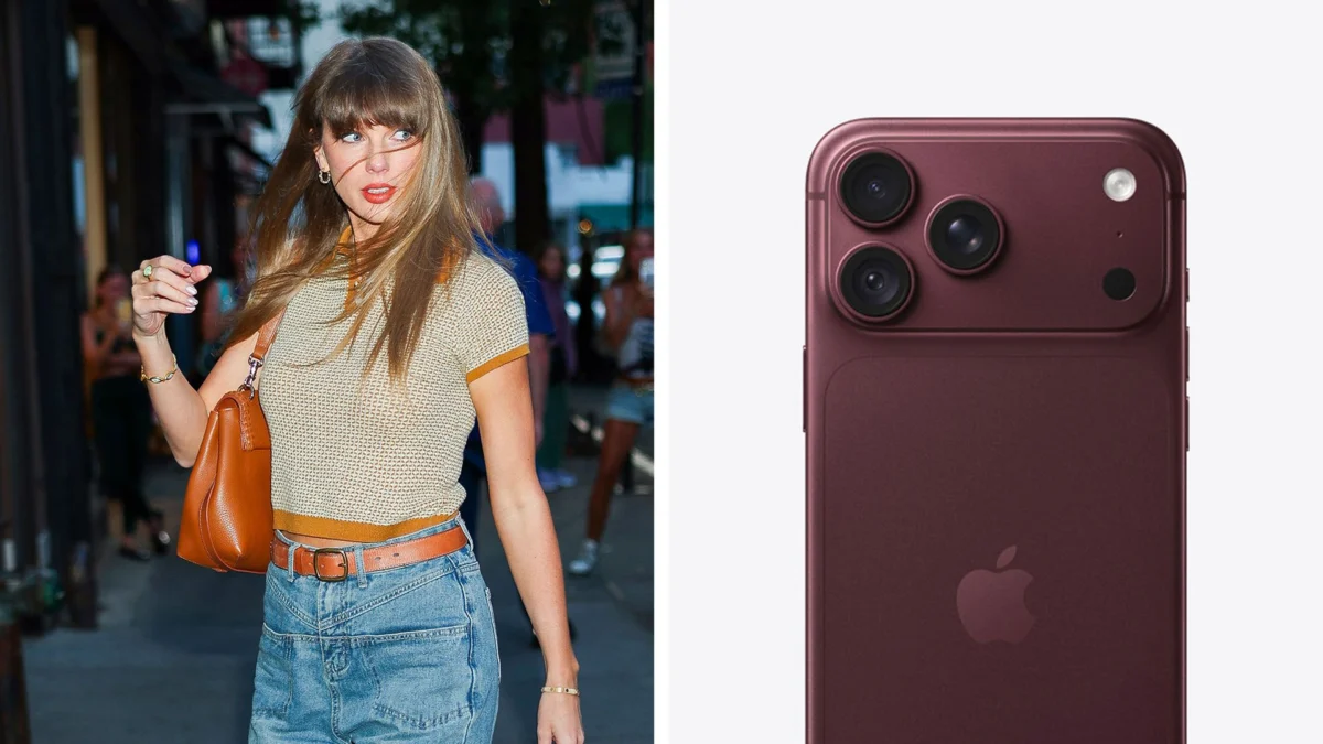
In the hyper-curated world of modern pop culture, nothing is ever truly a coincidence. From the cryptic "Easter eggs" embedded in music videos to the meticulously color-coded aesthetics of an album rollout, Taylor Swift has built an empire on the foundation of intentionality. Yet, a recent theory circulating among design enthusiasts and "Swifties" alike suggests that her influence may extend far beyond the Billboard charts—straight into the hardware labs of Cupertino.
Could Taylor Swift be secretly coordinating her album color palettes with the annual iPhone lineup? While the notion began as a lighthearted joke on social media, the mounting evidence is becoming increasingly difficult to dismiss. As we analyze the intersection of brand strategy, aesthetic alignment, and corporate synergy, we must ask: Is this merely a case of two global giants chasing the same seasonal color trends, or is there a high-level design pact hidden in plain sight?
The Genesis of the Theory: A Pattern Emerges
The conversation reached a fever pitch recently when leaks surrounding the upcoming iPhone colorways began to surface. With rumors pointing toward a striking dark red and a sleek black aesthetic for the next generation of handsets, observers immediately drew a parallel to the promotional materials for Swift’s latest project, an "Encore" expansion to her recent album, The Life of a Showgirl.
The match is, to put it mildly, uncanny. This isn’t the first time the colors have aligned with suspicious precision. Last year, the introduction of the "Cosmic Orange" and "Teal" iPhone models felt like a direct visual echo of the Showgirl aesthetic. When viewed in isolation, one might dismiss these as common design choices in a saturated market. When viewed as part of a multi-year chronology, however, the pattern becomes difficult to ignore.
A Chronology of Synchronicity
To understand the depth of this potential collaboration, one must look at the historical timeline of both Apple’s hardware releases and Swift’s "Era" transitions.
The 1989 (Taylor’s Version) and Midnights Era
When 1989 (Taylor’s Version) arrived, it was accompanied by a distinctive, ethereal blue palette. During that same fiscal window, Apple leaned heavily into blues for its accessory and device marketing. The Midnights album, characterized by its deep, moody, and celestial aesthetic, coincided with Apple’s push for the "Navy Blue" iPhone. The overlap in saturation and hue was noted by color theorists at the time, though it was largely attributed to the "night-sky" trend prevalent in industrial design that year.
The Tortured Poets Department
With the release of The Tortured Poets Department, the aesthetic shifted to a stark, monochrome, and paper-white palette. Again, observers pointed to the Apple Store’s updated merchandising, which favored minimalist white and "Starlight" tones. Critics of the theory argue that these are universal design trends—popular palettes dictated by Pantone and global consumer sentiment. However, the sheer frequency of these "coincidences" has fueled a growing suspicion that the overlap is not merely observational, but strategic.
Supporting Data: The Power of Brand Synergy
Why would Apple and Taylor Swift collaborate on such a granular level? The answer lies in the concept of "Total Aesthetic Dominance."
For Apple, the iPhone is more than a communication device; it is a fashion accessory. For Swift, her album cycles are immersive environments that define the fashion, social media presence, and consumer habits of millions. If Apple could ensure that its most expensive consumer hardware complements the aesthetic of the world’s most popular artist, they effectively turn the iPhone into the ultimate piece of "merch."
Cross-Pollination of Marketing
It is no secret that the two brands have a long-standing relationship. Swift has appeared in high-profile Apple Music advertisements, and her music is frequently used as a benchmark for the platform’s audio quality. Furthermore, Apple Music is notorious for its "Easter egg" culture, often hiding clues for fans within the app’s interface or metadata.
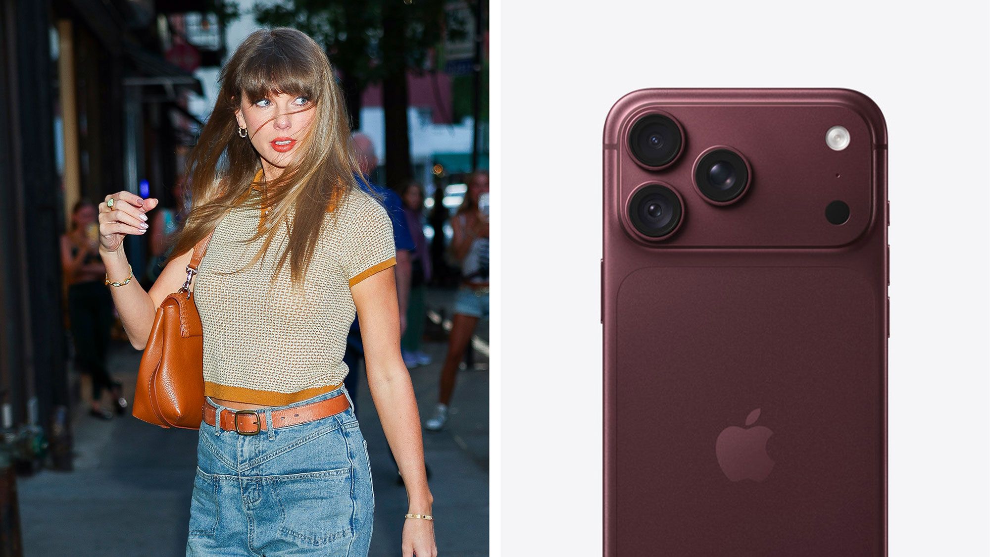
If the two parties were to coordinate, the benefits would be mutual. Swift gains the prestige of being visually integrated into the world’s most recognizable piece of technology, and Apple gains a layer of "cool" that transcends traditional tech marketing, capturing the undivided attention of Gen Z and Millennial consumers.
Official Responses and Corporate Silence
When approached for comment regarding the alleged design coordination, representatives for both Apple and Taylor Swift have maintained a standard policy of "no comment." In the world of corporate branding, this is telling.
Designers often work under strict non-disclosure agreements (NDAs) that prohibit the discussion of cross-brand synergy. However, internal sources within the tech and music industries suggest that high-level "brand alignment" meetings are standard practice for companies of this magnitude. While a formal contract regarding "color coordination" may not exist in a literal sense, it is highly probable that both parties share data on consumer preferences, color psychology, and aesthetic trends, leading them to reach the same conclusions simultaneously.
Implications: The Future of "Lifestyle Tech"
If this coordination is indeed real, it marks a significant shift in how we perceive the relationship between technology and pop culture. We are moving toward an era of "lifestyle tech," where the hardware we carry in our pockets is no longer just a tool, but a curated extension of our cultural consumption.
1. The Death of the "Random" Design
If Apple is indeed aligning its hardware with major cultural milestones, the days of unpredictable product launches may be numbered. Consumers are becoming hyper-aware of these visual cues. This creates a feedback loop: fans begin to anticipate the color of the next iPhone based on the color of their favorite singer’s next album, thereby increasing engagement for both products.
2. Aesthetic Branding as a Moat
For competitors, this presents a significant challenge. How does a rival smartphone manufacturer compete with a brand that is physically "synced" with the cultural zeitgeist? If Apple has secured a de facto partnership with the most influential cultural figures of the decade, they have created a marketing moat that is nearly impossible to cross.
3. The Psychological Impact on Consumers
For the average user, this alignment serves as a subtle, psychological reinforcement. When the device in your hand matches the aesthetic of the music playing in your ears, the product experience feels "complete." It creates a sense of belonging and relevance that is difficult to replicate through traditional advertising alone.
Conclusion: Coincidence or Strategy?
Is it a wild suggestion? Perhaps. It is entirely possible that both Apple’s industrial design team and Taylor Swift’s creative directors are simply reading the same cultural tea leaves. Both brands are experts at anticipating what consumers want before they even know they want it. When you are at the pinnacle of your respective fields, you tend to move in the same direction.
However, the sheer consistency of these matches—from 1989 to The Tortured Poets Department and now the Encore red—suggests a level of synchronization that feels too intentional to be pure luck. Whether it is a formal partnership or a subconscious alignment of two massive, trend-setting entities, the result is the same: the world is becoming increasingly color-coordinated.
As we look toward the next iPhone launch, the question remains: what color will it be, and what does that tell us about the next chapter of Taylor Swift’s career? For now, we wait, we watch, and we keep our eyes peeled for the next hue to hit the shelves. The era of the "Lifestyle Sync" has arrived, and it is painted in the colors of the stars.

 Basiran
 Siti Muinah