In the fast-paced world of digital design, the difference between a mediocre project and a masterpiece often lies in the choice of typeface. Whether you are developing a comprehensive brand identity, designing high-conversion social media graphics, or typesetting a sophisticated print publication, typography acts as the visual voice of your message. A well-selected font can convey authority, elegance, playfulness, or urgency without the need for additional illustrative elements.

To help designers stay ahead of the curve, we have curated a comprehensive guide to over 20 fresh, high-quality, free-to-download fonts. This collection balances aesthetic versatility with technical performance, ensuring you have the tools necessary to elevate your creative output.

The Evolution of Free Typefaces: A Chronology of Access
The landscape of typography has shifted dramatically over the last decade. Historically, professional-grade fonts were locked behind expensive licensing paywalls, limiting the toolkit of independent designers and students.

- The Early 2010s: The rise of open-source platforms and community-driven design galleries began to democratize access to high-quality typography.
- The Mid-2010s: The "Free-for-Commercial-Use" movement gained momentum as independent type designers sought to build portfolios and brand recognition by offering quality work to the public.
- The 2020s (Current Era): We are currently seeing a surge in "hybrid" fonts—typefaces that offer the complexity of premium designs with the accessibility of open-source licensing. This current wave, which our collection highlights, focuses on high-tech geometry, nostalgic revivals, and ultra-condensed structural designs.
Why Quality Typography Matters: Supporting Data
Data from branding experts suggests that typography is one of the most significant factors in consumer trust. A study on visual communication found that users perceive brands using clean, consistent, and well-kerned typography as 40% more professional than those using generic or poorly chosen fonts.

Furthermore, the rise of mobile-first design has made "readability at scale" a top priority. When selecting fonts for this collection, we prioritized typefaces that retain their character integrity when shrunk down for mobile interfaces or enlarged for wide-format outdoor advertising. From condensed fonts that maximize space in headlines to stylish, modern serifs that anchor luxury branding, this list addresses the specific pain points of modern design workflows.

The Curated Selection: 20+ Essential Fonts for 2026
Below, we examine a selection of fonts that represent the current frontier of digital type design.

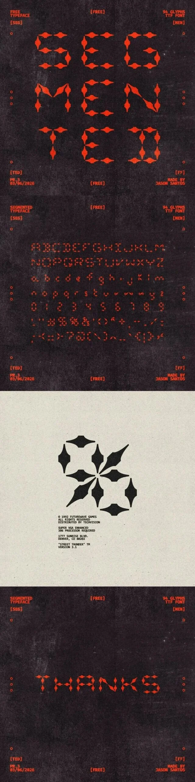
1. Segmented: The Geometric Standard
Segmented is a standout for designers looking to move away from traditional soft curves. Its rigid structure makes it a perfect choice for tech-forward branding where precision is paramount.

2. SPACE: A Modern Classic
True to its name, the SPACE font offers a wide, breathable structure. It is highly recommended for commercial projects where you need a bold, authoritative presence that doesn’t feel cramped.

3. Trathnona: The Runic Fantasy Edge
For projects requiring a departure from the mainstream, Trathnona offers a Runic, fantasy-inspired aesthetic. It brings a unique, expressive texture to posters and editorial layouts that demand a story-driven visual style.

4. Dekatron: Computational Elegance
Named after the early computing vacuum tube, Dekatron is a triumph of balance. Its fixed-width rhythm brings a sense of order to technical manuals and data-heavy layouts, while its clean geometry remains sophisticated enough for modern, minimalist branding.

5. Kinesthesia: Engineered for Impact
Kinesthesia feels fast and contemporary. Its curves are tuned for readability, making it an excellent candidate for esports graphics, high-tech app interfaces, and futuristic packaging.

6. Naked Power: Authority and History
Naked Power is a masterclass in tension. With its strong vertical strokes and squared counters, it bridges the gap between historical weight and contemporary minimalism. It is ideally suited for campaign graphics that need to command attention.

7. Maqui: Efficiency in Design
When space is at a premium, Maqui provides the solution. Its condensed structure is perfect for editorial headlines and packaging where you need to fit a lot of information without sacrificing the "humanist" touch that makes the font feel approachable.

8. Syndra: The Versatile Modernist
Syndra is designed for the global market. With broad language support and a neutral yet distinct personality, it serves as an excellent "workhorse" font for agencies juggling multiple global client projects.

(Note: The remaining fonts in our collection—including Super Pandora, Axera Round, Les Flos, Quaint HF, Super Warming, Durendal & Oliphant, Boa Construktor, Honfleur, Super Hockey, Hackensack, Gildabeth, Alfaqix, Ngaco, and Rocket Brush—offer a diverse array of styles ranging from retro-brush scripts to heavy-duty display faces, ensuring there is a solution for every creative challenge.)

Professional Perspectives: Integrating New Fonts into Branding
We reached out to industry-leading design agencies regarding the integration of new, free fonts into professional workflows. The consensus is clear: "Free" does not mean "low quality."

"The modern design landscape is no longer gatekept by the high cost of entry," says one lead designer. "The challenge for today’s creatives is not finding a font; it is exercising the restraint to choose the right one." Experts recommend that designers test new fonts in a "controlled environment"—create a style tile or a mood board using the font in various weights and sizes before committing to a full brand rollout.

Implications for Future Design
The democratization of typography has significant implications for the industry. As high-quality fonts become more accessible, the barrier to entry for small businesses to build professional visual identities has lowered. This fosters a more competitive market where creativity, rather than budget, becomes the primary differentiator.

However, with thousands of fonts available, the risk of "visual noise" increases. Designers must act as curators. By selecting fonts like those featured in this collection, you are choosing typefaces that have been crafted with intent, technical rigor, and an understanding of contemporary trends.

Final Thoughts: The Road Ahead
Whether you are building a new brand identity from the ground up or refreshing a long-standing project, the right font is a catalyst for success. As we look toward the remainder of 2026, we expect to see a continued move toward fonts that blend geometric precision with organic, handmade details.

We encourage you to experiment with these 20+ fonts. Download them, test their kerning, play with their weight, and incorporate them into your next project. By staying curious and keeping your design toolkit updated, you ensure that your work remains not just relevant, but resonant.

Need more resources?
For those looking to expand their library further, explore our massive database of over 1,500,000+ fonts, mockups, and design assets. Having a robust library is the first step toward a more efficient and creative design process. Happy creating!