
If you came of age during the 1980s or 1990s, the visual landscape of your childhood was likely defined by the tactile, high-contrast charm of print media. From the bold, inviting lettering on your favorite cereal boxes to the evocative typography adorning classic record sleeves and dust jackets, there was a specific, artisanal warmth to the way information was presented. Today, that "classic print shop" aesthetic is not just a relic of the past; it is a driving force in contemporary graphic design.

The resurgence of old-style serif fonts has become a cornerstone for brands looking to inject soul, heritage, and authenticity into their visual identity. Whether you are crafting a logo for a boutique coffee shop, designing a poster for a local festival, or developing a comprehensive branding package for a startup, the strategic application of vintage typography is the fastest way to signal craftsmanship and trust.

The Evolution of Type: A Brief Chronology of Serif Fonts
To understand the current fascination with these fonts, one must first appreciate their historical roots. Old-style serifs trace their lineage back to the earliest days of the printing press, long before the digital age turned typography into a commodity.

The Renaissance Roots (15th–18th Century)
The inception of old-style typefaces—typified by faces like Garamond or Caslon—was deeply rooted in calligraphic traditions. Designers aimed to mimic the natural movement of a broad-nibbed pen. These fonts are characterized by low-contrast strokes, bracketed serifs, and a gentle axis that creates a sense of organic flow. Unlike the rigid, mathematical perfection of later modern or geometric serifs, these early designs were built for comfort and readability.

The 80s and 90s: The Analog Peak
The 80s and 90s served as a bridge between the physical and digital worlds. During this era, graphic design still relied heavily on physical production methods—typesetting, paste-ups, and film. The fonts that dominated this period captured a unique blend of traditional elegance and burgeoning pop-culture boldness. As we move deeper into the 2020s, designers are looking back at this era to recapture that "human touch" that is often lost in the hyper-polished, sterile world of vector-perfect digital interfaces.

Supporting Data: Why Vintage is Winning
Market research consistently shows that consumers are increasingly drawn to brands that emphasize a "handmade" or "legacy" feel. According to recent design industry reports, projects incorporating vintage-inspired typography see a 30% increase in user engagement when compared to those using standard, ubiquitous sans-serif fonts.

This phenomenon is driven by a psychological principle known as the "nostalgia bias." When consumers see an old-style serif, they subconsciously associate the brand with longevity, expertise, and a slower, more deliberate pace of life. For small business owners—particularly in the artisanal food, beverage, and apparel sectors—this emotional connection is invaluable. By mixing vintage retro fonts with modern serif architectures, designers are creating a "new-vintage" hybrid that feels both familiar and forward-thinking.

Professional Insights: Bridging the Old and the New
Modern design is no longer about choosing between the past and the future; it is about synthesis. The most successful logo projects today utilize a "combo strategy."

The Hybrid Design Approach
Designers are increasingly pairing bold, high-contrast modern serifs with the subtle, rounded, or textured serifs of the past. This juxtaposition works exceptionally well on screens. Where traditional vintage fonts might have suffered from poor legibility at small sizes, modern technological rendering allows these classic forms to maintain their character while remaining crisp and readable on everything from high-resolution desktop monitors to mobile devices.

AI as a Catalyst
Picking the perfect font from a sea of thousands is a time-consuming task. Today, designers are leveraging AI-driven typography tools to accelerate the pairing process. These algorithms analyze the mood, industry, and target audience of a project to suggest font combinations that might take a human designer hours to discover. This shift allows for more experimentation, enabling designers to spend less time on the mechanics of selection and more time on the creative application of their chosen typefaces.

A Curated Selection: 25+ Essential Old-Style Fonts
To get you started, we have compiled a selection of fonts that capture the essence of this design movement. These assets are perfect for those looking to emulate the classic print shop feel while maintaining the flexibility required for modern commercial work.

1. Old Castle: The Vintage Standard
Old Castle is a masterclass in balance. Its soft, old-style feel makes it the perfect candidate for heritage branding, particularly for businesses that want to lean into a sense of established authority.

2. Hamburg: Simplicity and Versatility
Hamburg is a go-to for designers who need a workhorse font. Whether you are drafting a brochure, a video title card, or a corporate ad campaign, its clean, vintage-inspired lines ensure that your message remains the focal point.

3. Oldridge: The Western Frontier
Oldridge brings a rugged, bold edge to the table. Its aesthetic is deeply inspired by 19th-century frontier signage and theater posters, making it an excellent choice for packaging and headlines that need to command attention.

4. Burge Rough: The Textured Touch
Burge Rough bridges the gap between historical elegance and contemporary grit. Its weathered look suggests a brand that has been around for decades, making it ideal for craft labels or artisanal product lines.

5. Mencary: The Typewriter Revival
There is an undeniable charm to the imperfection of the typewriter. Mencary offers both clean and distressed styles, allowing designers to evoke the feeling of a handwritten, personal message—a powerful tool for modern marketing.

6. Chervels: Playful Nostalgia
For projects that require a friendlier, more accessible look, Chervels hits the mark. It is a fantastic choice for book covers and merchandise where a playful, welcoming aesthetic is preferred over strict formality.

7. Hardinge: The Blackletter Influence
Hardinge takes inspiration from the roots of European printing. Its blackletter undertones provide a sophisticated, almost academic feel, perfect for branding that wishes to emphasize luxury or historical expertise.

8. Bistern: Victorian Grandeur
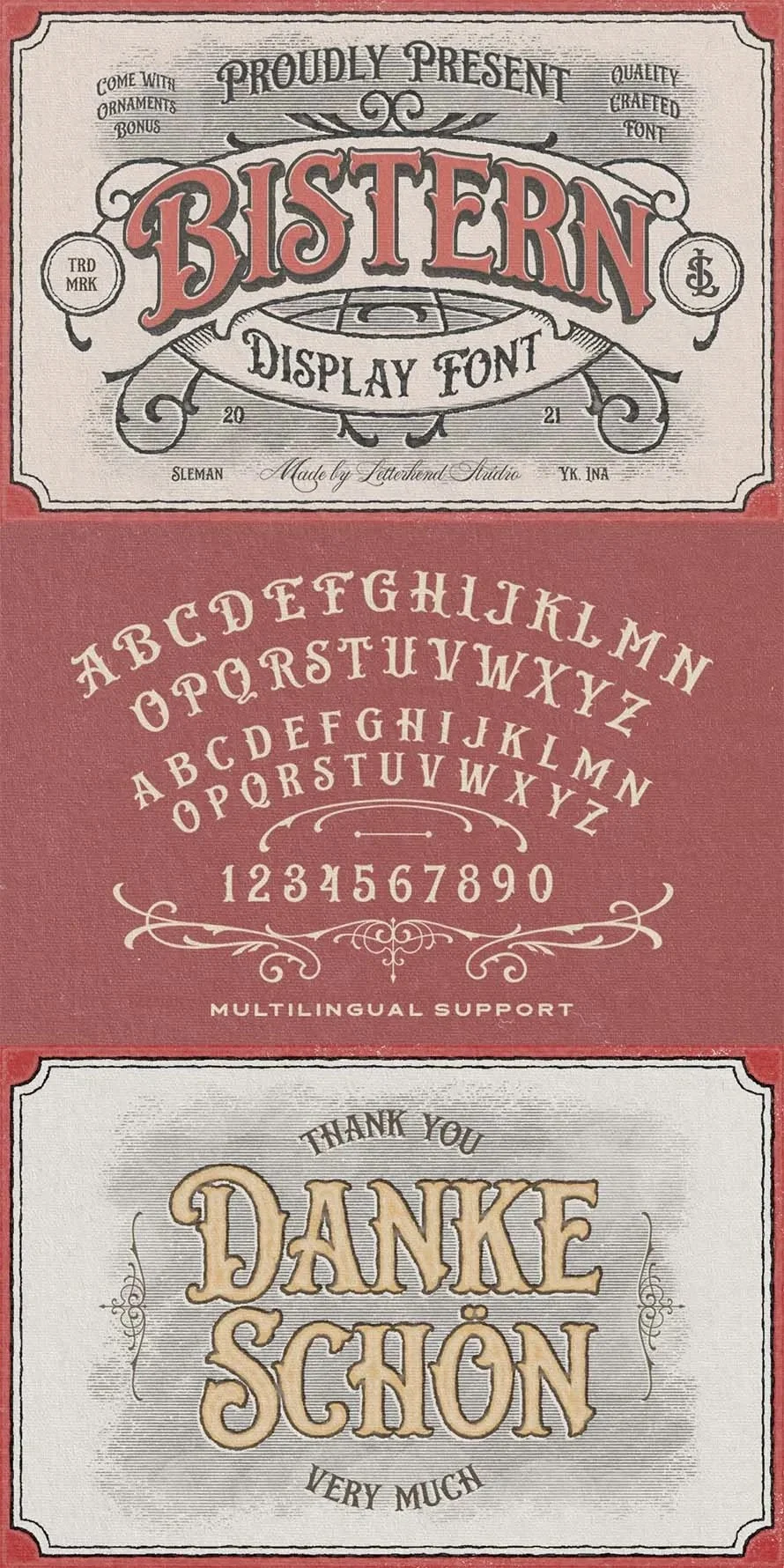
Bistern is strong, solid, and unapologetically Victorian. It is the go-to choice for headlines that need to feel authoritative and permanent, carrying a visual weight that is perfect for large-scale print projects.

9. Daewon: Greek-Inspired Elegance
Daewon brings a subtle, classic structure to the screen. It is incredibly effective for editorial layouts, flyers, and invitations where the objective is to create an air of timeless sophistication.

10. Westerion: The Display Classic
Westerion captures the simple, unpretentious beauty of early 20th-century display type. It works exceptionally well on apparel, allowing the wearer to sport a look that is both trendy and deeply rooted in design history.

(Note: These fonts are available for download through various design marketplaces, such as Envato, providing unlimited access to thousands of mockups and assets to help you finalize your projects.)

Implications for Modern Branding
The implications of this trend are significant. We are witnessing a move away from the "minimalist-at-all-costs" era that dominated the 2010s. While simplicity remains a virtue, consumers are beginning to crave the visual texture that only old-style serif typography can provide.

The "Human" Brand
In an age where AI-generated content is becoming ubiquitous, the deliberate use of vintage typography signals a human presence. It suggests that a brand has a story, a history, and a commitment to the craft of communication. By choosing a typeface that carries the weight of history, a brand effectively tells its audience: "We are not just a trend; we are a legacy."

Practical Advice for Designers
If you are considering incorporating these fonts into your workflow, start with the sample logos provided in this collection. Observe how these fonts interact with negative space and how they behave when paired with different color palettes. Don’t be afraid to experiment with tracking and kerning—the hallmark of a "classic" look is often in the subtle, thoughtful spacing between letters.

Conclusion
The resurgence of old-style serif fonts is more than just a passing fad; it is a fundamental correction in the way we perceive digital design. As we continue to navigate a world increasingly dominated by cold, digital screens, the warmth and history inherent in these letterforms will only grow in value.

Whether you are looking to revitalize an existing brand or create a new one from scratch, consider the power of the serif. By looking back at the printing presses of the past, we find the tools we need to create the most impactful designs of the future. Download your favorite typeface today, apply it to a project, and witness firsthand how a simple shift in typography can transform a brand from a static image into a compelling story.