
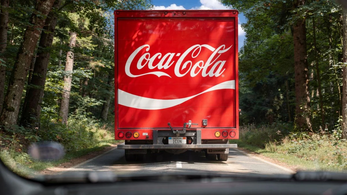
In the world of global branding, few visual identities carry the weight and recognition of the Coca-Cola script. It is a symbol that transcends language, geography, and culture, etched into the collective consciousness of billions. However, maintaining such a potent legacy is a paradox: how do you evolve a brand that is arguably already perfect?
The answer, according to the recent partnership between the beverage giant and the design agency Jones Knowles Ritchie (JKR), is not to reinvent, but to "make Coca-Cola more Coca-Cola." This mission, a delicate balancing act between historical reverence and modern-day agility, has resulted in a global visual refresh designed to unify the brand across every possible touchpoint.
Main Facts: The "More Coca-Cola" Mandate
The latest visual refresh for Coca-Cola was not intended to be a disruptive rebrand, but rather an amplification of the brand’s "core truth." The project aimed to address the fragmentation that naturally occurs within a massive global conglomerate operating across diverse markets. As brand identities proliferate across digital, physical, and experiential channels, inconsistencies can dilute the equity of an icon.
The central goal for JKR was to strip away the "noise" and refocus on the elements that define the brand at its most elemental level: the Spencerian script, the iconic red, and the distinctive bottle silhouette. By "amplifying" these assets, the agency sought to create a more cohesive visual language that functions seamlessly whether it appears on a tiny mobile screen or a massive digital billboard in Times Square.
Chronology: A Legacy of Evolution
To understand the weight of this refresh, one must look at the historical trajectory of the Coca-Cola identity. The logo has not remained static since its inception in 1886; it has been a living, breathing entity that adapts to the visual zeitgeist of the era.
The Early Years (1886–1900)
The original script was created by Frank Mason Robinson, bookkeeper to Dr. John Pemberton. It was never a formal "font" but a handwritten calligraphic style that became the company’s signature. Throughout the late 19th century, the logo saw minor tweaks to its flourishes and legibility, but the core essence remained remarkably stable.
The Mid-Century Refinements (1940s–1960s)
This period saw the introduction of the "Red Disc" and the first major attempts to standardize the brand’s appearance across vending machines and physical retail. The iconic "White Wave" (or Dynamic Ribbon) emerged later, adding a sense of movement and refreshment to the static text.
The Modern Consolidation (2000s–Present)
As digital transformation began to accelerate, Coca-Cola faced the challenge of maintaining its "analog" warmth in a "digital" space. The recent JKR-led initiative marks a new chapter in this chronology—a shift away from decorative elements and toward a "design-led" simplicity that prioritizes the logo as the hero of every interaction.
Supporting Data: The Anatomy of the Refresh
The refresh is characterized by a "less is more" approach, which is grounded in the psychological impact of brand recognition. Data-driven design suggests that the more an audience is exposed to a consistent brand asset, the higher the emotional recall.
The Return of the Logo
The most prominent change is the "centralization" of the logo. In many previous iterations, the logo was relegated to the corner of packaging or marketing materials. The new identity brings the logo to the center, treating it as the primary anchor point. By giving the logo more "breathing room"—increasing the negative space around the script—the brand ensures that its most valuable asset is never competing for attention.
Color as a System
The refresh also doubles down on the "Coca-Cola Red." Rather than using a spectrum of reds, the new guidelines enforce a singular, punchy, and highly saturated hue that is instantly identifiable, even in low-light conditions. This is a critical move for digital accessibility and visual consistency across mobile apps and social media platforms.
The "White Wave" Reimagined
The Dynamic Ribbon, while still present, has been refined. It is no longer a complex, multi-layered graphic but a cleaner, more fluid element that guides the eye toward the logo. This is a direct response to the need for "mobile-first" design, where complex gradients often fail to translate well on small, high-resolution screens.
Official Responses: The Philosophy of JKR
The partnership between JKR and Coca-Cola was rooted in a deep-dive investigation into the company’s archives. In interviews regarding the project, the creative leads at JKR emphasized that the primary challenge was "editorializing" the brand.
"We weren’t tasked with changing the logo, but with changing how the logo occupies space," said a spokesperson for JKR. "When you have a brand this famous, every pixel matters. We spent months looking at the original pen strokes of the Spencerian script to ensure that when we applied it to modern materials, we didn’t lose the ‘human’ touch that makes Coca-Cola feel authentic."
The Coca-Cola internal brand team echoed this sentiment, noting that the objective was to provide their global teams with a "kit of parts" that is easier to use but harder to break. "We wanted to empower our markets to be creative while ensuring that no matter where you are in the world, you know exactly what you are looking at," they stated.
Implications: The Future of Global Branding
The impact of this project extends far beyond the beverage industry. It serves as a masterclass for other global entities struggling with the "fragmentation trap."
The "Unification" Trend
We are currently witnessing a shift in the corporate world away from complex, multi-layered branding and toward "monolithic" identities. Companies like Apple, Nike, and now Coca-Cola have realized that in an attention-starved economy, simplicity is the ultimate form of sophistication. The implication for smaller brands is clear: if you have a legacy asset, don’t bury it under new trends. Amplify it.
Digital-First Integration
By optimizing the identity for digital touchpoints, Coca-Cola is acknowledging that the physical bottle is no longer the only "first point of contact." Whether it is a delivery app icon, a banner ad, or a VR experience, the logo must be as legible as it is iconic. This refresh sets a standard for how "heritage brands" can migrate into the metaverse and beyond without losing their souls.
Consumer Trust and Stability
In a volatile global market, consumers gravitate toward brands that feel stable and familiar. By leaning into its history—as evidenced by the "gorgeous retro imagery" utilized in the JKR "making of" campaign—Coca-Cola is signaling reliability. The refresh isn’t just about aesthetics; it is about reinforcing the emotional promise of the brand. It is a psychological signal that despite the chaos of the modern world, the "Coca-Cola" experience remains unchanged, consistent, and reliable.
Conclusion: The Endurance of the Icon
The project led by JKR is a testament to the power of thoughtful design. It proves that the most effective way to innovate is often to look backward, identify the core principles that made a brand successful in the first place, and polish them for a new generation.
As Coca-Cola continues to navigate a rapidly evolving marketplace, this refresh ensures that it does so from a position of strength. The logo hasn’t changed; the presence of the logo has. And in doing so, they have achieved the impossible: they have made one of the most famous brands in human history feel fresh, relevant, and more "Coca-Cola" than ever before.
For designers and brand strategists, the lesson is clear: true power lies not in constant reinvention, but in the disciplined, relentless pursuit of your own identity. When you have an icon, the job isn’t to change it—it’s to ensure the world never stops seeing it.