
In the world of branding, the most successful identity systems often rely on rigid grids, clear logic, and data-driven market positioning. However, when the psychic services platform Purple Garden approached the creative agency Mother Design for a complete overhaul, they were faced with a unique paradox: How do you design a visual identity for an industry built entirely on the intangible, the subconscious, and the metaphysical?
The resulting rebrand is a masterclass in experimental design, blending traditional artistry with unconventional, trance-like workshops. It serves as a compelling case study on how bypassing conventional "corporate" design processes can lead to a more authentic, resonant brand narrative.
The Core Objective: Elevating the "Seasoned Seeker"
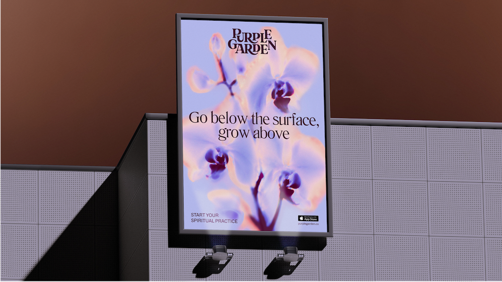
The spiritual services sector is often saturated with predictable visual tropes: hazy, low-resolution imagery, overly literal iconography, and high-pressure marketing tactics that urge users to "book now" for urgent answers. Purple Garden, seeking to cement its position as a market leader, required an identity that felt elevated, credible, and distinct from the "quick fix" competitors.
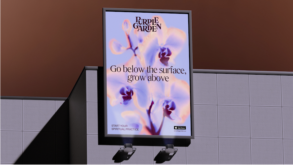
Jo Tulej, Creative Director at Mother Design, notes that the project began with a fundamental question: Who is the user? "Purple Garden is aimed at people who have had spiritual readings and practices before—these are ‘seasoned seekers,’" Tulej explains. "They don’t need the hard-sell. They need a brand that respects their journey and offers a sense of grounded guidance rather than a promise of magical resolution."
To achieve this, the team had to move away from standard design briefs and into a space of experiential research. They needed to understand the essence of the service, not just by observing it, but by participating in it.
Chronology of a Spiritual Design Process
The creative journey was far from linear. Instead of jumping straight into mood boards and typography, the Mother Design team opted for an immersive, multi-stage process that prioritized intuition over conscious aesthetic choice.
Phase 1: The "Séance" and Intuitive Workshops
Drawing inspiration from the pioneering Swedish artist Hilma af Klint—who claimed her abstract masterpieces were guided by spirits—the team initiated a series of workshops. They enlisted a holistic practitioner from the Purple Garden platform to facilitate chakra readings and sessions of automatic drawing and writing.
"The word ‘séance’ literally translates to ‘sitting’ or ‘session,’" says Tulej. "We wanted to see if we could bake that spirit of connection into the design process." By working with charcoal and paper in a group setting, the designers aimed to silence the "inner critic" and the desire for perfection, allowing raw shapes, textures, and marks to emerge from the subconscious.
Phase 2: Analysis and Translation
Several days after the initial workshops, the team returned to the studio to analyze the output. They looked for recurring motifs, tensions, and flows in their drawings. These abstract markings became the literal foundation for the brand’s visual language. This was not a standard brand audit; it was a collaborative synthesis of emotional experience and visual exploration.
Phase 3: Systematization and Refinement
Once the raw, intuitive forms were established, the team moved into the professional refinement phase. This involved taking the "wild" marks and translating them into a cohesive design system, ensuring that the final output was both emotionally resonant and functionally legible across digital platforms.
The Design Anatomy: A Closer Look
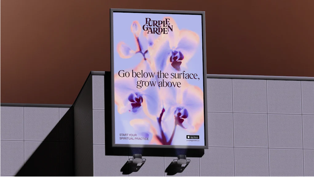
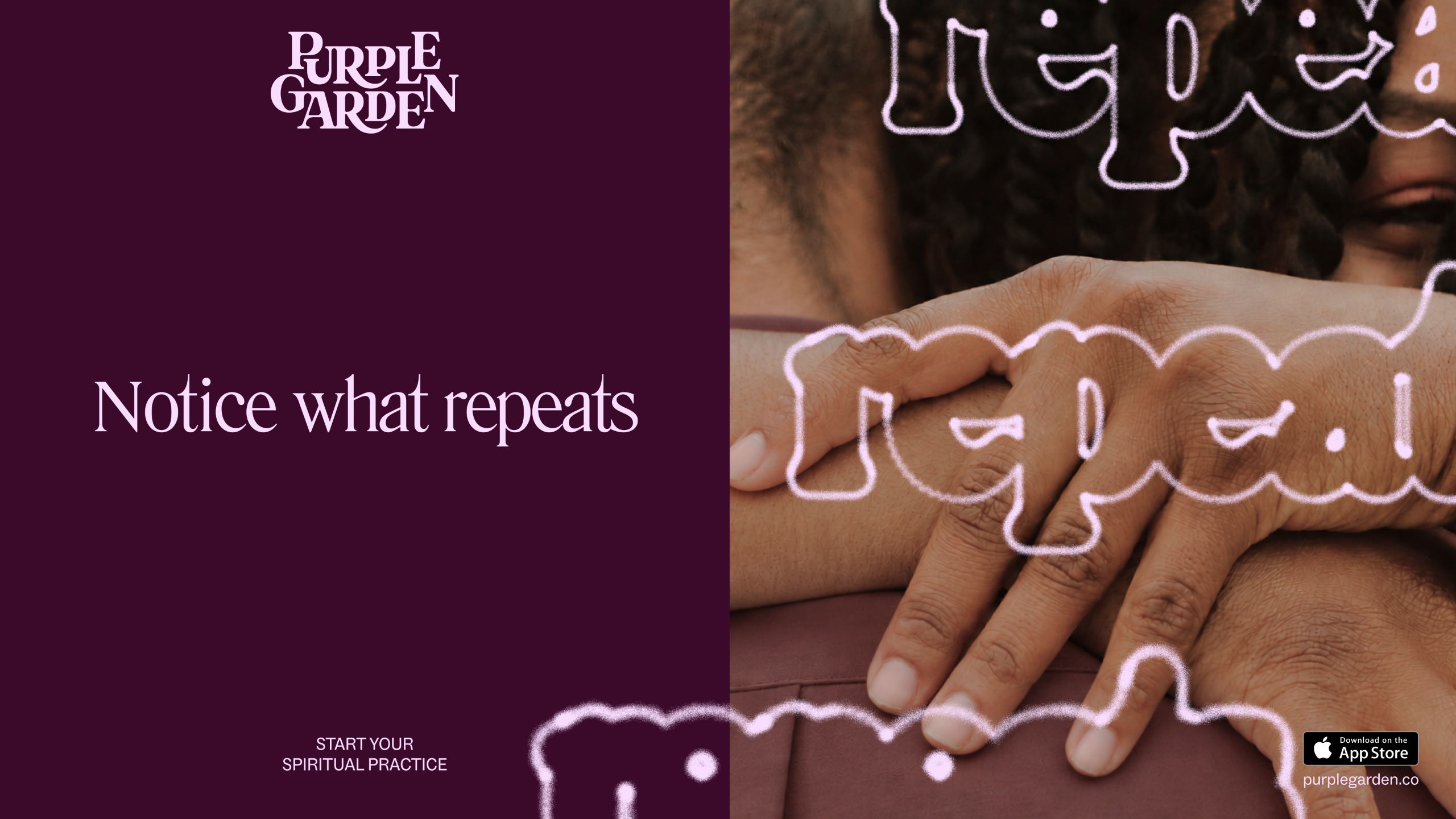
The resulting identity is a harmonious blend of the ethereal and the grounded. It moves away from the "flat" tones of the spiritual category, opting instead for a rich, sophisticated palette and sophisticated typography.
Typography and the "Growing" Wordmark
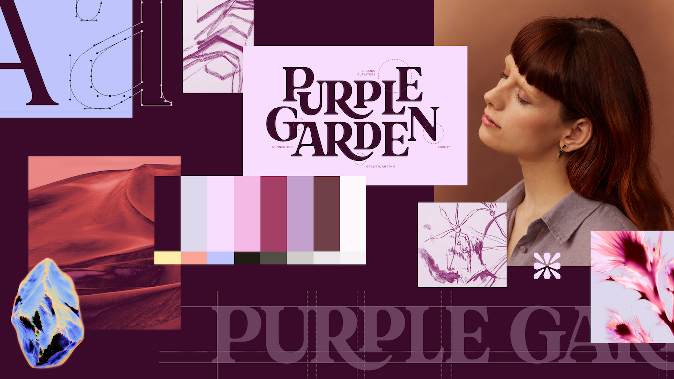
The new Purple Garden wordmark is a study in organic growth. Featuring elegant serifs and curved junctures, the letters appear to sprout and interconnect, symbolizing the concept of "continual growth." To balance this whimsy, the team implemented Literatura Present and ABC Social, typefaces that offer high legibility and a modern, digital-first feel.
The Power of "Charged Objects"
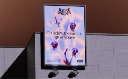
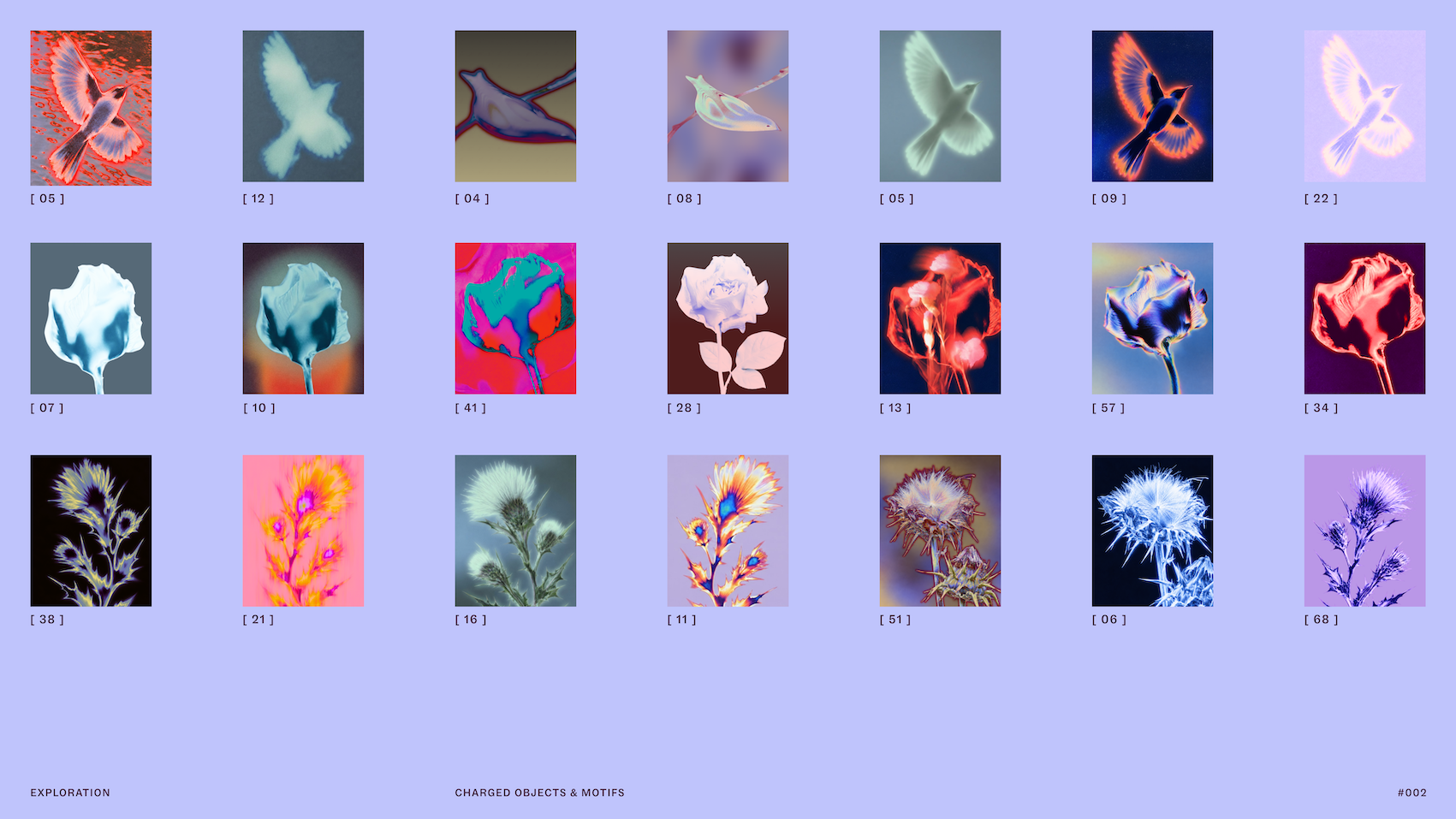
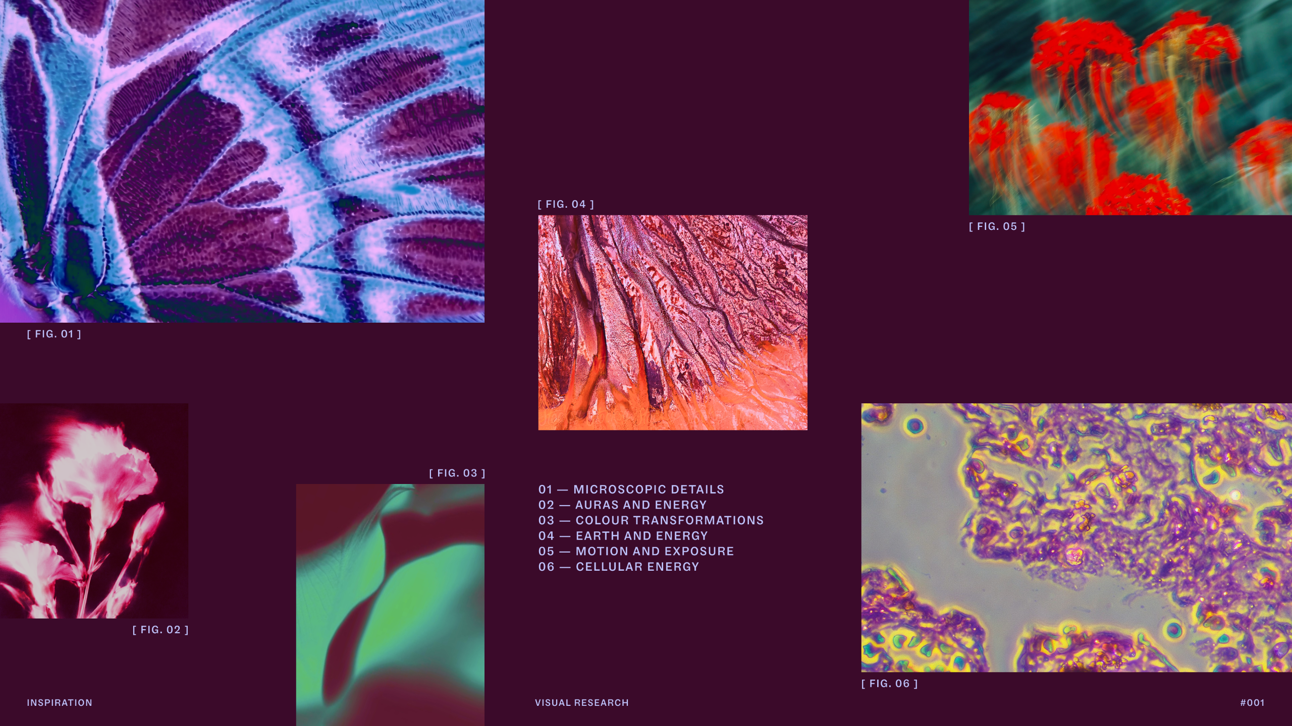
A central pillar of the identity is the use of imagery that the team calls "charged objects." These are not standard stock photos. Through the use of solarized glows and flame-like ripples, the team transformed everyday imagery into something that feels magical and charged with energy. This aesthetic choice represents the transactional exchange of energy between the practitioner and the client, moving the brand away from the static, "flatter" visuals often seen in the sector.
The Seven-Hue Palette
While purple remains the brand’s namesake and anchor, the new palette expands significantly. Mother Design introduced seven distinct, earthy tones that provide depth and contrast, allowing the brand to stand out in a digital ecosystem often dominated by single-note color schemes.
Official Perspective: Jo Tulej on Creative Vulnerability
For Jo Tulej, the project provided a rare opportunity to defend the value of "slow design." In an industry where projects are often rushed to meet arbitrary KPIs, Mother Design fought to protect their "Wild Card" time—a period of the process where output isn’t measured by immediate results, but by creative exploration.
"I was struck by how the initial séance experiment gave us a totally different way of starting a branding project," Tulej reflects. "It was slow, it was unclear, and it required a massive amount of trust—not just from us, but from our client. But by removing the pressure of a traditional KPI from the early phases, it gave our client a much richer, more robust output."
Tulej emphasizes that the success of the project stems from the agency’s ability to "get under the skin" of the audience. By contrast, she notes her work on other psychic platforms like Keen yielded a completely different visual result. "It proves that if you do the work to understand the specific aims of a business, you don’t fall into the trap of using the same design ‘tricks’ for everyone," she says.
Implications for the Future of Branding
The Purple Garden rebrand serves as a significant case study for the branding industry at large. It suggests several key takeaways for agencies and businesses alike:
- Process Determines Output: If the process is standard and commoditized, the brand will inevitably feel like a commodity. By adopting unconventional research methods, Mother Design created a visual language that is difficult to replicate.
- The Duality of Communication: The brand’s new voice is defined by "Active Contemplation." It manages to be both an invitation to act and an invitation to pause. This dual-purpose messaging is a masterclass in user experience, respecting the customer’s need for guidance without relying on fear-based, high-pressure tactics.
- Authenticity Over Tropes: By leaning into the "spiritual" nature of the category rather than hiding it behind sterile, "tech-first" design, the brand has gained a sense of authority. It is comfortable in its own skin, which in turn builds trust with the consumer.
A New Standard for "Spiritual" Tech
As the digital landscape continues to evolve, businesses in "niche" categories like astrology, tarot, and psychic services are finding themselves in a position to professionalize. Purple Garden’s rebrand proves that "professionalism" does not have to mean stripping away the soul of a brand. Instead, it means applying high-level craft, thoughtful strategy, and a willingness to be vulnerable to create something that feels truly human in an increasingly automated world.
By protecting the "wild card" time in their workflow, Mother Design has delivered more than just a logo or a color palette; they have built a cohesive, breathing world that invites the user to engage, reflect, and grow. It is a bold reminder that in design, sometimes the most productive path forward is the one that allows you to slow down, look inward, and trust the process.