
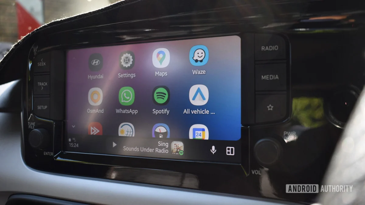
The driving experience is undergoing a digital transformation. As connected vehicles become an extension of our smartphone ecosystems, the interface between the driver and the car has become a critical battleground for usability, safety, and aesthetic design. Google, recognizing this, has been methodically rolling out a series of enhancements to its flagship automotive platform, Android Auto. Following the ambitious promises made at Google I/O 2026, the company is now quietly pushing out a significant visual overhaul to one of the most frequently used components of the dashboard: the media player card.
This latest update, discovered through an in-depth APK teardown, signifies a shift toward cleaner, more organized information architecture. While the current iteration of the media player relies on a full-bleed album artwork aesthetic, the forthcoming design prioritizes readability and expanded functionality, marking a subtle but meaningful evolution in how we interact with our music and podcasts while on the road.
Main Facts: What Is Changing?
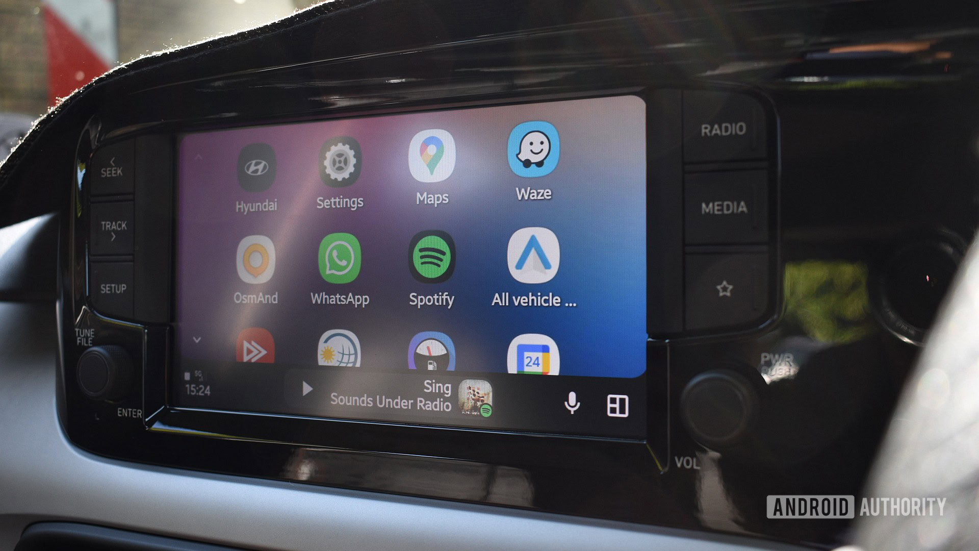
For the average driver, the Android Auto dashboard is a hub of multitasking. It typically splits screen real estate between navigation, communication, and media. The current media card, while functional, often feels cluttered because it uses the song’s album artwork as a full-size, semi-transparent background, with playback controls and metadata layered on top.
The newly discovered design takes a more conventional approach. Under the revised layout:
- Album Art Placement: The artwork is moved to a centralized, fixed position within the card rather than serving as the background.
- Blurred Aesthetic: To maintain visual continuity, the system uses the dominant colors of the album art to create a soft, blurred background, reducing the "busy" feel of the current interface.
- Typography and Hierarchy: Song titles and artist names are shifted below the artwork and centered. This design choice separates the visual anchor (the album cover) from the text, theoretically allowing for quicker, safer glancing by the driver.
- Expanded Functionality: Perhaps most importantly, the redesign accommodates additional playback controls. Depending on the specific application and the display density of the vehicle’s head unit, users may soon see dedicated buttons for "Like," "Shuffle," and "Repeat" directly on the dashboard card.
It is important to note that this redesign is currently limited to the split-screen dashboard view. When a user taps the media card to launch the full-screen player, the experience remains consistent with the current, established interface.
Chronology: The Road to I/O 2026 and Beyond
The journey toward this update began in earnest at Google I/O 2026. During the keynote, Google unveiled a broad vision for the future of Android Auto, promising deeper integration with Material 3 design principles, interactive widgets, and support for a wider array of video streaming applications.
- Q1 2026: Google began pushing out subtle updates to the media player, including the now-standard "squiggly" progress bar and refined touch targets for buttons. This was the first hint that a larger aesthetic shift was underway.
- May 2026 (I/O Conference): Google officially announced the "makeover," emphasizing a more modular, widget-based dashboard that adapts to different vehicle screen aspect ratios.
- Q3 2026: The rollout of Google Maps’ "Immersive Navigation" began, which introduced 3D building renderings and more detailed road features to the dashboard. This demonstrated Google’s commitment to high-fidelity visuals.
- Late 2026: Through recent APK teardowns of the latest Android Auto builds, developers and tech analysts identified the hidden layout for the new media player card. This confirms that while the I/O announcement set the stage, the implementation is happening in iterative, incremental waves.
Supporting Data: Why Design Matters in the Cockpit
In the automotive industry, interface design is not merely a matter of taste; it is a matter of cognitive load. According to research from the National Highway Traffic Safety Administration (NHTSA) and various human-factors engineering studies, the "eyes-off-road" time is the primary metric for driver distraction.
The current Android Auto media card—with its busy, layered background—can occasionally make text difficult to read, especially in bright sunlight or high-contrast environments. By adopting a blurred background and a more rigid, centered hierarchy, Google is essentially adhering to "glanceability" principles. A centered layout allows the human eye to find information in a predictable location every time, reducing the processing time required for the brain to decode the information on the screen.
Furthermore, the inclusion of "Like," "Shuffle," and "Repeat" buttons addresses a common pain point: the need to dive into the full-screen app just to perform a simple action. By bringing these controls to the main dashboard, Google is minimizing the number of taps required, which translates directly to shorter interaction sessions and more focus on the road ahead.
Official Responses and Corporate Strategy
Google has remained characteristically tight-lipped about the specific rollout schedule for this feature. As is standard practice for the company, the feature is being pushed via server-side flags, meaning that even if the code is present in the latest APK, users may not see it until Google flips the switch on their end.
In the wake of the I/O 2026 announcement, Google representatives emphasized that their goal is to provide a "consistent, yet adaptive" experience. "Android Auto should feel like a native part of the car, regardless of the screen size or hardware manufacturer," said a Google product spokesperson during a post-keynote briefing. The focus, they noted, is on "reducing complexity" and ensuring that the most relevant information is always front and center.
While there has been no dedicated press release for the media card update, the company’s ongoing commitment to Material 3—a design language focused on personalization and fluid motion—suggests that this is part of a larger, systemic upgrade to all Android-powered platforms, including Android Automotive OS (the native version of the software built directly into vehicles).
Implications: What This Means for Drivers
The implications of this update extend beyond simple aesthetics. For the driver, it means a more streamlined, less distracting experience. For app developers, it signals a need to ensure their media services are compatible with the new, tighter constraints of the media card.
1. The Death of the "Busy" Interface
The industry-wide move toward minimalism in UI/UX is reaching the automotive sector. By removing the full-bleed image as the primary background, Google is acknowledging that the dashboard is a functional workspace, not a digital photo frame. This design philosophy will likely continue to influence how other elements of the Android Auto interface are handled in future updates.
2. Hardware Scalability
The mention of "display density" is critical. One of the greatest challenges in the automotive space is the fragmentation of hardware. Some cars have massive, high-resolution portrait screens, while others use small, low-resolution landscape displays. By designing a card that can dynamically add or remove buttons based on available space, Google is ensuring that the software remains usable across both budget-friendly hatchbacks and luxury SUVs.
3. The Future of Interaction
As we look toward 2027 and beyond, the dashboard is likely to become even more reactive. With the integration of advanced AI, the media card could theoretically begin to suggest playlists, podcasts, or audiobooks based on the time of day, the user’s location, or the duration of the commute. By cleaning up the visual layer now, Google is clearing the "clutter" to make room for more intelligent, context-aware features in the future.
Conclusion: A Work in Progress
As with all features uncovered through APK teardowns, it is vital to remember that the design is still a "work in progress." Google often uses these hidden flags to test features with a subset of users, monitoring telemetry data to see how the changes affect engagement and user behavior. There is always a possibility that the design could be tweaked further, or in a rare instance, retracted entirely.
However, given the trajectory of Google’s design language and the feedback following the I/O 2026 keynote, the new media card represents the "new normal." It is a calculated step toward a safer, more intuitive, and visually harmonious driving environment. For those who rely on Android Auto for their daily commute, these small, incremental changes are what keep the platform relevant in an increasingly competitive market of connected car technologies. As we wait for the official rollout, one thing is clear: the dashboard is becoming more than just a menu—it is becoming a refined, purposeful tool for the modern driver.