 Siti Muinah
After nearly two decades covering the intersection of art, technology, and industry, I have attended my fair share of creative conferences. From sterile, corporate summits to grassroots gatherings, the visual identity—the "face" of these events—always serves as a fascinating bellwether for the industry.
Design conferences exist in a unique ecosystem. They are populated by the brightest minds in the field, professionals who are both hyper-aware of aesthetic trends and deeply motivated to impress their peers. Consequently, while I have rarely encountered a "bad" conference identity, I have often seen them drift toward the safe, the sanitized, and the predictable.
However, the unveiling of the visual identity for the World Design Congress (WDC) 2027 in Seoul marks a refreshing, chaotic, and intellectually rigorous departure from the norm. It is a masterclass in controlled maximalism, proving that institutional prestige does not have to be synonymous with visual boredom.
The Evolution of the World Design Congress
The World Design Congress is the flagship event of the World Design Organization (WDO), an international non-governmental body that has been the global standard-bearer for industrial design since its inception in 1959.
The congress operates on a biennial cycle, acting as a nomadic hub for designers, policymakers, and industry leaders to discuss how design shapes our collective future. The event is a high-stakes affair, with each host city eager to showcase its local creative economy. Following the 2025 edition held at the iconic Barbican in London, the spotlight now shifts to South Korea.
The 35th edition of the Congress is scheduled for September 22–25, 2027, in Seoul. As the WDO prepares to mark its 70th anniversary, the pressure to produce a brand identity that captures both the organization’s legacy and the hyper-modern energy of its host city was immense.
A Visual Riot: The Seoul Identity
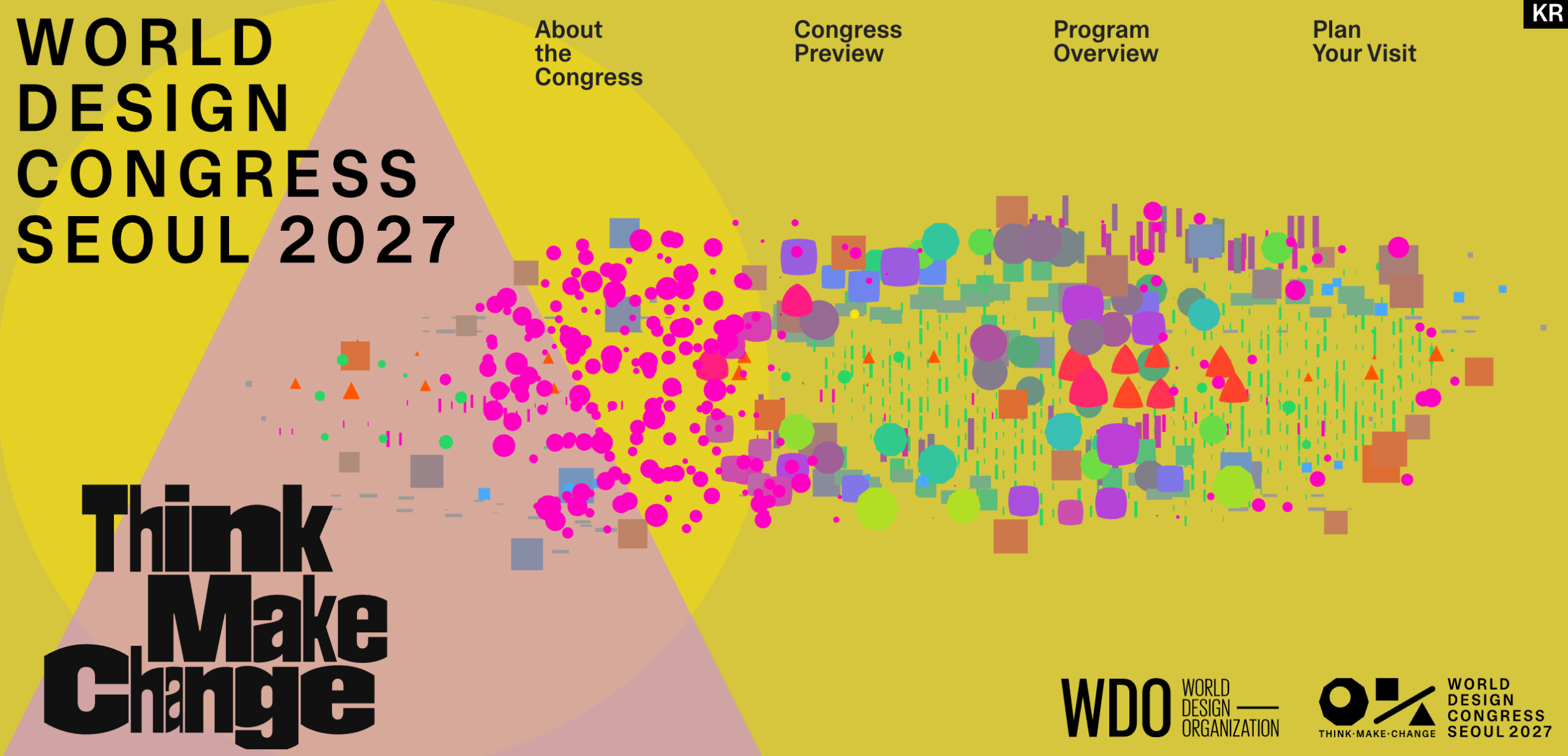
If you visit the official World Design Congress 2027 website, you are immediately struck by a sense of kinetic energy. The identity, crafted by the Seoul-based studio Everyday Practice, is a far cry from the minimalist, monochrome logos that dominate current design festival branding.
The visual language is defined by:
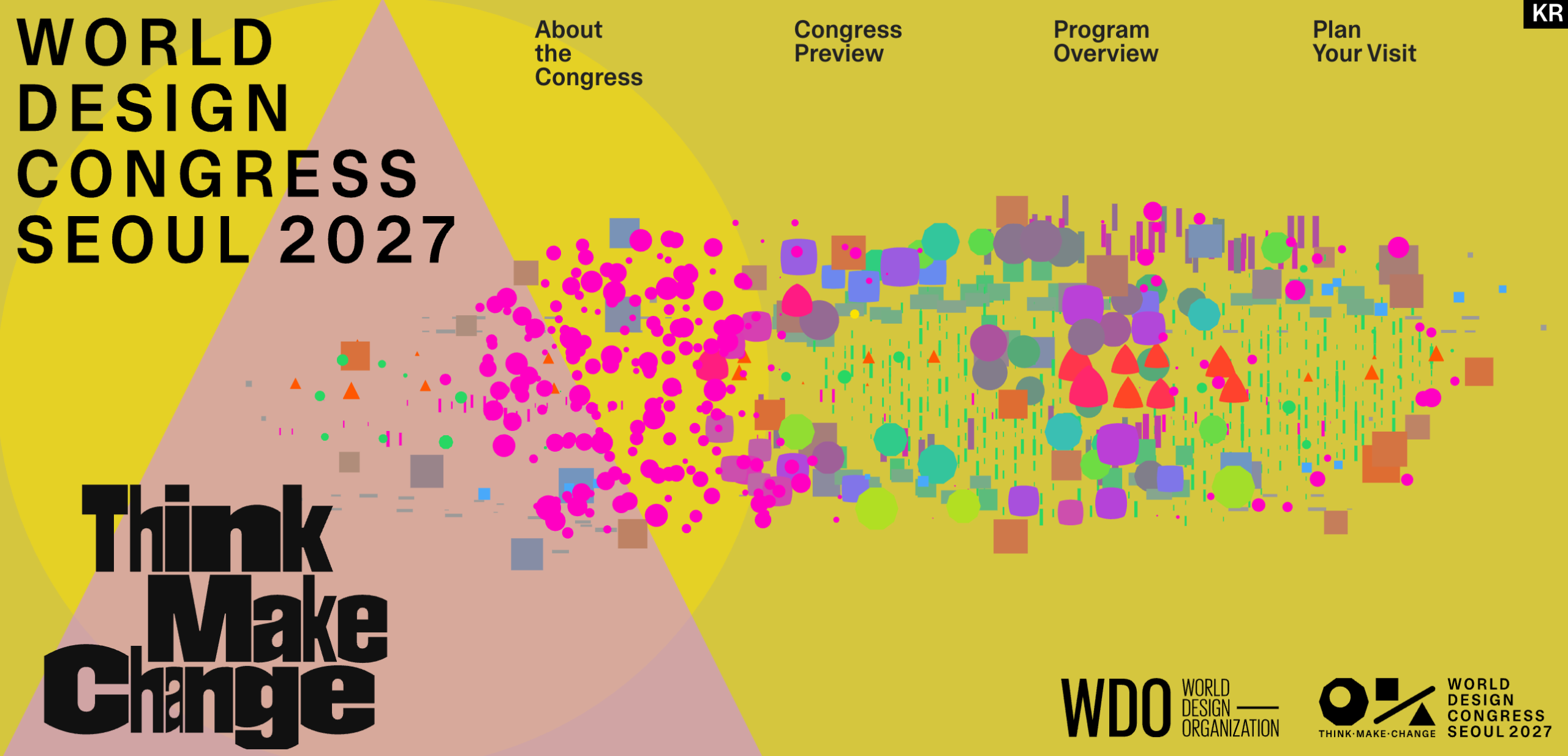
- Clashing Chromatics: A bold, high-contrast palette that refuses to shy away from saturation.
- Geometric Flux: Shapes that seem to drift, collide, and scatter across the screen.
- Kinetic Motion: The logo itself acts as a "seesaw" in a constant state of transition, mirroring the fluid nature of design thinking.
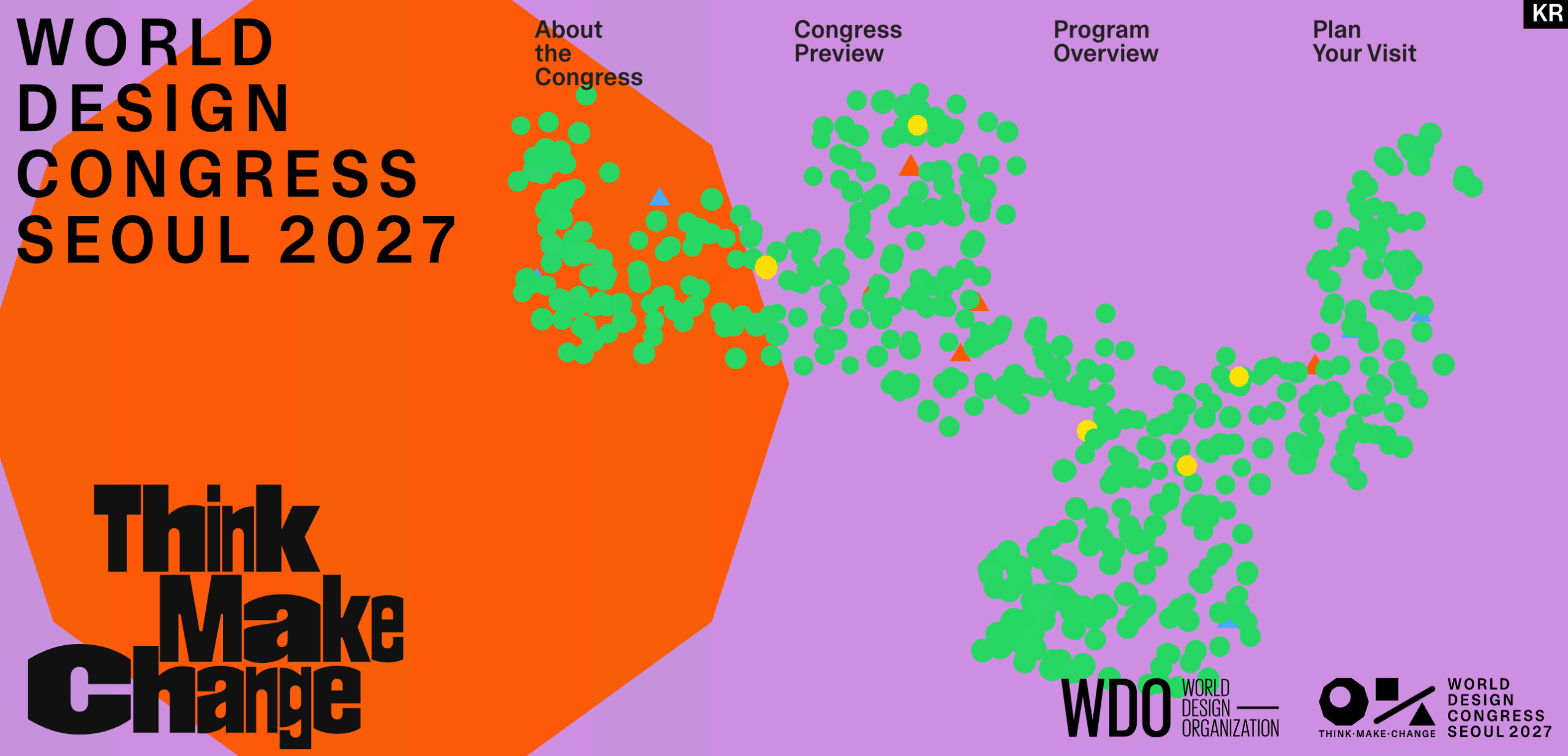
- Generative Systems: The identity is not static; it responds and shifts, suggesting a living, breathing urban environment.
In an era where "corporate minimalism" has led to a sea of sans-serif sameness, this identity feels like a necessary act of rebellion. It is loud, unapologetic, and, to the casual observer, perhaps even a bit "weird." But upon closer inspection, the chaotic exterior hides a deeply disciplined core.
Chronology of the Brand Development
The development of this identity did not happen in a vacuum. It represents a multi-year effort to encapsulate the dualistic nature of Seoul—a city defined by the tension between its ancient heritage and its role as a global technology powerhouse.
- Selection Phase: The WDO and local Seoul organizers sought a creative partner capable of synthesizing the city’s multifaceted identity without relying on tired tropes of K-culture or predictable "futuristic" neon aesthetics.
- Concept Synthesis: Everyday Practice began by mapping the urban geography of Seoul. They identified the "city of contrasts" as the central thesis: the juxtaposition of centuries-old palaces against glass-and-steel skyscrapers, and the serene, quiet corners of traditional villages existing just streets away from the sensory overload of the city’s nightlife.
- Color Theory Application: The studio developed a seven-color palette, each hue serving as a narrative device:
- Green: Representing the city’s expansive urban parks.
- River Blue: Inspired by the lifeblood of the city, the Han River.
- Sunset Orange: Capturing the atmospheric transition over the skyline.
- Midnight Magenta & Dawn Violet: Reflecting the vibrancy of Seoul’s legendary nocturnal culture.
- Autumn Yellow & Stone Gray: Nodding to the seasonal shifts and the historical architecture that anchors the city.
- Public Unveiling: The launch of the website and accompanying digital collateral signaled a shift in WDO’s branding strategy, moving away from institutional rigidity toward a more expressive, playful aesthetic.
Why "Loud" Design Works
Many institutions fear that a "loud" design identity will diminish their authority. The prevailing logic is that a logo for a global body should be stable, symmetrical, and serious. However, the WDC 2027 identity succeeds precisely because it challenges that assumption.
The "seesaw" logo is the perfect metaphor for the design process: it is a balancing act of Think, Make, and Change. By allowing the logo to wobble and the shapes to scatter, Everyday Practice suggests that design is not a fixed destination but a dynamic, ongoing negotiation.
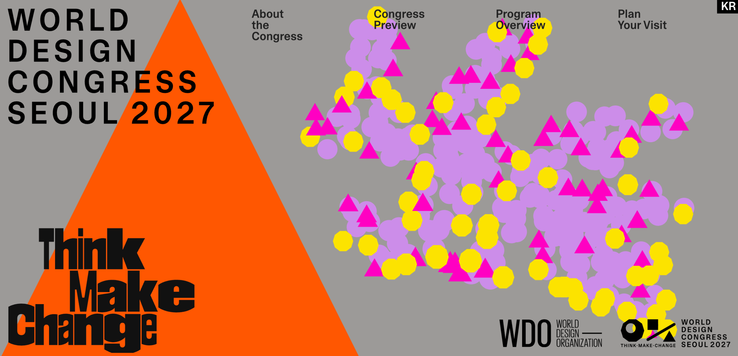
Furthermore, the consistency across various applications—from the pastel-heavy homepage to the greyscale print variants—demonstrates that the system is robust. It is not just "thrown together"; it is a generative system with clear, logical rules. The loudness is functional; it serves to draw the eye, invite interaction, and signal that the WDO is ready to engage with the next generation of designers.
Implications for the Future of Design Festivals
The success of this branding strategy holds significant implications for the wider design community. We are currently witnessing a "design recession" of sorts, where agencies and institutions have converged on a bland, homogenized style to avoid offense and ensure broad appeal.
By commissioning an identity that is inherently polarizing, the WDO has sent a clear message: risk is necessary for relevance.
The "Safe" vs. "Brave" Spectrum
- The Status Quo: Many recent rebrands have utilized a single, muted typeface and a "bank-style" logo. This approach is low-risk but low-impact. It fails to inspire or differentiate.
- The Seoul Approach: By embracing maximalism, the WDC 2027 branding forces the viewer to pay attention. It communicates that the event is not just a meeting of minds, but a collision of ideas.
This project proves that a reasoned, well-constructed piece of maximalism can be approved by a serious, international institutional client. It is a validation for designers who have been told to "dial it back." It suggests that if the underlying concept is strong—in this case, the urban tension of Seoul—then the execution can be as chaotic as necessary.
Conclusion: A New Standard for 2027
As we look toward September 2027, the visual identity for the World Design Congress serves as a promise. It promises that the event will not be a dusty, stagnant affair, but a vibrant exploration of the tensions that define our modern world.
Everyday Practice has managed to create an identity that is, at once, deeply rooted in the specific geography of Seoul and broadly applicable to the universal challenges of industrial design. It is a reminder that in the world of design, if you are not willing to make a little noise, you might not be heard at all.
For the WDO, reaching its 70th anniversary is a milestone. For the rest of us, seeing them take this leap into a more colorful, chaotic, and thoughtful future is a sign that the industry is still capable of surprising us. The World Design Congress 2027 is already shaping up to be one of the most visually compelling events of the decade, and it hasn’t even begun yet.

 Asep Darmawan