In the modern automotive landscape, branding is everything. Long before a consumer turns an ignition key or experiences the tactile thrill of a leather-stitched steering wheel, they are captured by a visual identity. From the infancy of childhood, where logos are often among the first complex symbols we learn to recognize, these emblems serve as shorthand for prestige, engineering prowess, and cultural status.
A car’s logo is not merely a piece of metal or a decal applied to a hood; it is a corporate manifesto compressed into a single graphic. When these symbols are executed correctly, they transcend their status as branding to become icons of desire. However, the path to an iconic logo is fraught with risk. As seen in recent years with high-profile rebranding attempts—such as Kia’s polarizing 2021 redesign—altering an established symbol can confuse the market and erode years of brand equity.
The following five luxury marques demonstrate how historical narratives, personal passions, and geographic heritage converge to create some of the most recognizable logos in automotive history.
1. Ferrari: The Prancing Horse and the Skies of WWI
The Origins of a Legend
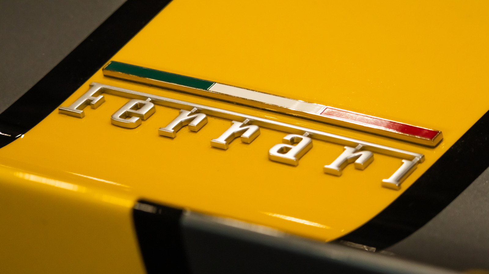
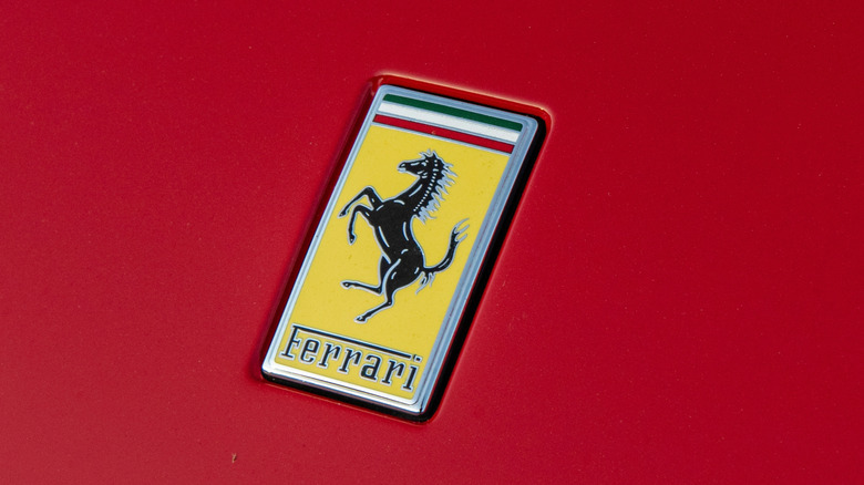
Arguably the most prestigious emblem in the history of the automobile, the Ferrari "Prancing Horse" (Cavallino Rampante) is a symbol synonymous with high-octane performance and Italian luxury. While Ferrari is now a titan of the track and road, the logo’s origins are firmly rooted in the clouds.
In 1923, an aspiring race car driver named Enzo Ferrari achieved a significant victory at the Circuito del Savio. Following his success, he was introduced to the parents of Francesco Baracca, a legendary Italian fighter pilot and World War I ace who had been killed in action. Baracca had famously adorned his biplane with a rearing black stallion.
The Evolution of the Emblem
Contessa Paolina Biancoli, Baracca’s mother, reportedly told Enzo that the symbol would bring him good fortune. Enzo adopted the horse, but he curated the rest of the badge to reflect his own identity. He added a vibrant yellow background—the color of his hometown, Modena—and topped the crest with the green, white, and red of the Italian flag. The initials "S.F." were included to represent Scuderia Ferrari (Ferrari Stables).

Market Implications
When the first Ferrari road car debuted in 1947, the logo was already imbued with a sense of history that other manufacturers spent decades trying to fabricate. Today, the Ferrari brand remains untouchable in terms of prestige. With entry-level models like the Ferrari Amalfi starting at approximately $266,000, the logo functions as a barrier to entry, signaling a level of affluence that few other brands can replicate. The badge remains virtually unchanged, a testament to the power of a legacy design that requires no "modernization" to remain relevant.
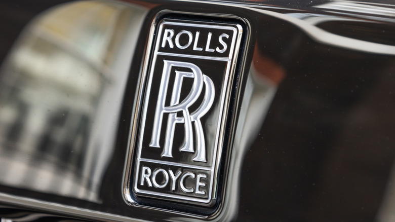
2. Rolls-Royce: The Spirit of Bespoke Engineering
Architectural Foundations
Founded in 1906 by Charles Rolls and Henry Royce, the brand was built on the promise of mechanical perfection. Their logo, featuring two superimposed "R"s, was designed to reflect the synergy between the two men. Originally rendered in red enamel, the logo transitioned to a more understated black in 1934, reflecting the brand’s shift toward a more somber, dignified aesthetic.
The Goddess and the Hood
While the double-R emblem serves as the official corporate logo, the Spirit of Ecstasy—the hood ornament depicting a woman leaning forward with her gown flowing behind her—is perhaps the most recognizable mascot in the world. Introduced in 1911, the icon was born from the romantic obsession of Lord Montagu, who commissioned sculptor Charles Sykes to create an ornament for his personal car, modeled after his secretary and muse, Eleanor Velasco Thornton.
Supporting Data: The Cost of Perfection
Rolls-Royce ownership is a commitment to the pinnacle of bespoke manufacturing. Current models utilize high-grade wool, rare wood veneers, and noise-cancellation technology that creates a "silent cabin" experience. With prices routinely exceeding $300,000, the brand doesn’t just sell cars; it sells a sanctuary. The consistency of the logo and the ornament across the last century serves as an anchor for the brand, assuring buyers that while the technology evolves, the commitment to "the best" remains stagnant.
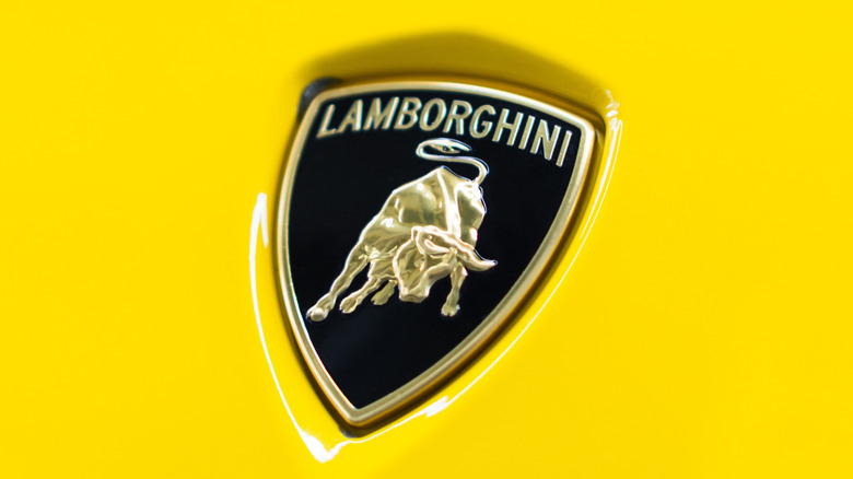
3. Lamborghini: From Tractors to Supercars
A Shift in Identity
The story of Ferruccio Lamborghini is one of the most famous "grudge" stories in the automotive world. Originally an agricultural machinery manufacturer, Ferruccio was a successful businessman who felt insulted by Enzo Ferrari regarding the quality of his clutch. He founded Automobili Lamborghini in 1963 to prove he could build a better car.
The Astrology of Power
The Raging Bull is a deliberate contrast to the Prancing Horse. Ferruccio was a Taurus, and his fascination with bullfighting—a sport defined by bravery and raw power—led him to choose the bull as his company’s spirit animal. The first prototype’s badge was a simple red-and-white affair, but the design evolved into the gold-on-black shield that is now synonymous with extreme speed.
Recent Shifts and Modernity
In 2024, Lamborghini introduced a minimalist update to the logo. The gold bull is flatter and more aggressive, signaling the brand’s transition into the hybrid and electric era, starting with models like the 2026 Temerario. By streamlining the logo, the company aims to maintain its "flashy" identity while signaling a modern, tech-forward trajectory. Whether on a steering wheel or a leather headrest, the bull serves as a constant reminder of the brand’s defiance of the status quo.
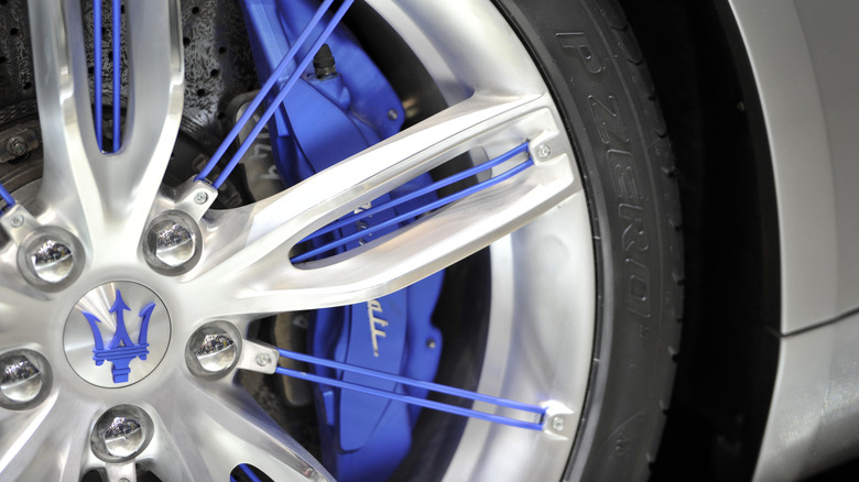
4. Maserati: The Trident of Neptune
Artistic Inspiration
In the world of 1920s automotive design, many companies were opting for winged mascots. The Maserati brothers took a different, more localized approach. Mario Maserati, an artist who stood apart from his racing-obsessed siblings, drew inspiration from the fountain of Neptune in the Piazza Maggiore of their native Bologna.
The Symbolism of the Three Prongs
The Trident is more than just a nod to the god of the sea; it represents the multifaceted nature of the Maserati brand. The three prongs have historically been interpreted as "Power, Control, and Strength." This "number three" motif appears throughout the vehicle’s design, from the signature side-vent gills to the light clusters.
Implications for Design
The evolution of the logo—from the original silver rectangle of 1926 to the modern blue-and-white oval—reflects the brand’s ability to remain classic while adapting to contemporary aesthetic standards. Maserati uses the Trident as an immersive design element, placing it on everything from the grille to the C-pillars, reinforcing the brand’s heritage as an Italian design house rather than just a motor company.
5. Lucid: The California Bear and the New Frontier
A Modern Take on Branding
Lucid Motors represents the disruptive force of the EV market. Unlike the heritage-heavy brands above, Lucid is a 21st-century startup. Their logo, however, is not a nameplate, but a subtle, clever tribute to their home state of California.
The Hidden Iconography
The logo is a stylized bear—a reference to the California state flag. Unlike the aggressive, forward-facing animals of Ferrari or Lamborghini, the Lucid bear is integrated into the vehicle’s "Easter Eggs." It appears in the upholstery, the digital interfaces, and even the "frunk."
Official Corporate Stance
Lucid has stated that the bear represents "entrepreneurial freedom" and sustainability. In a recent design update, the bear was adjusted to lift its head, symbolizing a more forward-looking, optimistic stance. This is a brilliant branding strategy: it provides a sense of warmth and localized identity to a high-tech, clinical product. By hiding the logo in plain sight, Lucid creates an exclusive, "if you know, you know" connection with its owners, distinguishing itself from legacy brands that wear their badges on their sleeves.
Conclusion: The Endurance of the Symbol
The logos of luxury automotive brands are more than just marketing collateral. They are historical markers that track the evolution of the companies themselves. From the war-torn skies of Italy that gave us Ferrari’s horse to the modern, minimalist bear of California’s Lucid, these symbols serve to bridge the gap between the machine and the driver.
As we move toward a future defined by electrification and automation, the importance of the badge will only grow. In an era where many cars are beginning to look similar in their quest for aerodynamic efficiency, the logo remains the primary differentiator—a tiny piece of metal or light that carries the weight of a century of engineering, passion, and, ultimately, human ambition.