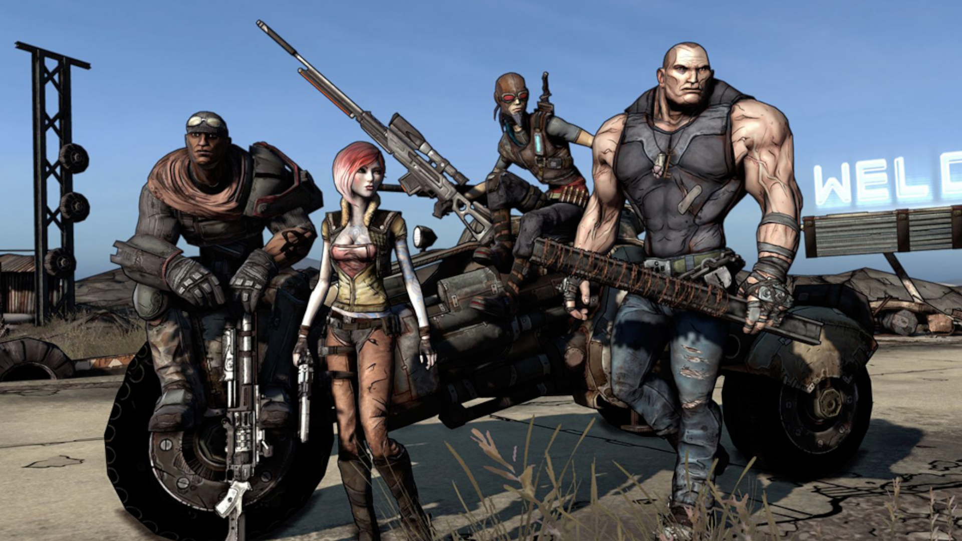
It is nearly impossible to visualize the world of Pandora without its signature thick ink lines, vibrant, cel-shaded color palette, and the anarchic, comic-book aesthetic that has become synonymous with the Borderlands franchise. Yet, as the series approaches its two-decade milestone, a startling revelation from Take-Two Interactive CEO Strauss Zelnick has shed light on a pivotal moment in gaming history: Borderlands was originally slated to be a gritty, "beige" shooter that looked indistinguishable from the generic titles dominating the late 2000s.
In a candid discussion on the Capital Allocators podcast with David Senra, Zelnick revealed that the game’s iconic visual overhaul was not an early creative decision, but a desperate, $50 million eleventh-hour pivot that risked the future of the company.
The Origin: A Brooding, Generic Vision
When Borderlands was first teased in the mid-2000s, the industry was in the throes of the "brown and grey" era. Following the massive success of titles like Gears of War and the burgeoning popularity of post-apocalyptic shooters like Fallout 3, developers were obsessed with "realism" and desaturated color palettes. The original vision for Borderlands leaned heavily into this trend.
Early internal builds featured a grounded, realistic art style. It was atmospheric, perhaps even moody, but it lacked the "hook" that would eventually propel the franchise to multi-million unit sales. At the time, Gearbox Software was attempting to capture a sense of gritty sci-fi realism, but as the project neared its projected launch date, the internal consensus shifted from confidence to concern.
Chronology: The Last-Minute Pivot
The timeline of this creative crisis is what makes the story so remarkable. According to Zelnick, the decision to scrap the existing art style occurred when the game was essentially "done."
- The Pre-Launch Phase: Gearbox had spent years and significant capital developing a traditional, realistic shooter. The game was effectively two months away from shipping.
- The "Crisis" Meeting: The head of the division approached Zelnick with a frank admission: the game was not good enough. The team realized that in a saturated market, their product failed to stand out. It looked too similar to contemporary competitors like id Software’s Rage or Fallout 3.
- The Decision: Zelnick was faced with a choice that would break most publishers: ship a "good enough" game and hope for the best, or halt production to embark on a massive, costly, and time-consuming artistic overhaul.
- The Transformation: Zelnick gave the green light. The team pivoted to the now-famous "cel-shaded" style, a process that required an additional year of development and an investment of $50 million—a staggering sum at the time for a game that was already technically finished.
Supporting Data: The Cost of Identity
To understand the magnitude of this decision, one must consider the financial climate of the mid-2000s. Take-Two was not the juggernaut it is today; they were in the middle of a corporate turnaround. Capital was limited, and the gaming industry was notoriously unforgiving regarding delays.
"We had not turned around the company yet, we had very limited capital," Zelnick recalled. "The head of the division came into my office and said, ‘Look, we just don’t think this is good enough… the art style is not appropriate and it’s not differentiated, we want to remake the game.’"
The $50 million figure represents more than just art assets; it encompasses the "opportunity cost" of an entire year of development salaries, marketing shifts, and the high-stakes risk of delaying a launch in a volatile fiscal quarter. While Zelnick admits it was a "non-obvious" choice, he notes that he "dug in and did his homework." He recognized that while the financial risk was high, the risk of releasing a "beige" shooter that would inevitably be forgotten in a sea of similar titles was far higher.
Official Responses: Zelnick on Leadership
Strauss Zelnick’s commentary on the situation serves as a masterclass in executive decision-making. In his interview with David Senra, he emphasized that most industry executives would have prioritized the immediate quarterly earnings over the long-term health of the brand.
"No one else in the business would have done it," Zelnick stated. By betting on the creative intuition of the development team, Zelnick fostered a culture where "artistic integrity" was eventually tied to "market differentiation." He recognized that in a medium defined by visual storytelling, a game that doesn’t look like anything else on the shelf has a significantly higher chance of longevity.
Implications: A Legacy Defined by Risk
The implications of this pivot are monumental for the gaming landscape. Had Borderlands launched with its original, gritty art style, it is highly probable that the franchise would have been relegated to the annals of "forgotten shooters"—the kind of game you find in a bargain bin, lauded for its mechanics but ignored for its lack of identity.
1. Market Differentiation
The switch to the stylized, comic-book aesthetic allowed Borderlands to age gracefully. While the "realistic" shooters of 2009 now look muddy, low-resolution, and dated, the original Borderlands—and its sequels—retains a sharp, timeless quality. This stylistic choice effectively "future-proofed" the franchise.
2. The Power of "The Hook"
Borderlands proved that a game’s "look" is as important as its "feel." By embracing a look that felt like a living graphic novel, Gearbox created a brand identity that was instantly recognizable. This identity became the cornerstone of the series’ marketing, merchandising, and eventual transmedia adaptations.
3. Industry Standards for Reiteration
The $50 million pivot serves as a rare, transparent example of a studio admitting they were on the wrong path and having the executive backing to correct it. It highlights the tension between the "ship it now" mentality of modern corporate gaming and the "ship it right" philosophy that historically creates legendary franchises.
4. Influence on Future Titles
The success of Borderlands triggered a wave of "stylized" shooters. Developers saw that they didn’t have to chase the graphical fidelity of the Call of Duty series to succeed; they could lean into artistic expression. The success of games like Team Fortress 2, Valorant, and Hi-Fi Rush can, in a broader sense, be traced back to the industry-wide lesson that unique visual language often beats hyper-realism.
Conclusion: The $50 Million Lesson
When we look back at the original, gritty screenshots of the Borderlands prototype, it is hard not to feel a sense of curiosity. There is a "what if" scenario there—a version of the game that might have been a solid, if forgettable, military-style shooter. However, the decision to pivot was not just an artistic choice; it was a fundamental rejection of the industry’s status quo.
By spending $50 million to rewrite their visual identity, Take-Two and Gearbox didn’t just save a game; they created a titan of the industry. It stands as a powerful reminder that in the creative arts, the courage to change course at the eleventh hour can be the difference between a footnote in gaming history and a cultural phenomenon that defines a generation. For Strauss Zelnick, the gamble paid off, not just in revenue, but in the creation of an enduring, unmistakable brand that continues to thrive today.