
 Asep Darmawan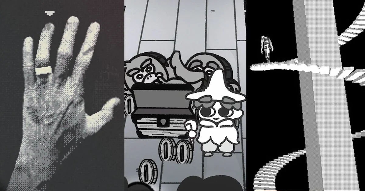
In an era defined by the pursuit of hyper-realistic 4K textures, ray-tracing, and infinite color palettes, a counter-movement is quietly seizing the spotlight. The surge in popularity of monochrome and restrained-color game art is no longer merely a budget-friendly constraint for indie developers; it has evolved into a deliberate, sophisticated aesthetic choice. Much like the transition of film from the necessity of black-and-white to the stylistic mastery of noir and high-contrast cinema, video games are leveraging the absence of color to evoke atmosphere, nostalgia, and visceral emotional intensity.
The industry’s current obsession with this minimalist approach is best evidenced by the "Steam Monochropoly" festival. Running until August 3rd, this dedicated digital storefront event serves as a curated gallery for titles that eschew the rainbow in favor of the stark, the moody, and the shadow-drenched. By stripping away the visual noise of a full-color spectrum, these developers force players to engage with composition, silhouette, and light, proving that sometimes, less truly is more.
A Chronology of the Monochrome Renaissance
The shift toward monochromatic gaming did not happen overnight. Its roots can be traced back to the early 2010s, with breakout hits like Limbo (2010) and Return of the Obra Dinn (2018). Limbo used a stark, greyscale palette to turn a simple physics-based platformer into a haunting, dreamlike meditation on mortality. Obra Dinn, conversely, utilized a 1-bit, dithered aesthetic to mimic the look of early Macintosh monitors, effectively turning a maritime mystery into a visual puzzle that relied on the player’s ability to interpret shape and pattern over hue.
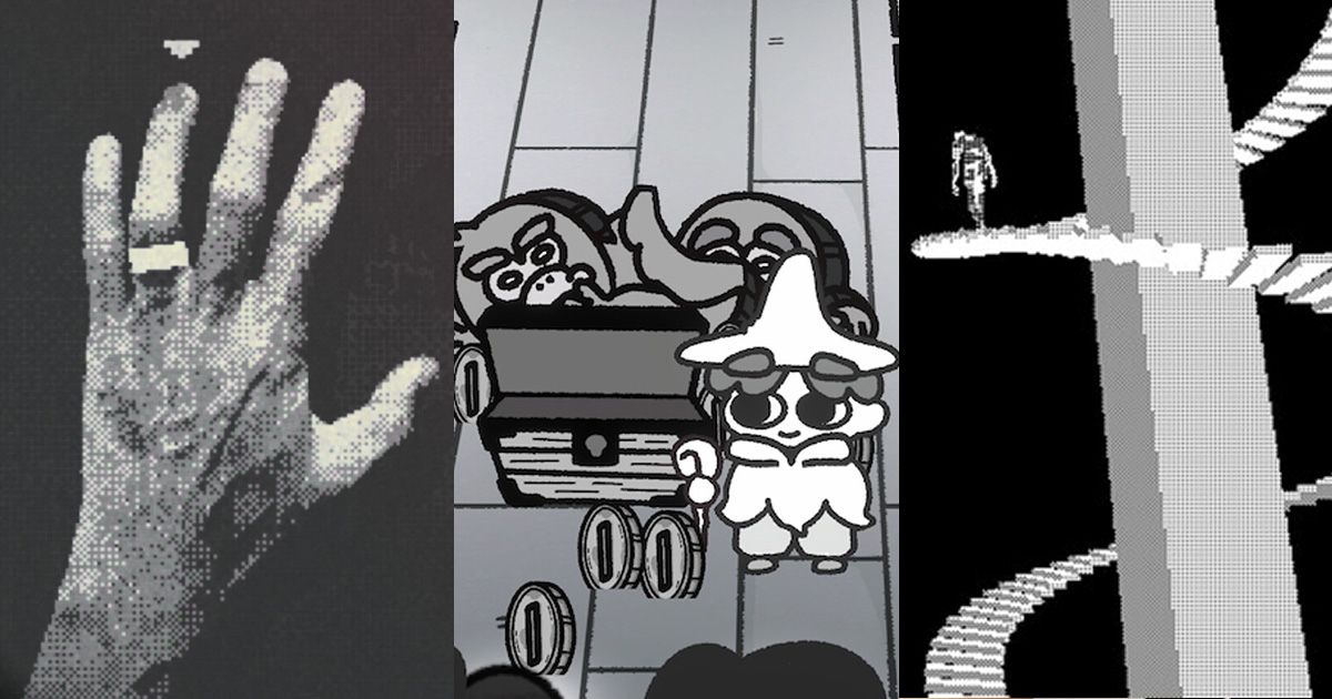
Between 2020 and 2024, the trend accelerated. As the barrier to entry for game development lowered, thanks to accessible engines like Unity and Unreal, a new generation of creators began to experiment with "neo-retro" styles. By 2023, the term "monochropoly" began appearing in indie developer circles, referring to games that purposefully limit their palette to create a cohesive, often unsettling, visual identity. This movement culminated in the current Steam festival, which marks the first time this niche interest has been institutionalized by the world’s largest PC gaming platform.
Supporting Data: Why Players Are Turning to the Shadows
While the industry continues to push for visual fidelity, player engagement metrics tell a different story. According to recent surveys within the indie development community, games featuring unique, highly stylized art directions—even those limited to 1-bit or sepia-toned palettes—consistently maintain higher "wishlist-to-purchase" conversion rates than generic, realistic-looking titles.
Psychologically, this makes sense. A limited color palette reduces cognitive load. When a player is not bombarded with a chaotic array of neon colors, their focus is sharpened. They are no longer distracted by the "clutter" of high-fidelity graphics, allowing for a more profound connection with the game’s mechanics and narrative beats. For horror games, in particular, the use of shadow and high-contrast black-and-white is a powerful tool; the human brain is hardwired to fear what it cannot see, and by obscuring details in deep, ink-black voids, developers can stimulate a player’s imagination far more effectively than any high-budget, fully lit environment could.

The Standout Titles of the Monochropoly Movement
The current festival highlights a diverse range of creative visions. Here are the titles currently defining the genre:
O Empire: Ward Off Thy Rot
Developer Dean Moynihan has crafted a slow, meditative survival experience that feels like a fever dream. Players traverse a bleak, desolate continent while carrying an evil artifact. The shader work is nothing short of masterful, creating a landscape that feels alien and oppressive. With a death-metal-inspired, nearly illegible logo and a visual style that prioritizes grit and texture over clarity, it is a masterclass in environmental storytelling.
You Are Family
A collaboration between Kramelman and DevilishGames, You Are Family brings a B-movie horror sensibility to the table. Set in a secluded country house, the game uses a restricted color palette to heighten the sense of isolation. It manages to balance dark, unsettling horror with off-kilter humor, proving that a lack of color does not equate to a lack of personality.
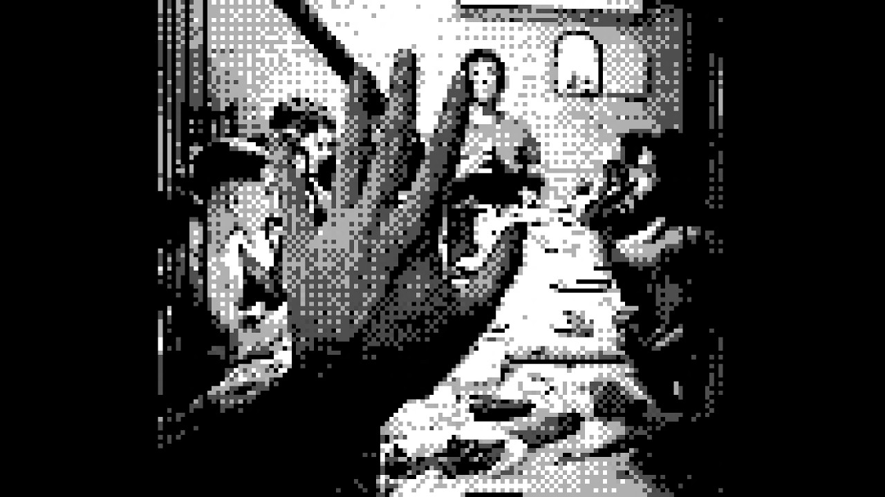
DOPROS
The Witchers Circle’s DOPROS is perhaps the most politically resonant of the group. Set in an Orwellian dystopia, the game utilizes stark visual contrast to create a claustrophobic, oppressive atmosphere. The player is thrust into an interrogation room, tasked with proving their innocence for a crime they don’t understand. The binary nature of the art—pure black against stark white—mirrors the binary nature of the interrogation itself: guilty or innocent, truth or lie.
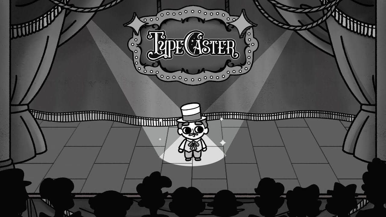
TypeCaster
TBA Studio takes a different route, utilizing a clean, 2.5D cartoony art style. A "Type ’em up" action RPG, TypeCaster shows that monochromatic art isn’t just for horror or gloom. By using a bold, limited palette, the developers have ensured that the action remains readable, even when the screen is filled with hordes of monsters and magical effects.
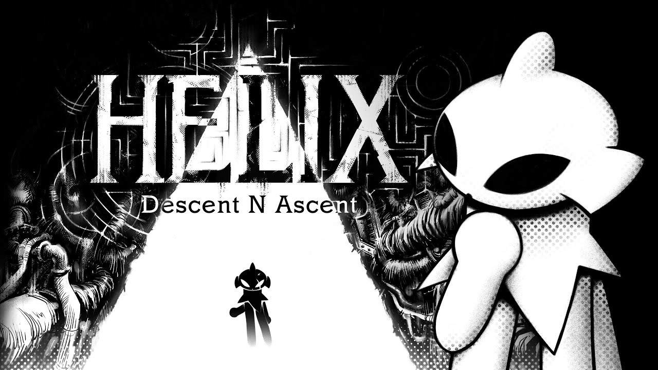
Helix: Descent N Ascent
Belgian studio Badass Mongoose has garnered significant attention for Helix. The game’s lineart is a love letter to 1980s black-and-white indie comics and 1990s manga. Unlike many titles that use static backgrounds, Helix treats its architecture as a living, breathing participant in the narrative. Stairs and walls ripple and shift, creating a kinetic, cinematic experience that feels entirely unique in the current market.

PAGER
Perhaps the most "Kafkaesque" of the bunch, PAGER is a 1-bit 3D horror game that turns the mundane 1990s office environment into a site of psychological terror. The use of dithering—a technique where dots are used to simulate shading—gives the game a grainy, analog feel that is deeply unsettling. It forces the player to interpret the world through a veil of static and shadow, making the environment feel familiar yet inherently wrong.
Implications for the Future of Game Design
The rise of the monochrome aesthetic has significant implications for the future of the industry. Firstly, it democratizes high-level game design. When developers do not need to spend thousands of man-hours creating photorealistic lighting and complex color grading, they can reallocate those resources to writing, complex AI, and deep mechanical systems.
Secondly, it highlights the importance of "Art Direction" over "Graphic Fidelity." For years, the industry has equated progress with the number of polygons on screen. The success of the Monochropoly movement proves that players are craving distinct, artistic visions. They want to play games that look like graphic novels, woodcuts, or charcoal sketches.
Finally, this trend serves as a warning to AAA studios. As players become increasingly fatigued by "sameness" in high-budget releases, the indie sector is finding success by doing exactly the opposite of what the big studios are doing. If a small team in Belgium or a solo developer in their home office can create a more memorable, atmospheric experience with a single color than a multi-million dollar studio can with 16 million colors, the industry is bound to shift.
Conclusion: Looking Through the Lens of Shadow
The "Monochropoly" festival is more than just a sale; it is a declaration of intent. It is a sign that the gaming community is maturing, moving past the "wow factor" of high-resolution textures and toward an appreciation for visual language, composition, and the emotional power of the void.
For those interested in joining this movement, the path is wide open. Whether you are an aspiring developer looking to build your first project with limited assets or a player seeking an experience that challenges the senses rather than simply overwhelming them, the monochrome world offers a depth that is often missing from the technicolor mainstream. As we look ahead, one thing is certain: the most vivid experiences in gaming may well be those that choose not to use color at all.
If you are a developer, there has never been a better time to experiment with these techniques. Use the best game development software available to refine your line work, study the masters of black-and-white cinema, and remember that when you take away the color, you are left with the essence of your story. The shadows are waiting, and they have plenty to show us.


 Asro
Asro
 Sagoh
Sagoh