
 Basiran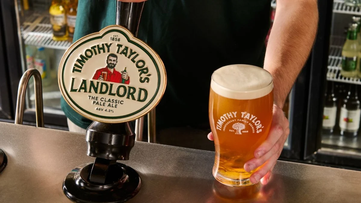
In an era where corporate identity is increasingly defined by sleek, minimalist aesthetics and the relentless pursuit of "contemporary relevance," the backlash against major rebrands has become a staple of the design world. From the automotive sector with Jaguar’s recent pivot to the consumer goods industry with Cracker Barrel, the trend is clear: brands are rushing to shed their history in favor of high-polish, digital-first visuals.
However, few recent transitions have sparked as much nuanced debate as the major overhaul of the iconic British brewery, Timothy Taylor’s. As the brand attempts to court a younger demographic, it has traded its weathered, authentic mascot for a sanitized, modern counterpart—a move that has left many design critics and long-time drinkers wondering if, in the pursuit of "cool," the brand has inadvertently discarded its soul.
The Evolution of an Icon: Main Facts
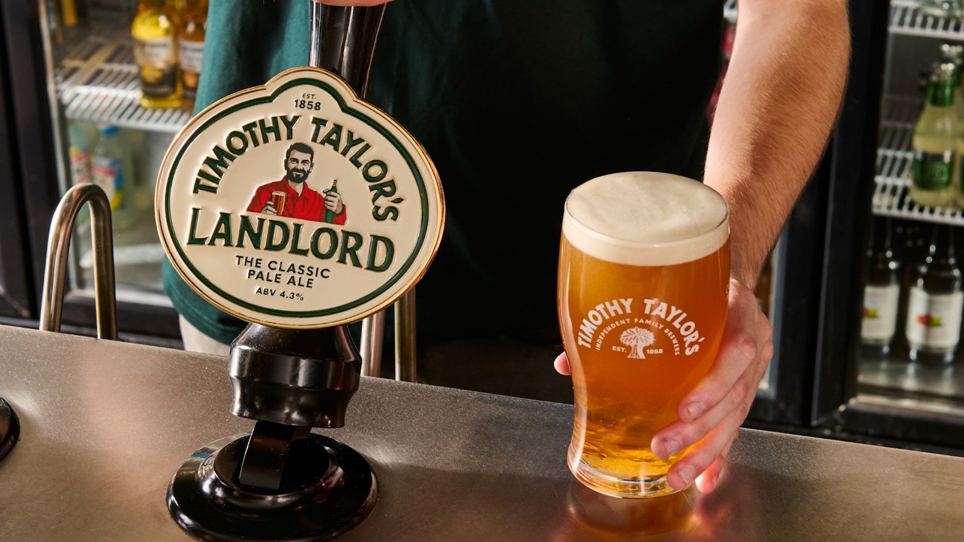
Timothy Taylor’s, a cornerstone of Yorkshire’s brewing heritage, recently unveiled its first significant visual identity overhaul in over a decade. The refresh spans a comprehensive suite of assets, including a redesigned logo, updated packaging, new pump clips, and, most controversially, a reimagined visual identity for the "Landlord"—the character that has graced the brewery’s flagship cask ale for years.
The brewery’s stated objective is to ensure that the visual presentation of their products aligns with the quality and care invested in the brewing process. By modernizing their look, the company hopes to secure its place in the market for the next generation of drinkers, specifically targeting Gen Z consumers who are increasingly exploring the world of cask ale.
A Chronology of Change
The journey to this rebrand did not happen in a vacuum. For years, Timothy Taylor’s maintained a visual identity rooted in traditional typography and a familiar, grounded character illustration. This aesthetic served as a visual shorthand for "authentic, heritage-rich, and reliable."
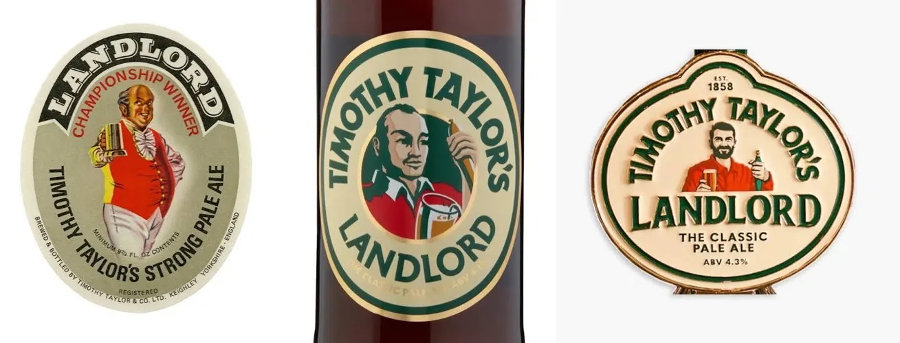
- The Heritage Era: For over ten years, the previous branding relied on classic design cues, evoking the feeling of a traditional British pub. The original Landlord character felt like a personification of the brand’s history—an approachable, lived-in figure that signaled consistency.
- The Planning Phase: Recognizing a shift in market demographics, leadership initiated a review of their brand assets. The goal was to maintain the company’s status as the UK’s best-selling cask ale by volume and value while ensuring the brand did not appear stagnant.
- The Launch: The rollout of the new branding began recently, introducing a cleaner, flatter, and more "premium" aesthetic. The most glaring change was the Landlord himself: the new version is visibly younger, more fit, and possesses a full, groomed head of hair.
The Data: Why Heritage Still Matters
The controversy surrounding Timothy Taylor’s comes at a time when other major global brands are moving in the opposite direction. Companies like Burger King and Pepsi have recently launched successful campaigns that lean heavily into their heritage, resurrecting classic logos and design motifs to foster a sense of stability in an increasingly digital and artificial world.
In the current design landscape, there is a paradox: while technology allows for infinite precision and scaling, consumers are increasingly gravitating toward the "imperfect." The rise of "heritage-core" design suggests that shoppers are looking for depth. When a brand like Timothy Taylor’s—which already possessed high cultural capital and genuine, hard-won character—chooses to homogenize that character, it risks losing the very "peculiarities" that make a brand memorable.
In a market saturated with flat, sans-serif fonts and sterile vectors, the "old-fashioned" look is no longer a liability; it is a competitive advantage. It provides a visual signal of trust that modern design often fails to replicate.
Official Responses and Corporate Strategy
CEO Andrew Carter has been vocal about the intent behind the redesign. According to the brand, the refresh is not a deviation from the quality of the beer itself, but a necessary evolution in how that quality is communicated.
"The quality and care that go into every pint should be reflected in how Timothy Taylor’s is presented today," Carter noted during the announcement. The brewery remains steadfast in its belief that the brand must evolve to remain as relevant to the next generation of drinkers as it has been to the previous ones.

However, the industry response has been mixed. Critics argue that this represents a fundamental misunderstanding of the target demographic. Younger drinkers are often the most cynical regarding "corporate cool." By attempting to manufacture a "hip" version of a traditional character, the brand may be coming across as insincere to the very people it is trying to attract.
Implications: The Lessons for Modern Brands
The "Timothy Taylor’s incident," as it has been dubbed by some, offers a profound lesson for design agencies and brand managers alike: Modernizing a heritage brand does not necessarily require making it look "modern."
1. The Trap of Homogeneity
When brands strip away the unique, quirky elements of their identity to fit a standard "digital-first" template, they lose the ability to stand out. Design should be about amplification, not erasure. The old Landlord had a "character" that felt like a real person—a fixture of the community. The new version feels like a stock-photo representation of a microbrewery owner, which ironically makes the brand feel less like a heritage giant and more like a generic newcomer.
2. Authenticity vs. Aesthetics
There is a dangerous assumption that younger generations prioritize sleek design over history. In reality, Gen Z has shown a marked preference for brands with "provenance." They want to know the story behind the product. By flattening the visual identity, Timothy Taylor’s has inadvertently hidden its story behind a veneer of high-gloss design.
3. The "Woke" Misconception
It is important to address the elephant in the room: the internet’s tendency to categorize any change as part of a "woke" cultural agenda. Many critics, including some mainstream outlets like The Spectator, have framed the rebrand through a political lens, calling it a "disgrace."
However, looking at the design logic, the issue isn’t political—it’s aesthetic and strategic. The backlash is less about the brand’s ideology and more about the loss of a beloved icon. It serves as a reminder that when a brand is successful, it belongs to the consumers as much as the owners. Changing the face of a product is, in effect, changing the relationship with the customer.
Conclusion: A Path Forward
Will the new look doom Timothy Taylor’s? Unlikely. The beer itself remains the same, and the loyalty of the core customer base is robust. The brewery will likely survive this transition just as it has survived economic shifts for decades.
Yet, there is a cautionary tale here. The most successful rebrands of the 21st century have been those that understood the difference between "cleaning up" a brand and "replacing" it. Timothy Taylor’s had something that many brands spend millions of dollars trying to buy: a soul. By replacing a character with a caricature, they have provided a masterclass in how easily a brand’s identity can be diluted by the pursuit of trends.
As the industry moves forward, designers must ask themselves: if the heritage is what makes the product sell, why are we so eager to change it? In the quest to look "now," brands should be careful not to throw away the very history that ensures their future. Sometimes, the most progressive move a heritage brand can make is to embrace its past, quirks and all.


 Lina Irawan
 Nana Wu