 Layla Zulfa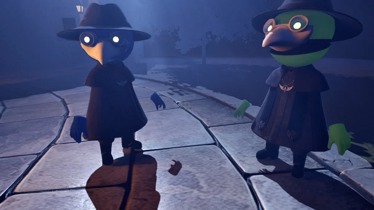
In the high-stakes world of digital marketing and independent game development, visual identity is everything. A logo is often the first point of contact between a developer’s creative vision and a potential player. However, as independent Japanese developer Engawa Games recently discovered, even the most atmospheric and well-crafted artwork can be undermined by a single, microscopic design oversight.
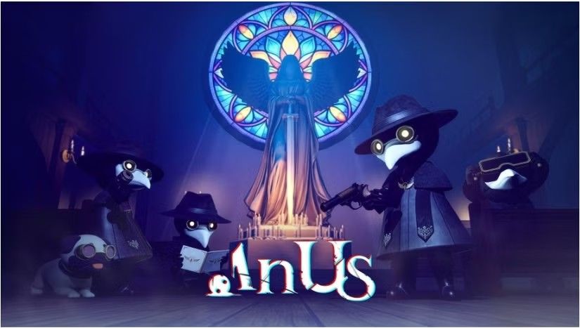
The studio’s upcoming co-op horror title, In Us, has recently become the internet’s latest viral sensation. Unfortunately, the attention has little to do with its promising gameplay mechanics or its haunting, gothic aesthetic. Instead, the game has been thrust into the spotlight due to an unfortunate typographic blunder: the title, when presented in its stylized, tightly kerned logo, bears an uncanny and distracting resemblance to the word "Anus."
This incident serves as a masterclass in the perils of design myopia and the unpredictable nature of internet virality. While the game itself—a social deduction horror title where players must identify demons hiding among villagers—is receiving genuine interest, the conversation has been hijacked by the optics of its branding.
A Chronology of the Kerning Fiasco
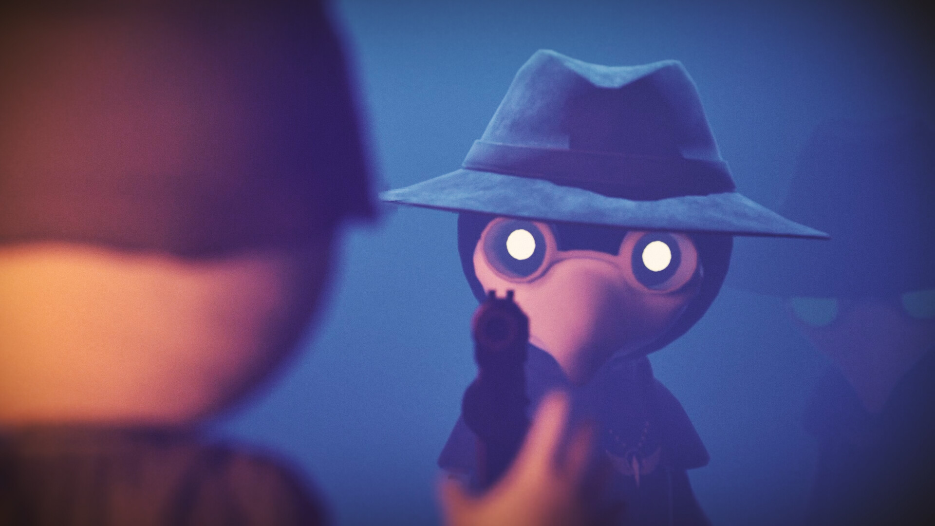
The journey of In Us from a quiet, promising Steam listing to a viral meme began with the reveal of its promotional assets. Engawa Games, the studio previously known for the chaotic and well-received title Parking Together!, aimed to capture a somber, eerie tone. The key art features hooded, bird-masked figures standing before glowing, stained-glass windows, bathed in the flickering light of candles. It is, by all accounts, high-quality, evocative illustration.
However, the trouble began with the treatment of the title. In an effort to create a cohesive, modern logo, the designers opted for a typeface with extremely tight letter spacing (kerning). When the words "In" and "Us" are placed side-by-side with such proximity, the capital ‘I’ and the lowercase ‘n’ bleed into the ‘U’, creating a visual sequence that the human brain immediately autocorrects into a very different, anatomical word.
The discovery was first brought to broader public attention by gaming outlets like DualShockers, who highlighted the "most unfortunate artwork of the year." Once the comparison was made public, the effect became—as the saying goes—impossible to unsee. Within hours, the image was circulating across X (formerly Twitter), Reddit, and various gaming forums, with users highlighting the unintentional pun.
The Mechanics of Design Myopia: Why Did This Happen?
To the casual observer, the error seems glaring. "How did no one notice this?" is the most common refrain in comment sections. However, for those within the design and creative industries, the mistake is both understandable and deeply relatable.
The "Invisible Gorilla" of Graphic Design
The phenomenon at play is strikingly similar to the famous "Invisible Gorilla" experiment conducted by psychologists Christopher Chabris and Daniel Simons. In their study, participants were asked to focus so intently on counting basketball passes that they completely failed to notice a person in a gorilla suit walking through the scene.
Designers often fall victim to this same cognitive bias. When an artist spends dozens of hours obsessing over the color palette, the weight of the strokes, and the balance of the composition, their brain stops interpreting the shapes as language. The text ceases to be a word—a carrier of meaning—and instead becomes a collection of geometric shapes that need to be "balanced" within the frame.
Technical and Environmental Factors
Furthermore, designers often work on high-resolution, large-format monitors. When working in a zoomed-in, pixel-perfect environment, the overall shape of the word can become obscured. What looks like "bold, modern typography" on a 32-inch 4K screen may look entirely different when viewed as a thumbnail on a smartphone or a small banner advertisement on the Steam store.
The context of the "In Us" logo is also vital. In a horror game, designers often use "distressed" or "tightly packed" fonts to convey tension, claustrophobia, or archaic mystery. By pushing the limits of typography to achieve that aesthetic, the safety margin for legibility narrows significantly. If the kerning is tightened just a few pixels too far, the negative space—the "white space" between letters—collapses, forcing the letters to merge into new, unintended shapes.
The Psychological Impact of Unintended Branding
Why does this specific type of error go viral? The answer lies in the intersection of professional branding and juvenile humor. The internet is a place where "pattern recognition" is a sport. When a brand takes itself seriously—as the horror genre inherently does—any slip that introduces absurdity acts as a catalyst for viral mockery.
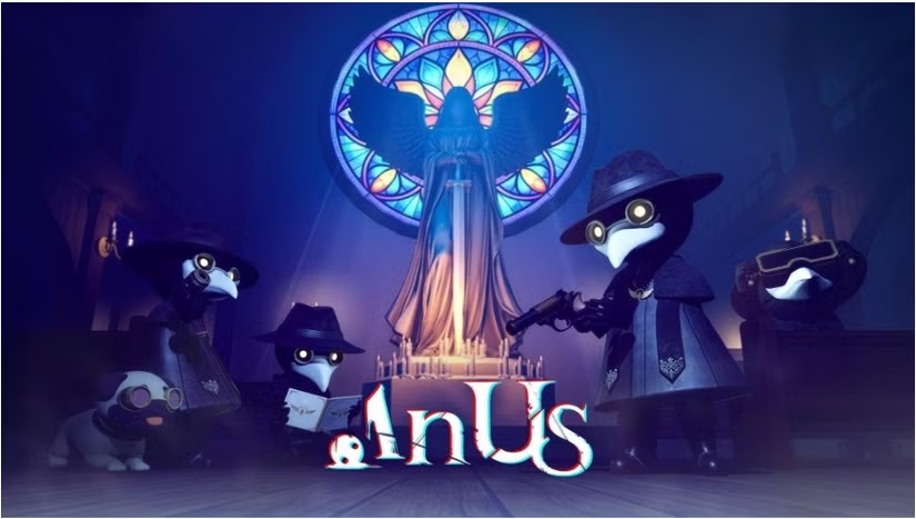
The "In Us" case is particularly ironic because the game’s core premise involves suspicion and identifying the "imposter" in the group. By creating a logo that is itself a "hidden" shape, the game has accidentally turned its branding into a meta-commentary on its own gameplay.
Historical Precedents: You Are Not Alone
Engawa Games is far from the first entity to suffer from this. History is littered with typographic disasters. From poorly placed line breaks that create inappropriate phrases to logos that, when rotated or mirrored, reveal hidden messages, the annals of design are full of cautionary tales.
In the world of print media, editors often share stories of "the one that got away"—a typo that survived ten rounds of proofreading, the scrutiny of an art director, and the gaze of a managing editor, only to be discovered minutes after the printing presses began to run. The reason these errors persist is often "context blindness." Once you have read a document or looked at a design thirty times, your brain creates a "top-down" model of the content. You are no longer seeing what is there; you are seeing what you expect to be there.
Implications for Engawa Games and the Industry
For an indie studio, the immediate impact of such a viral moment is a double-edged sword. On one hand, the game has gained massive visibility. Thousands of people who might never have clicked on a Steam listing for a niche horror game are now aware of In Us. As the old adage goes, "there is no such thing as bad publicity."
However, there is a risk that the game’s tone will be forever tainted by the meme. If players enter the game expecting a serious, terrifying experience, but the branding makes them chuckle before they even hit "Start," the atmospheric immersion is compromised.
For the broader design community, this incident serves as a vital reminder of the importance of:
- The "Thumbnail Test": Always view your design at the size it will actually be consumed by the end user. If it doesn’t read clearly on a mobile screen, the kerning is too tight.
- The "Fresh Eyes" Policy: Never approve a final design without showing it to someone who has never seen the project before. A colleague who is familiar with the process will suffer from the same "context blindness" as the designer.
- Cultural Sensitivity: What looks like a design choice to one person might look like a lewd joke to another. A quick "sanity check" with a focus group or a diverse set of eyes can prevent a marketing disaster.
Moving Forward: The Path to Redemption
As of now, Engawa Games has the opportunity to turn the situation around. They could choose to lean into the meme, perhaps by subtly tweaking the logo or by acknowledging the oversight with a wink to the community. In the current gaming climate, developers who engage with their audience—even during moments of embarrassment—often foster stronger, more loyal communities.
Ultimately, the "In Us" logo will likely remain a footnote in the history of design fails, a humorous reminder of the fallibility of human perception. It is a cautionary tale for designers everywhere: look at your work, then look away, and then look again. And if you are ever unsure, ask yourself: does this look like what I think it looks like, or does it look like something that will make the internet laugh for all the wrong reasons?
For now, the team at Engawa Games can take some solace in the fact that, while their typography might be the subject of a joke, they have successfully managed to capture the attention of the world. In the crowded marketplace of Steam, that is an accomplishment in itself—even if it was achieved by accident.

 Lina Hope
 Lina Irawan