
Since the debut of iPadOS 26, the discourse surrounding Apple’s tablet operating system has shifted from excitement over newfound power to a growing frustration regarding usability. By aggressively pushing a "Mac-like" windowing paradigm, Apple has arguably alienated a significant portion of its user base—those who view the iPad as a tablet first and a computer second. As we navigate the realities of iPadOS 27, it has become clear that the current multitasking framework is suffering from a lack of focus, forcing "simple" users into a "pro" workflow they never asked for.
Main Facts: The Current State of iPad Multitasking
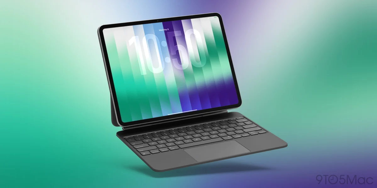
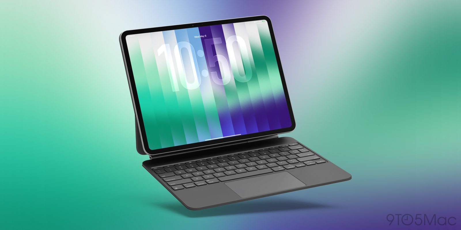
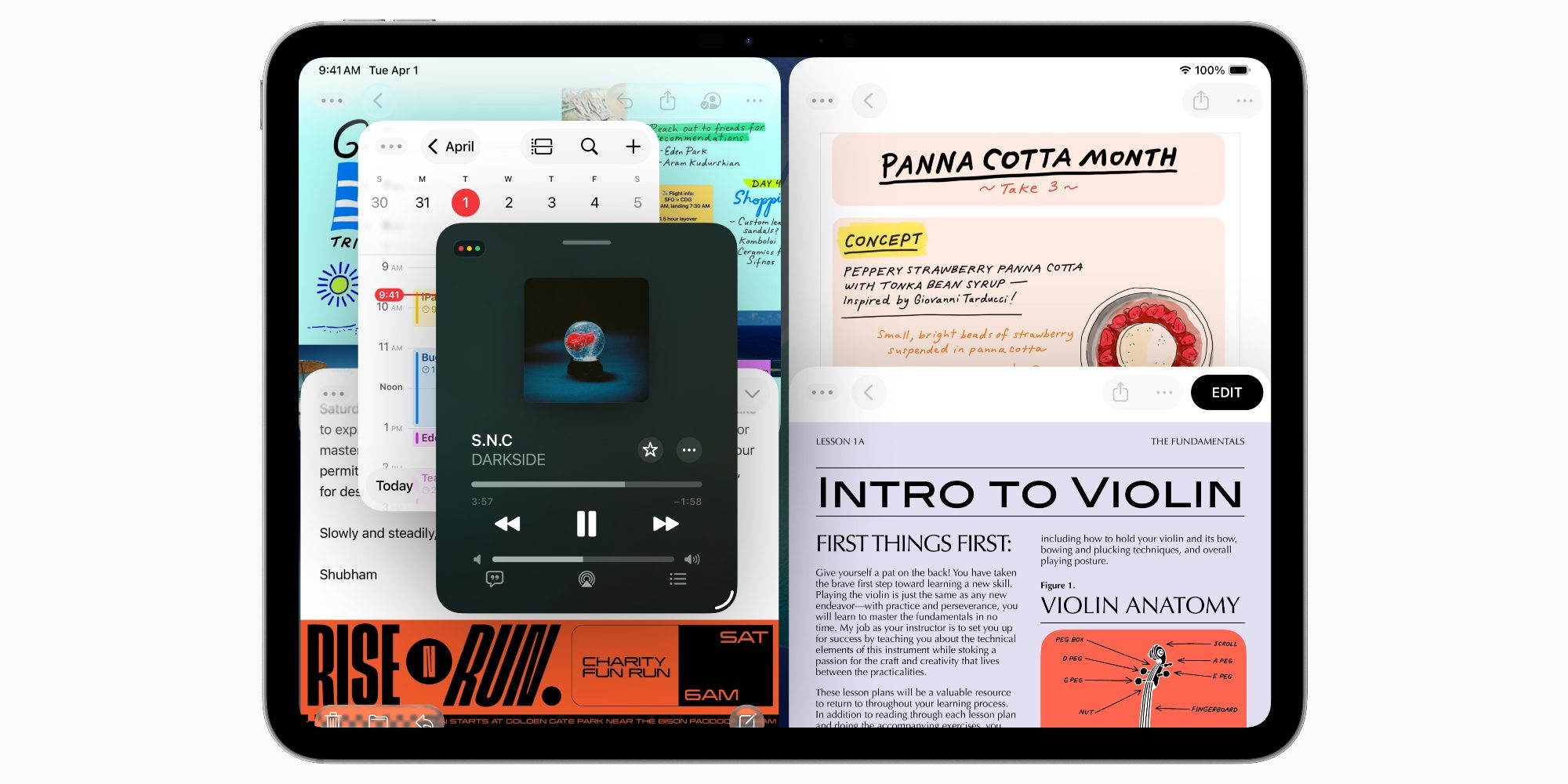
At the heart of the current debate is the structural change implemented in iPadOS 26. Apple replaced the long-standing, intuitive Split View and Slide Over paradigms with a comprehensive, free-form windowing system. While this system offers deep, granular control for power users—particularly those paired with a 13-inch iPad Pro and a Magic Keyboard—it fundamentally altered the accessibility of the device for everyone else.
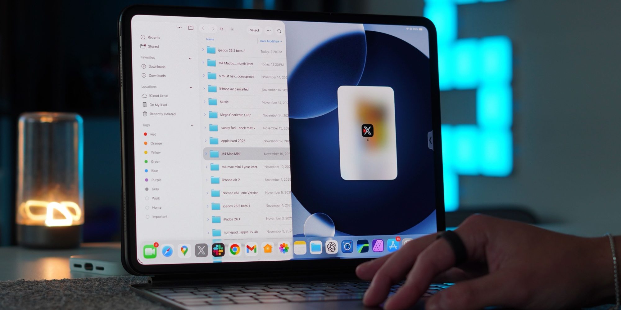
The core issue is one of forced convergence. In the current iteration of iPadOS, the operating system treats every interaction through the lens of a desktop-class window manager. While the company eventually relented and restored the "classic" Split View and Slide Over gestures in later updates (iPadOS 26.1 and 26.2), these features were not restored as independent, lightweight options. Instead, they were "shoveled" into the existing windowing architecture. This means that to use the simple features, one must still navigate the overhead and potential friction of the complex windowing environment.

A Chronology of the Multitasking Shift
To understand the current friction, we must look at the timeline of these changes:
- Pre-iPadOS 26: The era of "Simple Multitasking." Users enjoyed a predictable, gesture-based system where apps could exist in full screen, Split View, or Slide Over. The workflow was tactile, fast, and required zero window management.
- June 2025 (The iPadOS 26 Launch): Apple introduces a radical overhaul of the multitasking system. The focus is on windowing, mirroring the desktop experience. Crucially, the familiar Split View and Slide Over gestures are initially removed, replaced entirely by a system that demands active window management.
- October 2025 (iPadOS 26.1 Beta 2): Responding to widespread user feedback, Apple restores the classic multitasking gestures. However, there is a catch: they are now nested within the new, complex windowing system, requiring the user to operate within the "pro" framework to access them.
- November 2025 (iPadOS 26.2 Update): Refinements are made to the drag-and-drop mechanics. While the features are more stable, the fundamental design philosophy remains unchanged.
- 2026/2027 (The Present): iPadOS 27 arrives, maintaining the status quo established by its predecessor. Users hoping for a "Classic Mode" toggle find themselves stuck with the same hybrid system that prioritizes power-user complexity over simple, touch-first efficiency.
Supporting Data: Why "One Size Fits All" Fails
The primary contention from power users and casual observers alike is that the iPad is now suffering from an identity crisis. The data, if we look at user satisfaction and anecdotal reports, suggests that the "windowing" approach is highly context-dependent.
On a 13-inch iPad Pro with a Magic Keyboard, the windowing system functions as a legitimate tool for productivity. The screen real estate justifies the complexity, and for users who are already in a "laptop-replacement" mindset, the ability to resize windows and overlay apps is a welcome evolution. However, on an 11-inch iPad Air or an iPad mini, this same logic becomes a detriment.
The complexity of the system introduces what engineers call "interaction friction." When a user attempts to snap an app into a simple side-by-side view, the sensitivity of the windowing system often misinterprets the input. A slight misalignment in a drag-and-drop gesture can cause an app to "float" or overlap in an unwanted way, breaking the user’s flow. When the operating system forces a user to think about the placement of a window rather than the content of the app, the "tablet-ness" of the device is diminished.
Official Responses and The "Pro" Philosophy
Apple has remained largely silent regarding a potential "Classic Mode," but their design language speaks volumes. The company’s trajectory is clear: the iPad is being groomed to be a primary computing device for the next generation. By embedding "simple" features into the "pro" framework, Apple is attempting to create a unified experience.
In official documentation and developer guidelines, Apple frames the windowing system as the future of the platform. They argue that by standardizing the windowing logic, they are providing a more consistent environment for developers to create apps that work across both macOS and iPadOS. While this is an objective win for software compatibility, it ignores the subjective experience of the human user.
Implications: The Case for a Two-Tier System
If Apple wishes to retain its status as the premier tablet manufacturer, it must acknowledge that the iPad is not just a secondary computer. The current "forced convergence" creates three major negative implications:
- Reduced Accessibility: New or casual users are greeted by an interface that is far more intimidating than the iPad of 2020. The learning curve for basic multitasking is now unnecessarily steep.
- Degraded Tablet Experience: On devices not attached to a keyboard, the windowing system feels like a "skin" on top of the OS rather than an integral part of the experience. It feels "clunky," as users often describe it, because it is essentially a desktop environment ported to a touch-first device.
- The "Ghost" Feature Problem: Because the classic features are hidden, many users may not even realize they can still perform basic Split View tasks, leading to the false perception that the device is less capable than it actually is.
A Path Forward: The "Classic vs. Pro" Toggle
The most logical solution, and one that is frequently requested by the community, is the introduction of a "Multitasking Profile" setting.
- The Classic Profile: This would prioritize full-screen, focused app usage. It would bring back the pure, gesture-based Split View and Slide Over of the past, stripping away the window management complexity. It would be the default for smaller iPads and would appeal to students, artists, and casual media consumers.
- The Pro Profile: This would enable the full suite of windowing features, Stage Manager, and advanced peripheral support. This would be the "power user" setting, reserved for those who intentionally seek to use their iPad as a professional workstation.
By decoupling these two philosophies, Apple would satisfy both ends of the spectrum. It would stop "shoveling" complexity into simple workflows and allow the iPad to reclaim its reputation as a device that is as simple to use as it is powerful.
Conclusion: Reclaiming the iPad Identity
The iPad is at a crossroads. While the hardware has never been more powerful, the software has become a victim of its own ambition. By trying to bridge the gap between a tablet and a desktop, Apple has inadvertently made the iPad a less effective tablet without fully succeeding in making it a perfect laptop.
As we look toward future iterations of iPadOS, the message from the user base is clear: we appreciate the power, but we also cherish the simplicity. Providing a choice—a way to step back into a "Classic" mode—would not be a step backward for Apple. It would be a recognition that the iPad’s greatest strength has always been its versatility, not its adherence to a desktop-standard template. It is time for Apple to stop forcing the iPad to be a Mac and allow it to be the best version of itself: a powerful, flexible, and fundamentally simple tool.