In the modern digital landscape, a brand’s logo is often its first—and sometimes only—point of contact with a potential consumer. While colors and symbols draw the eye, the typeface, or logo font, performs the heavy lifting of conveying the brand’s voice, authority, and personality. A carefully selected font can command trust, evoke nostalgia, or signal cutting-edge innovation, whereas a mismatched choice can lead to confusion and diminished brand recall. As we navigate 2026, the intersection of typography and consumer psychology has become more critical than ever for designers and business owners alike.
The Science of Brand Perception Through Typography
Typography is more than just the arrangement of letters; it is a psychological trigger. Research in consumer behavior consistently demonstrates that fonts possess inherent "personalities." Serif fonts, characterized by the small decorative strokes at the ends of letters, are historically associated with tradition, reliability, and high-end elegance. Consequently, they remain the gold standard for luxury fashion houses, legal firms, and legacy publishing brands.
Conversely, sans-serif typefaces—those lacking those decorative appendages—are perceived as clean, modern, and accessible. In the tech sector, where clarity and efficiency are paramount, the preference for geometric or humanist sans-serif fonts has become an industry standard. However, the landscape is evolving. Today’s designers are increasingly experimenting with "hybrid" typography, blending the readability of classic forms with the bold, experimental flair of modern digital design to capture the attention of an increasingly distracted global audience.
The Chronology of Modern Logo Design Evolution
The history of logo design is essentially a timeline of shifting typographic trends. In the early 20th century, logos were largely illustrative, relying on intricate hand-lettering and ornate serifs to signal craftsmanship. The mid-century modern movement ushered in an era of "less is more," popularized by icons like Paul Rand, who championed minimalist sans-serifs that prioritized scalability and recognition.
By the early 2000s, the rise of the digital internet brought about the "web-safe" era, where font choices were severely limited by technical constraints. Today, in 2026, we have entered the "Variable Font Era." With the advent of advanced rendering technology, designers no longer have to compromise between weight, width, and style. They can now utilize fonts that adapt fluidly across devices—from high-resolution 8K billboards to the small, pixel-dense screens of wearable tech—ensuring that the brand message remains consistent and sharp regardless of the medium.
Supporting Data: Why Font Selection Matters
According to recent design industry analytics, 70% of consumers identify a brand primarily through its visual identity, with typography accounting for nearly 40% of that recognition. When a brand undergoes a "rebrand," the change in typeface is often the most polarizing element for the public. Data suggests that:
- Readability correlates with conversion: Brands that utilize clean, legible fonts in their primary logo experience a 15% higher engagement rate on mobile platforms.
- Emotional resonance: Fonts with rounded edges are statistically perceived as "friendlier" and more "approachable," whereas angular, condensed fonts are associated with "speed," "precision," and "technology."
- Cross-platform viability: A font that fails to scale—looking muddy at small sizes or losing character at large scales—can cause a 25% drop in brand equity over a five-year period.
Expert Perspectives and Professional Standards
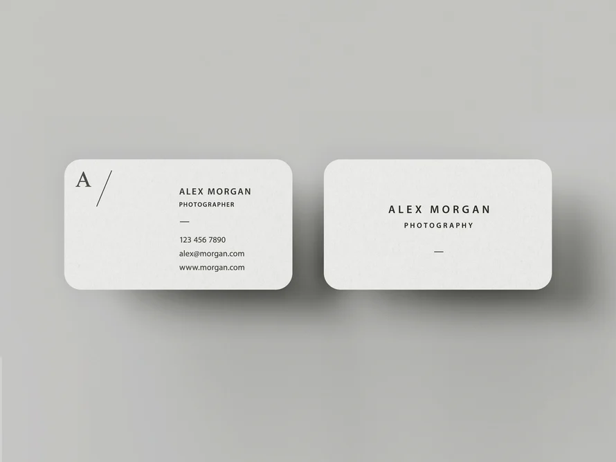
Leading design agencies emphasize that the process of selecting a font is rarely about aesthetic preference alone; it is about strategic utility. "The best logo font is one that balances uniqueness with legibility," notes one industry veteran. "You want something that looks distinctive on a business card, but remains perfectly clear when rendered as an app icon or a favicon."
Designers are encouraged to follow a rigorous testing phase, often referred to as "the stress test." This involves:
- Monochrome Testing: Ensuring the font holds its integrity in black and white, free from the crutch of color.
- The "Squint Test": Reducing the logo to a thumbnail size to ensure the letter shapes are still recognizable.
- Contextual Application: Evaluating how the font interacts with negative space on packaging, social media headers, and physical signage.
Implications for Future Branding
As AI-driven design tools become more prevalent, the role of the human designer is shifting from "creator" to "curator." The ability to discern which font fits a specific market segment is becoming a high-value skill. We are seeing a move toward bespoke typography, where brands move away from generic, widely available fonts in favor of custom-commissioned typefaces that cannot be easily replicated by competitors.
The implications for small businesses and startups are profound. With access to vast libraries of high-quality, professional-grade assets, even the smallest enterprise can now compete visually with global corporations. However, the paradox of choice remains; with millions of fonts available, the challenge lies in the curation—the ability to select the one that tells the brand’s story most effectively.
Curated Collection: 22 High-Quality Logo Fonts for 2026
To assist designers in streamlining their creative process, we have curated a list of essential fonts that define current design standards. These fonts offer versatility, ranging from the architectural precision required for tech startups to the elegant curves needed for luxury lifestyle brands.
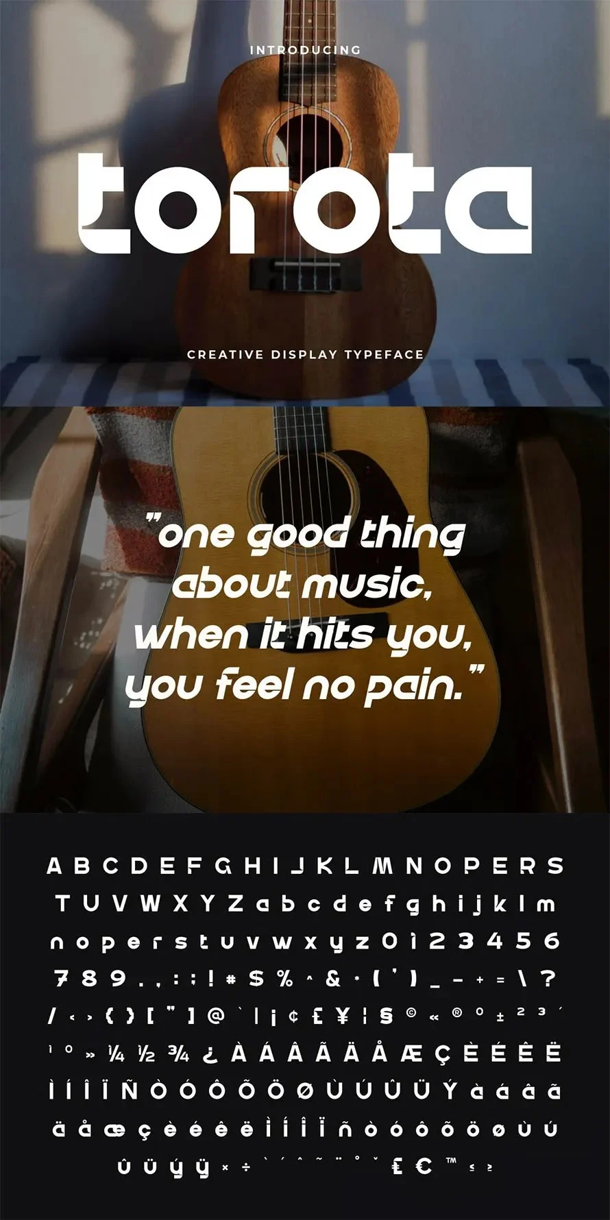
1. Torota Display Logo Font
A masterclass in minimalism, Torota is engineered for impact. Its balanced, clean lines ensure that social media posts and digital ads remain punchy. The inclusion of both regular and italic styles makes it a versatile tool for building hierarchy in a brand identity.
2. Emira – Unique Luxury Logo Font
For brands in the high-fashion or premium retail space, Emira provides the sophistication of a high-end editorial publication. Its serif structure is refined and balanced, making it ideal for luxury packaging where elegance is the primary deliverable.
3. Geometrix Branding
Geometric fonts are the backbone of modern corporate identity. Geometrix offers a mathematically balanced approach that screams "trust" and "efficiency." It is particularly effective for SaaS companies and consultancies that want to signal a modern, forward-thinking philosophy.
4. Spring – Modern Editorial
Spring bridges the gap between classic print aesthetics and modern digital needs. Its smooth, readable flow is perfect for lifestyle blogs, magazines, and brands that want to convey a sense of curated, organic growth.
5. Horible – Unique Extended Logo Font
Horible leans into the "extended" trend currently dominating modern streetwear and avant-garde fashion branding. It offers a wide stance that commands attention in headlines and high-impact visual layouts.
6. Enigma Stippled
For those looking to break the mold, Enigma Stippled offers a unique gothic-modern hybrid. Its dotted texture adds a tactical, tactile element to branding, making it perfect for independent music labels, underground fashion, or creative agencies looking to stand out.
7. Amoxil – Modern Futuristic
Amoxil is built for the screen. Its thick, bold letterforms ensure maximum legibility, even in high-motion environments like film credits or dynamic video intros.
8. Conda Logo Font
Conda is the definition of "tech-forward." Its sharp edges and futuristic silhouette make it a natural fit for software companies, gaming hardware, and automotive branding that needs to look fast and reliable.
9. Elora – Modern Logo Font
Elora specializes in the "human" touch. Its soft, curved lines provide a welcoming aesthetic, making it a favorite for wellness brands, eco-friendly startups, and boutique hospitality services.
10. Grandom – Bold Art Deco
Art Deco is making a significant comeback in 2026. Grandom captures the glitz and glamour of the era while maintaining a modern, clean sensibility suitable for high-end hospitality and event branding.
11. Bulgary – Serif Elegance
Bulgary adds a layer of artistry with its swash details. It is the perfect choice for brands that want to communicate a sense of "hand-crafted" quality and meticulous attention to detail.
12. Network – Branding Technology
Network is built for the digital arena. With a sharp, tech-oriented design, it is ideal for esports, cybersecurity firms, and companies operating in the high-speed data space.
13. Slimking
Slimking is the go-to for those who need to maximize space. Its condensed, bold structure is perfect for long-form brand names that need to remain readable in tight horizontal formats.
14. Mearu Food
Branding in the food and beverage industry requires a specific warmth. Mearu Food is designed to be appetizing, friendly, and memorable—a perfect choice for cafes, artisanal food brands, and modern kitchenware.
15. Hengky – Modern Vintage
Hengky manages to bridge the gap between retro and contemporary. Its vintage roots are softened by modern legibility, making it perfect for craft beverage brands or artisanal lifestyle goods.
16. Wonome – Modular Grid
Wonome is an experimental typeface for brands that want to be perceived as "builders" or "innovators." Its grid-based structure feels structural and precise, perfect for architecture or education-based tech.
17. Harse – Clean Corporate
Harse is the workhorse of the collection. When a brand needs to convey professionalism above all else, Harse delivers. It is compact, legible, and fits perfectly into corporate decks and formal business documentation.
18. Speclogo – Classic Tech
Speclogo provides a playful, chunky aesthetic that avoids the stuffiness of traditional tech fonts. It is perfect for creative apps or platforms that target a younger, digital-native demographic.
19. Riona – Modern Swash
Riona is all about movement. Its sweeping, handwritten-style swashes give a brand a personal, human feel that is hard to achieve with standard sans-serifs.
20. Nagel – Unique Corporate
Nagel is for the brand that wants to be different without being loud. It offers a unique character set that ensures your corporate identity is never mistaken for a generic "out-of-the-box" design.
21. Qepho Modern
Qepho is the ultimate all-rounder. With its bold sans-serif design, it handles everything from mobile app icons to large-scale retail signage with ease and grace.
22. Bluster – Futuristic
Bluster rounds out our list as the choice for cutting-edge projects. Its aggressive, sharp, and tech-focused design is perfect for brands that want to position themselves as the future of their respective industries.
Conclusion: Crafting Your Brand’s Future
Selecting the right font is an investment in the long-term recognition of your brand. As you explore these options, remember that the most successful logos are those that achieve a harmony between the message they convey and the medium through which they are delivered. Whether you are aiming for the elegance of a serif or the bold authority of a modern sans-serif, the tools are available to help you build a visual identity that stands the test of time. Take the time to test, experiment, and refine—your brand’s legacy begins with the letterforms you choose today.