Google’s recent decision to overhaul its suite of application icons was met with a collective sigh of relief from the global user base. For years, the tech giant had pushed a "unified" design language—a minimalist, flat aesthetic that, while clean, rendered individual apps virtually indistinguishable from one another at a glance. The latest update, which introduced more distinct visual identifiers, has been largely praised for improving usability and aesthetic clarity.
However, the real excitement hasn’t been limited to Google’s official design team. A wave of creative disruption has washed over X (formerly Twitter), where users are pushing the boundaries of icon design by taking a hilariously literal approach to the brand’s identity. From crumpled bed sheets to literal piles of dirt, this viral trend is sparking a broader conversation about the nature of modern design and the potential resurgence of skeuomorphism.
The Chronology of a Viral Trend
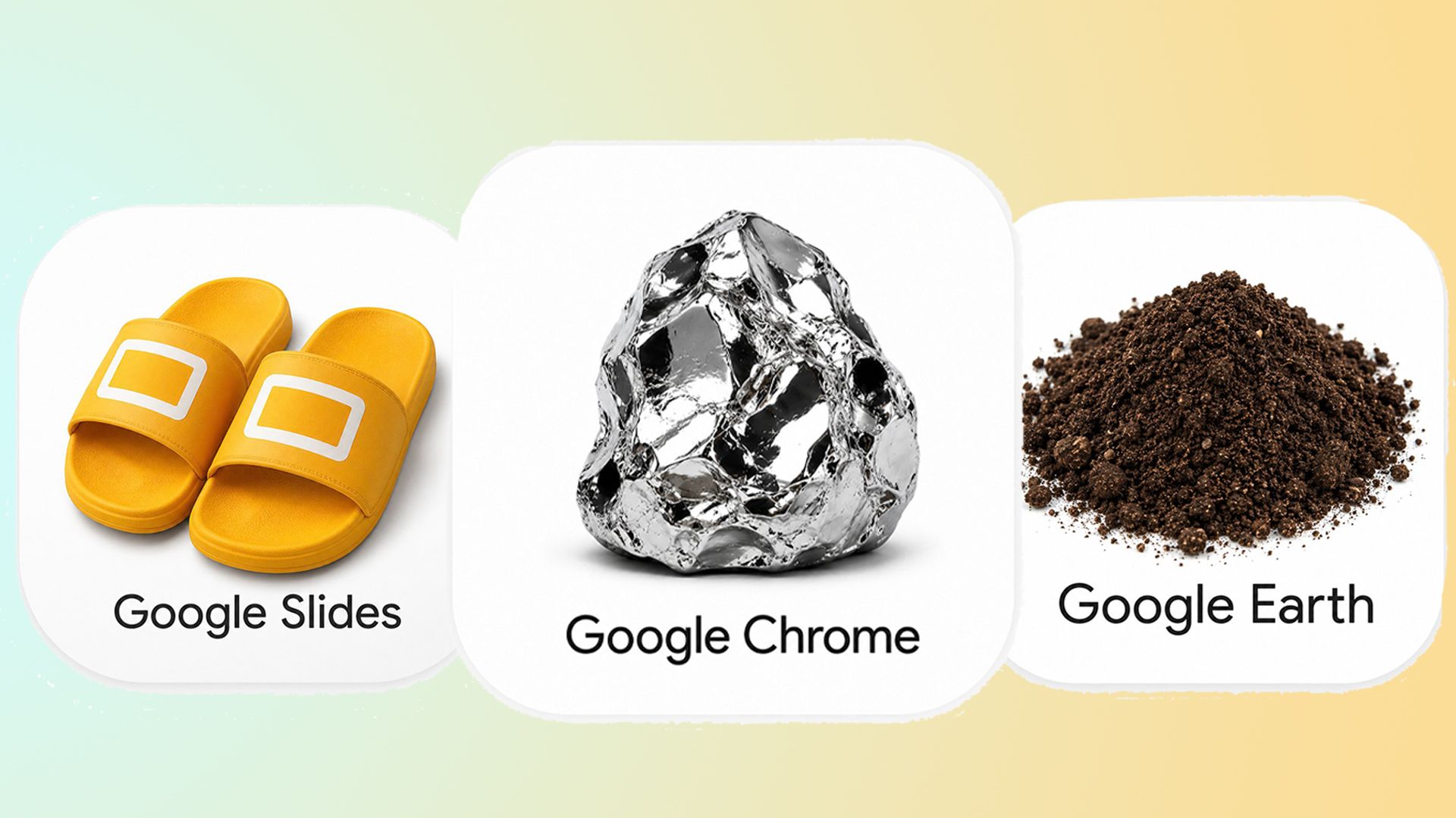
The phenomenon began with an unassuming post by designer and creator Amichai Mantinband. In a tweet that has since garnered widespread attention, Mantinband shared a radical reimagining of the Google Sheets logo. Instead of the familiar, sterile green rectangle, Mantinband’s design featured a hyper-realistic, 3D-rendered set of crumpled bed sheets. With the simple, provocative caption, "hear me out," he tapped into a latent desire for visual wit in an otherwise homogenized digital landscape.
The reaction was instantaneous. Within hours, the thread became a catalyst for a community-wide design challenge. Users began applying this literalist lens to the entire Google ecosystem:
- Google Earth: Reimagined as a literal pile of dirt and organic matter.
- Google Slides: Transformed into a pair of physical, rubbery slider sandals.
- Google Docs: Depicted as an actual medical document or a stack of physical papers.
This creative outpouring serves as a direct retort to the "flat design" era that has dominated tech since the early 2010s. By prioritizing realism and physical texture over abstract symbolism, these users are effectively signaling a shift in aesthetic preference—one that favors personality and recognition over rigid adherence to corporate minimalism.
The Power of Literalism: Why These Icons Work
At first glance, the trend may seem like a parody, but there is a profound design principle at play: the power of immediate mental association.
In the heyday of early iOS and OS X, skeuomorphism—the design concept where digital elements mimic their real-world counterparts—was the industry standard. It helped users bridge the gap between physical tools and digital interfaces. As we moved toward "Flat Design 2.0" and Google’s "Material Design," we gained efficiency but lost soul.
The viral Google icons created by the X community succeed because they are "instantly recognizable." When a user sees a pair of slides, their brain immediately processes the pun (Slides = Slides), creating a memory hook that a simple, colored square can never achieve. This highlights a critical lesson for modern UI/UX designers: while minimalism is excellent for scalability, it often comes at the expense of delight and brand personality.
The Evolution of Google’s Design Language
To understand why this trend has gained such traction, one must look at the history of Google’s design evolution. For a decade, Google pushed for a cohesive, cross-platform look. While this created a sense of brand unity, it created a "UX tax"—users had to expend more cognitive energy to distinguish between apps that looked identical.
The recent official update was an admission that perhaps the pendulum had swung too far toward abstraction. By introducing more distinct shapes and nuanced color palettes, Google has acknowledged that clarity is the ultimate priority in mobile UI.
However, the community’s "literalist" response suggests that Google’s official path—while better—is still too safe. The viral trend is a manifestation of the "human-centric" design that users are craving in an age of increasing automation and algorithmic uniformity.
Supporting Data: The Skeuomorphic Resurgence
Design analysts have noted a clear shift in industry trends for 2026. After years of the "blandification" of logos—where major brands like Warner Bros, Airbnb, and Google stripped away detail to favor simple, bold typography—we are seeing a counter-movement.
Data from design platforms like Behance and Dribbble indicate a 30% increase in projects featuring "Neo-Skeuomorphism" or "Glassmorphism." These styles use depth, shadow, and realistic textures to provide a tactile experience in digital spaces. This is not a return to the heavy, faux-leather textures of 2010, but a sophisticated integration of realism that aids navigation.
The popularity of these fan-made Google icons provides anecdotal evidence that the general public is tired of "invisible" design. They want interfaces that feel like they have weight, history, and a touch of humor.
Official Responses and Industry Implications
As of this writing, Google has not released a formal statement regarding the viral redesigns. However, industry insiders suggest that such trends are often monitored closely by big-tech design teams.
"When a user base starts mocking or ‘fixing’ your brand identity, it’s a bellwether," says one lead UI designer at a major tech consultancy. "It’s not necessarily that they want a pile of dirt as their icon, but they are signaling that the current branding lacks an emotional connection. The ‘literal’ trend is a cry for design that feels tangible."
The implications for the broader design industry are significant:
- Brand Personality is Currency: As AI begins to generate generic assets, human-led, witty, and personalized design will become the premium standard.
- The End of Peak Minimalism: We are likely moving into a post-minimalist phase where functional, flat foundations are embellished with realistic, playful elements.
- User-Generated Branding: Brands that can successfully incorporate community feedback or even adopt "fan-made" aesthetics will foster deeper loyalty than those that remain behind closed doors.
Looking Ahead: The Future of Digital Identity
The viral Google icon trend is more than a fleeting moment of internet humor; it is a symptom of a larger cultural shift. As our digital lives become more complex, we are seeking interfaces that don’t just work, but that we can "feel."
The tension between the sterile perfection of corporate design and the messy, human, and often literal creativity of the internet is where the next wave of design innovation will be born. As we look at the trends defining 2026, it is clear that the most successful brands will be those that learn to balance the structural requirements of a global corporation with the creative, chaotic, and deeply human desires of their users.
Whether Google eventually adopts these "literal" designs is irrelevant. What matters is that the conversation has changed. We are no longer content with logos that are merely functional; we want them to tell a story, make us laugh, and remind us that behind every app, there is a human connection.
As designers continue to experiment with depth, texture, and character, one thing remains certain: the era of the boring icon is coming to an end. The future is looking more tangible, more ridiculous, and significantly more interesting.