In an era dominated by digital networking, social media profiles, and ephemeral QR codes, the humble business card remains a remarkably resilient tool for professional identity. However, the philosophy of card design has shifted significantly over the last decade. Gone are the days of cluttered layouts, embossed gold foil, and chaotic typography. Today, the most effective business cards are defined by a singular, powerful attribute: simplicity.

This article explores the evolution of minimalist business card design, examining why a "less is more" approach is no longer just an aesthetic choice, but a strategic business imperative.

The Core Philosophy: Why Minimalist Design Wins
The fundamental purpose of a business card is to facilitate a connection. When a potential client or partner receives your card, they should be able to identify your name, role, and contact information within seconds. Complexity is the enemy of clarity. By stripping away extraneous decorative elements, designers can focus on the hierarchy of information, ensuring that the most vital details—your name and your unique value proposition—are the first things the eye lands on.

Professional designers now emphasize "negative space" as a key design element. By allowing the design to "breathe," you communicate confidence. A sparse, clean card suggests a brand that is organized, intentional, and modern. Conversely, a card crammed with logos, social media handles, and complex patterns often signals a lack of focus.

Chronology of the Minimalist Shift
The trajectory toward minimalism in business card design has been a steady movement fueled by broader shifts in UI/UX design and corporate branding:

- 2010–2014 (The Decorative Era): Business cards were often used as canvases for excessive graphic design. Heavy gradients, complex drop shadows, and busy backgrounds were common, often making the text difficult to read.
- 2015–2018 (The Rise of Flat Design): As mobile technology and app design moved toward "flat" interfaces, print design followed suit. The emphasis shifted toward bold, sans-serif typography and high-contrast color palettes.
- 2019–2022 (The "Human-Centric" Approach): Designers began focusing on paper quality and texture rather than graphic complexity. The "feel" of the card became as important as the look.
- 2023–Present (The Sustainable & Functional Era): Today, the trend is moving toward extreme minimalism. Many professionals now favor single-color, monochromatic schemes that prioritize sustainability in printing and absolute ease of readability.
Supporting Data: The Impact of Clarity
Data from branding surveys consistently shows that prospective clients rank "legibility" and "professionalism" as the two most important factors in evaluating a business card. Research indicates that cards with excessive visual noise are discarded or lost significantly faster than those with a clean, minimalist aesthetic.

The psychology of design plays a critical role here. A minimalist card forces the viewer to focus entirely on the contact information. If a card is cluttered, the viewer’s brain is forced to work harder to filter out the "noise" to find the "signal" (your name or email). By removing the friction of a busy design, you increase the likelihood that your contact details are saved, scanned, or keyed into a CRM system.

Strategic Applications: Who Benefits Most?
Minimalist design is particularly effective for certain professional sectors where personal brand authority is paramount:

1. Creative Professionals (Designers and Photographers)
For creatives, a minimalist card serves as a "meta" statement about their work. It tells the recipient: "My work is so strong that it doesn’t need to be explained by a flashy card."

2. High-Level Consultants and Executives
In corporate environments, minimalism exudes authority. A simple, well-spaced card with high-quality card stock signals that the individual is confident and does not need to resort to visual gimmicks to command attention.

3. Startups and Tech Agencies
Tech firms often adopt minimalist aesthetics to mirror the clean, efficient user experience of their digital products. A clean card acts as a physical manifestation of a "clean code" or "streamlined workflow" philosophy.

Official Perspectives: The Expert View
Leading branding agencies have noted that the "minimalist revolution" is not merely a fad, but a correction of previous design excesses. As Muhammad Faisal, founder of Graphic Design Junction, notes, "The most effective designs are those that focus on clarity instead of decoration."

Industry experts argue that the shift is also driven by the democratization of design tools. With access to professional-grade PSD templates and design software, small business owners and freelancers can now produce high-end, minimalist stationery that once required a significant budget for a high-end agency. This accessibility has raised the bar for everyone; because high-quality design is easier to produce, the market has become less tolerant of low-quality, "busy" designs.

Implications for Your Next Project
If you are planning to update your business card, consider these four pillars of effective, minimalist design:

The Typography Hierarchy
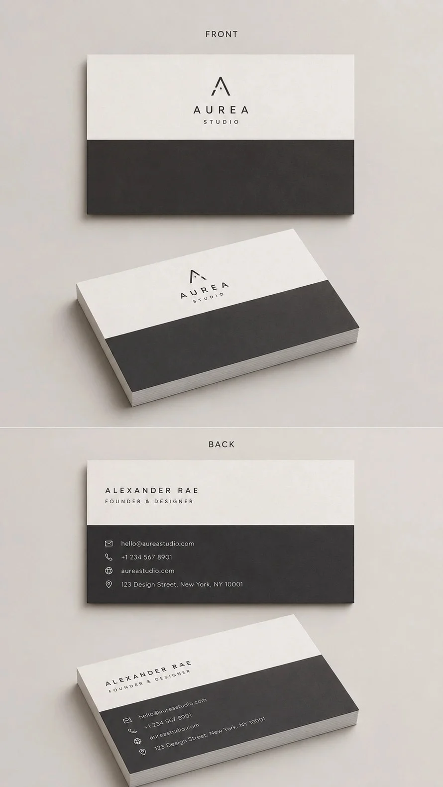
Your name should be the most prominent element. Your job title should be secondary, and contact details should be tertiary. Use a single, clean font family to maintain visual consistency. If you use bold for your name, use a lighter weight for your contact information.

The Power of Negative Space
Do not fear the "empty" areas of the card. Negative space is not wasted space; it is a design tool that draws the eye toward the content. When in doubt, scale back. If you have a decorative element that serves no functional purpose, remove it.

Materiality Matters
When you remove color and complex graphics, the physical quality of the card becomes your primary brand differentiator. Opt for heavy-weight card stock, textured paper, or subtle finishes like spot UV or matte lamination to provide a tactile experience that makes the card memorable despite its visual simplicity.

The "PSD" Advantage
Utilizing professional templates (often available in PSD format) allows you to experiment with alignment and spacing without needing to be an expert in graphic design. By downloading these assets, you can see how professionals balance white space and typography, giving you a blueprint for your own brand.

Practical Steps to a Better Card
- Audit your current assets: Do you really need your physical address on the card in the age of Google Maps? Does your logo need to be massive? If not, strip it down.
- Define your focal point: What is the one thing you want the person to remember? Make that the largest element on the page.
- Choose a limited palette: A black-and-white card is timeless, but if you must use color, stick to one primary color to keep the design cohesive.
- Test for readability: Print a draft on a standard home printer. If you have to squint to read your email address, increase the font size or choose a cleaner typeface.
Conclusion: Designing for Longevity
The beauty of a simple, minimalist business card is its longevity. While trends in fashion and digital design change every few months, a well-executed, minimalist card remains professional, relevant, and effective for years.

By prioritizing clarity, respecting the power of whitespace, and focusing on the essential information, you transform your business card from a mere piece of paper into a sophisticated tool for professional networking. As you embark on your next design project, remember that the goal is not to fill the space, but to create a space that allows your professional identity to shine through clearly and confidently. Embrace the simplicity—your brand, and your future clients, will thank you for it.