In the rapidly evolving landscape of digital design, the quest for authenticity has never been more pressing. As brands and creators move away from the cold, sterile perfection of machine-generated aesthetics, there has been a profound resurgence in the use of script and handwritten fonts. These typefaces, characterized by their fluid strokes and humanistic imperfections, have become the cornerstone of modern visual storytelling. Whether it is the intimate elegance of a wedding invitation or the approachable personality of a startup’s logo, script fonts provide an emotional bridge between a brand and its audience.

The Evolution of Handwritten Typography: From Paper to Pixels
The history of handwritten lettering is as old as civilization itself, but its digital manifestation is a relatively modern phenomenon. For decades, designers were limited by the rigid constraints of early digital typography, which favored legibility and uniformity above all else. However, the advancement of font rendering technology and the proliferation of high-resolution displays have allowed for the intricate details of brushwork, ink bleeds, and variable line weights to be captured with stunning accuracy.

By 2025, the industry has reached a tipping point. Designers are no longer settling for generic "script" presets; they are demanding typefaces that carry the weight of real-world tools—pens, markers, calligraphy brushes, and even street-art graffiti canisters. This shift represents a broader cultural desire to infuse digital media with a sense of "wabi-sabi"—the Japanese philosophy of finding beauty in imperfection.

Why Script Fonts Are Essential for Modern Design
Modern handwritten fonts serve a function that traditional sans-serif or serif fonts cannot: they provide a personal touch. When a consumer encounters a brand, the typography serves as the "voice" of that organization. A sharp, geometric sans-serif font might project efficiency and technical prowess, but a flowing, handwritten script suggests creativity, warmth, and accessibility.

The Power of Pairing: Finding the Perfect Layout
One of the most effective strategies utilized by professional graphic designers today is the art of "font pairing." By mixing a bold, clean sans-serif font for body text with a character-rich script font for headings, designers create a visual hierarchy that is both functional and aesthetically pleasing. This balance ensures that while the script font provides the emotional hook, the sans-serif font ensures that the core message remains easy to digest.

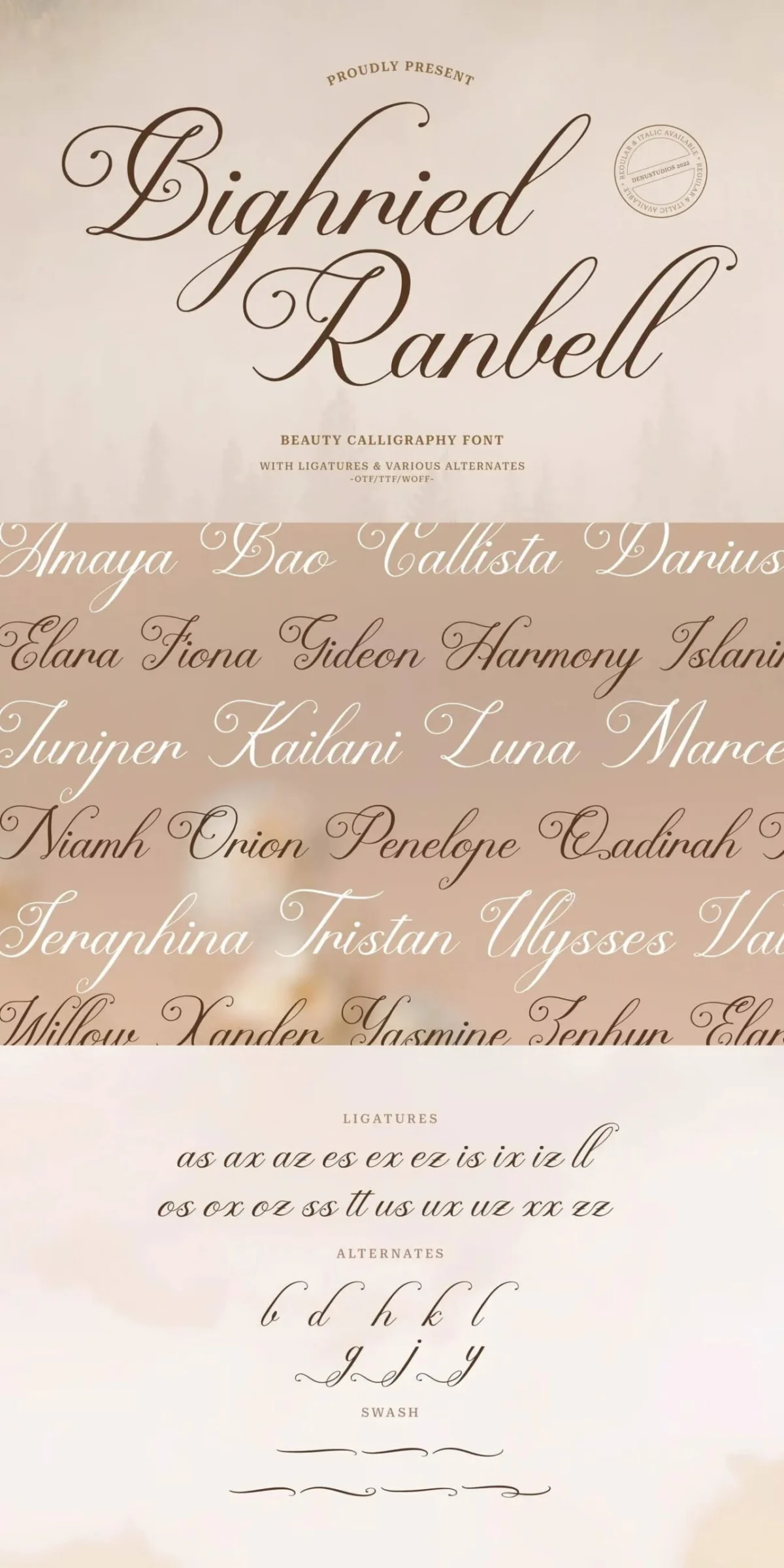
A Curated Selection: 40+ Premium Handwritten Assets
To help designers navigate this crowded space, we have curated a selection of over 40 top-tier, professionally crafted script fonts. These assets, ranging from elegant signatures to playful doodles, are engineered to perform seamlessly across both print and digital platforms.

The Signature Series: Sophistication and Flow
For branding projects that require a touch of luxury, signature-style fonts are the gold standard.

- Sonthayu: A masterclass in natural fluidity, mimicking the authentic cadence of human penmanship.
- Silkora: Designed specifically for beauty and fashion brands, this font exudes a high-end, editorial feel.
- Solasta & Serifora: These fonts offer the delicate curves needed for boutique branding and high-end stationery.
The Playful and The Bold
Not every project requires formal elegance. For designs that need to stand out, bolder, more experimental typefaces are necessary.

- Sketchbook Doodle: A whimsical, rounded typeface that is an ideal choice for educational materials, children’s product branding, and casual marketing.
- Stryvix: Inspired by street art, this font brings a raw, energetic aesthetic to posters and modern apparel design.
- Etta Melody: A retro-inspired bold script that transports the viewer to the era of classic diner signage and mid-century advertising.
Supporting Data: The Impact of Typography on Brand Perception
Recent studies in consumer psychology suggest that typography is not merely an aesthetic choice but a critical component of brand trust. A study conducted by the Journal of Consumer Research found that consumers are more likely to perceive a product as "handcrafted" or "personalized" when the packaging uses a script font. This psychological association increases the perceived value of the product, often leading to higher conversion rates in retail environments.

Furthermore, with over 1,500,000 design assets now available through digital marketplaces, the barrier to entry for high-quality typography has dropped significantly. This democratization of design allows small business owners to compete with larger corporations by utilizing premium, bespoke-looking typefaces that were once the exclusive domain of large design agencies.

Official Perspectives: The Role of the Designer
In an interview with leading industry typographers, the consensus is clear: the "handwritten" trend is not a passing phase but a permanent evolution in design.

"Every handwritten script font tells a story without saying a word," says one lead designer. "When you choose a font that looks like it was written with a fountain pen versus a thick paint brush, you are telling the customer exactly what kind of experience they are about to have. It’s a silent language of brand identity."

Designers are encouraged to test font combinations rigorously. Using a platform to preview specific words—such as a brand name or an event title—is essential. Often, a font that looks beautiful in isolation may not carry the same weight when paired with specific branding colors or logo shapes.

Implications for the Future of Branding
As AI-driven design tools become more prevalent, the value of "human" design will only continue to rise. While AI can generate infinite variations of a font, the nuance of a human-crafted script font—with its deliberate imperfections and natural flow—will remain a unique identifier of quality.

For the modern designer, the implications are twofold:

- Versatility is Key: Investing in font families that include multiple weights and alternate characters (swashes, ligatures, and stylistic sets) will provide more creative freedom.
- Focus on Readability: No matter how beautiful a script font is, it must remain legible. Designers must be vigilant about kerning and line spacing, especially when applying these fonts to digital interfaces where screen resolution can vary.
Conclusion: Crafting Your Next Masterpiece
Whether you are designing a wedding invitation that requires the utmost grace, a café menu that needs to feel inviting, or a corporate logo that demands a personal touch, the right script font is your most powerful tool.

By utilizing the curated resources mentioned above, you can ensure that your work is not just seen, but felt. Remember, the best design is the one that invites the viewer to lean in, read the message, and connect with the story behind the text. Start your next project by selecting a typeface that reflects the soul of your brand—because in a world of digital noise, a little bit of human touch goes a long way.

For those looking to expand their design library, consider exploring the vast archives of professional-grade assets that offer not only fonts but also mockups and templates, providing a holistic approach to your creative workflow.