In the sterile, grid-locked era of the early 2010s, minimalism was king. Brands vied for supremacy through "flat" aesthetics, excessive white space, and a reliance on the ubiquity of Helvetica. It was a digital epoch defined by cold, algorithmic precision. However, a decade later, the pendulum has swung violently in the opposite direction. Anti-design—a movement characterized by deliberate distortion, chaotic typography, and a rejection of traditional legibility—has emerged from the fringes to become a dominant force in modern branding.
But this is not merely a stylistic fad; it is a profound reaction to the digital fatigue brought on by a decade of "perfect" design. To understand the mechanics of this shift and its implications for the future of creativity, we sat down with Ollie Patterson, managing director at the creative agency Mynt, to unpack why brands are choosing to tear up the rulebook.
The Chronology of the Shift: From Order to Chaos
To appreciate the rise of anti-design, one must first look at the trajectory of digital aesthetics. Following the vibrant, often cluttered, and highly experimental design language of the 90s and early 2000s, the industry underwent a radical purification. As mobile devices became the primary window into the internet, designers adopted a "less is more" philosophy. Minimalist interfaces were prioritized for their perceived usability and speed.
However, as the internet became saturated with high-fidelity, polished, and homogenous imagery, the consumer gaze began to glaze over. By the late 2010s, "blandness" became a critique of the tech industry’s visual output.

The subsequent emergence of anti-design was a visceral counter-movement. It began in the underground art scene and digital subcultures—places like Tumblr and experimental zine communities—before bleeding into mainstream advertising. Today, it is no longer an "edgy" choice for indie labels; it is a calculated strategy employed by major corporations to cut through the noise of an over-curated digital environment.
The Psychology of Imperfection: Why Perfection Fails
The core of the anti-design movement is the human desire for authenticity. According to Ollie Patterson, the fatigue surrounding perfect design is rooted in a fundamental disconnect between polished brands and the lived experience of the consumer.
"A desire to feel real and authentic is the driving force," Patterson explains. "Imperfections are the things we can relate to and fall in love with. When everything is too polished and perfect, it feels out of reach."
This is the "Uncanny Valley" of graphic design. When a brand’s aesthetic is too clean, it triggers a subconscious skepticism in the consumer. We associate "perfection" with mass production, automation, and corporate distance. Conversely, the small, "accidental" flaws—a jagged edge, a slightly off-center text block, or a grain-heavy photograph—signal human effort.
"It’s the small flaws and unexpected design elements which demonstrate genuine human effort and give a design its authenticity and character," says Patterson. "And it’s that authenticity that creates connection and builds trust. In an increasingly filtered and curated world, it’s genuine, honest design which stands out."
The AI Factor: The New Catalyst for "Realness"
The rapid democratization of Artificial Intelligence in creative workflows has accelerated the anti-design trend. As AI tools gain the ability to generate hyper-realistic, perfectly composed, and technically flawless imagery in seconds, the value of that perfection has plummeted.
"AI can produce lots of clean, polished visuals," Patterson notes. "But when everyone has access to the same tools and the easier ‘perfection’ becomes to create, the less interesting it becomes."
This shift has created an ironic paradox: as machines become better at creating "perfect" content, human creators are increasingly leaning into "imperfect" design to assert their identity. Authenticity has become the ultimate differentiator in the market. Brands that simply lean on AI to churn out generic, high-gloss campaigns are finding themselves lost in a sea of sameness. The brands that resonate today are those that use technology as a tool, not a crutch—maintaining a distinct, human point of view that AI cannot replicate.
Defining the Philosophy: Crafted Imperfection vs. Poor Design
A common misconception is that anti-design is synonymous with "bad" or "lazy" design. This is a critical error in judgment. As Patterson clarifies, the distinction lies entirely in the intent.
"Crafted imperfection still has a clear purpose and communicates brilliantly—it just doesn’t feel over-engineered," Patterson says. "Poor design is accidental."
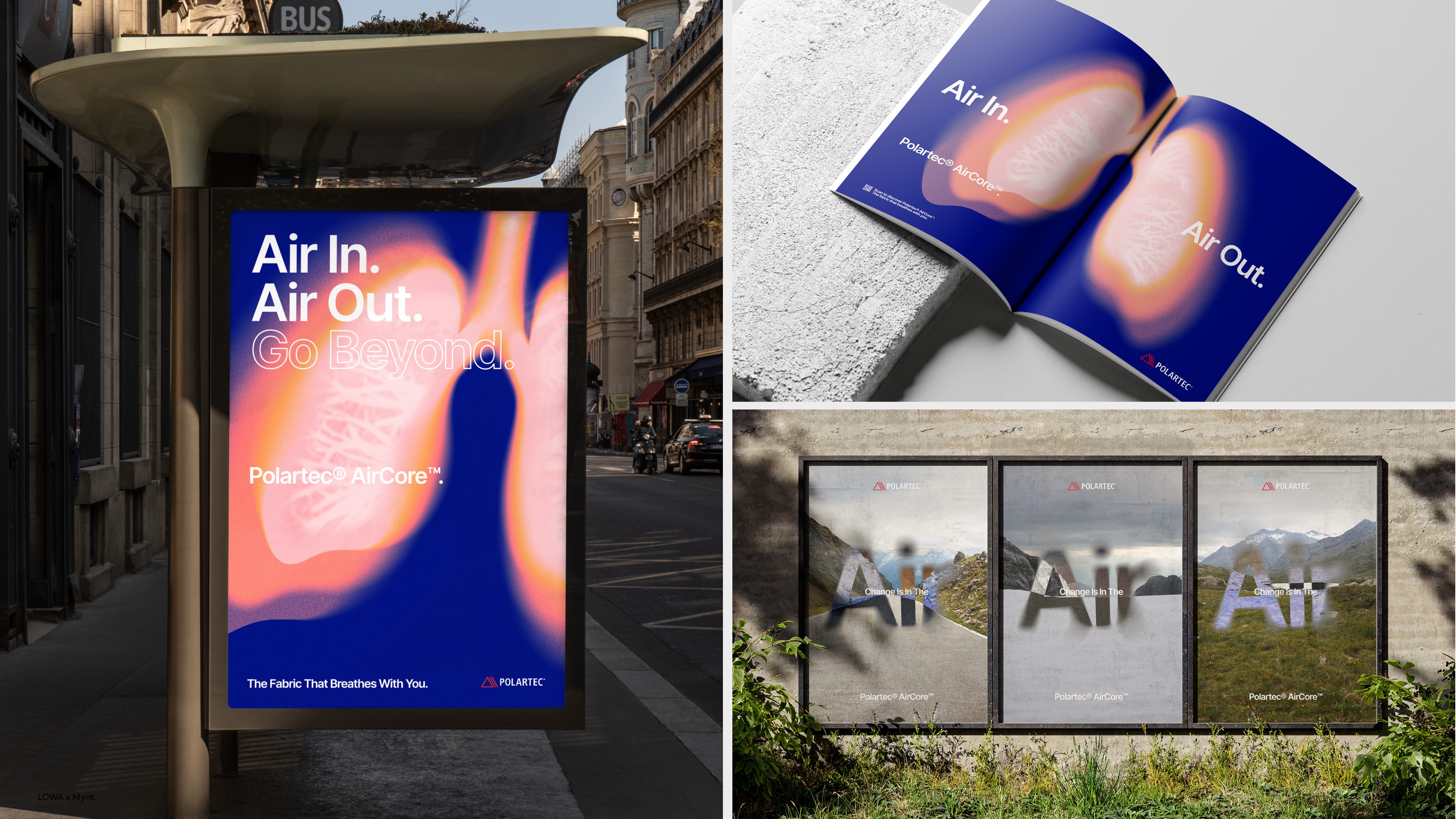
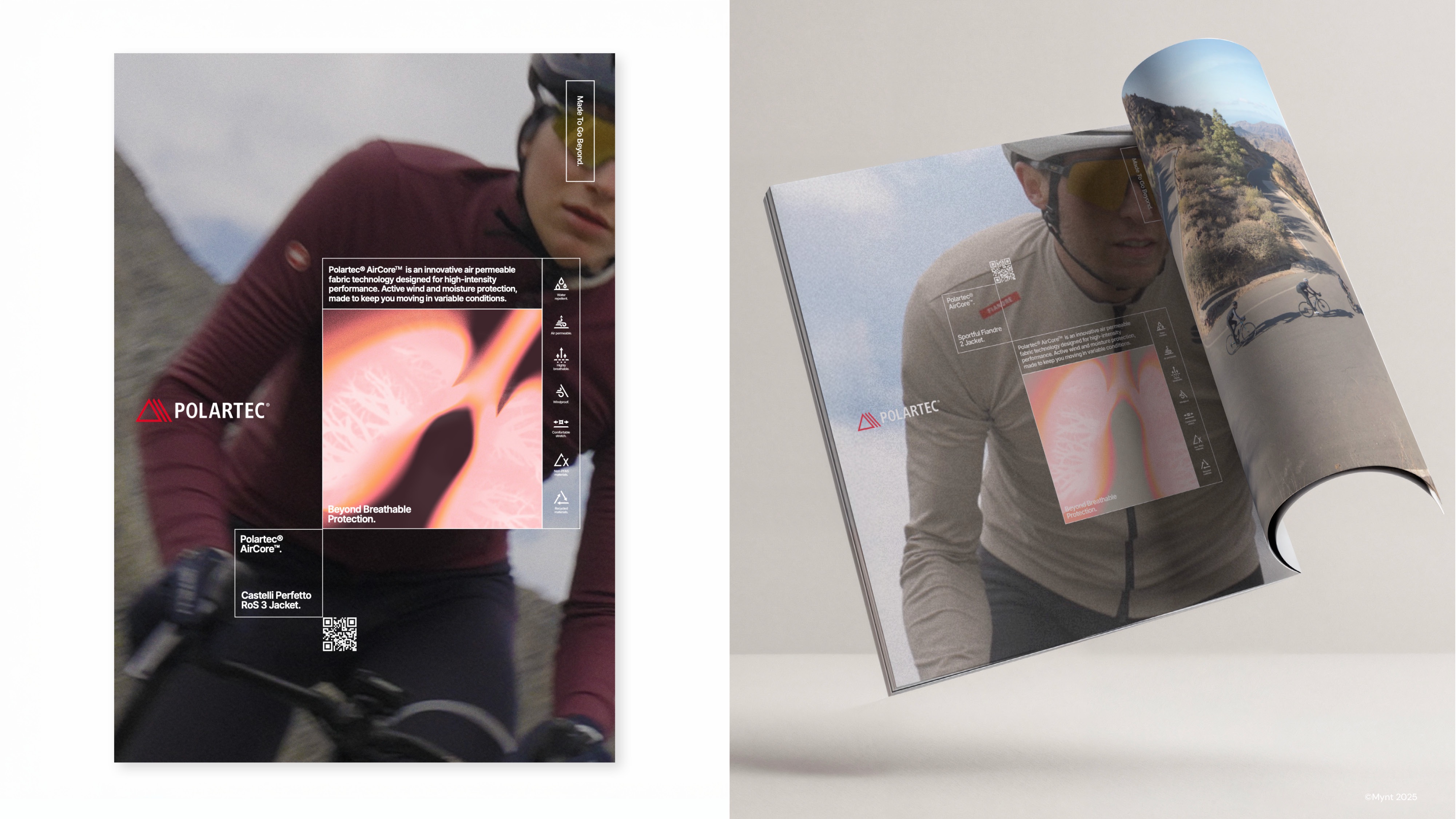
Crafted imperfection is a deliberate aesthetic choice. It is a calculated removal of the "polish" to reveal the underlying message. It requires a high level of design maturity to know how to break the rules effectively. Conversely, poor design is a failure of communication. If an audience cannot understand the message because the design is too chaotic, it has failed. The best anti-design doesn’t sacrifice legibility or intent; it uses "imperfection" as a visual texture to humanize the message.
Case Study: The Polaroid Rebellion
To see this philosophy in action, one need look no further than Polaroid’s recent branding efforts. Facing a digital world dominated by cloud-synced, filtered photos, the brand leaned into its analog roots.
"I really liked Polaroid’s campaign last year when they launched their ‘Flip’ camera, taking AI head-on by celebrating realness," says Patterson. "The focus was on print photography as a lifestyle choice over endless scrolling and digital images saved in the cloud."
The genius of this campaign was not just in the aesthetic of the ads, which celebrated the grainy, unpredictable nature of physical film, but in the physical placement of the media. By placing billboards directly adjacent to the glass-walled, ultra-minimalist offices of tech giants like Apple and Google, Polaroid turned their design into a manifesto. The contrast was stark: the cold, perfect, digital future versus the warm, imperfect, tangible present. It was a masterclass in using design to define a brand’s place in the cultural conversation.
The Implications: What Follows Anti-Design?
If the current trend is a rejection of the status quo, where do we go from here? Some fear that if anti-design becomes too popular, it will eventually become just as stale and "corporate" as the minimalism it replaced.
Patterson, however, does not foresee a complete return to the era of ultra-perfect design. Instead, he predicts a shift toward a nuanced balance.
"I don’t think we’ll suddenly swing back into a world of ultra-perfect design. I think we’ll see a balance," he says. "Brands will continue to embrace authenticity, but they’ll become more selective about where they introduce imperfections. The winners will be those who know when to be beautifully crafted and when to let their personality shine through."
Conclusion: The Future is Human-Centric
The rise of anti-design is a clear signal that the era of the "faceless brand" is coming to an end. In a world of infinite digital choice, consumers are gravitating toward brands that feel human, relatable, and—above all—honest.
Whether it is through the intentional use of grit, the celebration of analog media, or the rejection of algorithmic aesthetics, the goal remains the same: to catch the heart, not just the eye. As we move forward, the most successful brands will be those that master the art of the imperfect, proving that in a world of machines, the most valuable commodity remains a human perspective.