
 Asep Darmawan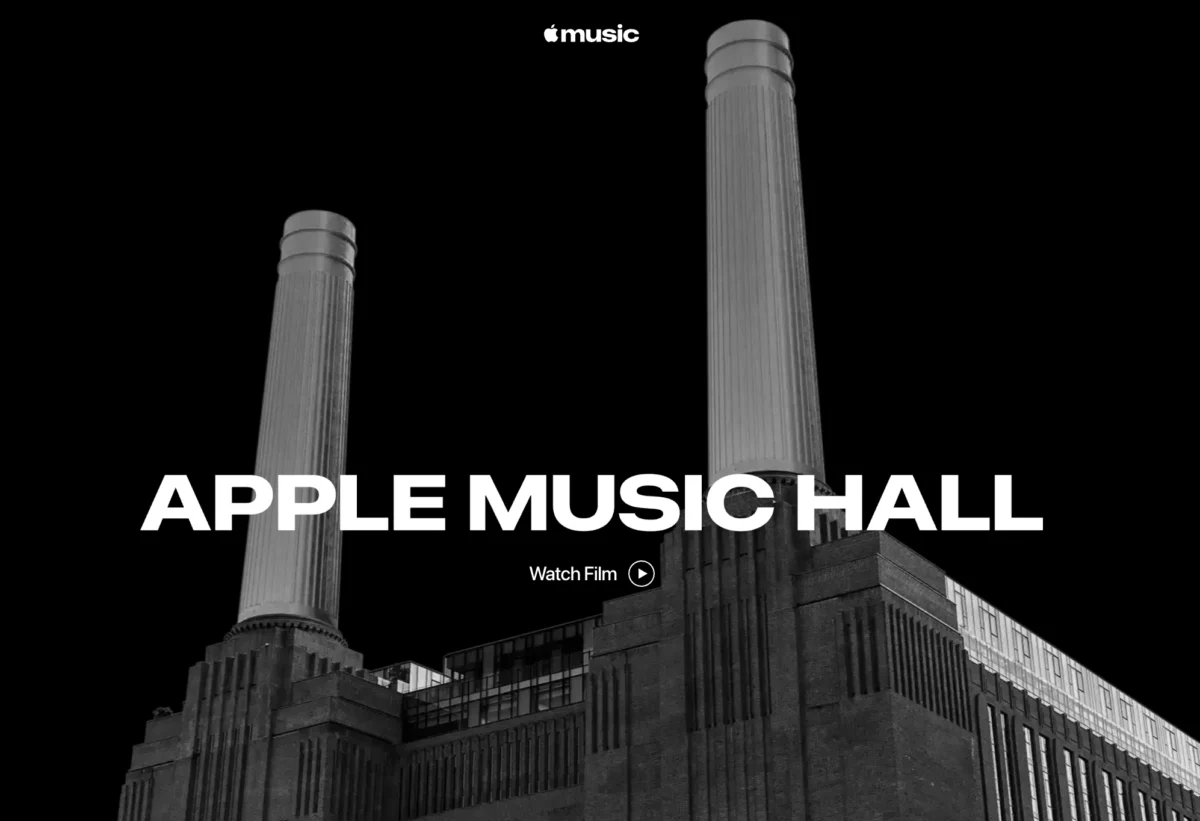
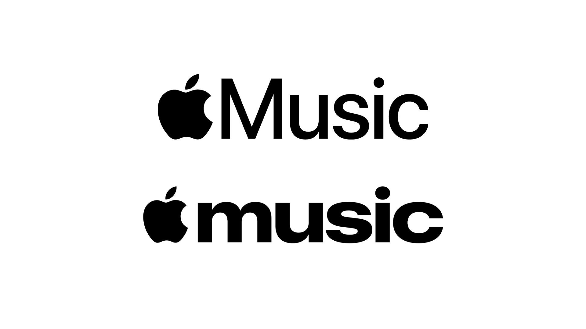
For over a decade, Apple has been the undisputed high priest of minimalism. Since the rollout of iOS 7 in 2013, the company has championed a "less is more" philosophy, characterized by clean, sans-serif typography, airy whitespace, and a monochromatic restraint that defined the modern aesthetic of Silicon Valley. However, a quiet but seismic shift has occurred. With the launch of Apple Music Hall in London, the tech giant has unveiled a striking new logo for its music streaming service—one that abandons the clinical precision of the "San Francisco" font in favor of a bold, lowercase, and unapologetically retro wordmark.
If this pivot is any indication, the industry’s long-standing obsession with ultra-minimalism may finally be facing its sunset, making room for a more expressive, maximalist future.
The Core Revelation: Apple Music Hall and the New Visual Identity
The catalyst for this design evolution is the unveiling of Apple Music Hall, a state-of-the-art, 600-capacity performance venue nestled within the iconic architecture of London’s Battersea Power Station. Designed to bridge the gap between intimate live performance and high-fidelity production, the venue is a physical manifestation of Apple’s deepening commitment to the music industry.
However, it is the digital collateral accompanying the venue—specifically the new Apple Music wordmark—that has set the design community ablaze. The new logo ditches the thin, precise strokes of the standard Apple corporate typeface for a weightier, more character-driven lowercase aesthetic. It feels tactile, weighted, and intentional. While the Apple Music service itself (launched in 2015) has historically utilized a sleek, almost invisible interface, this new iteration suggests that Apple is ready to let its typography do the talking.
Chronology: A Decade of Design Evolution
To understand the weight of this change, one must look back at the trajectory of Apple’s visual language over the last fifteen years.
2013: The Death of Skeuomorphism
The defining moment of modern digital design occurred when Jony Ive and his team introduced iOS 7. The industry shifted overnight from "skeuomorphism"—design that mimics real-world textures like leather, felt, and glass—to "Flat Design." This set the standard for the next decade, with every major competitor, from Google to Microsoft, stripping away shadows and gradients to mirror Apple’s clean aesthetic.
2015: The Birth of Apple Music
When Apple Music launched, it followed the established rules of the time: high-contrast black and white, perfectly legible sans-serif fonts, and a heavy reliance on album artwork to provide the color. It was functional, sterile, and perfectly "Apple."
2023–2024: The "Liquid Glass" and Beyond
Last year saw the introduction of "Liquid Glass" UI elements, a subtle move toward more depth and dimensionality. This was the first sign that the company was growing bored with flat, two-dimensional surfaces.
2025: The Maximalist Pivot
With the Apple Music Hall branding, the company has officially signaled a departure from the "invisible" design language. By embracing a bolder, almost Y2K-inspired typeface, Apple is moving away from the "default" look that has dominated the web since 2015.
Supporting Data: Why the Shift Matters
Design is rarely a matter of whim for a company of Apple’s stature; it is a strategic response to shifting cultural tides.
- The "Y2K" Resurgence: Data from social media trends and consumer branding reports indicates a massive surge in interest regarding the late 90s and early 2000s aesthetic. Gen Z consumers, who comprise a growing segment of Apple’s music streaming demographic, are gravitating toward "maximalism"—bold colors, thicker fonts, and designs that feel less like a clinical app and more like a curated cultural artifact.
- The "Magazine" Effect: As noted by early adopters on platforms like Reddit, the new font carries the weight of a physical cassette insert or a 90s music magazine cover. By leaning into this, Apple is attempting to inject a sense of "soul" and "history" into a digital product that often feels ephemeral.
- Market Differentiation: In a crowded streaming market, differentiation is key. When every app looks the same—white background, black text, rounded corners—a bold, stylized logo becomes a competitive advantage. It screams for attention in a sea of sameness.
Official Perspectives and Industry Reaction
While Apple has remained characteristically tight-lipped about the long-term implications of this design change, the move has been received with both excitement and skepticism.
Industry analysts suggest this is a "test-and-learn" strategy. By applying the new wordmark to a specific, high-profile physical venue, Apple is gauging public reaction before potentially rolling out a global rebrand.
"The font feels human," says one prominent design blogger. "It feels like someone chose it for its personality, rather than its algorithmic perfection." Conversely, some design purists argue that the move away from the San Francisco font could threaten the brand’s visual consistency, which has been the bedrock of their user experience (UX) for years.
Implications: Is Maximalism the New Standard?
The decision to adopt a bolder, more maximalist visual identity is not merely an aesthetic choice; it is a signal of where Apple—and by extension, the broader design world—is heading.
1. The End of "Design by Algorithm"
For years, UI/UX has been governed by data. If A/B testing showed that a slightly thinner, more neutral font led to a 0.5% increase in click-through rates, that font became the standard. This led to a "blandification" of the internet. If Apple is now willing to prioritize character over pure efficiency, we may see a wave of "personality-driven" design in the coming years.
2. Apple’s "Fun" Renaissance
We have seen hints of this shift elsewhere. The release of brightly colored laptops and the company’s recent "unhinged" TikTok advertising campaigns suggest that Apple is no longer afraid to look "fun" or even "edgy." The company is moving away from the untouchable, ultra-premium monolith toward a brand that feels more relatable and, crucially, more human.
3. The Future of Typography
Expect to see a decline in the use of standard, safe system fonts. As hardware displays improve, the need for extreme legibility at tiny sizes is being replaced by the desire for brand identity and emotional resonance. The future of design will likely be defined by "expressive legibility"—typefaces that are easy to read but carry a distinct emotional weight.
4. A Template for Web 3.0
If Apple successfully transitions to this new aesthetic, the ripple effects will be felt across every industry. Small businesses, startups, and massive corporations alike look to Cupertino for guidance. If Apple says "bold is better," the world will follow. We are likely entering a period where whitespace is used less to "clean up" the screen and more to "frame" high-impact, artistic visual choices.
Conclusion: Embracing the Bold
The quiet revelation of the new Apple Music logo is the loudest design statement the company has made in years. By stepping away from the cold, clinical minimalism that defined the 2010s, Apple is opening the door to a more vibrant, expressive, and human-centric future.
Whether this is a temporary trend or a fundamental shift in the company’s DNA, one thing is certain: the era of the "bland" web is ending. As we move further into the decade, design will once again be about personality, nostalgia, and the courage to be bold. If Apple is the barometer for the industry, then the future isn’t just bright—it’s loud, it’s weighted, and it’s anything but minimal.
The stage is set at Battersea Power Station. The curtains are pulling back. And for the first time in a long time, the design looks ready to rock.

 Siti Muinah