In the high-stakes environment of modern recruitment, a job seeker’s resume is often their only ambassador. With human resources managers and recruiters frequently spending less than ten seconds scanning an initial application, the battle for attention is won or lost in the design. As the job market becomes increasingly competitive, the trend has shifted decisively away from elaborate graphics and complex layouts toward a philosophy of "less is more."

Minimalist resume design—characterized by clean lines, ample white space, and sophisticated, readable typography—has emerged as the gold standard for professionals across all sectors. This shift is not merely an aesthetic choice; it is a calculated response to how hiring software and human eyes process information in the digital age.

The Evolution of the Resume: From Clutter to Clarity
The history of the modern resume is one of rapid transformation. In the early 2000s, applicants often attempted to stand out with vibrant colors, headshots, and experimental formatting. However, the introduction of Applicant Tracking Systems (ATS) and the shift to mobile-first document consumption changed the landscape.

A Chronology of Resume Design Trends
- The Early 2000s (The Decorative Era): Resumes were often designed in Word with excessive borders, clip art, and tables. These files were notoriously difficult for early digital parsers to read, often leading to formatting errors.
- The 2010s (The Graphic Revolution): As design software became accessible, candidates leaned toward "infographic" resumes. While visually striking, these documents frequently failed to pass ATS filters, which could not interpret text embedded within graphics.
- The 2020s to Present (The Minimalist Standard): The current era prioritizes ATS-friendly, clean layouts. Modern templates focus on hierarchy, using bold headers and strategic white space to guide the reader’s eye directly to key qualifications.
The Data Behind the Design: Why Minimalism Works
The preference for minimalist design is supported by cognitive psychology and recruitment data. According to industry studies, recruiters tend to follow an "F-pattern" or "Z-pattern" when scanning documents. They look for specific anchors: job titles, company names, and dates of employment.

Optimization and Accessibility
Minimalist templates are inherently more efficient. From a technical standpoint, they are easier to export as high-quality, lightweight PDFs. When a file is too large or contains complex vector graphics, it can suffer from slow load times or rendering issues on mobile devices—a critical failure point when a recruiter is reviewing an application on the go.

Furthermore, clean layouts ensure that keywords are easily indexed by automated software. By removing unnecessary design elements, candidates ensure that their most vital data—their skills and achievements—remains front and center, unobstructed by decorative clutter.

Professional Perspectives: The "Cohesive Package" Strategy
Industry experts emphasize that a resume should never exist in a vacuum. A professional application is a holistic ecosystem consisting of a resume, a cover letter, and—where applicable—a portfolio.

"The greatest mistake a candidate can make is a lack of visual continuity," says one hiring consultant. "When your resume and cover letter share the same typography, color palette, and margin structure, you signal to the recruiter that you are organized, detail-oriented, and professional. It turns two separate documents into a singular, branded identity."

Implications for the Modern Job Seeker
Adopting a minimalist design approach has significant implications for how a candidate is perceived. A cluttered, chaotic resume often correlates in a recruiter’s mind with a cluttered, chaotic professional approach. Conversely, a clean, well-spaced layout suggests a candidate who can distill complex information into actionable insights—a soft skill that is highly valued in every industry, from software development to corporate finance.

Tailoring Your Approach
Whether you are a fresh graduate entering the workforce or a seasoned executive transitioning to a new field, the rules of minimalism remain constant:

- Typography: Stick to one or two high-readability sans-serif or serif fonts.
- White Space: Do not fear empty space; it acts as a visual break that prevents reader fatigue.
- Hierarchy: Use varying font weights rather than multiple colors to differentiate sections.
A Curated Selection of Professional Templates
For those looking to transition to a cleaner aesthetic without the cost of a private graphic designer, the following categories of templates offer a starting point for a professional upgrade. These templates are optimized for common editing software such as Microsoft Word, Adobe Photoshop, and Adobe Illustrator.

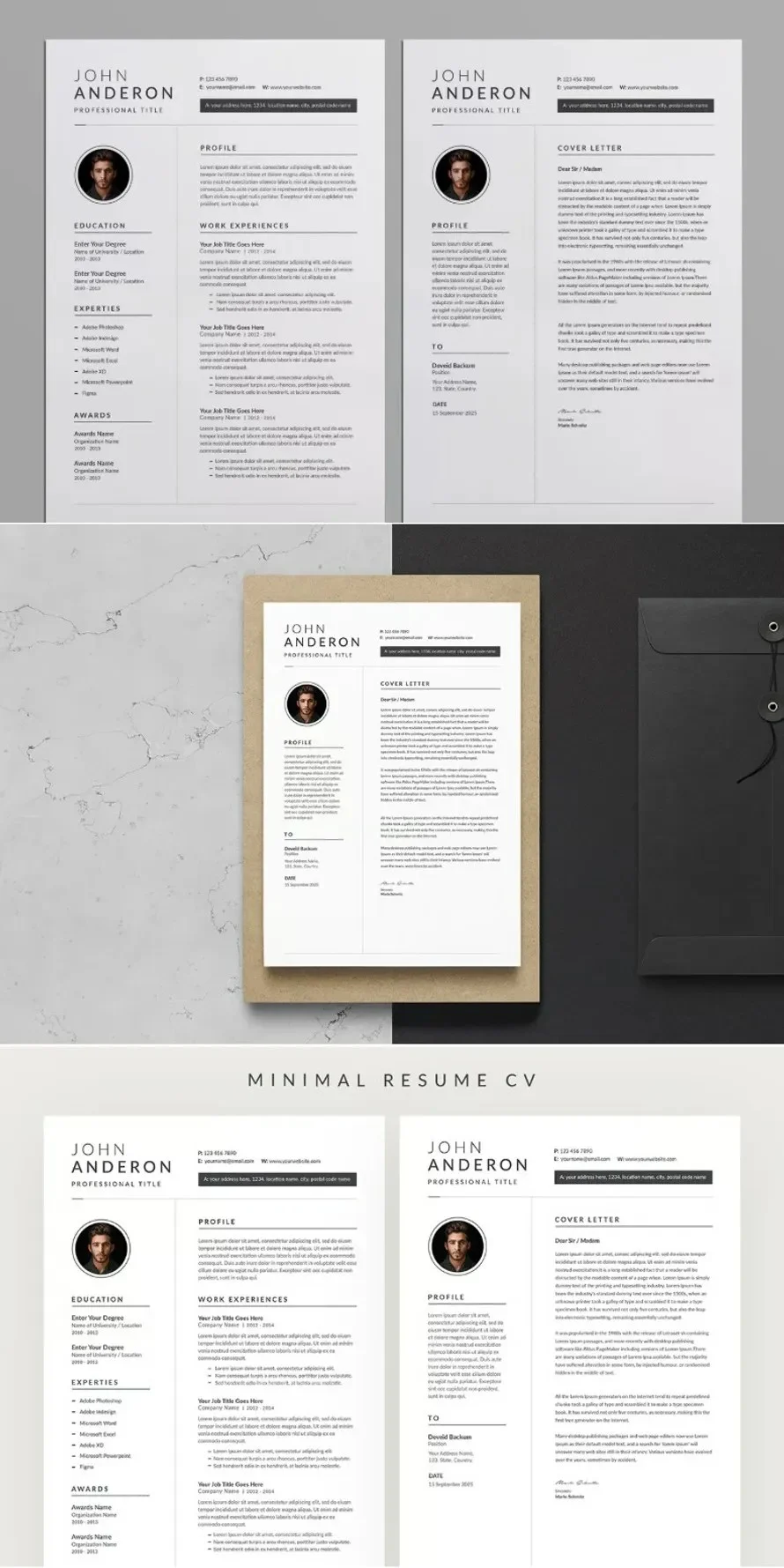
1. The Minimalist Professional
This category focuses on rigid, grid-based layouts. It is ideal for individuals in the legal, financial, or administrative sectors where a conservative, authoritative look is expected.

2. The Tech-Centric Developer Layout
Software engineers and developers often benefit from a "full-stack" design that allows for the integration of technical skills, GitHub links, and project repositories without overwhelming the page. These designs often utilize monochromatic color schemes to maintain a focus on technical competency.

3. The Creative-Minimalist Hybrid
For those in marketing or design roles, minimalism does not mean being boring. These templates utilize clever use of layout and whitespace to suggest a sense of style without sacrificing the readability required by ATS software.

Implementing Your New Design
To effectively implement these designs, candidates should follow a structured process:

- Audit Your Content: Before moving your information to a new template, strip away irrelevant older roles or outdated skills.
- Select the Template: Choose a format that matches your career level. A senior project manager will require more space for complex work history than an entry-level applicant.
- Customize and Polish: Edit the sections to align with your personal experience. Ensure that the cover letter accompanying the resume uses identical fonts and color schemes.
- Review for ATS: Once completed, save your document as a PDF, but keep an eye on the text-searchability of the file. If you can highlight the text with your cursor, it is generally safe for ATS.
The Future of Application Design
As Artificial Intelligence becomes more integrated into the hiring process, the importance of structural clarity will only grow. AI-driven screening tools favor documents that are easy to parse. By embracing the principles of minimalist design today, job seekers are not just improving their aesthetic appeal—they are future-proofing their applications against the evolving demands of the digital hiring landscape.

In conclusion, the resume remains the most powerful tool in the job seeker’s arsenal. By choosing a design that favors readability, structure, and professional restraint, you position yourself as a candidate who understands the value of clear communication. Whether you are aiming for a career pivot or a promotion, the first step is ensuring that your story is not just told, but clearly seen.

Disclaimer: This article references professional design assets available for download. Users are encouraged to browse reputable marketplaces for templates that allow for full customization in standard software formats like Word or AI, ensuring that every resume remains a unique reflection of the individual applicant.