For years, Samsung Health has served as the bedrock of the Galaxy ecosystem’s wellness tracking. While competitors like Garmin, Fitbit, and the burgeoning Google Health platform have iterated rapidly, Samsung’s offering remained remarkably consistent, favoring a utilitarian, "if it ain’t broke, don’t fix it" approach to user interface design. That era of stability has officially come to an end.
Ahead of the highly anticipated launch of the Galaxy Watch 9 and the widespread rollout of the One UI 9 interface, Samsung has deployed a radical redesign of its flagship health application. The update is, in a word, transformative. It departs from the sober, data-first aesthetic of its predecessors in favor of a vibrant, high-contrast, and widget-heavy layout. However, as users are beginning to discover, this "sparkly" new look brings a complex mix of genuine usability gains and questionable aesthetic choices.
Main Facts: The Scope of the Redesign
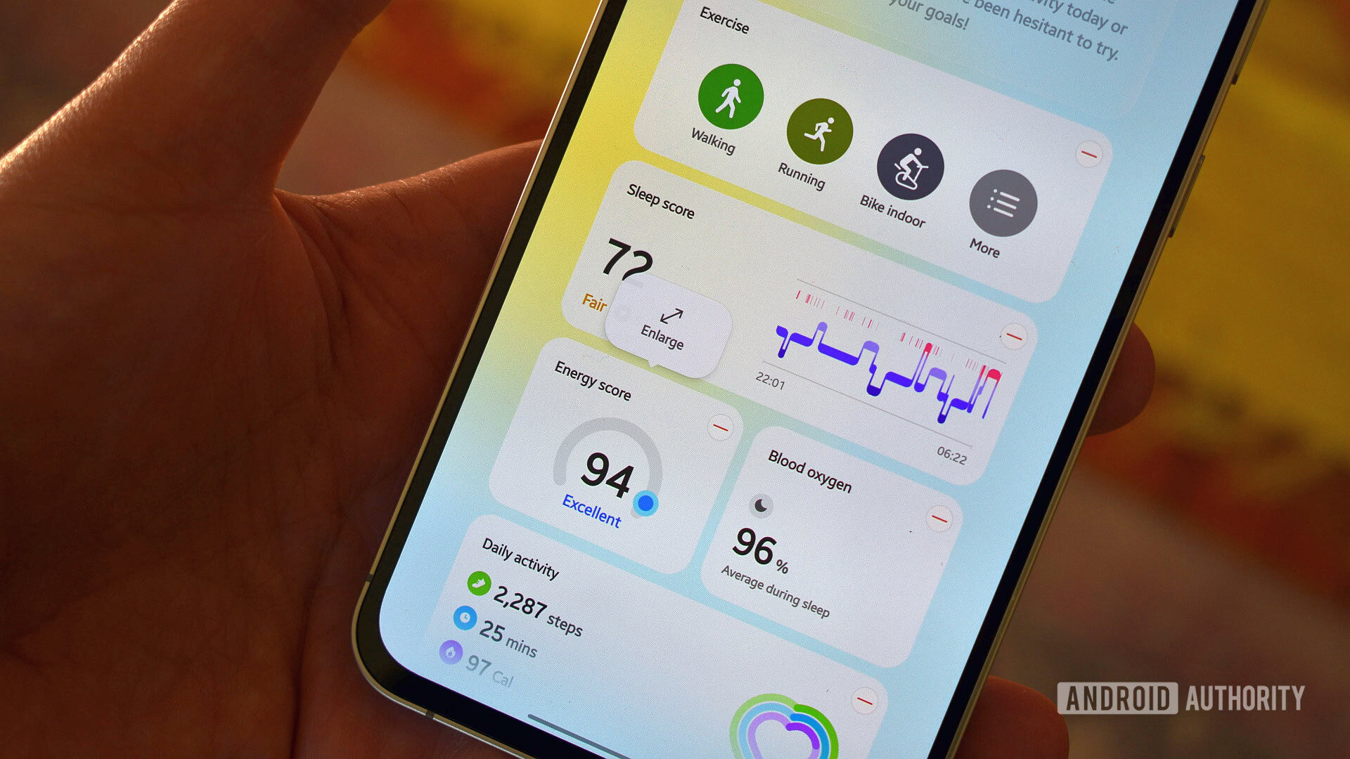
The latest iteration of Samsung Health represents the most significant UI overhaul in the app’s history. The primary focus of this update is a shift toward a more modular dashboard, allowing users to customize their experience with resizable widgets that function similarly to modern, high-end weather applications.
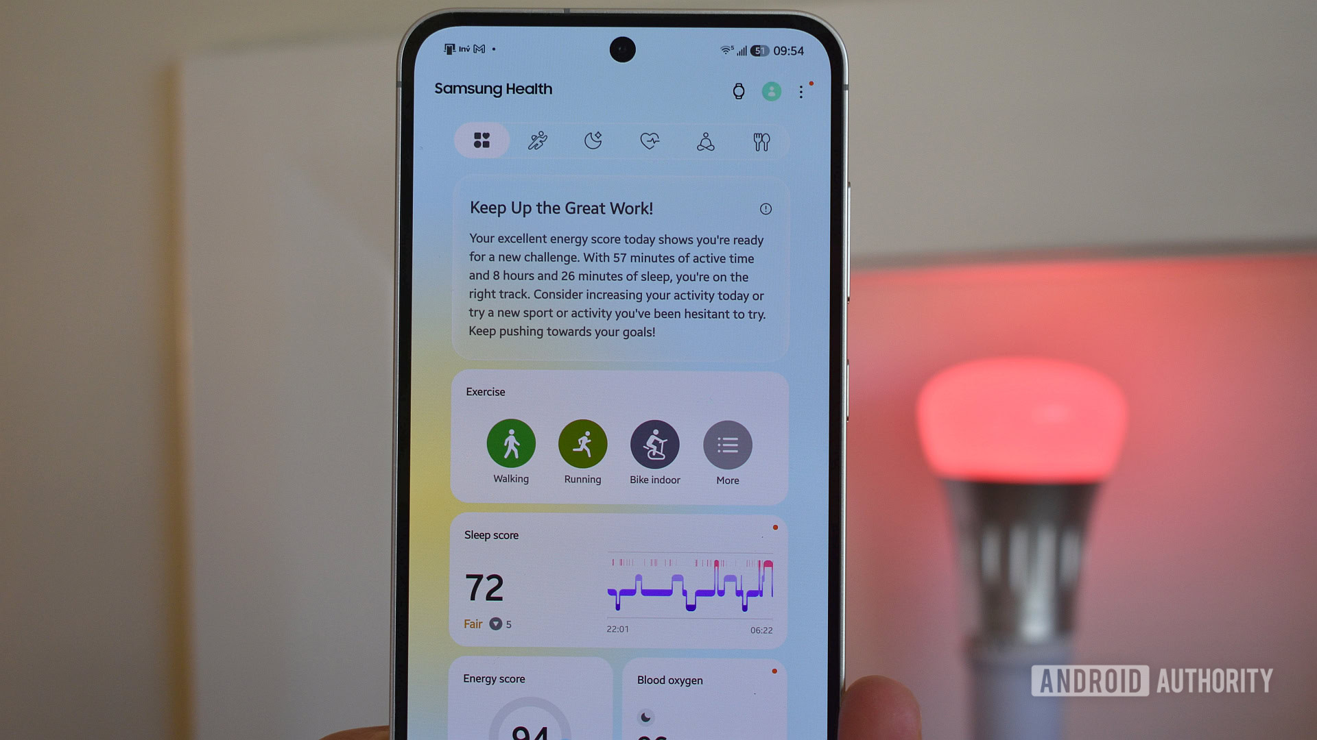
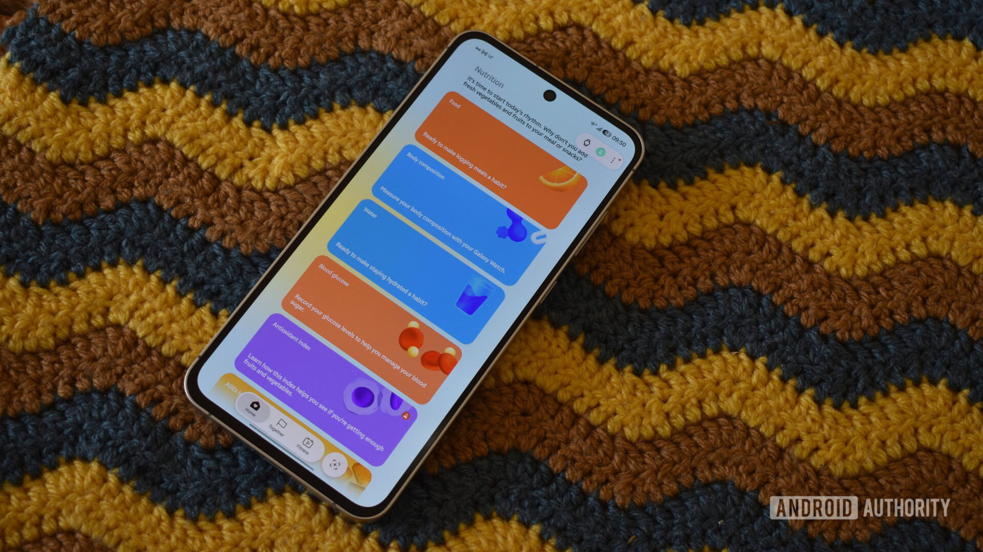
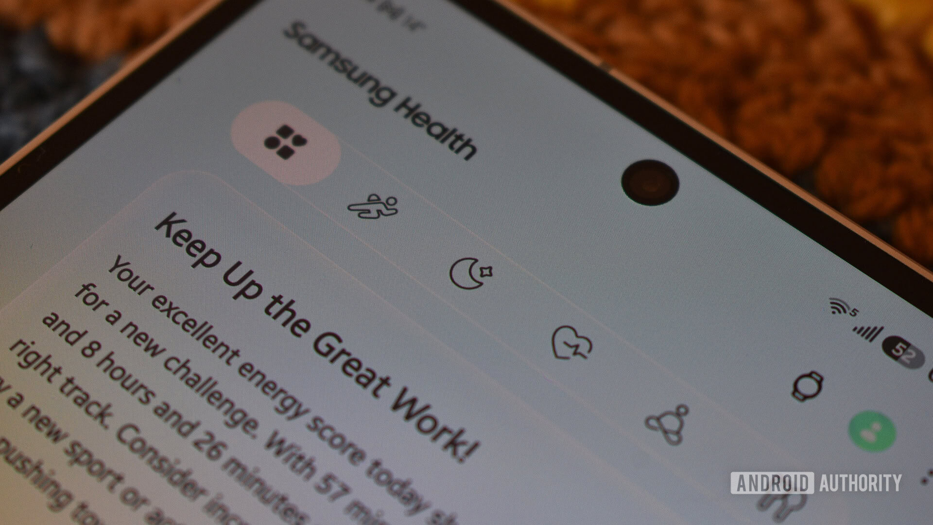
The update introduces a new top-level navigation bar designed to silo health data into five distinct categories: Activity, Sleep, Vitals, Mindfulness, and Nutrition. This is a direct attempt to solve the "discovery" problem that plagued the previous version, where an ever-expanding list of metrics made it increasingly difficult for users to locate specific data points.
However, the visual language of the app has shifted dramatically. Where the legacy version utilized specific color coding for distinct metrics—green for movement, blue for sleep, etc.—the new version employs a palette that appears largely decorative. This has led to concerns regarding cognitive load, as users must now contend with an interface where the visual "form" does not always align with the functional "content."
A Chronological Evolution of Samsung Health
To understand the significance of this update, one must look at the trajectory of the app over the last decade.
- The Early Years (Galaxy S8/S9 Era): The app was defined by its strict adherence to functional design. Color was used sparingly and served a specific purpose: to categorize data types instantly. A glance at the dashboard provided immediate, high-contrast feedback on activity and health status.
- The Expansion Phase: As Samsung expanded its wearable portfolio from the Galaxy Watch 3 through the Watch 7, the app became increasingly crowded. New sensors for blood oxygen, stress, and body composition were bolted onto the existing architecture, leading to a cluttered user experience.
- The Current Pivot (One UI 9/Watch 9 Era): This week’s release marks the culmination of a push toward a more "lifestyle-oriented" aesthetic. By moving away from the purely clinical look, Samsung is clearly aiming to compete with the more lifestyle-focused dashboards of platforms like Apple Health and Oura.
Supporting Data and User Experience Hurdles
The reception of the update among power users has been divided. Early sentiment, as reflected in initial community polls, suggests a tension between the aesthetic appeal of the new design and the practical requirements of long-term health tracking.
The "Crayola" Problem
One of the most immediate criticisms is the perceived lack of color coherence. The new interface features an ombre background and saturated widgets that, while aesthetically pleasing to some, introduce a level of visual noise. When metrics like sleep, calories, and stress are rendered in colors that bear no relation to their previous associations, it forces users to re-learn the interface rather than relying on muscle memory.
The Success of the Shortcut Bar
Conversely, the implementation of the top shortcut bar is a resounding success. By partitioning the app into logical silos (Activity, Sleep, Vitals, Mindfulness, Nutrition), Samsung has drastically reduced the navigation time required to access granular data. The ability to "portal" directly to a category, such as jumping to "Nutrition" to find body composition metrics, represents a clear improvement in information architecture.
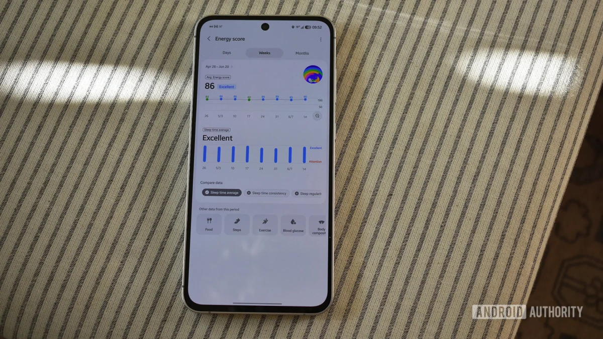
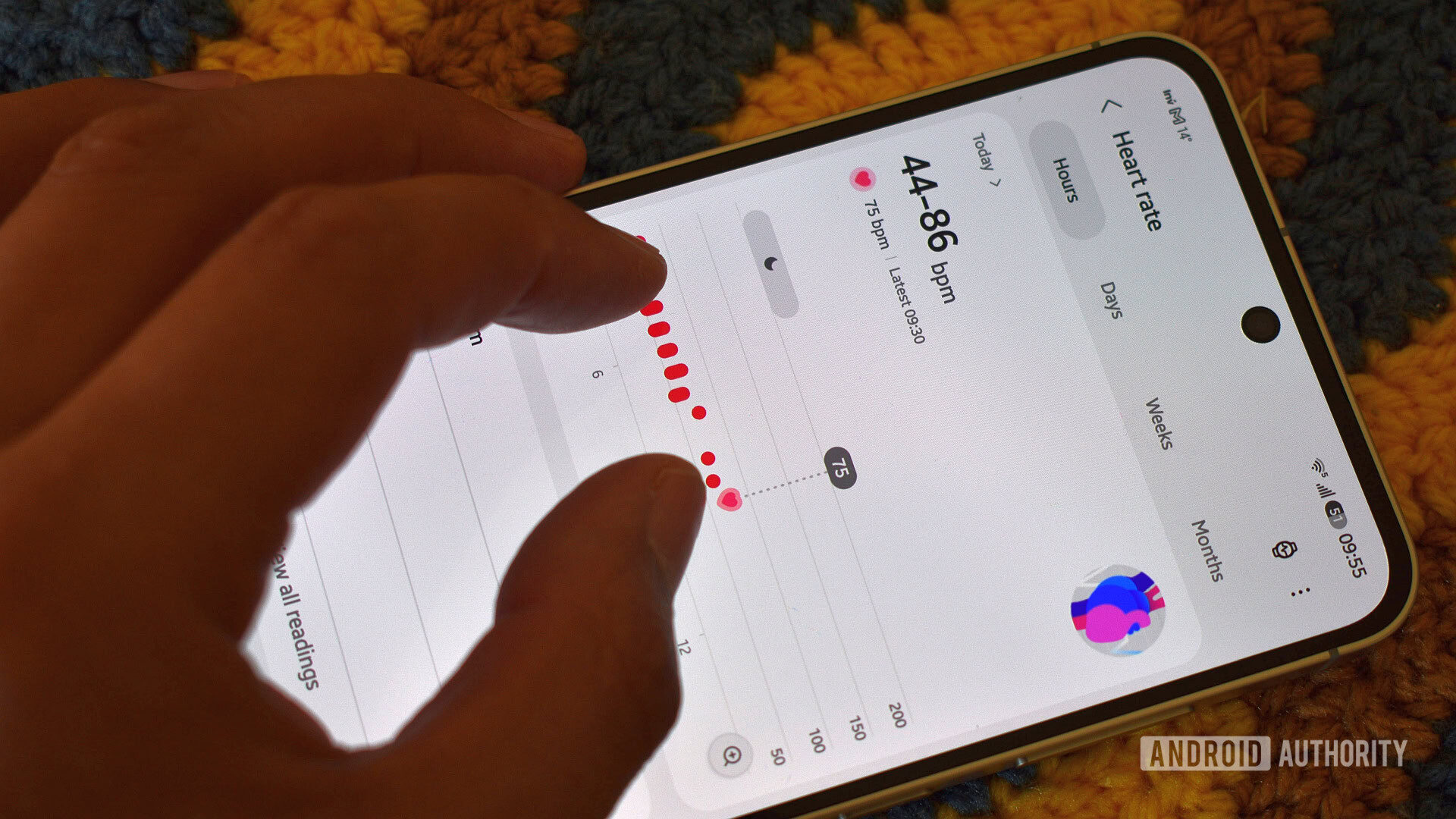
The "Pinch-to-Zoom" Inconsistency
The introduction of interactive, pinchable graphs is a welcome, albeit incomplete, feature. While users can now zoom in on certain heart rate or blood oxygen graphs to see more detail, the functionality is inconsistent. It is currently missing from critical areas like the Sleep widget. For a user trying to correlate restlessness with specific noises or events during the night, the lack of zoom functionality on the sleep graph feels like a missed opportunity for deep-dive analysis.
Official Responses and Strategic Implications
While Samsung has not issued a formal press release detailing the "why" behind every design choice, the move is clearly strategic. The integration of "Vascular Load," "Fitness Index," and "Hearing" widgets—even for users on older hardware like the Galaxy Watch 4—signals that Samsung is shifting to a "Feature-First" marketing strategy.
By placing these widgets on the dashboard, even if they are non-functional on older devices, Samsung is creating a "feature gap" that acts as a subtle, persistent advertisement for the latest hardware. While this effectively drives the narrative for the Galaxy Watch 9, it creates a frustrating experience for users on legacy devices who are forced to manually declutter their dashboards of non-supported, immovable widgets.
Implications for the Future of Wellness Tracking
The implications of this redesign extend beyond just the UI. It signals that Samsung is moving away from being a "sensor data provider" and toward being a "wellness coach." The app is increasingly trying to interpret data for the user rather than just displaying it.
The Missing "Graph Stacking" Feature
The most glaring omission in this redesign remains the lack of a "master graph" page that allows for the cross-referencing of disparate metrics. Users have long requested the ability to stack data—for instance, comparing daily step counts directly against sleep quality, or exercise intensity against body composition changes.
The "Compare data" button found at the bottom of some pages is a step in the right direction, but it is currently limited to comparing similar data types. Without the ability to correlate life-style choices (like walking more) with biological outcomes (like better sleep or higher muscle mass), the app remains a collection of silos rather than a holistic health assistant.
The "Legacy Device" Friction
The decision to display widgets that are not compatible with the user’s specific watch model is a double-edged sword. While it keeps the app ecosystem consistent, it risks alienating the massive base of users who are not on the absolute latest flagship wearable. If the goal of the redesign was to increase user engagement, forcing users to repeatedly remove non-functional, "placeholder" widgets from their dashboard may have the opposite effect, creating a sense of frustration that overshadows the app’s legitimate improvements.
Final Thoughts: A Promising, Yet Incomplete, Transition
The new Samsung Health is, in many ways, a microcosm of the current state of the tech industry: a push toward vibrant, high-engagement aesthetics that occasionally sacrifices the utilitarian precision of the past.
There is much to like in the new navigation, the smarter dashboard layout, and the attempt to make health data more visually digestible. However, the lack of graph consistency, the confusing color schemes, and the intrusive marketing of new-hardware-exclusive features create a user experience that feels somewhat disjointed.

As we move closer to the official launch of the Galaxy Watch 9, it is highly probable that Samsung will issue follow-up patches. The success of this redesign will ultimately depend on whether the company listens to the feedback regarding color logic and widget customization. For now, the app is a bold step forward that, while occasionally stumbling, points to a more organized and accessible future for health tracking—provided the developers are willing to refine the "crayola" aesthetic into something a bit more functional.
For the time being, users who rely on the precision of the legacy interface may find themselves needing a period of adjustment. Whether this change is seen as a necessary evolution or a step backward will likely depend on how much one values a pretty, modern interface over the raw, clinical, and predictable data displays of the past.