
When FIBA Oceania announced the official visual identity for the upcoming 2026 Polynesian Cup and Women’s Polynesian Cup, the design community took notice. The reveal, centered around an intricate, turtle-inspired motif, represents a bold departure from the minimalist, vector-heavy trends currently dominating corporate sports branding. As Tahiti prepares to host the tournament—a key precursor to the 2027 Pacific Games—the FIBA branding team has opted for a narrative-driven aesthetic that prioritizes cultural heritage over immediate, high-contrast legibility.
Yet, in the world of sports identity design, there is often a tension between cultural storytelling and functional utility. As we look ahead to the tournament, it is worth dissecting not just the beauty of the design, but its efficacy as a global sports logo.
The Context: A Tournament of Nations
To understand the significance of the design, one must first understand the event itself. The Polynesian Cup is one of three foundational regional tournaments organized by FIBA Oceania. It serves as a vital proving ground for five participating nations: Samoa, American Samoa, Tonga, Tahiti, and the Cook Islands.
Historically, these tournaments are more than just athletic competitions; they are events that foster inter-island unity and provide a platform for regional talent to showcase their skills on an international stage. The 2026 iteration, hosted in the scenic backdrop of Tahiti, is particularly significant as it acts as a cultural and competitive barometer ahead of the 2027 Pacific Games. The tournament, slated for October 19–24, 2026, aims to bridge the gap between local basketball development and the broader, global reach of the FIBA brand.
A Deep Dive into the Visual Identity
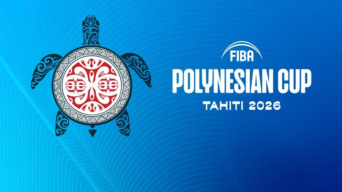
The core of the 2026 identity is the sea turtle—a creature of profound significance in Polynesian mythology. The design utilizes the aesthetic of tatau—the ancestral art form from which the English word "tattoo" is derived.
The logo features complex, carved linework and a stylized, weave-patterned shell. Encased within a red and white roundel, the imagery is reminiscent of ancient stone carvings found throughout the region. It is, by all accounts, a stunning piece of graphic illustration. The intentionality behind the design is clear: FIBA sought to move away from the "corporate-sanctioned" look of generic basketball logos and instead anchor the tournament in the specific geography and spirit of the host islands.
Official Perspectives: The Philosophy of Heritage
FIBA’s official communication regarding the rebrand emphasizes the necessity of storytelling. According to their design team, these visual assets were created to carry the "weight of culture, community, and sporting ambition."

The creative brief for the project focused on five pillars:
- Heritage: Respecting the deep history of Polynesian artistry.
- Craftsmanship: Emulating the visual language of traditional carving and weaving.
- Voyaging: Celebrating the seafaring history of the Pacific.
- Guardianship: Recognizing the turtle as a symbol of protection and guidance.
- Connection: Highlighting the deep, unbreakable ties between the competing islands.
"The patterns are more than aesthetic choices," a spokesperson for FIBA noted. "They are storytelling devices. They reflect the artistry found in tatau, weaving, carving, and Tahitian iconography, and they anchor the basketball silhouette in a distinctly Polynesian narrative."
The Conflict: Aesthetics vs. Functionality
While the design is objectively beautiful and culturally rich, it raises a perennial debate in the design industry: the difference between an illustration and a logo.
A logo is a functional tool. It must perform across a vast spectrum of media environments, from the massive scale of stadium signage to the microscopic space of a mobile application icon or a secondary social media avatar. The primary concern with the 2026 Polynesian Cup logo is its scalability.
The Problem of "The Smudge"
The very elements that make this design successful as a piece of art—the dense, interlocking lines and the delicate negative space—are the same elements that threaten its legibility at small sizes. When reduced to a standard 64×64 pixel profile picture or a broadcast "bug" in the corner of a television screen, the complexity of the tatau patterns risks collapsing into a singular, murky, and illegible shape.
In sports branding, legibility is the ultimate metric of success. If a fan cannot instantly recognize the tournament brand on a smartphone screen, the logo has failed in its primary duty. Furthermore, there is the issue of "sporting relevance." While the turtle shell is cleverly used to represent a basketball, it remains a secondary interpretation. The design does not immediately scream "basketball" to the casual observer, lacking the kinetic energy or ball-specific iconography typically associated with the sport.
A Chronology of FIBA Branding
Historically, FIBA has vacillated between rigid, standardized branding and experimental regional identities.

- The Early Years: Early FIBA tournaments utilized generic, crest-based designs that prioritized flags and balls.
- The Shift (2010s): As the organization expanded, it began to lean into the "City Edition" style of design, favoring local flavor over monolithic corporate branding.
- The Current Era (2020–Present): With the introduction of the Polynesian Cup identity, FIBA is signaling a pivot toward "hyper-local" storytelling. The 2026 logo represents the zenith of this trend—a move that prioritizes local cultural pride over the "universal" language of sports marketing.
Strategic Implications for Future Tournaments
The decision by FIBA to adopt such a complex identity has significant implications for how international sports bodies approach design. By choosing to embrace the intricacies of Polynesian art, FIBA has set a precedent that could either pave the way for more authentic, culturally representative design or lead to a series of functional failures in the digital age.
If the 2026 tournament branding is to be considered a long-term success, the organization will need to develop a "responsive" version of the logo—a simplified, stripped-down iteration that maintains the spirit of the turtle design while ensuring legibility at smaller scales. This is a common practice in modern branding; even the most complex logos now come with "favicon" or "icon" versions that sacrifice detail for clarity.
The Verdict: Beauty with Risks
The 2026 Polynesian Cup logo is a triumph of artistic intent. It is a bold, unapologetic celebration of a region that has often been overlooked in the global sporting hierarchy. It commands respect for its depth, its craftsmanship, and its refusal to be just another generic, over-simplified corporate mark.
However, the question remains: at what cost? While the design succeeds in honoring the culture of the islands, it faces a steep climb to function effectively as a modern, cross-platform brand asset. For the tournament organizers, the coming years will be a test of how well they can adapt this beautiful, complex art form to the demands of the modern media landscape.
Ultimately, the Polynesian Cup 2026 branding serves as a perfect case study for the contemporary designer. It reminds us that while a design must speak to the heart and the history of a people, it must also be able to survive the harsh, unforgiving realities of the digital screen. Whether or not this specific logo achieves that balance remains to be seen, but one thing is certain: it will be one of the most discussed visual identities in the sporting world for years to come.
As we approach 2026, the focus will shift from the logo to the court. But until then, the turtle of Tahiti remains a testament to the fact that, in the world of design, the most beautiful choices are often the most challenging ones to execute.